SlideShare ist ein Scribd-Unternehmen logo
1 von 11
In what ways does your media product use, develop or challenge forms and conventions of real media products? Here is my magazine compared to an existing one I have used labels to highlight how my magazine includes the same features. Masthead Strap line Main image Puff Main heading Subsidiary articles My music magazine includes a number of conventions most notably a bold striking main image. I have also included a strapline which features directly below the masthead. I have also included information on the main story and the sub story's. above I have labelled the key features of my magazine and a current real life music magazine.  As in many music magazines the main image goes over or is very close to the masthead. Like the example of kerrang I have done exactly the same. People who read the magazine regularly will know the tittle as soon as they see it even though the image goes over the text slightly.  The colour scheme fits in with conventional music magazines. Almost all the magazines I viewed used the colours red and black. These colours are not to in your face so the consumers focus remains on the main image. I have challenged conventions slightly by not including any other images on the front cover. Many magazines include other images however I wanted to keep the focus on the main image.  11
how do my contents page and double page spread  use, develop or challenge forms and conventions of real media products? Double page spread Contents page  Both my double page spread and my contents page use, develop or challenge forms and conventions of real media products.  I have conformed to the conventional colour scheme which remains constant across all the pages. Using the same colour scheme is key in creating a constant house style. I have challenged conventions by including a whole page if images followed by the text. The aim of this is to cater for people who prefer visual and people who prefer written information. The text in the article is organised to make it easy for the reader to consume.  The contents page again continues with the house style and colour scheme. I have included the feature articles which draw the reader in just like real contents pages do. However I have not included lots of images as a feel this causes a congested feel.  I tried to achieve a more tidy well laid out presentation which would appeal to the more sophisticated end of the target audience.
How does your media product represent  particular social groups? Young people are the main target for my magazine therefore they are the sole image of my front cover. I key part of teenage life is socializing and being part of social groups. The two young people on my front cover are shown close together a connection can be seen between the male and female.  Teenagers often have mixed social groups within which they interact with many different people. Relationships play a big part in teenage life, and a clear relationship is shown between the band members. The young people who feature in my magazine and presented as cool and trendy and ultimately look the part.  They are wearing trendy clothing which the target audience can relation the fashion.  Youngpeople My magazine targets young people by portraying young people in the magazine. The artists featured in the magazine are young which young people can relate to.  The colour schemes used do not indicate a specific gender therefore it can appeal to both.  Although the magazine is aimed at younger people it is still sophisticated to appeal to young adults.
What kind of media institution might distribute your media product and why? I think EMAP would produce my magazine , they produce Q a leading music magazine. They have experience in publishing and in particular have proven to be successful with in the music market.  Q is a very modern music magazine which has a young target audience a lot like mine does. “Emap’sonline and offline publications provide industry-leading information, analysis and inspiration.”  EMAP provides news and information on a fast and sufficient level , this is very important in an ever changing celebrity world.  EMAP also provides an online publishing service I feel it would be best to keep the publisher the same for both. Therefore both would be published in the same manner making it more easily for the audience that this is an EMAP production.  Here is an example of a music magazine produced by EMAP. As you can see the magazine is of a very high quality and very professional.
Who would be the audience for your media product? The audience for my magazine would be 15 to 20 , teenagers and young adults. This age group is seen as the upcoming generation. Young people in society consume music on a large scale and therefore are probably the best target audience. The music in the magazine is all modern up to date music which young people are into. The magazine is trendy and cool like the young people who will consume it. Almost all young people own some sort of music device, therefore are always consuming music.  Teenagers and young adults are always wanting to keep up to date with the latest news and gossip, something my magazine would provide.  Young people are interested in the latest stories and hottest gossip in the music world. This is something my magazine would deliver. Young people are also very into fashion then artists are shown wearing fashionable clothes, which appeals to the target audience.
How did you attract/address your audience? My main image is bold and fills a high percentage of the page. The two people with in the image also have bold black eyes which gives the sense they are looking at the consumer.  The two people used for the image are 17 the midpoint of my target age. Therefore they appeal to them , they also represent the young people the magazine is targeted at.  The young target audience can relate and aspire to the young artists.  My tittle audio bully has been given a neon effect similar to that of lights which advertise bands in clubs and gigs. Many young people go to see live music and can relate to the style of the tittle.  I attracted and addressed my audience in a number of ways. The bold image is eye catching and immediately draws your attention.  The colours used all stand out against the dark background making it eye catching.  I believe my colour scheme also attracts my audience because it isn't “to in your face” but at the same time is bold enough.  The colours used are also not related specifically to a gender therefore they appeal to both genders.
Audience feedback   In order to measure the success of my magazine I carried out an audience evaluation, which gave me some feedback.  I asked 10 people from my specific target audience what they thought of the magazine.  A large number of people said they liked my colour scheme, with many saying the colours were appealing. The majority of the audience liked the images because they felt that they could relate to them as there age group was being portrayed by the band members.  The audience would have liked to see more variation of artists, rather then the main focus being on just one.  The majority of people thought the magazine was appropriate and would appeal to them. Many would consider buying it.
What have you learnt about technologies from the process of constructing this product? I cut this image out using a tool on fireworks however the person in the image had red eye. Therefore I copied the image over to photo plus and using the red eye reduction was able to regain his natural eye colour.  As you can see the person now has normal eye colour this gives it a much more professional out come. Cutting the image out using fireworks worked well to a high standard as you can see there is a nice clean edge around the figure.   To edit my images I used the programme fireworks. I found this fairly easy to use and didn’t encounter many problems. I used a simple tool to cut out my images to make them look more professional.  Fireworks was very easy to use I had never used it before but I quickly picked it up. The tool bar is very clear and these tools are simple and easy to use.  The use of fireworks to edit the images gives an overall professional finish to the magazine.
Step by step : how to edit photos using fireworks
Using publisher I used Microsoft publisher to create my magazine, I believe this was the most efficient way to create the magazine.  Microsoft publisher was the best programme to use in creating the magazine because its easy to move things around. This is important in the construction of the magazine because you can move things around and try out different concepts. Microsoft Publisher differing from Microsoft Word in that the emphasis is placed on page layout and design rather than text composition and proofing. Publisher is included in higher-end editions of Microsoft Office, reflecting Microsoft's emphasis on the application as an easy-to-use and less expensive alternative to the "heavyweights," with a focus on the small business market where firms do not have dedicated design professionals available to make marketing materials.
Looking back at your preliminary task, what do you feel you have learnt in the progression from it to the full product? Here are my preliminary tasks , the task was to create a school magazine. My music magazine as developed drastically from this.  Here is my music magazine front cover as you can see it is much more professional, compared to my first attempt at creating a magazine. The space has been filled much more efficiently . There are many more conventions of a magazine included in my finished product.  How my work developed The preliminary task I carried out in creating a school magazine is a far cry from my finished music magazine. During the construction of the magazine I picked up a number of skills which proved extremely useful. I learnt how to crop images, cut them out, how to reduce red eye as well as successful presentation and lay out.  The preliminary task was created with out any knowledge of how to produce a magazine , however the skills I picked up a long the way helped massively in creating a professional magazine.

Weitere ähnliche Inhalte

Was ist angesagt? (18)

Media evaluation
Media evaluationMedia evaluation
Media evaluation
 
Media Evaluation
Media EvaluationMedia Evaluation
Media Evaluation
 
Media evaluation
Media evaluationMedia evaluation
Media evaluation
 
Evaluation
EvaluationEvaluation
Evaluation
 
Evaluation
EvaluationEvaluation
Evaluation
 
Evaluation
EvaluationEvaluation
Evaluation
 
Luke smith
Luke smithLuke smith
Luke smith
 
Evaluation of music magazine
Evaluation of music magazineEvaluation of music magazine
Evaluation of music magazine
 
Evaluation
EvaluationEvaluation
Evaluation
 
'TIU' Evaluation
'TIU' Evaluation'TIU' Evaluation
'TIU' Evaluation
 
Evaluation
EvaluationEvaluation
Evaluation
 
Lewis szulc
Lewis szulcLewis szulc
Lewis szulc
 
Evaluation
EvaluationEvaluation
Evaluation
 
Media as coursework evaluation
Media as coursework evaluationMedia as coursework evaluation
Media as coursework evaluation
 
Music magazine evaluation
Music magazine evaluationMusic magazine evaluation
Music magazine evaluation
 
Magazine evaluation
Magazine evaluationMagazine evaluation
Magazine evaluation
 
Evaluating My Coursework
Evaluating My CourseworkEvaluating My Coursework
Evaluating My Coursework
 
Evaluation
EvaluationEvaluation
Evaluation
 

Ähnlich wie Jamie cranwell (20)

Evaluation
EvaluationEvaluation
Evaluation
 
Evaluation
EvaluationEvaluation
Evaluation
 
Gareth tomlins 2
Gareth tomlins 2Gareth tomlins 2
Gareth tomlins 2
 
Evaluation
EvaluationEvaluation
Evaluation
 
Evaluation
EvaluationEvaluation
Evaluation
 
Evaluation
EvaluationEvaluation
Evaluation
 
Evaluation
EvaluationEvaluation
Evaluation
 
Evaluation
EvaluationEvaluation
Evaluation
 
Evaluation
EvaluationEvaluation
Evaluation
 
Evaluation
EvaluationEvaluation
Evaluation
 
Evaluation[1]
Evaluation[1]Evaluation[1]
Evaluation[1]
 
Media ev
Media evMedia ev
Media ev
 
Evaluation of final construction
Evaluation of final constructionEvaluation of final construction
Evaluation of final construction
 
Rebecca Warren AS Media evaluation
Rebecca Warren AS Media evaluationRebecca Warren AS Media evaluation
Rebecca Warren AS Media evaluation
 
Music magazine evaluation
Music magazine evaluationMusic magazine evaluation
Music magazine evaluation
 
Evaluation
EvaluationEvaluation
Evaluation
 
Evaluation Presentation
Evaluation PresentationEvaluation Presentation
Evaluation Presentation
 
Media evaluation pdf
Media evaluation pdfMedia evaluation pdf
Media evaluation pdf
 
Media evaluation presentation
Media evaluation presentationMedia evaluation presentation
Media evaluation presentation
 
Sophie davies evaluation
Sophie davies evaluationSophie davies evaluation
Sophie davies evaluation
 

Mehr von afrench14

Evaluation of music magazine
Evaluation of music magazineEvaluation of music magazine
Evaluation of music magazine
afrench14
 
Sam titmarsh
Sam titmarshSam titmarsh
Sam titmarsh
afrench14
 
Sam titmarsh
Sam titmarshSam titmarsh
Sam titmarsh
afrench14
 
Stephen woodley
Stephen woodleyStephen woodley
Stephen woodley
afrench14
 
Hannah matthews
Hannah matthewsHannah matthews
Hannah matthews
afrench14
 
Keiron bradbury
Keiron bradburyKeiron bradbury
Keiron bradbury
afrench14
 
Harry seager
Harry seagerHarry seager
Harry seager
afrench14
 
Emma whitehand 2
Emma whitehand 2Emma whitehand 2
Emma whitehand 2
afrench14
 
Hannah Matthews
Hannah MatthewsHannah Matthews
Hannah Matthews
afrench14
 
Beth presentation
Beth presentationBeth presentation
Beth presentation
afrench14
 
Music magazine evaluation
Music magazine evaluationMusic magazine evaluation
Music magazine evaluation
afrench14
 
Codie's Evaluation
Codie's EvaluationCodie's Evaluation
Codie's Evaluation
afrench14
 
My evaluation a2
My evaluation a2My evaluation a2
My evaluation a2
afrench14
 

Mehr von afrench14 (20)

Daniel jay
Daniel jayDaniel jay
Daniel jay
 
Evaluation
EvaluationEvaluation
Evaluation
 
Evaluation of music magazine
Evaluation of music magazineEvaluation of music magazine
Evaluation of music magazine
 
Wham!
Wham!Wham!
Wham!
 
Sam titmarsh
Sam titmarshSam titmarsh
Sam titmarsh
 
Sam titmarsh
Sam titmarshSam titmarsh
Sam titmarsh
 
Ryan lock
Ryan lockRyan lock
Ryan lock
 
Ryan lock
Ryan lockRyan lock
Ryan lock
 
Stephen woodley
Stephen woodleyStephen woodley
Stephen woodley
 
Hannah matthews
Hannah matthewsHannah matthews
Hannah matthews
 
Keiron bradbury
Keiron bradburyKeiron bradbury
Keiron bradbury
 
Harry seager
Harry seagerHarry seager
Harry seager
 
Emma whitehand 2
Emma whitehand 2Emma whitehand 2
Emma whitehand 2
 
Hannah Matthews
Hannah MatthewsHannah Matthews
Hannah Matthews
 
Evaluation
EvaluationEvaluation
Evaluation
 
Beth presentation
Beth presentationBeth presentation
Beth presentation
 
Music magazine evaluation
Music magazine evaluationMusic magazine evaluation
Music magazine evaluation
 
Codie's Evaluation
Codie's EvaluationCodie's Evaluation
Codie's Evaluation
 
Evaluation
EvaluationEvaluation
Evaluation
 
My evaluation a2
My evaluation a2My evaluation a2
My evaluation a2
 

Kürzlich hochgeladen

THE OBSTACLES THAT IMPEDE THE DEVELOPMENT OF BRAZIL IN THE CONTEMPORARY ERA A...
THE OBSTACLES THAT IMPEDE THE DEVELOPMENT OF BRAZIL IN THE CONTEMPORARY ERA A...THE OBSTACLES THAT IMPEDE THE DEVELOPMENT OF BRAZIL IN THE CONTEMPORARY ERA A...
THE OBSTACLES THAT IMPEDE THE DEVELOPMENT OF BRAZIL IN THE CONTEMPORARY ERA A...
Faga1939
 
₹5.5k {Cash Payment} Independent Greater Noida Call Girls In [Delhi INAYA] 🔝|...
₹5.5k {Cash Payment} Independent Greater Noida Call Girls In [Delhi INAYA] 🔝|...₹5.5k {Cash Payment} Independent Greater Noida Call Girls In [Delhi INAYA] 🔝|...
₹5.5k {Cash Payment} Independent Greater Noida Call Girls In [Delhi INAYA] 🔝|...
Diya Sharma
 
Powerful Love Spells in Phoenix, AZ (310) 882-6330 Bring Back Lost Lover
Powerful Love Spells in Phoenix, AZ (310) 882-6330 Bring Back Lost LoverPowerful Love Spells in Phoenix, AZ (310) 882-6330 Bring Back Lost Lover
Powerful Love Spells in Phoenix, AZ (310) 882-6330 Bring Back Lost Lover
PsychicRuben LoveSpells
 

Kürzlich hochgeladen (20)

THE OBSTACLES THAT IMPEDE THE DEVELOPMENT OF BRAZIL IN THE CONTEMPORARY ERA A...
THE OBSTACLES THAT IMPEDE THE DEVELOPMENT OF BRAZIL IN THE CONTEMPORARY ERA A...THE OBSTACLES THAT IMPEDE THE DEVELOPMENT OF BRAZIL IN THE CONTEMPORARY ERA A...
THE OBSTACLES THAT IMPEDE THE DEVELOPMENT OF BRAZIL IN THE CONTEMPORARY ERA A...
 
Nara Chandrababu Naidu's Visionary Policies For Andhra Pradesh's Development
Nara Chandrababu Naidu's Visionary Policies For Andhra Pradesh's DevelopmentNara Chandrababu Naidu's Visionary Policies For Andhra Pradesh's Development
Nara Chandrababu Naidu's Visionary Policies For Andhra Pradesh's Development
 
Enjoy Night ≽ 8448380779 ≼ Call Girls In Gurgaon Sector 47 (Gurgaon)
Enjoy Night ≽ 8448380779 ≼ Call Girls In Gurgaon Sector 47 (Gurgaon)Enjoy Night ≽ 8448380779 ≼ Call Girls In Gurgaon Sector 47 (Gurgaon)
Enjoy Night ≽ 8448380779 ≼ Call Girls In Gurgaon Sector 47 (Gurgaon)
 
Enjoy Night⚡Call Girls Rajokri Delhi >༒8448380779 Escort Service
Enjoy Night⚡Call Girls Rajokri Delhi >༒8448380779 Escort ServiceEnjoy Night⚡Call Girls Rajokri Delhi >༒8448380779 Escort Service
Enjoy Night⚡Call Girls Rajokri Delhi >༒8448380779 Escort Service
 
₹5.5k {Cash Payment} Independent Greater Noida Call Girls In [Delhi INAYA] 🔝|...
₹5.5k {Cash Payment} Independent Greater Noida Call Girls In [Delhi INAYA] 🔝|...₹5.5k {Cash Payment} Independent Greater Noida Call Girls In [Delhi INAYA] 🔝|...
₹5.5k {Cash Payment} Independent Greater Noida Call Girls In [Delhi INAYA] 🔝|...
 
Kishan Reddy Report To People (2019-24).pdf
Kishan Reddy Report To People (2019-24).pdfKishan Reddy Report To People (2019-24).pdf
Kishan Reddy Report To People (2019-24).pdf
 
Busty Desi⚡Call Girls in Sector 62 Noida Escorts >༒8448380779 Escort Service
Busty Desi⚡Call Girls in Sector 62 Noida Escorts >༒8448380779 Escort ServiceBusty Desi⚡Call Girls in Sector 62 Noida Escorts >༒8448380779 Escort Service
Busty Desi⚡Call Girls in Sector 62 Noida Escorts >༒8448380779 Escort Service
 
Enjoy Night ≽ 8448380779 ≼ Call Girls In Gurgaon Sector 46 (Gurgaon)
Enjoy Night ≽ 8448380779 ≼ Call Girls In Gurgaon Sector 46 (Gurgaon)Enjoy Night ≽ 8448380779 ≼ Call Girls In Gurgaon Sector 46 (Gurgaon)
Enjoy Night ≽ 8448380779 ≼ Call Girls In Gurgaon Sector 46 (Gurgaon)
 
Embed-2 (1).pdfb[k[k[[k[kkkpkdpokkdpkopko
Embed-2 (1).pdfb[k[k[[k[kkkpkdpokkdpkopkoEmbed-2 (1).pdfb[k[k[[k[kkkpkdpokkdpkopko
Embed-2 (1).pdfb[k[k[[k[kkkpkdpokkdpkopko
 
Nurturing Families, Empowering Lives: TDP's Vision for Family Welfare in Andh...
Nurturing Families, Empowering Lives: TDP's Vision for Family Welfare in Andh...Nurturing Families, Empowering Lives: TDP's Vision for Family Welfare in Andh...
Nurturing Families, Empowering Lives: TDP's Vision for Family Welfare in Andh...
 
Julius Randle's Injury Status: Surgery Not Off the Table
Julius Randle's Injury Status: Surgery Not Off the TableJulius Randle's Injury Status: Surgery Not Off the Table
Julius Randle's Injury Status: Surgery Not Off the Table
 
Transformative Leadership: N Chandrababu Naidu and TDP's Vision for Innovatio...
Transformative Leadership: N Chandrababu Naidu and TDP's Vision for Innovatio...Transformative Leadership: N Chandrababu Naidu and TDP's Vision for Innovatio...
Transformative Leadership: N Chandrababu Naidu and TDP's Vision for Innovatio...
 
AI as Research Assistant: Upscaling Content Analysis to Identify Patterns of ...
AI as Research Assistant: Upscaling Content Analysis to Identify Patterns of ...AI as Research Assistant: Upscaling Content Analysis to Identify Patterns of ...
AI as Research Assistant: Upscaling Content Analysis to Identify Patterns of ...
 
Busty Desi⚡Call Girls in Vasundhara Ghaziabad >༒8448380779 Escort Service
Busty Desi⚡Call Girls in Vasundhara Ghaziabad >༒8448380779 Escort ServiceBusty Desi⚡Call Girls in Vasundhara Ghaziabad >༒8448380779 Escort Service
Busty Desi⚡Call Girls in Vasundhara Ghaziabad >༒8448380779 Escort Service
 
1971 war india pakistan bangladesh liberation.ppt
1971 war india pakistan bangladesh liberation.ppt1971 war india pakistan bangladesh liberation.ppt
1971 war india pakistan bangladesh liberation.ppt
 
05052024_First India Newspaper Jaipur.pdf
05052024_First India Newspaper Jaipur.pdf05052024_First India Newspaper Jaipur.pdf
05052024_First India Newspaper Jaipur.pdf
 
BDSM⚡Call Girls in Sector 135 Noida Escorts >༒8448380779 Escort Service
BDSM⚡Call Girls in Sector 135 Noida Escorts >༒8448380779 Escort ServiceBDSM⚡Call Girls in Sector 135 Noida Escorts >༒8448380779 Escort Service
BDSM⚡Call Girls in Sector 135 Noida Escorts >༒8448380779 Escort Service
 
Powerful Love Spells in Phoenix, AZ (310) 882-6330 Bring Back Lost Lover
Powerful Love Spells in Phoenix, AZ (310) 882-6330 Bring Back Lost LoverPowerful Love Spells in Phoenix, AZ (310) 882-6330 Bring Back Lost Lover
Powerful Love Spells in Phoenix, AZ (310) 882-6330 Bring Back Lost Lover
 
Group_5_US-China Trade War to understand the trade
Group_5_US-China Trade War to understand the tradeGroup_5_US-China Trade War to understand the trade
Group_5_US-China Trade War to understand the trade
 
Gujarat-SEBCs.pdf pfpkoopapriorjfperjreie
Gujarat-SEBCs.pdf pfpkoopapriorjfperjreieGujarat-SEBCs.pdf pfpkoopapriorjfperjreie
Gujarat-SEBCs.pdf pfpkoopapriorjfperjreie
 

Jamie cranwell

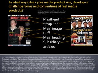
  • 1. In what ways does your media product use, develop or challenge forms and conventions of real media products? Here is my magazine compared to an existing one I have used labels to highlight how my magazine includes the same features. Masthead Strap line Main image Puff Main heading Subsidiary articles My music magazine includes a number of conventions most notably a bold striking main image. I have also included a strapline which features directly below the masthead. I have also included information on the main story and the sub story's. above I have labelled the key features of my magazine and a current real life music magazine. As in many music magazines the main image goes over or is very close to the masthead. Like the example of kerrang I have done exactly the same. People who read the magazine regularly will know the tittle as soon as they see it even though the image goes over the text slightly. The colour scheme fits in with conventional music magazines. Almost all the magazines I viewed used the colours red and black. These colours are not to in your face so the consumers focus remains on the main image. I have challenged conventions slightly by not including any other images on the front cover. Many magazines include other images however I wanted to keep the focus on the main image. 11
  • 2. how do my contents page and double page spread use, develop or challenge forms and conventions of real media products? Double page spread Contents page Both my double page spread and my contents page use, develop or challenge forms and conventions of real media products. I have conformed to the conventional colour scheme which remains constant across all the pages. Using the same colour scheme is key in creating a constant house style. I have challenged conventions by including a whole page if images followed by the text. The aim of this is to cater for people who prefer visual and people who prefer written information. The text in the article is organised to make it easy for the reader to consume. The contents page again continues with the house style and colour scheme. I have included the feature articles which draw the reader in just like real contents pages do. However I have not included lots of images as a feel this causes a congested feel. I tried to achieve a more tidy well laid out presentation which would appeal to the more sophisticated end of the target audience.
  • 3. How does your media product represent particular social groups? Young people are the main target for my magazine therefore they are the sole image of my front cover. I key part of teenage life is socializing and being part of social groups. The two young people on my front cover are shown close together a connection can be seen between the male and female. Teenagers often have mixed social groups within which they interact with many different people. Relationships play a big part in teenage life, and a clear relationship is shown between the band members. The young people who feature in my magazine and presented as cool and trendy and ultimately look the part. They are wearing trendy clothing which the target audience can relation the fashion. Youngpeople My magazine targets young people by portraying young people in the magazine. The artists featured in the magazine are young which young people can relate to. The colour schemes used do not indicate a specific gender therefore it can appeal to both. Although the magazine is aimed at younger people it is still sophisticated to appeal to young adults.
  • 4. What kind of media institution might distribute your media product and why? I think EMAP would produce my magazine , they produce Q a leading music magazine. They have experience in publishing and in particular have proven to be successful with in the music market. Q is a very modern music magazine which has a young target audience a lot like mine does. “Emap’sonline and offline publications provide industry-leading information, analysis and inspiration.” EMAP provides news and information on a fast and sufficient level , this is very important in an ever changing celebrity world. EMAP also provides an online publishing service I feel it would be best to keep the publisher the same for both. Therefore both would be published in the same manner making it more easily for the audience that this is an EMAP production. Here is an example of a music magazine produced by EMAP. As you can see the magazine is of a very high quality and very professional.
  • 5. Who would be the audience for your media product? The audience for my magazine would be 15 to 20 , teenagers and young adults. This age group is seen as the upcoming generation. Young people in society consume music on a large scale and therefore are probably the best target audience. The music in the magazine is all modern up to date music which young people are into. The magazine is trendy and cool like the young people who will consume it. Almost all young people own some sort of music device, therefore are always consuming music. Teenagers and young adults are always wanting to keep up to date with the latest news and gossip, something my magazine would provide. Young people are interested in the latest stories and hottest gossip in the music world. This is something my magazine would deliver. Young people are also very into fashion then artists are shown wearing fashionable clothes, which appeals to the target audience.
  • 6. How did you attract/address your audience? My main image is bold and fills a high percentage of the page. The two people with in the image also have bold black eyes which gives the sense they are looking at the consumer. The two people used for the image are 17 the midpoint of my target age. Therefore they appeal to them , they also represent the young people the magazine is targeted at. The young target audience can relate and aspire to the young artists. My tittle audio bully has been given a neon effect similar to that of lights which advertise bands in clubs and gigs. Many young people go to see live music and can relate to the style of the tittle. I attracted and addressed my audience in a number of ways. The bold image is eye catching and immediately draws your attention. The colours used all stand out against the dark background making it eye catching. I believe my colour scheme also attracts my audience because it isn't “to in your face” but at the same time is bold enough. The colours used are also not related specifically to a gender therefore they appeal to both genders.
  • 7. Audience feedback In order to measure the success of my magazine I carried out an audience evaluation, which gave me some feedback. I asked 10 people from my specific target audience what they thought of the magazine. A large number of people said they liked my colour scheme, with many saying the colours were appealing. The majority of the audience liked the images because they felt that they could relate to them as there age group was being portrayed by the band members. The audience would have liked to see more variation of artists, rather then the main focus being on just one. The majority of people thought the magazine was appropriate and would appeal to them. Many would consider buying it.
  • 8. What have you learnt about technologies from the process of constructing this product? I cut this image out using a tool on fireworks however the person in the image had red eye. Therefore I copied the image over to photo plus and using the red eye reduction was able to regain his natural eye colour. As you can see the person now has normal eye colour this gives it a much more professional out come. Cutting the image out using fireworks worked well to a high standard as you can see there is a nice clean edge around the figure. To edit my images I used the programme fireworks. I found this fairly easy to use and didn’t encounter many problems. I used a simple tool to cut out my images to make them look more professional. Fireworks was very easy to use I had never used it before but I quickly picked it up. The tool bar is very clear and these tools are simple and easy to use. The use of fireworks to edit the images gives an overall professional finish to the magazine.
  • 9. Step by step : how to edit photos using fireworks
  • 10. Using publisher I used Microsoft publisher to create my magazine, I believe this was the most efficient way to create the magazine. Microsoft publisher was the best programme to use in creating the magazine because its easy to move things around. This is important in the construction of the magazine because you can move things around and try out different concepts. Microsoft Publisher differing from Microsoft Word in that the emphasis is placed on page layout and design rather than text composition and proofing. Publisher is included in higher-end editions of Microsoft Office, reflecting Microsoft's emphasis on the application as an easy-to-use and less expensive alternative to the "heavyweights," with a focus on the small business market where firms do not have dedicated design professionals available to make marketing materials.
  • 11. Looking back at your preliminary task, what do you feel you have learnt in the progression from it to the full product? Here are my preliminary tasks , the task was to create a school magazine. My music magazine as developed drastically from this. Here is my music magazine front cover as you can see it is much more professional, compared to my first attempt at creating a magazine. The space has been filled much more efficiently . There are many more conventions of a magazine included in my finished product. How my work developed The preliminary task I carried out in creating a school magazine is a far cry from my finished music magazine. During the construction of the magazine I picked up a number of skills which proved extremely useful. I learnt how to crop images, cut them out, how to reduce red eye as well as successful presentation and lay out. The preliminary task was created with out any knowledge of how to produce a magazine , however the skills I picked up a long the way helped massively in creating a professional magazine.