
Empfohlen
Empfohlen
Weitere ähnliche Inhalte
Was ist angesagt?
Was ist angesagt? (16)
Andere mochten auch
Andere mochten auch (16)
Ähnlich wie Audience re search
Ähnlich wie Audience re search (20)
Audience re search
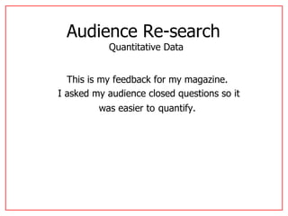
- 1. Audience Re-search Quantitative Data This is my feedback for my magazine. I asked my audience closed questions so it was easier to quantify.
- 2. Out of 10 people that I asked 50% of them were female and the other 50% were male. This was to get an equal amount of feedback from both genders.
- 3. Front Cover Feedback This pie chart shows that out of the 90% liked the images whereas 10% didn’t. Showing that the majority of my target audience liked them proving that they are effective.
- 4. Front Cover Feedback This pie chart shows that 100% of people thought that my layout for my front cover is effective.
- 5. Front Cover Feedback This pie chart shows that the majority of the people I asked thought my front cover was effective.
- 6. Contents Page Feedback This shows that most of my target audience thought my images used on my contents page were effective.
- 7. Contents Page Feedback This shows that they mainly liked my layout, 80% thought it was effective and 20% didn’t. However, I think I need to improve on this since this is the case.
- 8. Contents Page Feedback This proves that 100% of the people asked think the fonts I have used are effective?
- 9. Article Feedback This pie chart shows that 100% of the people I asked think my images are effective.
- 10. Article Feedback This shows that 100% of the people I asked think my layout for my Article is effective.
- 11. Article Feedback This shows that the majority of the people asked 10% of them said they didn’t think the fonts were effective.