
Empfohlen
Weitere ähnliche Inhalte
Was ist angesagt?
Was ist angesagt? (17)
Andere mochten auch
Andere mochten auch (17)
Mehr von a2mn
Mehr von a2mn (20)
Kürzlich hochgeladen
Kürzlich hochgeladen (20)
After more feedback
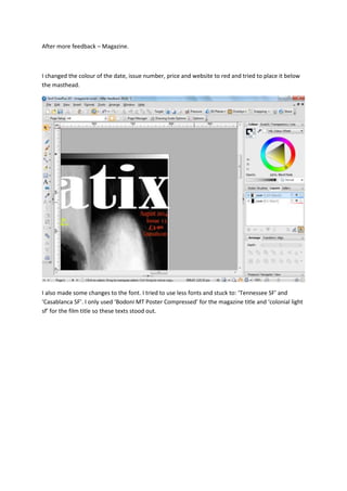
- 1. After more feedback – Magazine. I changed the colour of the date, issue number, price and website to red and tried to place it below the masthead. I also made some changes to the font. I tried to use less fonts and stuck to: ‘Tennessee SF’ and ‘Casablanca SF’. I only used ‘Bodoni MT Poster Compressed’ for the magazine title and ‘colonial light sf’ for the film title so these texts stood out.
- 2. I changed the colour of the border at the bottom of the magazine cover to a darker colour.
- 3. I then added arrows in between each image and made them white so that they would stand out on the dark background.
- 4. I used a rectangle to make sure that the space in between each image was the same: I then rotated the barcode.