
Empfohlen
Weitere ähnliche Inhalte
Was ist angesagt?
Andere mochten auch
Ähnlich wie Magazine evaluation
Ähnlich wie Magazine evaluation (20)
Mehr von a2columnd12
Mehr von a2columnd12 (20)
Magazine evaluation
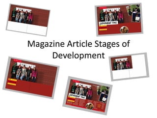
- 1. Magazine Article Stages of Development
- 2. After I had rearranged my pages to a double spread, I added in the main image, using ‘file’ and ‘place’. I then placed it in the appropriate place on the page.
- 3. When I placed the image in, I realized that it was not the right size. Therefore it was put into Photoshop, where it was edited to make it wider. We copied parts of the bricks and moved them to the edge of the image to make it wider, until it was wide enough to fill the whole width of the page.
- 4. Next, I added in the background for the rest of he page. We didn’t want lots of white as it makes the page seem emptier than it is, so after consulting the rest of my group, I decided to use a colour close to that of the bricks but different enough to be clearly visible as not part of the main image.
- 5. The next stage was to add in a header, I looked at existing magazine articles from ‘TV&Satellite Week’ magazines. I used the same header that is used in the other articles. First I added a red box and then added the text over the top of the box, editing it to the correct size, font and colour.
- 6. Next, I added in a small box holding the main information of the documentary. I made this out of different boxes that I coloured differently. I then added the text over the top of the boxes. After this, I grouped them all together, making it one larger box. I chose these colours as they match one I have looked at for my analysis’. I have included the necessary information, using different font types to separate them as different pieces of information.
- 7. I then added the main heading in. This has a background of its own as it is an important part of the article. The font has been chosen because it is a stereotypical font, being stereotyped as ’chavy’ I think it works well as it stands out very clearly against the rest of the page. Also it matches the title ‘Labelled’ in the background.
- 8. The next step was to add in the secondary images. These have taken up a fair amount of the page as they are visual and capture the readers eye. I have chosen images from the documentary, showing one of our experts, and some stereotypes. To help them stand out and look more professional I added a white border around each image. I also added a drop shadow effect to them all to give them a sense of dimension.
- 9. I then added in a footer, giving it a different coloured background to make it stand out better. I used red to stick with the colour scheme. I then added the page numbers and the name of the magazine as this is a typical convention of a tv magazine. I have placed them in the same place that ‘Tv&Satellite week’ does.
- 10. I added in a caption for the main image. After looking at existing captions, I noticed that most of them are whitty and humorous. I came up with the caption as it too is whitty and humorous and relates to the main image. I chose not to have captions for the secondary images because there was not a lot of space free to put them and I couldn’t think of any appropriate captions.
- 11. I then wrote the text for the article in word, so that I could check easily for spelling errors. I checked this with my group to make sure they were happy with the text.
- 12. The next thing I did was add a pull quote. I used a quote from the article text. To make it stand out, I Made it yellow to match the colour scheme and I also made it larger. It is going to be in the middle of the text to help break it up more. Plus, this is what is done in existing magazines.
- 13. I then copied the article that I had written earlier into two text boxes that have been linked so the text follows on from one into the other. The text is white to stand out from the background and to follow the colour scheme. I used drops cap to start the article off as this looks more professional.
- 14. This is the finished magazine spread.