Using data visualization for accessible science (communication)

23 November 2022… GFDL Lunchtime Seminar Series Creating visualizations of complex data structures and patterns is an important part of our jobs. We use figures for journal publications, presentations, posters, lab group meetings, science communication, and more. However, creating suitable figures for the task can sometimes be an afterthought during the extensive scientific process. In this seminar, I’ll share examples from climate science to discuss a network of resources available for designing accessible figures in both publications and presentations by leveraging resources that support open science practices. I will also share examples of what not to do, which goes beyond only considering interpretable colormaps, and how to improve these figures moving forward. Finally, by using global mean surface temperature as a case study, I will share some creative instances of using data visualization as a form of storytelling for communicating climate change.

Empfohlen
Empfohlen
Weitere ähnliche Inhalte
Ähnlich wie Using data visualization for accessible science (communication)
Ähnlich wie Using data visualization for accessible science (communication) (20)
Mehr von Zachary Labe
Mehr von Zachary Labe (20)
Kürzlich hochgeladen
Kürzlich hochgeladen (20)
Using data visualization for accessible science (communication)
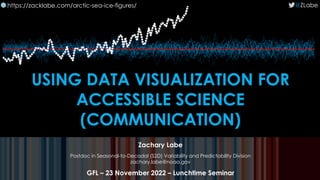
- 1. USING DATA VISUALIZATION FOR ACCESSIBLE SCIENCE (COMMUNICATION) Zachary Labe Postdoc in Seasonal-to-Decadal (S2D) Variability and Predictability Division zachary.labe@noaa.gov GFL – 23 November 2022 – Lunchtime Seminar @ZLabe https://zacklabe.com/arctic-sea-ice-figures/ 🌐
- 2. The Arctic is warming more than 3 times faster than the global average!
- 5. DATA VISUALIZATION IS STORY-TELLING. Arctic temperature anomalies from 1950 to 2021
- 6. DON’T BE SUCH A SCIENTIST WE ARE DATA SCIENTISTS ART BY JILL PELTO
- 7. Landscape of Change uses data about sea level rise, glacier volume decline, increasing global temperatures, and the increasing use of fossil fuels. These data lines compose a landscape shaped by the changing climate, a world in which we are now living. Jill Pelto|https://www.jillpelto.com/landscape-of-change “ ”
- 8. WHAT ARE YOUR WORST FIGURES?
- 9. My first map subplot?
- 11. Arctic sea ice thickness variability and the atmospheric circulation Zachary M. Labe Gudrun Magnusdottir 2 June 2016
- 21. :)
- 25. MAP PLOTS
- 26. YIKES!
- 27. YIKES – FONT IS BLEH!
- 28. YIKES – COLOR!
- 29. MAP PROJECTION!
- 30. :)
- 31. HAVE FUN!
- 39. LEVERAGING ALL DIMENSIONS OF YOUR DATA.
- 40. I have a 2D-array of sea ice thickness anomaly data [year,day]… Each line is one day Number of Years Thickness Anomaly (m)
- 44. https://betterfigures.org/2012/09/15/decadal-temperatures/ Error bars and graphical clutter…
- 45. https://betterfigures.org/2012/09/15/decadal-temperatures/ Error bars and graphical clutter…
- 46. https://betterfigures.org/2012/09/15/decadal-temperatures/ Error bars and graphical clutter…
- 51. cmap = ‘jet’
- 52. STOELZLE AND STEIN, 2021, HESS
- 53. 1998!
- 54. Citations on Google Scholar…
- 56. 2004!
- 68. Crameri, F. (2018). Scientific colour maps. Zenodo. http://doi.org/10.5281/zenodo.1243862 Crameri, F. (2018), Geodynamic diagnostics, scientific visualisation and StagLab 3.0, Geosci. Model Dev., 11, 2541- 2562, doi:1 0.5194/gmd-11-2541-2018 Crameri, F., G.E. Shephard, and P.J. Heron (2020), The misuse of colour in science communication, Nature Communications, 11, 5444. doi:10.1038/s41467-020-19160-7
- 69. BY FABIO CRAMERI
- 70. BY FABIO CRAMERI
- 71. Crameri, F. (2018). Scientific colour maps. Zenodo. http://doi.org/10.5281/zenodo.1243862 Crameri, F. (2018), Geodynamic diagnostics, scientific visualisation and StagLab 3.0, Geosci. Model Dev., 11, 2541- 2562, doi:1 0.5194/gmd-11-2541-2018 Crameri, F., G.E. Shephard, and P.J. Heron (2020), The misuse of colour in science communication, Nature Communications, 11, 5444. doi:10.1038/s41467-020-19160-7 Palettable: Color palettes for Python
- 74. OTHER OPTIONS THYNG ET AL. 2016; OCEANOGRAPHY
- 75. CMOCEAN THYNG ET AL. 2016; OCEANOGRAPHY
- 76. CMASHER “Scientific colormaps for making accessible, informative and cmashing plots”
- 77. Adapted from Ed Hawkins at betterfigures.org
- 80. 1. Seaborn. 2. Plotly. 3. ggplot. 4. Matplotlib v3. RESOURCES
- 81. 1. https://betterfigures.org/ 2. https://www.climate-lab-book.ac.uk/ 3. http://colorbrewer2.org/ RESOURCES
- 82. LABE ET AL. 2019, GRL Bring drama to your data story
- 83. LABE ET AL. 2019, GRL
- 84. LABE ET AL. 2019, GRL STRONGER POLAR VORTEX Zonal wind at 10 hPa Geopotential at 30 hPa
- 85. WEAKER POLAR VORTEX Zonal wind at 10 hPa Geopotential at 30 hPa LABE ET AL. 2019, GRL
- 86. 2-m TEMPERATURE Future minus Pre-Industrial PEINGS, LABE ET AL. 2021, JCLI
- 87. 2-m TEMPERATURE Future minus Pre-Industrial PEINGS, LABE ET AL. 2021, JCLI
- 88. 2-m TEMPERATURE Future minus Pre-Industrial PEINGS, LABE ET AL. 2021, JCLI
- 89. 2-m TEMPERATURE Future minus Pre-Industrial PEINGS, LABE ET AL. 2021, JCLI
- 90. 2-m TEMPERATURE Future minus Pre-Industrial PEINGS, LABE ET AL. 2021, JCLI
- 91. 2-m TEMPERATURE Future minus Pre-Industrial PEINGS, LABE ET AL. 2021, JCLI
- 92. 2-m TEMPERATURE Future minus Pre-Industrial PEINGS, LABE ET AL. 2021, JCLI
- 93. Perceiving internal climate variability WITT, LABE ET AL. 2022; submitted
- 100. ACCESSIBILITY
- 101. ACCESSIBILITY
- 102. ACCESSIBILITY
- 103. ACCESSIBILITY No jargon Tell a story Alternative text Color contrast ratio Label data directly Avoid flashing GIFs Include figure titles Avoid data overlays Provide data references
- 107. 2016 RIO OLYMPICS OPENING CEREMONY
- 109. PLOT BY ED HAWKINS
- 110. PLOT BY ED HAWKINS DON’T BE SUCH A SCIENTIST WE ARE DATA SCIENTISTS
- 113. CHECK: Simple. Bold. Stories. @ZLabe Questions! https://zacklabe.com/arctic-sea-ice-figures/ ZACHARY LABE | 23 NOVEMBER 22| GFDL LUNCHTIME SEMINAR