3 Ways to Go Mobile First with Responsive Design
•
0 gefällt mir•605 views

The document discusses strategies, processes, and implementations for mobile-first responsive design. The key points are: 1. The strategy is to use progressive enhancement, designing first for mobile and enhancing for larger screens. 2. The process involves designing for user flows rather than individual pages and embracing constraints of mobile. 3. The implementation places non-mobile styles in media queries, uses ems to keep layouts proportional, and leverages tools like Sass and Foundation for responsive coding.

Empfohlen
Empfohlen
Weitere ähnliche Inhalte
Was ist angesagt?
Was ist angesagt? (20)
Ähnlich wie 3 Ways to Go Mobile First with Responsive Design
Ähnlich wie 3 Ways to Go Mobile First with Responsive Design (20)
Mehr von ZURB
Mehr von ZURB (20)
Kürzlich hochgeladen
Kürzlich hochgeladen (20)
3 Ways to Go Mobile First with Responsive Design
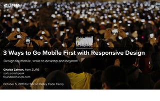
- 1. Ghaida Zahran, from ZURB zurb.com/speak foundation.zurb.com October 5, 2013 for Silicon Valley Code Camp Design for mobile, scale to desktop and beyond! 3 Ways to Go Mobile First with Responsive Design
- 2. Everything changed when real mobile web browsing entered the scene with the first iPhone. We started looking at our pages differently.
- 3. Before responsive design, we could either serve up a mobile-specific page or simply make sure that the desktop-optimized page isn't broken on the phone.
- 4. Let’s not do that. Responsive design!
- 5. Why Go Mobile First?
- 6. Shift your strategy, process, and implementation for Mobile First. We all know responsive design is where its at, but Mobile-First responsive design presents an opportunity to learn about what matters most to our customers.
- 7. Simplify your design process Build super focused products Improve your product performance What are the advantages?
- 8. Simplify your design process Build super focused products Improve your product performance
- 9. Simplify your design process Build super focused products Improve your product performance
- 10. Strategy
- 11. Progressive Enhancement Vs. Graceful Degradation Graceful degradation and progressive enhancement aren't new concepts. If you’ve been building pages for some time now then you’ve been following these methodologies in your browser QA. For example, how a site design might gracefully degrade for viewing on IE6 (ARGH!)
- 12. Progressive Enhancement The New Hotness With Mobile First, we're designing with progressive enhancement in mind. We start off with minimal, essential content and presentation, and work our way up, adding more content and presentational components for larger screens.
- 13. So you go from this...
- 14. ... To this.
- 15. And this...
- 16. ... To this.
- 17. And this...
- 18. You get the picture.
- 19. Strategy Progressive Enhancement Design for mobile first and progressively enhance your layouts for larger screens.
- 20. Process
- 21. Design flows, not pages. How did the user end up on a page? Did they click a link you tweeted? Or browse from your homepage?
- 22. Design flows, not pages, to effectively guide your users to a task. That way you can figure out what they’re expecting before and after they are on a particular page, making your design more meaningful.
- 23. Bring your wireframes to life with clickable prototypes. At a certain point you will need to create wireframes. Find gaps in your flow by linking them up into a clickable prototype.
- 24. Mobile First is user first. Mobile First is a return to user-centered design.
- 25. By eliminating unnecessary content for mobile, we can maintain that simplicity for larger devices as well making the site simpler for everyone.
- 26. Mobile is the ultimate design constraint. Design is defined by constraints.
- 27. Design Constraints Design is defined by constraints. These constraints can manifest in any number of forms including time, money, or medium.
- 28. Design Constraints Time Don’t waste your customers’ time. Get to the point, and front-up your primary content.
- 32. Design Constraints Money Reduce your content to the essentials to decrease data usage. Use techniques such as the Interchange plugin to swap in smaller images on mobile.
- 33. Design Constraints Money Interchange Interchange is pretty great because it lets you have big awesome images on desktop or high-resolution devices
- 34. Design Constraints Medium Every pixel counts, make sure layouts are easy to read on mobile by using strong contrast and clear typography.
- 37. Stay on top of your user’s real-world context. Research your user. Don’t assume to know how they will use your site. Keep their context in mind and remember that mobile users will often be distracted by the real world. They could be waiting in line, watching TV
- 38. Hopefully not texting and driving.
- 39. Hopefully not texting and driving.
- 40. Design fast-loading layouts by prioritizing content and optimizing it for small-screen reading.
- 41. Process Design fast-loading layouts by prioritizing content and optimizing it for small-screen reading.
- 42. Process Design flows, not pages Design fast-loading layouts by prioritizing content and optimizing it for small-screen reading.
- 43. Process Design flows, not pages Embrace Constraints Design fast-loading layouts by prioritizing content and optimizing it for small-screen reading.
- 44. Process Design flows, not pages Embrace Constraints Keep your user’s context in mind Design fast-loading layouts by prioritizing content and optimizing it for small-screen reading.
- 45. Implementation
- 46. Code it up! Mobile-first coding can seem a little daunting. It’s one thing to start sketching and wireframing mobile pages first, it’s a completely different beast to code for mobile. But fear not! We’re here to break it down for you nice and easy.
- 47. // Small Screen Style body { color: blue; } // Large Screen Style @media only screen (and min-width: 767px) { body { color: red; } } CSS The most basic rule is to put all your visual styles as well as your base page styles in regular CSS declarations, and place styles for larger screens in media queries. Crazy, right?
- 48. // Small Screen Style body { color: blue; } // Large Screen Style @media only screen (and min-width: 768px) { body { color: red; } } CSS Use min-width instead of max-width.
- 49. Get sassy. // Define your media query variables $small: only screen and (min-width: 20em); $medium: only screen and (min-width: 48em); $large: only screen and (min-width: 80em); // Use your variables in media queries @media #{$small} { ... } Sass Sass is a pretty cool tool. Use it together with compass to define your media queries and make it simple to code up responsive sites.
- 50. Sass + Media Queries = <3 nav { background: pink; @media #{$large} { background: blue; } } Sass You can even use media queries inside a style declaration!
- 51. Sass + Media Queries = <3 nav { background: pink; @media #{$large} { background: blue; } } Sass nav { background: pink; } @media only screen and (min-width: 80em) { nav { background: blue; } } CSS Output You can even use media queries inside a style declaration!
- 52. Ems are your friend. $small: only screen and (min-width: 20em); Sass Ems are based on your base font size so it keeps all sizes proportional to your content.
- 53. Let the Yeti do the heavy lifting. We work hard to keep Foundation reasonably cutting edge. We decided it was time to change up our thinking and commit to going Mobile First, starting with Foundation 4.
- 55. Media Queries The Grid Support @media #{$small} { } Sass @media only screen and (min-width: 48em) { } CSS min-width is used for media query breakpoints because we’re designing up. For example, the $small screen size variable is for screens sized 768 pixels and larger.
- 56. Media Queries The Grid Support <div class=”small-4 large-8 columns”> <img src=”grumpycat.jpg”> </div> HTML
- 57. Media Queries The Grid Support font-size: em-calc(21); Sass font-size: 1.313em; CSS Output We wrote a handy function that calculates the correct em value for you in Foundation!
- 58. Media Queries The Grid Support IE8 Going Mobile First means that any non-mobile styles will have to be placed inside media queries, which IE8 doesn’t support. Ditch IE8 if you’re going Mobile First. Sell your clients and bosses on the benefits of Mobile First design.
- 59. Implementation Place Non-Mobile Styles in Media Queries Place desktop styles in a media query. Use ems. Use Sass. IE8’s gotta go.
- 60. And that’s how you can shift your strategy, process, and implementation for mobile first design.
- 61. Recap And that’s how you can shift your strategy, process, and implementation for mobile first design.
- 62. Recap Strategy: Use progressive enhancement And that’s how you can shift your strategy, process, and implementation for mobile first design.
- 63. Recap Strategy: Use progressive enhancement Process: Mobile first design is user-centered And that’s how you can shift your strategy, process, and implementation for mobile first design.
- 64. Recap Strategy: Use progressive enhancement Process: Mobile first design is user-centered Mobile is the ultimate design constraint And that’s how you can shift your strategy, process, and implementation for mobile first design.
- 65. Recap Strategy: Use progressive enhancement Process: Mobile first design is user-centered Mobile is the ultimate design constraint Implementation: Place non-mobile code in media queries And that’s how you can shift your strategy, process, and implementation for mobile first design.
- 66. Recap Strategy: Use progressive enhancement Process: Mobile first design is user-centered Mobile is the ultimate design constraint Implementation: Place non-mobile code in media queries Use sass to streamline your workflow And that’s how you can shift your strategy, process, and implementation for mobile first design.
- 67. Recap Strategy: Use progressive enhancement Process: Mobile first design is user-centered Mobile is the ultimate design constraint Implementation: Place non-mobile code in media queries Use sass to streamline your workflow Use ems to keep your layouts proportional And that’s how you can shift your strategy, process, and implementation for mobile first design.
- 68. Recap Strategy: Use progressive enhancement Process: Mobile first design is user-centered Mobile is the ultimate design constraint Implementation: Place non-mobile code in media queries Use sass to streamline your workflow Use ems to keep your layouts proportional Let Foundation do the heavy lifting. And that’s how you can shift your strategy, process, and implementation for mobile first design.
- 69. Questions? And that’s how you can shift your strategy, process, and implementation for mobile first design.
- 70. @ZURB facebook.com/zurb We’re around, catch us if you can... ZURB 100 W Rincon Ace Campbell, CA 95008 ZURB.com getstarted@zurb.com (408) 341-0600 See where we’ll be speaking next at zurb.com/speak