Donut chart in Revit with Dynamo
•
1 gefällt mir•735 views

Make a donut style charts in Revit with native geometry. Charts are data-driven, fully scalable and changeable. Workflow is easy to adopt for other chart types.

Empfohlen
Empfohlen
Weitere ähnliche Inhalte
Was ist angesagt?
Was ist angesagt? (20)
Ähnlich wie Donut chart in Revit with Dynamo
Ähnlich wie Donut chart in Revit with Dynamo (20)
Mehr von Wojciech Klepacki
Kürzlich hochgeladen
Kürzlich hochgeladen (20)
Donut chart in Revit with Dynamo
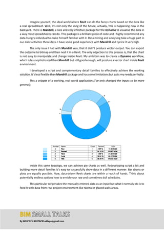
- 1. By WOJCIECH KLEPACKI wklepa@gmail.com Imagine yourself, the ideal world where Revit can do the fancy charts based on the data like a real spreadsheet. Well, it’s not only the song of the future, actually, this is happening now in the backyard. There is Mandrill, a nice and very effective package for the Dynamo to visualise the data in a way most spreadsheets can do. This package is a brilliant piece of code and I highly recommend any data-hungry individual to make himself familiar with it. Data mining and analysing take a huge part in our daily activities these days. I have some good experience with Mandrill and I price it very high. The only issue I had with Mandrill was, that it didn’t produce vector output. You can export the outcome to bitmap and then nest it in a Revit. The only objection to this process is, that the chart is not easy to manipulate and change inside Revit. My ambition was to create a Dynamo workflow, which is less sophisticated than Mandrill but still good enough, will produce a vector chart inside Revit environment. I developed a script and complementary detail families to effectively achieve the working solution. It’s less flexible than Mandrill package and has some limitations but suits my needs perfectly. This a snippet of a working, real-world application (I’ve only changed the inputs to be more general): Inside this same topology, we can achieve pie charts as well. Redeveloping script a bit and building more detail families it’s easy to successfully show data in a different manner. Bar charts or plots are equally possible. Now, data-driven Revit charts are within a reach of hands. Think about potentially endless options how to enrich your raw and sometimes dull schedules. This particular script takes the manually entered data as an input but what I normally do is to feed it with data from real project environment like rooms or glazed walls areas.
- 2. By WOJCIECH KLEPACKI wklepa@gmail.com This is how the whole script looks. I decided to use the Code Blocks and I assure you there is a good reason for this. Honestly speaking, there is more than only one. At first, it keeps the whole script much more compact. Secondly, because it has a modular structure it subjects to changes seamlessly and adopts new modules easily. The last but not least feature is that when you have some skills it’s more clear and effortless to follow. Let me give you a good example. This is a bit of code based on the traditional Dynamo nodes: The one below is done in Code Block technique. Like I mentioned, it’s easier to follow and it’s more compact. You can add own comments inside to make it more understandable. And what is important and comes in a package, it’s more elegant and sophisticated. Mastering this technique is very good exercise to start coding in Python for instance. Keeping every chunk of code in modules creates the good habits for the future as well.
- 3. By WOJCIECH KLEPACKI wklepa@gmail.com Let’s go deeper and allow me to explain the background of the whole process. The workflow utilizes detail families developed exclusively for the purpose of this process. The first one is the “donut” and the last one is the “table”. I decided to base the workflow on the families rather than the lines drawn by the script only because it’s a good compromise between the outcome and keeping the script reasonably easy to change. Please consider the fact that almost every specialised script is designed to solve specific not the generic problem. This is how the “donut” family looks and works:
- 4. By WOJCIECH KLEPACKI wklepa@gmail.com Please notice that all parameters that are to be changed by the Dynamo script are “instance”. This is important to keep them this way otherwise it will be not possible to access these parameters and change them per individual family instance. Please pay attention, that the chunk of “donut” is driven by angle, inner and outer parameters. Same principals apply to the “table” family: And family parameters: There is a trick, however. The table header is a part of the “table” family and it’s controlled by the visibility parameter. This trick keeps the whole workflow easier to manage inside the Dynamo. Now let’s jump in Dynamo and analyse the code. The first part of the script is responsible for the formatting the input data. Because I use string input nodes and not all the data are a string type, I want to convert some of them to integers. Subsequently, I want to change them into lists, splitting by the “,” separator. This is exactly what the block below does:
- 5. By WOJCIECH KLEPACKI wklepa@gmail.com Please pay attention, that I plug the watch nodes in some critical places of the code to analyse what information is coming out from them. This is not only the matter of a good practice. This step is necessary to understand if everything runs according to the specification. The chunk of code below checks if the input lists are equal in the count. It gives a combined list of input names and element counts. As an additional precaution, it gives a warning in case of error or confirmation if everything is up and running. The top part of the code calculates the percentage share and rounds the numbers. Subsequently, it converts the numbers to strings and adds “%” sign and “SQM” for percentages and
- 6. By WOJCIECH KLEPACKI wklepa@gmail.com square meters respectively. Because values for both are float type, it requires a few additional lines of code to convert and round them properly. indDot=String.IndexOf(numStr,".",true); strRem=String.Remove(numStr,(indDot+digToLeft+1),(numLen-indDot-digToLeft-1)); To make the life complicated, it may happen that some numbers are integers and others are a float. Two lines of code above take care that both of the types will be converted to strings with the desired precision. I want 100 to be precisely formatted as “100”, not “100.00”. But in contrary, I want 175.378 to be formatted exactly as “175.38”. Now comes the time when we definitely want to play with some colours. This portion of code defines “top left”, “middle” and “bottom right” colours. These three members will define the limits of the matrix of colours. Subsequently, I want to shuffle the colours, but I will use them only if the Boolean node is true, otherwise, I use the list of colours straight from the mixer. Here comes the interesting part and time the for a little disclaimer. The code will place “donuts” and “tables” in any plan, ceiling or section view. In my opinion, the best place to locate them is newly created drafting view. This view must be an active view! For some reason, I suggest setting the drawing scale to 1:100. The script will work fine on any scale, but some additional tweaking of code might be required to make it look nice and neat. The portion of the code below prepares data for rotation and placement the pieces of “donut”. The script utilizes the node FamilyInstance.ByPointInView from LunchBox package to place the family in a proper location. Afterwards, the script assigns the values for the parameters responsible for the rotation, inner and outer radiuses of the “donuts”. Before running the script, make sure that the right fill pattern is chosen in a Fill Patterns node. Also, pay attention that the outer radius has to be greater than the inner radius. It’s the question of common sense to keep them this way but it’s a matter of a good practice to doublecheck.
- 7. By WOJCIECH KLEPACKI wklepa@gmail.com The portion of the script below does roughly same operations as the part from the above. The differences occur because it was designed to place the “table” detail family. But the concept is the same. Find the location points, place multiple family instances, resize and assign values to the parameters. Last part of the script will override the colours of the placed family instances in a view. Please pay attention than the script utilizes only a few inputs of the OverrideGraphicSettings.ByProperties node.
- 8. By WOJCIECH KLEPACKI wklepa@gmail.com The benefit of keeping the chart as a native Revit geometry is an ability to perform modifications locally without running the script again. Please remember that if you want to modify the script dramatically, change the input numbers, amount of inputs or colours, it’s compulsory to run the script again. Also in new Revit session, it’s necessary to delete existing “donuts” and “tables” in an active view. As a bottom line let me visualise the example of a local change you can make. This change is impossible when the chart is nor vector type: