Designing TV Apps for Large Screens and Multiple Platforms
•
0 gefällt mir•186 views

The document discusses design considerations for TV user experiences across platforms. It covers projects designing mobile TV apps for Telenet and Proximus, with a focus on testing iterations. Key recommendations include designing for the large screen size and limitations of TVs, accommodating remote control navigation, minimizing data entry, aligning experiences across devices while respecting platform conventions, and continually testing designs with users.

Empfohlen
Weitere ähnliche Inhalte
Was ist angesagt?
Was ist angesagt? (17)
Ähnlich wie Designing TV Apps for Large Screens and Multiple Platforms
Ähnlich wie Designing TV Apps for Large Screens and Multiple Platforms (20)
Mehr von UX Antwerp Meetup
Mehr von UX Antwerp Meetup (20)
Kürzlich hochgeladen
Kürzlich hochgeladen (20)
Designing TV Apps for Large Screens and Multiple Platforms
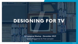
- 1. DESIGNING FOR TV UX Antwerp Meetup - November 2019 Sjoera Roggeman & Tine Lavrysen
- 2. The projects Design for large screens Cross-platform design Key take-aways WHAT WE’LL TALK ABOUT…
- 3. THE PROJECTS
- 6. WHAT WE DID FOR… Together with internal UX team UX and UI design of mobile TV apps Launch of new brand Pickx (previously Proximus TV)
- 7. PROXIMUS - WORKING PROCESS Wireframing User testing Visual design User testing Iterate Iterate Development User testing Iterate Cross-platform alignment
- 8. PROXIMUS - WIREFRAMING User testing per feature Short ad hoc testing to get quick feedback Tappable/swipeable prototype on mobile device Iterate with adjusted wireframes when necessary
- 9. PROXIMUS - VISUAL DESIGN Retest previous features Combine several features in a larger user test Both ad hoc and planned testing Iterate with adjusted designs when necessary
- 10. PROXIMUS - TESTING IN LAB Organised testing with FR and NL users Both Proximus and non Proximus customers Testing of developed product
- 11. CROSS-PLATFORM ALIGNMENT Weekly meetings with other teams Web * mobile * set-top box
- 12. WHAT WE DID FOR… Just one (part time) designer Branding was designed by an external agency UX and UI design of mobile TV apps, but also website, print design (packaging, invoices)
- 13. TADAAM - WORKING PROCESS Hyper-agile 😳 Very short feedback loops Beta-group of 100 Telenet staff
- 14. DESIGN FOR LARGE SCREENS
- 15. PEOPLE ARE FAR, FAR AWAY Lower information density Enough spacing Minimised amount of text Source: Apple Human Interface Guidelines
- 17. Source:
- 19. UNDERSTAND THE LIMITS OF A TV SCREEN Color gamut of HDTVs is more limited than that of computer screens Brightness, contrast en display quality varies a lot Test your designs! Source: B&H
- 21. PEOPLE ARE REALLY LAZY… Fast access to content Suggestions & recommendations Source: Tadaam
- 22. EVEN ON THE HOME SCREEN
- 23. EASE THE WAITING People are used to a TV that immediately shows content Customise loading screens for an immersive experience Show placeholders while loading Source: Apple Human Interface Guidelines
- 24. INSTEAD OF A SPINNER…
- 25. PEOPLE HAVE TO USE A REMOTE
- 26. BUT ALSO…
- 27. APPLE TV REMOTE Well-known standard tvOS gestures Swipe, click & tap Menu = Back
- 28. ANDROID TV REMOTE Not really standardised But all have some form of directional pad, Select-, Home- and Back button Some remotes also have a play/pause button Some remotes have a channel up/down button Source: designguidelines.withgoogle.com
- 29. NAVIGATING WITH A REMOTE Remotes limit navigation to up/down and left/right Design for navigating on a horizontal and vertical axis —> grid structure Source: designguidelines.withgoogle.com
- 31. FOCUS FOCUS FOCUS Make sure that what’s in focus is very clear tvOS focus engine is a b**** Not so clear
- 32. AT FIRST I THOUGHT THIS WAS CLEAR ENOUGH…
- 33. …BUT USERS SAID MORE CONTRAST WAS NEEDED
- 34. TV IS NOT MADE FOR DATA ENTRY Slow and annoying to input a username and password with a remote Minimise the need for authentication, or exchange for extra value
- 35. TADAAM OFFERS YOU A CUSTOM KEYBOARD…
- 36. …OR JUST SCAN THE QR CODE TO LOG IN
- 37. THE PROBLEM OF LINEAR TV Even though people say linear TV is (almost) dead …we still have to design for it 😱
- 38. EACH VARIATION HAS ITS DOWNSIDES…
- 40. WE TESTED THIS EPG WITH BETA-USERS
- 41. …AND THEN WE ARRIVED AT THE CLASSIC GRID (AGAIN)
- 42. BUT WE ALSO HAVE A CHANNEL PAGE…
- 43. …IN WHICH EACH PROGRAM IS ONLY SHOWN ONCE
- 45. ALIGNING THE DESIGN BETWEEN DIFFERENT PLATFORMS Always follow platform specific guidelines, don’t break them just for the sake of alignment Design for engagement, across platforms Rule of thumb for all platforms: make it easy to choose
- 47. …VERSUS A LIST VIEW ON PHONE Swimlanes on phone work well for discovering new content (1-2 tiles at a time) Not so much for browsing content you already know
- 48. A DETAIL PAGE WITH SEPARATE PLAYER FOR WEB…
- 49. …VERSUS PLAYER AND DETAIL ON ONE SCREEN ON PHONE Following common patterns for video player apps on mobile Users expect video to play in the detail if they tap on it Possible to read description while already viewing
- 50. AT FIRST WE KEPT PLAYERS ALIGNED…
- 51. …BUT THEN WE STARTED USING MORE NATIVE CONTROLS
- 52. SHOWING TITLE AND DESCRIPTION ON FOCUS FOR TV…
- 53. … VERSUS BELOW THE POSTER FOR PHONE No focus state on touch screen Therefore we chose to show title and release year below the poster
- 54. KEY TAKE-AWAYS
- 55. TAKE-AWAYS Take the user’s context into account (of course) 😏 Work around hardware restrictions 🚧 More space does not necessarily mean more content 👀 Don’t break platform specific guidelines just for the sake of alignment 👯 Think outside the linear TV box 🤩 Test, test, test! (
- 57. QUESTIONS?
- 58. THANK YOU