
Empfohlen
Weitere ähnliche Inhalte
Was ist angesagt?
Was ist angesagt? (20)
Ähnlich wie Double page spread evaluation
Ähnlich wie Double page spread evaluation (20)
Mehr von Tooney1994
Mehr von Tooney1994 (20)
Double page spread evaluation
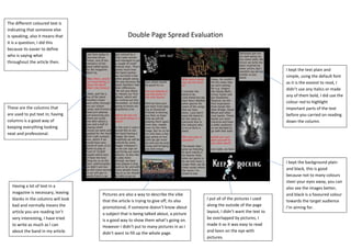
- 1. Double Page Spread Evaluation These are the columns that are used to put text in; having columns is a good way of keeping everything looking neat and professional. Having a lot of text in a magazine is necessary, leaving blanks in the columns will look bad and normally means the article you are reading isn’t very interesting, I have tried to write as much as I can about the band in my article. Pictures are also a way to describe the vibe that the article is trying to give off, its also promotional, if someone doesn’t know about a subject that is being talked about, a picture is a good way to show them what’s going on. However I didn’t put to many pictures in as I didn’t want to fill up the whole page. I put all of the pictures I used along the outside of the page layout, I didn’t want the text to be overlapped by pictures, I made it so it was easy to read and keen on the eye with pictures. I kept the background plain and black, this is good because not to many colours steer your eyes away, you can also see the images better, and black is a favoured colour towards the target audience I’m aiming for. The different coloured text is indicating that someone else is speaking, also it means that it is a question, I did this because its easier to define who is saying what throughout the article then. I kept the text plain and simple, using the default font as it is the easiest to read, I didn’t use any italics or made any of them bold, I did use the colour red to highlight important parts of the text before you carried on reading down the column.