Unit-IV; Professional Sales Representative (PSR).pptx
Media double page
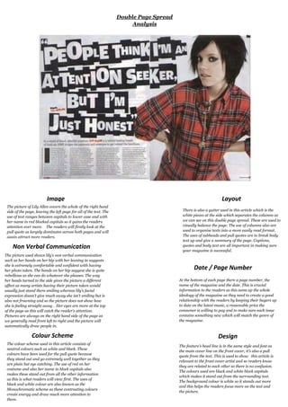
1. ImageThe picture of Lily Allen covers the whole of the right hand side of the page, leaving the left page for all of the text. The use of text ranges between capitals to lower case and with her name in red blocked capitals so it gains the readers attention ever more. The readers will firstly look at the pull quote as largely dominates across both pages and will again attract more readers. Non Verbal CommunicationLayoutThere is also a gutter used in this article which is the white pieces at the side which separates the columns as we can see on this double page spread. These are used to visually balance the page. The use of columns also are used to organise texts into a more easily read format. The uses of subheads and pull quotes are to break body text up and give a summary of the page. Captions, quotes and body text are all important in making sure your magazine is successful. Date / Page NumberAt the bottom of each page there a page number, the name of the magazine and the date. This is crucial information to the readers as this sums up the whole ideology of the magazine as they need to create a good relationship with the readers by keeping their buyers up to date on the latest music, a reasonable price the consumer is willing to pay and to make sure each issue contains something new which will match the genre of the magazine. The picture used shows lily’s non verbal communication such as her hands on her hip with her leaning in suggests she is extremely comfortable and confident with having her photo taken. The hands on her hip suggest she is quite rebellious as she can do whatever she pleases. The way her heads turned to the side gives the picture a different affect as many artists having their picture taken would usually just stand there smiling whereas lily’s facial expression doesn’t give much away she isn’t smiling but is also not frowning and so the picture does not show how she is feeling straight away . Her eyes are more at the top of the page as this will catch the reader’s attention. Pictures are always on the right hand side of the page as we generally read from left to right and the picture will automatically draw people in. Colour SchemeThe colour scheme used in this article consists of neutral colours such as white and black. These colours have been used for the pull quote because they stand out and go extremely well together as they are plain but eye catching. The use of red on her costume and also her name in block capitals also makes these stand out from all the other information as this is what readers will view first. The uses of black and white colour are also known as the Monochromatic scheme as these contrasting colours create energy and draw much more attention to them.DesignThe feature’s head line is in the same style and font as the main cover line on the front cover, it’s also a pull quote from the text. This is used to show this article is relevant to the front cover artist and so readers know they are related to each other so there is no confusion. The colours used are black and white block capitals which makes it stand out from the surrounding text. The background colour is white so it stands out more and this helps the readers focus more on the text and the picture. Double Page Spread Analysis <br />