
Empfohlen
Weitere ähnliche Inhalte
Was ist angesagt?
Was ist angesagt? (20)
Andere mochten auch
Ähnlich wie Do’s & don'ts of PowerPoint
Ähnlich wie Do’s & don'ts of PowerPoint (20)
Kürzlich hochgeladen
Kürzlich hochgeladen (20)
Do’s & don'ts of PowerPoint
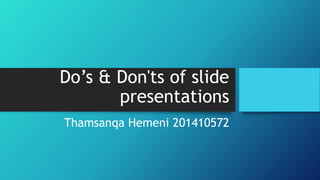
- 1. Do’s & Don'ts of slide presentations Thamsanqa Hemeni 201410572
- 2. Major errors done in slide presentations • Indecent choice of font style and size • Inappropriate choice of background and text color • Information overload and too many lines of text
- 3. Textual content • Text should be short and straight to the point • Include key words and phrases • Highlight key points
- 4. Content layout • There should be consistency in: • Position of headings, subheadings • Size of margins • Font styles, size, color should be consistent
- 5. Font • Readable font style • Use same font throughout presentation • Font size should be visible • Do not use font smaller than 24pts
- 6. Font cont… • Use readable font style • Do not use all capital letters • Use italics for quoting and highlighting
- 7. Use of a template • Use a set font and color scheme • Do not use different styles as they may hinder readability • Do not use multiple backgrounds in presentation because they are distracting • Avoid use of clashing colors, e.g. green on red, or orange on green
- 8. Graphs and charts • Make sure the audience can read the graphs and charts • Avoid using graphs that are difficult to read
- 9. Graphs and charts Good graph Bad graph
- 10. Tables and illustrations • Always place table on a separate slide • Use illustrations when needed • Illustrations should relate to the message and help make point
- 11. Animation and transitions • Use the same type of animation throughout entire presentation • Using too many animations can pose a distraction • Use appropriate transitions • Avoid using too many transitions • Avoid the use of too many slides
- 12. References • Aamer Nadeem, 2014 • Aishwaryabaile, 2013 • Kathryn Harth, (2011). Program Coordinator at Kansas State University • PlusOrMinusZero, (2009). Teaching at VAST, Thrissur, India