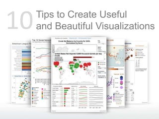
Ten Tips to Create Useful and Beautiful Visualizations
•Als PPTX, PDF herunterladen•
36 gefällt mir•10,279 views

Learn how to create useful and beautiful data visualizations by following these 10 straightforward tips.

Empfohlen
Empfohlen
Weitere ähnliche Inhalte
Mehr von Tableau Software
Mehr von Tableau Software (20)
Kürzlich hochgeladen
Kürzlich hochgeladen (20)
Ten Tips to Create Useful and Beautiful Visualizations
- 1. 10 Tips to Create Useful and Beautiful Visualizations
- 2. 1 Tell a story! Every viz should tell a story. As you create your visualization, make sure to continually ask, “What story does this tell?” This viz shows us that companies that IPO’d after reaching profitability were far more successful in the long run.
- 3. 2 Orient text horizontally Sometimes the small changes make all the difference in understanding
- 4. 3 Avoid pies! Except on maps… Bar charts beat pies every time! But… pies can be effective on maps. The human eye can compare height The same comparison problem exists, much easier than area. but pies allow analysis in small spaces.
- 5. 4 Use multiple views Use two coordinated views to show depth, rather than trying to place everything into one view.
- 6. 5 Bullets beat Gauges > Besides being difficult to read, gauges take up tons of space. Use bullets charts!
- 7. 6 Increase effectiveness with color The human eye can detect subtle differences in color much faster than it can read subtle differences in text. Using color saves on space too!
- 8. 7 But not too many colors at once Using more than 10 colors can cause them to blend together and confuse. This view is only using 8 colors, but it is still difficult to differentiate the greens.
- 9. 8 Labels make it clear Labels are wonderful for calling out key data points and actions
- 10. 9 Make it interactive! Enable filters, highlighting and clicking for more detail to supercharge the usefulness of your visualization
- 11. 10 No ornamentation necessary This viz shows the National Activity Index. Not exactly exciting stuff. Yet, this simple visualization tells a story and does it without ornamentation or added presentation layers. Let the data tell the story!