Data driven financial graphs
•
1 gefällt mir•389 views

This data-driven diagram template consists various illustrations of Pyramid Diagram, donut diagram, process diagram, arrow diagram and stabled circles. High quality and easily customizable illustrations used in these Power point slides are very useful especially for depicting all sort of analysis, graphs, process, representing chronological events and targets. They could be used by all professionals, businessmen, investors, managers and students. This template only works with Power point 2007 and 2008.Data driven chart can show the progress made at different interval of time and the progress made.

Empfohlen
Empfohlen
Weitere ähnliche Inhalte
Mehr von SlideShop.com
Mehr von SlideShop.com (20)
Kürzlich hochgeladen
Kürzlich hochgeladen (20)
Data driven financial graphs
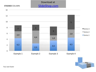
- 1. STACKED COLUMN Your own footer Download at SlideShop.com
- 2. CLUSTERED COLUMN Your own footer
- 3. Your own footer STACKED COLUMN
- 4. CLUSTERED BAR Your own footer Download at SlideShop.com
- 5. PIE CHART Your own footer
- 6. EXPLODED PIE CHART Your own footer
- 7. DOUGHNUT CHART Your own footer
- 8. STACKED LINE Your own footer Download at SlideShop.com
- 9. LINE Your own footer Download at SlideShop.com
- 10. 3D STACKED Area Your own footer
Hinweis der Redaktion
- To edit data in charts: Right click on chart and select ‘edit data’. Add data or change Headlines in Microsoft Excel. Add new lines of data and remove where needed. The data is automatically updated in PowerPoint. Close Microsoft Excel after updating data (Saving is not necessary)
- To edit data in charts: Right click on chart and select ‘edit data’. Add data or change Headlines in Microsoft Excel. Add new lines of data and remove where needed. The data is automatically updated in PowerPoint. Close Microsoft Excel after updating data (Saving is not necessary)
- To edit data in charts: Right click on chart and select ‘edit data’. Add data or change Headlines in Microsoft Excel. Add new lines of data and remove where needed. The data is automatically updated in PowerPoint. Close Microsoft Excel after updating data (Saving is not necessary)
- To edit data in charts: Right click on chart and select ‘edit data’. Add data or change Headlines in Microsoft Excel. Add new lines of data and remove where needed. The data is automatically updated in PowerPoint. Close Microsoft Excel after updating data (Saving is not necessary)
- To edit data in charts: Right click on chart and select ‘edit data’. Add data or change Headlines in Microsoft Excel. Add new lines of data and remove where needed. The data is automatically updated in PowerPoint. Close Microsoft Excel after updating data (Saving is not necessary)
- To edit data in charts: Right click on chart and select ‘edit data’. Add data or change Headlines in Microsoft Excel. Add new lines of data and remove where needed. The data is automatically updated in PowerPoint. Close Microsoft Excel after updating data (Saving is not necessary)
- To edit data in charts: Right click on chart and select ‘edit data’. Add data or change Headlines in Microsoft Excel. Add new lines of data and remove where needed. The data is automatically updated in PowerPoint. Close Microsoft Excel after updating data (Saving is not necessary)
- To edit data in charts: Right click on chart and select ‘edit data’. Add data or change Headlines in Microsoft Excel. Add new lines of data and remove where needed. The data is automatically updated in PowerPoint. Close Microsoft Excel after updating data (Saving is not necessary)
- To edit data in charts: Right click on chart and select ‘edit data’. Add data or change Headlines in Microsoft Excel. Add new lines of data and remove where needed. The data is automatically updated in PowerPoint. Close Microsoft Excel after updating data (Saving is not necessary)
- To edit data in charts: Right click on chart and select ‘edit data’. Add data or change Headlines in Microsoft Excel. Add new lines of data and remove where needed. The data is automatically updated in PowerPoint. Close Microsoft Excel after updating data (Saving is not necessary)