3-2-1-done-IBPA-2015-Shannon-Bodie
•
1 gefällt mir•440 views

Covers that Connect: 3-2-1-DONE! 3-2-1: That’s how much time your book has to grab your reader — mere seconds to sale or fail. Why do some covers propel sales and others fall flat? This slide show was part of an informative lecture with discussion of cover design principles and tips, before and after examples, and plenty of Q&A. Shannon Bodie is a professional cover designer, Benjamin Franklin Award design judge, here she share tools of the trade for cover design success. You'll receive advice about the front and back covers, the spine, and the ebook edition. Take-aways include cover design checklists and a glossary of industry terms (http://www.slideshare.net/Shannon_Bodie/book-wise-designglossary2015)

Empfohlen
Weitere ähnliche Inhalte
Mehr von BookWise Design
Kürzlich hochgeladen
Kürzlich hochgeladen (20)
3-2-1-done-IBPA-2015-Shannon-Bodie
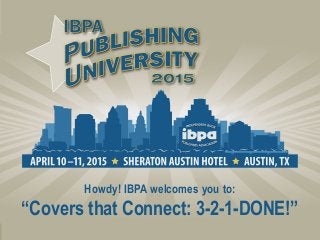
- 1. Howdy! IBPA welcomes you to: “Covers that Connect: 3-2-1-DONE!”
- 2. Get your cover on the right track: You only have seconds to reach your potential readers—so make it count! Before starting the cover design process determine your target audience. This is not all the possible readers your book will have, but the most likely readership. Knowing your target audience guides you (and your book design team) in all aspects of the design process: trim size, font, color, imagery, even what paper and finish are used when printing your book. Know your genre—what books are your audience buying? Gather genre research.
- 3. Know your genre visually: Genre and category research is very important. Of course you want to stand out in the crowd, but you don’t want to look out of place. Fiction vs. nonfiction, then drill down to your specific categories. Learn what books are selling well to your audience. Best sellers Fiction Best sellers Nonfiction
- 4. Your pre-design creative meeting checklist: Target market specs: gender, age, ethnic diversity. Does your target reader have any special training or knowledge, or beliefs to consider? Be specific and realistic, not everyone is truly in your book’s target market. What are the top 10 best-selling competitors? How is your book unique from these books? Also look at the books not selling as well. How will your book be better? Key team members with special knowledge, especially authors and editors should be included. Don’t forget a distributor with market info to share—can they review proofs with their sales staff?
- 5. Goals for sales of books: do you have the start of a series, potential for market expansion, author-speaker support? Share your goals for book sales: plan to start with a digital print run or ebook version, then future print or add-ons (guides, online courses, etc.) At least five samples of covers with design qualities you like. Not to be copied—to help detail the visual or “gut reactions” you have to design styles. Your personal preferences (and the author’s) are important to work into the design. Don’t hold back thinking you are “stifling creativity.” Now we have the foundation for creating a design, let’s explore what makes an outstanding cover . . .
- 6. You need to be able to read your title easily. This may seem obvious, but it is a common mistake, that best sellers rarely make. Your cover needs to attract a shelf viewer, and also look good at very small sizes online, where you may have questionable screen resolution and contrast, depending on the device a viewer is using.
- 7. Use good contrast for type and keep it concise. Try to keep character count low so the type can be larger. Assure any images used do not conflict with readability. Which text can you read well? Good contrast is crucial for readability of text: use light text over dark areas, or dark text over light backgrounds.
- 8. What if I have a lot of copy and just can’t reduce further? Tips for making dense copy work: 1)Make your title “pop.” Have a clear path for the eye: vary size and color of type to help the reader know what to read first. 2)Leave some white space “open areas” for balance. 3)It’s a balancing act—not all the text will read well at reduced sizes. 4)Stay in the same font family when you vary style (bold, italic, condensed or extended). 5)Make sure any image balances well with text and doesn’t angle the eye away from content.
- 9. Some examples to review contrast and text readability: Difficult to read: text is running over background with variation in light and dark (poor contrast). Similar design concept, but the text is larger, and white, with better contrast in the background for a more readable title.
- 10. Which title can you read? Which has better text contrast? Difficult to read: text is running over background with variation in light and dark (poor contrast). Text is over a background with less variation in dark and light. Areas of the image with variation in contrast (hands) do not have text running over them.
- 11. Avoid text over images that interfere with readability: Title is placed over a background with variation in light and dark (poor contrast). Text is also a hand written font style which is more difficult to read. Title over a background with no variation —black background and light text— contrast at the highest level. Equals a very readable title.
- 12. Avoid showing too much or trying to represent every reader possible on the front cover. Instead of attracting “everyone” as you hope, you can overwhelm, and detract from your message AND potential sales. First cover has too many images, so the cover feels crowded. The second and third, use multiple images in a clear and balanced way. Too much text or imagery can turn off the entire market, instead of widening your audience.
- 13. Color has a big impact on mood and emotion: You can learn from what other publishers improve in new editions. Why did they make an update, does it work better?
- 14. Cover design evolution and market testing: You can learn from what other publishers improve in new editions. Why did they make an update, does it work better?
- 15. Cover design evolution and market testing:
- 16. Cover design evolution and market testing: You can learn from your supporters, if you have a list ask them for feedback in cover design surveys. Starting in May, 2014 this book was funded by regular people and artists, and not by some corporation or publishing house. It was the most funded art project ever on one of the biggest crowd funding sites in the world, IndieGogo. Visit facebook.com/21draw to learn more.
- 17. After your front cover concept and artwork is approved, on to the rest of the cover—the spine and back cover: Unless you only plan to have ebook editions the rest of the cover is still very important to sales. On most non-fiction an author photo is not as key to sales as endorsements and strong marketing copy. If you have room you can direct traffic to a website with URLs or QR codes.
- 18. When the author is a speaker, and/or building their brand recognition a photo/bio can be important to their marketing efforts.
- 19. This publisher wanted the author photo featured because the author is attractive, a speaker and a doctor. On the front we featured a bonus CD.
- 20. Back cover and spine design check list: Cover template from printer: Includes the trim size dimension, bleed, and the spine width based on final page count. This is very import to have exact. Any change in paper (change in printer) will alter this measurement. Headline: Can be a call to action, and include the book’s title. Paragraph or two of concise marketing copy. Keep this readable, most fonts need to be at 10pt or above. Endorsements: Again keep these concise and readable, if needed get approval for reduced version and run full version if you like on an interior page.
- 21. Author photo: If your author is an expert/speaker, it is a good idea to place their photo on the back cover. However, if they are not well-known yet, better to use space for endorsements. Barcode/ISBN/price: Remember to order individual ISBNs for ebook editions, and other future books if you plan a series. Category: Don’t use more than three; too many could be confusing and difficult to make readable in the space available. Publisher: include name and logo with web url for connecting on back cover. Spine: Include title, author’s last name and publisher logo. Only use an image if your spine is wide enough to make this work well.
- 22. How is a cover design different for an e-book? The same design principles apply. Correct design for your market is still key, and good readability is even more crucial. Create your ebook covers at press resolution. The requirements for readers are high resolution, and if you decide to create a print edition, you’ll be ready. Simple answer—it isn’t. File size for 6”x9” print: 1800x2700 pixels Kindle preferred: 2500 pixels on longest side
- 23. Updates and new editions. With good planning you and your cover will have a long successful relationship. Slides & handouts at: www.slideshare.net/Shannon_Bodie
Hinweis der Redaktion
- Fiction titles tend to leave you guessing, open ended, planting an idea. Nonfiction titles have a clear message, answering a question or need.
- Crowd sourcing their funds allowed this publisher to have a large list. The market testing on cover design, let us know a sexy woman would be offensive to some religious parents, so we took the sexier artwork off, even though it had rated high during market testing with a portion of the target audience.