AlchemyLeads - LeadPages Instapage Top 15 landing page styles
•
3 gefällt mir•327 views

AlchemyLeads - LeadPages Instapage Top 15 landing page styles 15 highly converting squeeze / splash / or landing pages via Google Adwords PPC funnels. #UXMatters

Empfohlen
Empfohlen
Weitere ähnliche Inhalte
Kürzlich hochgeladen
Kürzlich hochgeladen (20)
Empfohlen
Empfohlen (20)
AlchemyLeads - LeadPages Instapage Top 15 landing page styles
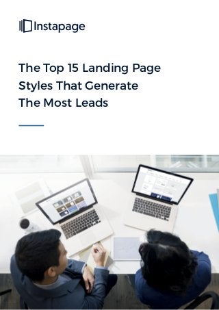
- 1. The Top 15 Landing Page Styles That Generate The Most Leads
- 2. Contents 03 Intro 04 Paid Search Landing Page 06 Squeeze Page 08 Splash Page 10 Lead Capture Landing Page 12 Sales Page 14 Upsell Landing Page 16 “Coming Soon” Landing Page 18 Gated Article Landing Page 20 Ebook Landing Page 22 White Paper Landing Page 24 Webinar Landing Page 26 Video Landing Page 28 Demo Landing Page 30 Free Trial Landing Page 32 “Thank You” Page 34 Don’t forget... Paid Search Squeeze Page Splash Page Lead Capture Sales Page Upsell Coming Soon Gated Article Ebook White Paper Webinar Video Demo Free Trial Thank You Page
- 3. Paid Search Squeeze Page Splash Page Lead Capture Sales Page Upsell Coming Soon Gated Article Ebook White Paper Webinar Video Demo Free Trial Thank You Page 3 Top 15 Landing Page Styles Online, the success of your business ultimately hinges on your ability to persuade internet users to take action. Getting them to subscribe to your newsletter, download your ebook, and purchase your product is no easy task — and unfortunately, traditional web pages aren’t designed to help you do it. That’s why expert marketers use landing pages. With the help of proven psychological principles and usability best practices, these persuasive powerhouses have the potential to send your business soaring into the black. Learn how to build them no matter your goal, and discover some pitfalls to avoid from the following 15 pages built by the pros.
- 4. 4 Paid Search Landing Page Studies show that 72% of buyers¹ start their research at Google. In total, there are over 6 billion searches conducted worldwide online daily.² That’s why paid ads on search engine results pages are a great way to get your product noticed. A paid search, or ppc landing page, allows you to capitalize on that traffic by sending prospects with high intent (meaning, they’re actively searching for a solution to their problem, as opposed to just browsing) to targeted landing pages that offer a solution to their problem. Take a look at how Velocify³ uses a landing page to offer lead management software to its prospects: Paid Search Squeeze Page Splash Page Lead Capture Sales Page Upsell Coming Soon Gated Article Ebook White Paper Webinar Video Demo Free Trial Thank You Page
- 5. 5 What This Paid Search Landing Page Does Well: • A logo not linked to the homepage won’t let prospects escape before converting. • The “Salesforce partner” badge in the upper right of the page aligns Velocify with a trusted brand. • This headline provides a strong benefit rooted in data, likely from a case study. Who wouldn’t want to boost close rates by 400%? • The image adds value here by giving prospects an inside look into the software. • The CTA button color stands out on a gray background. • The call-to-action is written in first person. • The “With Velocify your sales team can” section lets visitors know the benefits of using the service. • The testimonial has name, title, and company listed. The only way it could be stronger is by displaying an image of the person who gave the testimonial. • Company logos give visitors an idea of the big-name clients who use Velocify. What Could Be A/B Tested on This Paid Search Landing Page: • The CTA button would command more attention if it were bigger. • Social media links in the footer distract users from the page’s goal, allowing them to abandon it before converting. • Disappearing placeholder labels have the potential to confuse and frustrate visitors unlike permanent ones. Paid Search Squeeze Page Splash Page Lead Capture Sales Page Upsell Coming Soon Gated Article Ebook White Paper Webinar Video Demo Free Trial Thank You Page
- 6. 6 Squeeze Page Today, filling up your marketing funnel starts with one key piece of prospect information: email address. More than 95% of marketers⁴ say it’s the most important data they capture on lead generation forms. Luckily for you, email address is something your website visitors are willing to give up — and a squeeze page is the best tool for convincing them to. This type of landing page will pop up to cover your prospects’ browser window after they land on one of your web pages, and present them with an offer in exchange for their email. Here’s an example from AdEspresso:⁵ Paid Search Squeeze Page Splash Page Lead Capture Sales Page Upsell Coming Soon Gated Article Ebook White Paper Webinar Video Demo Free Trial Thank You Page
- 7. 7 What This Squeeze Page Does Well: • This headline is benefit-oriented, promising to turn visitors who convert into a Facebook Ads Pro. It also includes the word “free,” the second-most compelling word in copywriting next to “you.” • The subheadline below explains exactly what’s included in the offer: the company’s 4 most popular ebooks in one bundle. • The yellow banner reading “Available only for a limited time” uses scarcity to pressure the visitor into downloading before the offer expires. • The image of 4 ebooks to the left of the page show prospects what they stand to gain by converting. • Bulleted copy quickly communicates what the visitor will find inside the bundle. • The offer itself is a bargain value. Four ebooks, all in exchange for a simple email address? Sign us up. • The super-short form doesn’t even ask for name, just email. • The call-to-action is relevant to the offer, using “bundle” to refer to what’s up for grabs. • The CTA button color is green, a color that hasn’t been used on the page, which makes it stand out among other elements. • The little “X” in the upper-right corner is the only way off the page. What Could Be A/B Tested on This Squeeze Page: • Disappearing light gray labels within form fields have the potential to frustrate visitors when they can’t remember what information to input after the text vanishes. • Adding more white space would help draw more attention to each squeeze page element. Currently they all look a little too tightly packed. Paid Search Squeeze Page Splash Page Lead Capture Sales Page Upsell Coming Soon Gated Article Ebook White Paper Webinar Video Demo Free Trial Thank You Page
- 8. 8 Splash Page Normally when your prospect clicks a link to claim one of your offers, they expect to be directed to a landing page where they can find it. Their mindset isn’t the same when they land on a splash page, though. Splash pages are a bit different because they’re what you might consider stopovers on the way to the prospect’s final destination. And their goal isn’t always to get a visitor’s information. For example, you might choose to direct potential customers to a splash page that lets them choose what language they want to read your blog post in before they reach it. Or you might send them to one that displays an announcement when they type in the URL of your homepage. Regardless of its purpose, a splash page is never somewhere a prospect expects to be. So make sure you have a good reason to interrupt their trip in the first place, and that you allow them to continue on to their destination once they’ve read your message, or decided whether or not to convert. Here’s an example from Forbes⁶ you’ve likely seen before: Paid Search Squeeze Page Splash Page Lead Capture Sales Page Upsell Coming Soon Gated Article Ebook White Paper Webinar Video Demo Free Trial Thank You Page
- 9. 9 What This Splash Page Does Well: • The Forbes logo lets visitors know they’re on the site they intended to visit. • The partly see-through page teases the content the prospect wants to read. • A display ad gives Forbes the opportunity to monetize this splash page. On a landing page designed to convert, you don’t want to include ads to other offers that drive visitors off the page. But since this one doesn’t feature an offer, they’re alright to include. • A big “continue to site” link written in all-caps lets visitors know where to click when they want to continue to the article. What Could Be A/B Tested on This Splash Page: • Inspirational quotes, to most visitors, probably aren’t worth an interruption. Here, people may abandon the splash page before even reaching the Forbes website. Paid Search Squeeze Page Splash Page Lead Capture Sales Page Upsell Coming Soon Gated Article Ebook White Paper Webinar Video Demo Free Trial Thank You Page
- 10. 10 Lead Capture Landing Page Some sources claim that as many as 96% of people who visit your website aren’t ready to buy.⁷ If that’s the case, then you’ll have to guide those undecided prospects to sale using a process called “lead nurturing.” Before you can do that, though, you have to convince those visitors to tell you more about them. And that’s where lead capture landing pages come in. With a form designed to capture information that your marketing and sales teams use to qualify potential customers, this type of landing page turns prospects into leads that you can guide to sale with targeted content and offers. Here’s an example from MarketingBitz:⁸ Paid Search Squeeze Page Splash Page Lead Capture Sales Page Upsell Coming Soon Gated Article Ebook White Paper Webinar Video Demo Free Trial Thank You Page
- 11. 11 What This Lead Capture Landing Page Does Well: • This headline offers a valuable resource: 45 tips from experts. • The photo of the report shows visitors what they’ll get by downloading. • Photos with companies underneath them add credibility to the offer by showcasing the well-known businesses these experts work for. • Copy broken up into short paragraphs makes for easy reading. • Bulleted text quickly previews the content of the resource. • “Free” is used above the form, which helps persuade prospects to complete the form. • A short form doesn’t ask much from prospects in exchange for a big resource. • The CTA button color stands out on a gray form. What Could Be A/B Tested on This Lead Capture Page: • The call-to-action “Submit” won’t get the user excited about claiming the offer. • The CTA button is a little small. If it were larger, it would likely attract more attention and boost its potential to get clicks. • The click-to-tweet button beneath the form provides a way off this page before the conversion takes place. • The “contact us” link in the footer serve as an escape route for easily distracted prospects. Paid Search Squeeze Page Splash Page Lead Capture Sales Page Upsell Coming Soon Gated Article Ebook White Paper Webinar Video Demo Free Trial Thank You Page
- 12. 12 Sales Page The second-most persuasive word in a copywriter’s lexicon is “free,” and these pages can’t use it. That’s why they have to be so carefully constructed. A sales page is after the most coveted conversion, and to compel users to click “Buy,” it’ll need to be built with every element of a persuasive landing page and no fewer. Check out how Bloomberg Businessweek⁹ gets their visitors to buy with this sales page aimed at boosting subscriptions: Paid Search Squeeze Page Splash Page Lead Capture Sales Page Upsell Coming Soon Gated Article Ebook White Paper Webinar Video Demo Free Trial Thank You Page
- 13. 13 What This Sales Page Does Well: • The offer is a mighty valuable one. 50 issues AND digital access for only $30? That’s less than the cost of a dinner out. • A big discount graphic reading “Save Up To 93% Off The Cover Price” draws prospect eyeballs with bright, bold colors. • The CTA button is big and easy to find — and it’s actually shaped like a button. There’s no question about where prospects need to click to purchase this offer. • Images of both offers preview what visitors will get by converting. Notice how the cell phone and tablet images are only included in the “Print + Mobile + Tablet” version. • A “best deal” banner draws visitors’ attention to the offer that gets them the most bang for their buck. It also happens to be the most expensive offer on the landing page. • Security badges let visitors know their credit card information is safe. These are an absolute necessity on pages that capture sensitive information. What Could Be A/B Tested on This Sales Page: • The lack of visual hierarchy and white space really makes this page a cluttered mess. There are so many elements vying for visitors’ attention, they won’t know what to look at. • All-caps copy reads like a pitch from a wildly aggressive car salesman. “SUBSCRIBE NOW!” is yelling. “Subscribe Now!” is still emphatic, but without the aggressive overtones. • Text reading “The publisher has approved your discounted courtesy rate” isn’t fooling anyone. This landing page is generating visitors via a PPC ad. Anyone who clicks that ad is approved. This is a poor attempt at personalization. • A CTA button color that’s the same hue as a lot of elements on the page doesn’t stand out as much as it could. • Fine print may make visitors wary. The thing about fine print is, most people don’t read it. And because of that, it doesn’t matter if you haven’t snuck anything deceptive in there. The funny thing is, one of Bloomberg’s biggest selling points is hiding in the fine print: “Money-back Guarantee: If you should ever choose to cancel your subscription, you’ll receive a full refund on all unmailed issues.” If this were displayed more prominently, it would undoubtedly help convert more prospects. Ultimately, remember this: the more fine print you have, the sneakier you’re going to look. If you can avoid it, be as straightforward with your prospects as possible. • Outbound links in the footer have the potential to drive visitors off the page before they convert. Paid Search Squeeze Page Splash Page Lead Capture Sales Page Upsell Coming Soon Gated Article Ebook White Paper Webinar Video Demo Free Trial Thank You Page
- 14. 14 Upsell Landing Page Savvy marketers know that loyal customers are up to 10 times more valuable than new ones, and around 65% easier to sell to. That’s why upselling is so popular. “Upselling” refers to the practice of getting an existing customer to purchase a newer or more robust upgrade of your product or service, thereby maximizing their value to your business. When it comes to convincing them to do it, businesses like Grammarly¹⁰ use the persuasive power of a landing page: Paid Search Squeeze Page Splash Page Lead Capture Sales Page Upsell Coming Soon Gated Article Ebook White Paper Webinar Video Demo Free Trial Thank You Page
- 15. 15 What This Upsell Landing Page Does Well: • A logo that’s not linked to the homepage won’t drive visitors off the page when it’s clicked. • A progress graphic at the top of the page shows visitors where they are in the conversion process, and how many more steps they need to take before it’s complete. • An icon list shows prospects what they’ll get with an upgrade to Premium. • Testimonials from authoritative publishers like the New York Times and Harvard Business Review add to the page’s persuasiveness. • A limited-time discount tempts visitors to act before they have to pay full price again. • The money-back guarantee makes prospects more comfortable with converting. • Icons that show Grammarly’s number of followers on Facebook, Twitter, and Google+ add social proof to the page. What Could Be A/B Tested on This Upsell Landing Page: • Scrolling testimonials from well-known publishers tout the value of Grammarly, but with only one displaying at a time, there’s no guarantee the prospect sees all of them. Paid Search Squeeze Page Splash Page Lead Capture Sales Page Upsell Coming Soon Gated Article Ebook White Paper Webinar Video Demo Free Trial Thank You Page
- 16. 16 “Coming Soon” Landing Page Just because your offer or website isn’t ready yet doesn’t mean you can’t get a head-start generating leads for your business. Build anticipation with a coming soon landing page that adds visitors to an exclusive wait list where they can get notifications on your product’s release. Here’s an example from Optim-Eyez:¹¹ Paid Search Squeeze Page Splash Page Lead Capture Sales Page Upsell Coming Soon Gated Article Ebook White Paper Webinar Video Demo Free Trial Thank You Page
- 17. 17 What This Coming Soon Landing Page Does Well: • The big logo lets people looking for Optim-Eyez know they’re in the right place. • The handwritten signature on the page gives it a personal touch. • The words coming soon lets visitors know that the service will be available in the near future. • The photo of Sam Hurley humanizes the brand by introducing the man behind it. • A pink-outlined downward-pointing arrow directs people toward the lead capture form. • A one-field form requires very little information from prospects, making the conversion process nearly friction-free. • A permanent label above the form field, instead of a disappearing one inside the form field, let’s prospects know what personal information they have to input to convert. • The big, purple CTA button stands out on a black page. • Logos of well-known companies boost trust by aligning Sam with some powerful brands. What Could Be A/B Tested on This Coming Soon Landing Page: • The content of this page doesn’t tell visitors much about what Optim-Eyez is or does. • The tip list is confusing. What’s on it? Why should prospects join it? “Get exclusive marketing tips” is written right below Coming Soon – so does that mean the Optim-Eyez website will provide visitors with expert marketing tips when it’s finally up? Or does it mean “Subscribe to receive expert marketing tips”? Paid Search Squeeze Page Splash Page Lead Capture Sales Page Upsell Coming Soon Gated Article Ebook White Paper Webinar Video Demo Free Trial Thank You Page
- 18. 18 Gated Article Landing Page Content is the cornerstone of a strong inbound marketing strategy, but you don’t have to give it all away for free. Boost top-of-funnel lead generation by “gating” your most valuable articles – meaning, require your visitors to complete a form in order to read. Take this page from Frost & Sullivan¹² for example: Paid Search Squeeze Page Splash Page Lead Capture Sales Page Upsell Coming Soon Gated Article Ebook White Paper Webinar Video Demo Free Trial Thank You Page
- 19. 19 What This Gated Article Landing Page Does Well: • The question headline speaks directly to the reader. • The subheadline promises a benefit: ensure your content drives returns. • This photo shows visitors what they’ll get by converting. • The red CTA button stands out on the form and the page. • The responsiveness of this page allows it to adjust to different window and device sizes. What Could Be A/B Tested on This Gated Article Landing Page: • The 8-field form might scare prospects off this page. • The CTA copy could be more relevant to the offer, like “Show Me the Article,” to help encourage more conversions. • A logo linked to the homepage lets prospects abandon the page before they convert. Paid Search Squeeze Page Splash Page Lead Capture Sales Page Upsell Coming Soon Gated Article Ebook White Paper Webinar Video Demo Free Trial Thank You Page
- 20. 20 Ebook Landing Page They’re most often used at the top of marketing funnels, but ebooks can be effective lead generators throughout the entire buyer’s journey. The only problem with them is, there are countless free ones already floating around the internet. So if yours isn’t filled with valuable content – like advice from influencers, industry insights, and replicable case studies – the chances of someone claiming it are slim. Here’s an example of how to highlight ebook content from Salesforce:¹³ Paid Search Squeeze Page Splash Page Lead Capture Sales Page Upsell Coming Soon Gated Article Ebook White Paper Webinar Video Demo Free Trial Thank You Page
- 21. 21 What This Ebook Landing Page Does Well: • The headline uses “how” to imply the reader will learn something by reading the ebook. In this case, what they’ll learn is how a CRM helps to grow their business. Though, it could rephrased to communicate the benefit more clearly. What about, “How To Grow Your Business With A CRM”? • A photo gives prospects an idea of what the ebook being offered looks like. • Minimal text makes reading this landing page content easy. • Bulleted copy quickly communicates the benefits of claiming the ebook. • A phone number allows prospects to contact customer support if they have any questions about the company. • Text on the form lets visitors know exactly what they have to do to claim the ebook: “Sign up and get our free ebook.” • Security badges make visitors more comfortable with converting by letting them know their personal information is safe. • The word “now” in the call-to-action takes advantage of our desire for immediate results. There’s no waiting for this ebook. Click the button and get it now. What Could Be A/B Tested on This Ebook Landing Page: • An 8-field form might scare prospects into abandoning the page before they convert. Make sure when you’re designing yours that the ask is equal to the offer. Is an ebook worth this much personal information? • The CTA button color is the same shade as the form, which makes it less attention-grabbing than it could be. • Numerous links throughout the page (including the Salesforce logo, social media buttons, and the site map) give prospects too many opportunities to abandon before converting. • The words “Sign up” on the form might confuse visitors by making them think they’re signing up for a Salesforce service instead of inputting their information to download the ebook. Paid Search Squeeze Page Splash Page Lead Capture Sales Page Upsell Coming Soon Gated Article Ebook White Paper Webinar Video Demo Free Trial Thank You Page
- 22. Paid Search Squeeze Page Splash Page Lead Capture Sales Page Upsell Coming Soon Gated Article Ebook White Paper Webinar Video Demo Free Trial Thank You Page 22 White Paper Landing Page Packed full of product insights or industry statistics, white papers are valuable offers on any landing page, at any stage of the buyer’s journey. Prospects looking for facts and expert advice to help inform their personal and business decisions will come hunting for these, and more often than not, they’ll end up on a landing page. If they land on yours, make sure to emphasize why they should download it and what they’ll find inside. Here’s how Return On Digital¹⁴ uses them to capture prospect information:
- 23. 23 What This White Paper Landing Page Does Well: • A phone number in the top right of the page gives visitors a way to contact the company if they have any questions. It would be even better if that number was click-to-call. • The word “free” is used at the top of the page to emphasize that the offer comes at no cost. Everybody loves free stuff. • The question headline speaks directly to the reader, making them wonder if they’re missing out… but on what? (more on that in a minute). • The copy makes a compelling argument for using social media in business by citing specific statistics, and even dollar amounts. • Bulleted copy lets visitors know what they’ll find inside the white paper. • Social proof in the form of badges that showcase the company’s awards make people more comfortable with converting. • A non-existent footer won’t distract users with outbound links to other pages. • The word “you” speaks directly to the reader a number of times in the copy. • The message above the form justifies capturing prospects’ emails. They need it so they can send you a copy of the white paper. • Permanent labels above each form field, instead of disappearing placeholder text within each one, won’t frustrate users or strain their short-term memory. What Could Be A/B Tested on This White Paper Landing Page: • The text “For Marketing Managers” excludes all other marketing professions. Is the report really only for marketing managers, or would it be valuable to other types of marketers? What about small ecommerce business owners? • This headline has the right idea, but it's too vague. Missing out on potential for what? ROI? Revenue? This might seem nitpicky, but it’s always better to be specific than risk letting your prospects fill in the blanks. And, is that even the headline? Is it “Social Commerce,” along with the subheadline “How to realize your untapped potential”? Or is it “Are you missing out on untapped potential?”? Remember that one of your goals when designing a landing page is to create a visual hierarchy. Visitors are most likely to enter your page via an image or the headline — even the earliest eye tracking studies show that. So when you give them two big headlines, their eyes might go to one and not the other, or they might get confused over which information is more important. Stick to one headline, and a subheadline if you need it, then use smaller text combined with effects like bold, underline, or italics to communicate other important information on your page. • The pink CTA button stands out, but not as much as it could. There are a number of pink elements on this page — in the featured image, the logo, the bullets, and the phone number. A different hue might attract more attention. Paid Search Squeeze Page Splash Page Lead Capture Sales Page Upsell Coming Soon Gated Article Ebook White Paper Webinar Video Demo Free Trial Thank You Page
- 24. 24 Webinar Landing Page Webinars were once used strictly for top-of-funnel lead generation. Today though, studies have shown they’re effective for driving leads further down your marketing funnel, regardless of what stage of the buyer’s journey they’re in. They also have the unrivaled ability to keep people entertained – for an average of 56 minutes,¹⁵ in fact – at a time when attention spans are continually shortening. Offer them to visitors to watch live, and even record them to offer as a replayable video lesson. That way, you can use your webinar landing page to generate leads before and after the webinar is over. Here’s a great example of a webinar landing page from BitTitan:¹⁶ Paid Search Squeeze Page Splash Page Lead Capture Sales Page Upsell Coming Soon Gated Article Ebook White Paper Webinar Video Demo Free Trial Thank You Page
- 25. 25 What This Webinar Landing Page Does Well: • This headline and subheadline combo communicate a benefit: boost sales through Microsoft Azure with assessments. • Date, time, and duration are bolded to help visitors make time in their schedule to attend. • Names and titles let visitors know who’s presenting the webinar and why they’re qualified to present. A photo and a short bio mentioning their accolades would make the page even more persuasive. • Bulleted copy quickly lets visitors know what they’ll learn in the webinar. • The message “Save your spot” at the top of the form uses scarcity to pressure visitors into converting, making them fear spots will run out if they don’t act. • The red CTA button stands out on a white background. • A minimalistic footer doesn’t distract users from the page’s goal: to convert. There are no links to social media accounts or any other web pages. What Could Be A/B Tested on This Webinar Landing Page: • This photo doesn’t add to the value of the page in any way. • The hyperlinked logo lets users escape to the homepage before they convert. • The call-to-action “Submit” is the worst, most generic one out there. What about something more compelling and tailored to the offer, like “Increase My Sales”? Paid Search Squeeze Page Splash Page Lead Capture Sales Page Upsell Coming Soon Gated Article Ebook White Paper Webinar Video Demo Free Trial Thank You Page
- 26. 26 Video Landing Page For the most part, people navigate the world around them without the help of words. That’s why videos and images are powerful persuasive tools on landing pages. They’re easier for your visitors to process than written text, and they’re more effective at telling your brand’s story. With an explainer video you can showcase your product in action. Using an introductory video, you can build trust in your company. With video testimonials and case studies you can prove the value of your offer. Take a look at how Act-On¹⁷ uses video on their landing page to describe their service: Paid Search Squeeze Page Splash Page Lead Capture Sales Page Upsell Coming Soon Gated Article Ebook White Paper Webinar Video Demo Free Trial Thank You Page
- 27. 27 What This Video Landing Page Does Well: • This video explains Act-On’s solution in less than 2 minutes. • The word “free” is used on the form to remind visitors that the offer costs nothing to claim. • A phone number gives visitors a way to reach customer service representatives if they have any questions about the service. • A bright CTA button stands out on the white form. • Bulleted copy concisely lays out the reasons visitors should choose Act-On. • The CTA is relevant to the offer, and uses the word “free” right in it. What Could Be A/B Tested on This Video Landing Page: • The headline doesn’t convey a benefit, it makes an unsubstantiated claim. • Countless links on this page, in the navigation and footer, provide visitors way too many distractions. Paid Search Squeeze Page Splash Page Lead Capture Sales Page Upsell Coming Soon Gated Article Ebook White Paper Webinar Video Demo Free Trial Thank You Page
- 28. 28 Demo Landing Page Sometimes before your prospects can be convinced to buy your product, they’ll need to see it in action. That’s what demos are for. Most effective toward the bottom of your funnel, a demo will help evaluating prospects determine whether your product has all the features and capabilities they need. But before you can showcase all its bells and whistles, you first need to convince potential customers that your offer is worth looking at. That’s the job of a demo landing page. Take a look at how IBM¹⁸ uses one to persuade visitors to tour their Marketing Cloud: Paid Search Squeeze Page Splash Page Lead Capture Sales Page Upsell Coming Soon Gated Article Ebook White Paper Webinar Video Demo Free Trial Thank You Page
- 29. 29 What This Demo Landing Page Does Well: • An unlinked logo in the corner of the page keeps prospects from easily straying to the homepage. • A benefit-oriented headline and subheadline give people a reason to consider using IBM Marketing Cloud. • Explanational copy lets confused prospects know that IBM Marketing Cloud used to be called “Silverpop.” • Bulleted text explains all the beneficial techniques visitors will learn by watching the product demo. • A bright orange button draws prospect attention to the CTA. • The call-to-action is tailored to the offer — “Watch demo” instead of something generic like, “Submit.” That being said, it could be stronger. “Maximize My Budget With IBM Marketing Cloud,” “Show me IBM Marketing Cloud” or “Show Me The Power Of IBM” may boost conversions. • A minimalistic footer without outbound links keeps prospects focused on conversion. What Could Be A/B Tested on This Demo Landing Page: • The stock photo doesn’t add anything to the page. A screenshot from within the cloud would likely provide more value by giving people an idea of what the interface looks like. • The copy doesn’t explain who “Wendy” is. It refers to her as the person who’s going to lead the product demo, but doesn’t tell visitors why she’s qualified to do it. Does she work for IBM? Is she a client who’s used the Marketing Cloud to boost business? A short bio would be a worthwhile addition to this page. Paid Search Squeeze Page Splash Page Lead Capture Sales Page Upsell Coming Soon Gated Article Ebook White Paper Webinar Video Demo Free Trial Thank You Page
- 30. 30 Free Trial Landing Page When your product is costly or complicated, many of your prospects will want to try before they buy. And when they do, landing pages that feature free trials (used mostly by SaaS businesses) get them to do it. Fortunately, these pages already have a powerful persuasive tool going for them: The offer is free. And everybody loves “free” — even more than they do a money- back guarantee, according to Neil Patel.¹⁹ He conducted a test that showed more than double the people were willing to sign up for his service when offered a free trial over a money-back guarantee. At the bottom of your marketing funnel, these pages are powerful tools for generating customers. Check out how Alteryx²⁰ uses a free trial landing page to get visitors to try their analytics tool: Paid Search Squeeze Page Splash Page Lead Capture Sales Page Upsell Coming Soon Gated Article Ebook White Paper Webinar Video Demo Free Trial Thank You Page
- 31. 31 What This Free Trial Landing Page Does Well: • The word “free” in the headline and above the form offers the trial at no monetary cost. • Bulleted copy quickly lets visitors know exactly what they can do with Alteryx. • Social proof in the form of customer and partner logos align the company with well-known brands. • The green arrow above the form serves as a visual cue to direct visitors’ attention to completing the form and redeeming their free trial. • The word “now” in the call-to-action takes advantage of our inherent desire for immediate gratification. • An unchecked opt-in box on the form ensures that only people who want a demo of the software get one, thereby keeping Alteryx’s leads higher quality. What Could Be A/B Tested on This Free Trial Landing Page: • Outbound links in the logo connected to the homepage, the copy, and social media icons allow visitors to escape before converting. • The call-to-action “Start now” could be better. What about “Start My Free Trial Now”? Written in first person, it has the potential to boost conversions, and the word “Free” is never a poor addition to any button. • This CTA button color could grab more attention with a brighter hue that better contrasts the page. • Disappearing labels within form fields have the potential to frustrate and confuse visitors when they vanish. • The “privacy policy” link may concern prospects. The message below the form doesn’t say “We respect your privacy,” or “We won’t spam you,” or “We’ll never share your information with third parties.” All it says is “Privacy policy.” And that may make visitors wonder whether it’s written somewhere in the privacy policy that their information is going to get sent out to other advertisers. If you’re going to keep your leads’ information safe, it’s better to say so than assume people will figure it out for themselves by reading your entire policy. Paid Search Squeeze Page Splash Page Lead Capture Sales Page Upsell Coming Soon Gated Article Ebook White Paper Webinar Video Demo Free Trial Thank You Page
- 32. 32 “Thank You” Page There are very few well-designed thank you pages on the internet because they’re an afterthought to most marketers. They figure, “Why should I spend time designing the page my visitors see after they convert? I already have what I want.” Here’s why: When built the right way, a thank you page can do more than just show your new lead gratitude — it can also get them to convert again. Thank you pages are about continuing the conversation with your new leads, because conversion shouldn’t be the end of your relationship with them. It should be the beginning. Take a page from IMPACT Branding & Design²¹ on this one: Paid Search Squeeze Page Splash Page Lead Capture Sales Page Upsell Coming Soon Gated Article Ebook White Paper Webinar Video Demo Free Trial Thank You Page
- 33. 33 What This Thank You Page Does Well: • The word "thanks" is displayed prominently on the page, and it goes a step further by saying, “You’re Awesome. Seriously.” • Written directions let converters know where they can get their guide, and they refer to the resource by name: “Here’s your copy of ‘Mastering the Essentials of an Inbound Marketing Website,’” instead of “Here’s your ebook.” • Copy reading “Check out some of our latest blog posts” attempts to keep converters on the company’s website and engaging with their content. What Could Be A/B Tested on This Thank You Page: • The content that this page directs leads to could be more relevant to the offer they just claimed. Instead of blog posts about infographics and marketing jargon, why not nudge them toward content having to do with an inbound marketing website? And instead of blog posts, why not downloadable offers that could send them even further down IMPACT’s funnel? Paid Search Squeeze Page Splash Page Lead Capture Sales Page Upsell Coming Soon Gated Article Ebook White Paper Webinar Video Demo Free Trial Thank You Page
- 34. 34 Don’t forget... Your landing pages are most powerful when they’re customized to individual campaigns. Data from HubSpot has shown that companies who use 40 or more landing pages generate 12x more leads than those who use 5 or less.²² It’s no coincidence. To generate more conversions, you’ll need more landing pages. And usually that means more IT staff, like programmers and coders, to design them — but not always. With the most designer-friendly platform on the web, you can build and deploy professional landing pages in a matter of minutes, and integrate them with 20+ popular marketing tools you already use, like Salesforce, MailChimp, Google Analytics, and WordPress. Don’t miss another opportunity. Join over 250,000 businesses like Oracle, Allstate, and HelloFresh, that already build with Instapage. Start your journey to more leads and customers right here. Paid Search Squeeze Page Splash Page Lead Capture Sales Page Upsell Coming Soon Gated Article Ebook White Paper Webinar Video Demo Free Trial Thank You Page
- 35. 35 01. https://www.protocol80.com/blog/30-shareable-buyers-journey-statistics-every-marketer 02. http://www.smartinsights.com/search-engine-marketing/search-engine-statistics/ 03. http://pages.velocify.com/lead-management-A.html 04. https://www.marketingsherpa.com/article/chart/top-lead-gen-form-fields 05. https://adespresso.com/ 06. http://www.forbes.com/ 07. https://blog.kissmetrics.com/what-converting-websites-do/ 08. http://www.marketingbitz.com/report/expert-tips-guide.aspx 09. https://subscribe.businessweek.com/pubs/BW/BWK/EMAILBundle_PrintOnly_AB_2_2016_Seg1Expires.jsp?cds_page_ id=198669&cds_mag_code=BWK&id=1480129357215&lsid=63302058049029739&vid=4 10. https://www.grammarly.com/upgrade 11. https://optim-eyez.co.uk/coming-soon/ 12. http://brandanddemandsolutions.frost.com/forms/BDS_Create 13. https://www.salesforce.com/form/pdf/crm-grow-business.jsp 14. https://www.returnondigital.com/whitepaper/social-commerce/ 15. http://www.on24.com/wp-content/uploads/2015/05/ON24_Benchmark_2015-Fin.pdf 16. http://landing.bittitan.com/ENG_HFCA_11-30-2016_Registration-Page.html 17. https://buy.act.com/en-US/trial/product/ActPremium/plan/Month/ 18. http://www.silverpop.com/Landing-Templates/1-GLOBAL-IBM/NA-IOT/Inter-NA/2014/Paid-Search/Paid-Search-Automation-Q4-14/ 19. https://www.quicksprout.com/2013/06/27/what-converts-better-free-trial-versus-money-back-guarantee/ 20. http://pages.alteryx.com/free-trial.html 21. https://offers.impactbnd.com/thank-you-essentials-inbound-marketing-website 22. https://blog.hubspot.com/blog/tabid/6307/bid/33756/Why-You-Yes-You-Need-to-Create-More-Landing-Pages. aspx#sm.00004ufl3c19ibe25rt9q6rf7io2p Paid Search Squeeze Page Splash Page Lead Capture Sales Page Upsell Coming Soon Gated Article Ebook White Paper Webinar Video Demo Free Trial Thank You Page
- 36. Create Your Professional Landing Page Today