1. Scott Isler
Brand Identity Project
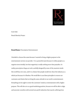
Brand Name: Prescription Entertainment
I decided to choose this name because I wanted to bring a higher purpose to the
entertainment services we provide. It is a powerful name because it strikes people as a
negative term initially, but that negativity is really nothing more than prejudice. In
reality prescription drugs are tools carefully designed by some of the smartest minds
this world has ever seen, and it is a shame that people would ever shun the industry as a
whole just because it is flawless. We would like to use these principles to ensure our
customers and clients that we bring the same attitude to our work in entertainment.
Everything we do ought to enter the customers’ minds as entertainment with a higher
purpose. This will also act as a good marketing position, because we will be able to align
and associate ourselves with several non-profit industries that may be suffering from
2. the same sort of stigma. We will also keep our website updated with articles relating to
what we consider important current events. This newsfeed will be a big part of shaping
our brand.
One of the concerns I have with this strategy is that our website’s newsfeed will be an
incredibly important part of our branding strategy. In order to establish ourselves in a
trustworthy position, we will have to deal with many controversial issues. That being
said, the controversial issues are precisely the ones in which we, as a society, ought to
focus our attention. Another concern of mine would be establishing myself a significant
web presence. The Internet is saturated with opinions from every realm of personal
experience, and we need to try to establish ourselves as a superior source of
information.
In researching the brand name and logo, in made sure that the name was protectable as
outlined on USPTO.gov. In the legal article Pursuing Strong Brand, I would have to say
that this brand name lands into the category of arbitrary. Prescription drugs really have
nothing to do with the entertainment industry, but it is the stigma against prescription
drugs that we aim to focus on. It lures people in because it is seemingly controversial,
but when anyone looks deeper they will see that our company and brand has an
unshakable ethical foundation.
3. 2. Logo:
I believe this will be an effective logo because it represents our core values as a
company. It gets the message across, it is a symbol that represents the name of the
company, it is clean, and it is straight to the point. Even though the “Rx” is more of a
symbol, I think it falls into the category as a letterform logo because it is simply two
different letters put together. These types of logos are simplistic, elegant, to the point,
and they effectively catch the eye. These are all words with which we would like our
customers to associate our company. As far as meeting the criteria of the “laws” goes, I
believe this logo has the potential to meet all of the criteria. It is expandable, can be
reinvented, it has a powerful name, it focuses on the brand, and I believe the shape and
color work together quite nicely.
Epitaph Records is going to be one of our main competitors. Their logo is very simple,
like ours, but I think ours is superior in a number of ways. First of all, Epitaph’s logo is
all black, and I think that takes away from its aesthetics. Second, I don’t think their logo
fits with the font they chose. The logo is rounded with a few slits to represent the letter
“E”, and then the font is jagged, almost sharp. I think they clash, and that would be
4. something I would change.
If I were to try to incorporate a few new elements into my logo, I would want to add
something subtle. I want to keep things simple, but I also think there is room for a bit
more creativity. For instance, the logo for the company Soak has a logo that is really just
a special font. The one thing that makes this logo stand out above a lot of others is the
two tiny dots that were added at the end of the letter “k”. These two dots are crucial to
this logo’s overall success, because they look like bubbles. It’s that simple. Now all the
customer has to do is look at the logo and then they immediately have a rough idea of
what the company provides. If I can learn anything from this logo, it would be that it
needs to scream “entertainment” a little bit more. I have a few pretty good ideas, but I’ll
have to take the time to create them all and judge them in a final line-up.
3. Corporate Culture
When we begin to develop our brand, our corporate culture is going to focus on quality,
accuracy, and rationality. These are all very important concepts, and they need to be
thoroughly understood by each individual involved in the company. Some people may
5. not immediately associate those particular words with the entertainment industry, but
we think they are important concepts regardless industry. The company will maintain
these core values by working together as a team. Each team member is expected to
contribute intelligently to each project, and this be able to act as a system of checks and
balances. This will be the most difficult when we are commenting on current events on
our news page, but that is a big part of why we will be successful.
4. Mission Statement:
At Prescription Entertainment we believe entertainment and artistry paves the way into
future. We want to be responsible for aiding in transforming the world from the way
things are into the way things ought to be.
This mission statement will be on our website, possibly as a header or a footer on every
page. We will also provide a link that leads to an entire page dedicated solely to
explaining our mission statement and why we created it. The mission statement is
directed to both our employees and our customers. It instills a sense of duty in our
employees, as what we are claiming to be responsible for is a huge undertaking. On the
other hand, we want to be able to give our customers the peace of mind knowing we are
confident, as a company, that we can successfully provide this service.
I believe that our mission statement is very memorable for a number of reasons. Most
6. importantly, I think it memorable. Why is it memorable? It gives our customers a sense
of comfort, and It tells our customers that we are passionate about being the best
company we can possibly be. We have a business-oriented and ethics-oriented agenda,
and we can stick to our guns. None of our competitors are doing anything like this. I
haven’t seen any record label or production company try to do anything other than
provide audio/visual services and/or marketing and distribution. We aim to be more
than that – much more than that.
5. Tagline:
The tagline for the company is, “Your mind is sacred. Guard it with facts.” I think this is
an effective tagline because I think it will effectively communicate to our customers and
7. clients what we are all about. There is few things in the world that more rigid and strong
than a fact. We want to be the strength in an industry that seems to be plagued with
perpetual uncertainty. We are not afraid to stand up for what is right, and we empower
those around us to do the same. It ought to instill a sense of duty in our customers, and
it ought to command action.
We wouldn’t mind provoking a backlash from the industry by taking controversial
stances on important issues, but we will only do this if the facts lead us to act in such a
manner. Information tends to spread very quickly, and it spreads even more quickly
when the information is on controversial issues. As far as distinguishing ourselves from
our competitors, I think we will be able to make it painfully obvious to the whole
industry that nobody takes entertainment as seriously as we do.