The Top 17 Aesthetically Disoriented Phones
•
1 gefällt mir•388 views

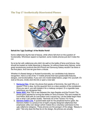
Some cellphones dig the test of beauty, while others fall short on the question of functionality. Whichever aspect is important, some mobile phones just don’t make the cut.

Empfohlen
Empfohlen
Weitere ähnliche Inhalte
Kürzlich hochgeladen
Kürzlich hochgeladen (20)
Empfohlen
Empfohlen (20)
The Top 17 Aesthetically Disoriented Phones
- 1. The Top 17 Aesthetically Disoriented Phones Behold the ‘Ugly Ducklings’ of the Mobile World! Some cellphones dig the test of beauty, while others fall short on the question of functionality. Whichever aspect is important, some mobile phones just don’t make the cut. So to be fair with cellphones who didn’t do well on the battle of fame and fortune, they should be treated as noble blessings in disguise, for without these tacky failures, some great revolutionary products like the iPhone and Samsung Galaxy wouldn’t be there in the first place. And now we give them a tribute. Whether it’s flawed design or flunked functionality, our candidates truly deserve recognition. Here is a list of the 17 mobile phones that had questionable features, designs, and functionalities. If you own one model stated below, judge it for yourself (To look at the pics, kindly click the link or open a new tab): 1. Samsung Cleo. At last, the phone that speaks of femininity. But wait! Why is it square? Pink is okay, but the squarish form is a clear paradox of the complexion. Once you see it, you will mistake it for a makeup compact. Or a cigarette case (whichever you recognize first). 2. Nokia 3620. Aha! This is war between the Japs-Swedes and the Finnish! The phone giant retorted by turning the tables on Sony Ericsson T6iz and created its rival Nokia 3620 with an oval bottom and a square top. Let the battle begin! Now this is what I call ‘perfect duality’. Reminds me of the Taoist’s Yin-Yang. 3. Siemens Xelibri Line. A questionable style for the perplexed techno geek, the Siemens Xelibri is a product line of eight uniquely designed cellphones that emphasize utility over design (which makes this a voluntary submission to the ugly cellphone category). These phones are the paragon of the adage, “Beauty is pain.” Not only does the flaw lie on the design, the phones are actually
- 2. featureless. The ugly shapes resemble a perfume bottle, a USB Flash drive, a thermometer, and a beeper. No wonder, the plug only lasted for 18 months of merchandising misery. Serves them right! 4. Nokia X 501. Not all cases of gimmick are cute: Sometimes, it’s purely disgusting. Ventured towards the ‘social-media loving teens’, Nokia must have been too consumed with overwhelming visions of megalomania. The grandiose pursuit to hit the target market bulls-eye rendered their eyes crossed; hence, the inappropriate form. Just who won the poll and suggested it should be square?! 5. Nokia 3650. Next to our ‘ugly phone’ series is the Nokia 3650. This is one of the first cellphones to have a rear-facing camera- which gets us into conclusion that it is the ‘guinea-pig’ of the ‘camera-phone generation’ experiment. The image quality is crappy and the keypad structure directly violates the tenets of good artistry. Engineered to make dialing difficult due to the confusing circular keypad, this makes a good technical brain twister tool. 6. F88 Wrist Phone. Inspired by Marvel through Spiderman’s web-shooter, this wrist phone only looks cool if you are a 5-year old kid fixated on episodes of the ‘hero fantasy’ while doing somersaults at the school playground. Experience the awkwardness of having to put your wrist close to your ears while answering a phone call, or texting messages on it. Warning: Throw this away before Green Goblin or Doctor Octopus finds you. 7. Bang and Olufsen Serenata. I hate to break this to the makers of Band and Olufsen Serenate: Boy, you are barking on the wrong niche market! Turns out, the second attempt wasn’t any better than its predecessor. The screen is still located below the keypad, making you hand block the display whenever you use it. I suggest that the makers stick to making audio components instead. This phone strikes a perfect resemblance to a mini-audio component that spews out great yet blaring sounds. The profile is also visually appealing. But the paradox lies on the camera on the side of the phone, and the screen is located below the keypad. This works for people who are diagnosed of mild schizophrenia. 8. Nokia 3250. Okay, Nokia deserves commendation in creativity, but consistency is always an interminable pursuit. And this phone is a testament that no matter how we learn every lesson that comes our way, we can still expect to make mistakes althroughout our lives. By the way, the Nokia 325O has a swiveling bottom half which can be rotated in three positions: phone mode, music mode, and camera mode. This should have been an advantage; only that if rotated, the phone resembles a Rubik’s cube minus the six solid colors. 9. Hong Jeong Dual LCD Cell Phone. Aha, the counterpart of the dual SIM phone is finally born. What do we need the two screens for? If Hong Jeong is a person, he would be an embarrassment to mankind. I mean, look at the borders of the dual LCD- they are as wide as the two screens themselves. As for me, I’d rather have a good single screen, than two flipped ones. 10. Nokia 7380. When you see a 7380, it is as if you are faced with a mind-boggling optical illusion. The visual vortex is not the sole issue here, the lack of keypad is another. The reason is pretty hazy. If you have an emergency and you need to send a text message, you are probably dead by now. Not only does it look like a small pencil case, it is also practically unusable. This phone only comes in handy when you want to answer an incoming call. It is narrow and chunky. And void of
- 3. geometrical beauty and symmetry, too. I guess that’s why no one you know owns this phone. 11. Toshiba G450. (Drumrolls) It’s a multi-media player! It’s a USB drive! No! It’s a Toshiba G450! This mobile phone is one of the many manufactured phones afflicted with identity crisis. What’s the use of two circular keypads? If I am a text message addict, I will never buy this one. Good thing, few fell on its traps! 12. Samsung P300. If I were you, I will not bring this while hanging out in a posh bar. This is better used as a pocket calculator on examination day. I guess stealing design from Casio isn’t a very bright idea. During its release in 2006, it was packed with great features. But what kind of a geezer would proudly use his pocket calculator when answering calls. 13. Vertu Bucheron Cobra. If you combine the tenets of technology and herpetology, you will come up with something like this. Not only is this pricey, but also outrageous. Essentially this is an ugly Nokia studded with $310, 000 worth of jewels. It is a fusion of your old phone, your Mommy’s jewelry box, and your little bro’s animal toy collectibles. Yes! A cobra slithers its way around the phone, enough to make customers run in the opposite direction. And no! We will not anymore apply our theories in literary criticism. All I can say is that ‘multiple personalities’ only work well for humans, and not for inanimate objects. And who says attaching the name ‘cobra’ on a techno device makes it appealing to the market? Back to reality: Why a snake? Is it better than a bird, or say, a dog? By the way, the maker has also released another version- the Signature Python. Presumably, that is wilder than the previous one. Got to alert PETA! 14. Nokia N-Cage. Okay! Another nominee for the ‘digital’ split personality category. Designed to swarm the maniacal tendencies of users for telecommunication and portable gaming devices, Nokia N-Cage appears more as a ‘mistake’ than a cool hybrid supporting two such great functionalities. Nintendo, say hello to your new rival! 15. Sony Ericsson W350 Walkman. If you want a cool handset, go for this phone. But its flimsiness as a functional phone would only make you smash this into bits. The ultrathin phone easily falls apart. It has a wobbly flip cover and music controls at the front. The battery’s cover also opens easily. You don’t break a Sony Ericsson phone: It breaks you. 16. Virgin Mobile Lobster 700 TV. I never knew a lobster could support the semantics that technology and style bring. In 2006, the technicians at Virgin alluded their product to the public’s appetite for lobsters, designing the phone’s exterior in honor of the sea animal. Well, it doesn’t actually resemble a perfect crustacean, but the handset is in the shape of a lobster’s claw. Which gets me wondering: Did the designers run into serious problems with nomenclature? You know- the semantic incompatibilities. Who, in his right mind, would name something a virgin and, at the same time, a lobster? Oh! The phones’ curves
- 4. might be the ‘virgin’ part, but the ‘lobster’ doesn’t fit into the bill. Aha! According to a famous surrealist, Salvador Dali, the claws of the crustacean symbolize and represent danger (in reference to his sculpture “Lobster Telephone” which subject focuses on the lobster supplanted as the telephone’s handset in the battlefields in World War II). So we proved there is some literary value on the name. Thankfully, the company did restrain themselves from making the phone’s color a signature red. The bump on its side looks like a tumor. Seriously. 17. Motorola ROKR E1. Believe it or not, Apple helped design this wicked phone. Well, let’s say it’s the spawn of two incompatible antecedents: Motorola and Apple. Its disfigured-ness reminds us of the Greek God of Fire Hephaestus, the only crippled god at the Olympus Mons whose parents are both beautiful gods and goddesses. This phone doubles as a MP3 player yet allows you only 100 songs from your iTunes collection. It is also ridiculously bulky. Apparently, the phones listed here commit a certain kind of aesthetic hubris. When artists try to put on that cloak of liberality, they risk the danger of failure and derision. But Motorola ROKR E1 does not invoke these kinds of emotions: Its boxy frame is so bland to the point of uninspiring catatonia. The monochrome interface adds to its already tasteless state. Frankly, it resembles a brick of Styrofoam with buttons. There you have it, chum! Beware of these phones and move on to a glorious mobile phone experience! (Or you can sell your old phone to Cash for Smartphones!) Source: http://www.cashforsmartphones.com/cfs/news/article/the_top_17_aesthetically_disoriented_phones