
Empfohlen
Weitere ähnliche Inhalte
Mehr von SaraMcgranaghan
Mehr von SaraMcgranaghan (20)
Kürzlich hochgeladen
Kürzlich hochgeladen (20)
Comparing contents pages
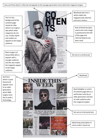
- 1. Sans-serif font which is informal and appeals to the younger generation more which this magazine targets. Masthead split into 3 which makes the The V in the magazine look informal background of the and more modern. contents page stands for Vibe which is an original Rule of thirds has been idea which other used as the main image magazines do not is positioned to the left use. It looks stylish of the page and and modern so informal balance has appeals to the target been used. audience. Main image is of Kanye West who is Set out on a vertical axis popular with a younger audience and this also makes the magazine appeal to the target audience. Masthead Serif font which is quite formal and appeals more to an older generation Noel Gallagher in centre which NME of contents page who is a targets more well known artist by an due to web 2 older generation and also technology. an indie audience who this magazine targets. Set out on a horizontal axis Advertising subscription in red to make it stand out