
Empfohlen
Weitere ähnliche Inhalte
Was ist angesagt?
Was ist angesagt? (19)
Ähnlich wie Poster 5th draft & reflection
Ähnlich wie Poster 5th draft & reflection (20)
Kürzlich hochgeladen
Kürzlich hochgeladen (20)
Poster 5th draft & reflection
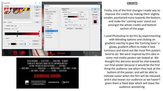
- 1. CREDITS Firstly, one of the first changes I made was to improve the credits by making them slightly smaller, positioned more towards the bottom, and make the 'coming soon' stand out amongst the whole credits and bottom section of the page. I used Photoshop to do this by experimenting with blending options and clicking on gradient overlay to give the 'Coming Soon' a glowy, gradient effect to make it look luminous and stand out like most film posters tend to do. We were inspired by this idea in some real media posters we looked at. We thought this decision would be vital towards our final poster because it would be the first thing the audience see when they look at the bottom of the poster, and will be able to indicate easier when the film will be released, and it also teases our audience as we haven't given them a fixed date which will leave the audience wondering.
- 2. These screenshots as well as the following show my progression as I amended the credits of the poster in terms of the layout and the quality. I decided to place the 'Coming Soon' in between the credits in large so it could stand out and I added more to it by using bevel & emboss and then adding glows and gradient effects to make it look luminous. I thought the layout of the credits is also important towards the final poster because it makes it look professional as a poster.
- 6. I made the award a little bit smaller so I can make more space for Lizzie Napper because at the start she was squeezed in tightly on the right side of the poster. I also changed the name of the award to 'Teen Screen Movie Award' in order to suit my younger target audience and thought it would suit the final poster because in the long run, the audience will see that this film has been nominated or won an award which was voted by lots of teenagers meaning they thought the film was amazing. This will encourage more young people to watch our film.
- 7. BEFORE AFTER