Methods for Causality Analysis in Climate Science

Knowledge of cause-effect relationships is central to the field of climate science, supporting mechanistic understanding, observational sampling strategies, experimental design, model development and model prediction. While the major causal connections in our planet's climate system are already known, there is still potential for new discoveries in some areas. The purpose of this talk is to make this community familiar with a variety of available tools to discover potential cause-effect relationships from observed or simulation data. Some of these tools are already in use in climate science, others are just emerging in recent years. None of them are miracle solutions, but many can provide important pieces of information to climate scientists. An important way to use such methods is to generate cause-effect hypotheses that climate experts can then study further. In this talk we will (1) introduce key concepts important for causal analysis; (2) discuss some methods based on the concepts of Granger causality and Pearl causality; (3) point out some strengths and limitations of these approaches; and (4) illustrate such methods using a few real-world examples from climate science.

Empfohlen
Empfohlen
Weitere ähnliche Inhalte
Was ist angesagt?
Was ist angesagt? (20)
Ähnlich wie Methods for Causality Analysis in Climate Science
Ähnlich wie Methods for Causality Analysis in Climate Science (20)
Mehr von The Statistical and Applied Mathematical Sciences Institute
Mehr von The Statistical and Applied Mathematical Sciences Institute (20)
Kürzlich hochgeladen
Kürzlich hochgeladen (20)
Methods for Causality Analysis in Climate Science
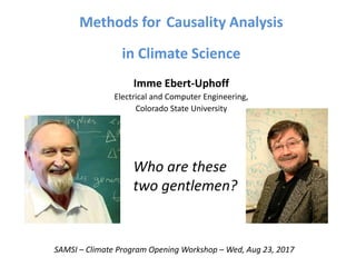
- 1. Methods for Causality Analysis in Climate Science Imme Ebert-Uphoff Electrical and Computer Engineering, Colorado State University SAMSI – Climate Program Opening Workshop – Wed, Aug 23, 2017 Who are these two gentlemen?
- 2. Who are these two gentlemen? Clive Granger Judea Pearl
- 3. Granger, C. W. J. 1969, Investigating causal relations by econometric models and cross-spectral methods. Econometrica 37, pp. 424-438. Pearl, J. and Verma, T. 1991, A theory of inferred causation. Second Int. Conf. on the Principles of Knowledge Representation and Reasoning, Cambridge, MA, April 1991, pp. 441-452. Granger causality 1969 Pearl causality 1991
- 4. Causality Frameworks – Quick History Development: • 1969: Granger causality – based on prediction. • 1987+: Pearl causality & Causal calculus – based on intervention. Recognition: • Nobel prize in economics, 2011: Sargent and Sims (using Granger) • Turing award, 2011: Judea Pearl (= Nobel prize in computer science) Use: • Both used first in economics and social sciences (since 1980s) • BIG recent success stories in bioinformatics: - identifying gene regulatory networks, - identifying protein interactions, • In climate science: mainly Granger causality used to date, and primarily in bivariate form. Our tools are FAR BEHIND everyone else’s! Time to upgrade our toolbox!
- 5. Goals Purpose of this talk: • Put known methods into context. • Make you aware of other frameworks and methods. • Point out some strengths and limitations.
- 6. Granger Causality vs. Pearl Causality Granger causality: definition based on predictability. Granger asks: Is value of X important to predict value of Y? If yes, then X Granger-causes Y. Granger framework is suitable for prediction problems. Pearl causality: definition based on interventions. Pearl asks: If I intervene in the system and change the value of X, does that change value of Y? If yes, then X Pearl-causes Y. Pearl framework is suitable for prediction and modeling problems.
- 7. Interventions ?!? Granger causality: Definition based on predictability. Pearl causality: Definition based on intervention. Question: But we rarely can perform interventions in climate science – what good is a definition based on interventions? Answer: Even if you cannot actually perform interventions, you still need to build the mathematical framework on a proper definition. That way you can build clear semantics and determine precisely what you can and cannot say, even if you only have observations available for analysis, not interventions.
- 8. Probabilistic Graphical Model Each node represents one variable. Can be: Compound index, value of field at different locations, at different lag times, etc. Graph encodes statistical dependencies: Very loosely speaking - there is an arrow from X to Y if changing the state of X would change the state of Y. There are many methods to learn structure of such graphs from data. We should all think in graphs! Very powerful and concise language. Vocabulary: If arrow from X Y, then X is called parent, Y is called child.
- 9. Assign each node cond. probability: P( x | parents(x) ) Markov property: In such a dependency graph the joint probability Is then defined as: P( a,b,c,d,e ) = P( a ) P( b | a ) P( c | a ) P( d | a,b,c ) P( e | a,c,d ) Bayesian network, if directed. Markov network if undirected. (See also, Cressie & Davidson 1998) Hidden Markov model = special case of dynamic Bayesian network: Probabilistic Graphical Model
- 10. This is Directed Acyclic Graph (DAG) A causal model is a minimal model: minimal number of arrows. Simplest model explaining all observations! That’s why humans always strive for causal explanations. It’s simplest for our brain. That’s why geoscientists strive for causal explanations. It’s simplest for model development. Learning such dependency graphs: Variable selection for modeling, estimation/prediction.
- 11. Example Yesterday’s talk by Matthias Katzfuss Vecchia Approximation as DAG: Matthias: Thanks so much for communicating in graphs! Conditioning set for each node = parents of node So if we can find the dependency graph for a (sufficiently large) data set, get the optimal conditioning sets (at least in theory)!
- 12. Two Types of Causality Studies 1) Intervention study: Causal analysis when interventions are possible. In climate science: usually only possible through use of climate models, where inputs or states can be altered for (intervention) experiments. Supports strong causality conclusions. 2) Observational Study: Causal analysis purely from observations. In climate science: Using observations of the climate system (may also use model output). No experiments required. Supports weaker causality conclusions, but still powerful.
- 13. 1) Intervention Analysis Example: Causal Attribution of Extreme Events Seminal paper: Hannart A., J. Pearl, F.E.L. Otto, P. Naveau and M. Ghil: Counterfactual causality theory for the attribution of weather and climate-related events, Bulletin of the American Meteorological Society, 97, no. 1, pp. 99-110, 2016.
- 14. Y: binary variable for extreme event: Y=0: event does not occur Y=1: event occurs Xf: binary variable for forcing: Xf=0: no forcing present Xf=1: forcing present p1 = P( Y=1 | Xf=1 ) (factual) p0 = P( Y=0 | Xf=0 ) (counterfactual) FAR = 1 - p0 / p1 (fraction of attributable risk) Causal Attribution of Extreme Events
- 15. FAR = 1 - p0 / p1 (fraction of attributable risk) What if Xf is not the only cause of Y? How exactly do we interpret FAR then? Causal Attribution of Extreme Events YX Y X Z
- 16. Pearl’s framework of causal calculus provides clear definitions, see Hannart et al. 2016. Causal necessity: X is a necessary cause of Y <==> X is required for Y, but other factors might be required as well. PN = probability that X is a necessary cause of Y. Causal sufficiency (much stronger condition): X is a sufficient cause of Y <==> X always triggers Y, but Y may also occur for other reasons. PS = probability that X is a sufficient cause of Y. Y X Z
- 17. Causal Attribution of Extreme Events Under certain assumptions ( Y monotonic wrt X; X exogeneous wrt Y), then PN = max( 1 - p0 / p1 , 0 ) PS = max( 1 – (1-p1)/(1-p0) , 0 ) If, in addition, p1 ≥ p0 , then PN = FAR! Using Pearl’s causal calculus provides: Clear interpretation of FAR for this case. Value PN, PS (and PNS) more fully characterize relationships between X and Y. For questions: Contact Alexis Hannart.
- 18. Switching gears … What if you only have observations, but cannot intervene? Answer according to mainstream literature up to 1980s: “Correlation does not imply causation.” “You cannot say anything!” “Use Granger causality” 2) Observation Analysis
- 19. 1) with Granger causality 2) with Pearl causality Observation Analysis
- 20. Granger Analysis – for two variables Most common method in climate science. Given two time series Xt and Yt. Question: Is X a Granger-cause of Y? Method: Develop two auto regression models for Yt: Model 1 (lags of Y only): yt = c + a1 yt−1+ a2 yt−2 ...+ ap yt−p + et Model 2 (lags of X and Y): yt = c + a1 Xt−1+ a2 Xt−2 ...+ ap Xt−p + b1 yt−1+ b2 yt−2 ...+ bp yt−p + et Perform statistical test: Is Model 2 significantly better than Model 1? If yes: X Granger-causes Y. Granger Causality based entirely on predictability.
- 21. Granger Analysis – based on VAR Second most common method in climate science. Given: k time series yt (1), yt (2), …, yt (k) (samples). Question: Which time series, yt (i), are causes of which other ones? Vector notation: yt = [yt (1), yt (2), …, yt (k)]T - vector of k time series at time t. Idea: Develop vector auto-regression (VAR) model and look at coefficients. VAR(p) model expresses yt in terms of its p lags: yt = c + A1 yt−1+ A2 yt−2 ...+ Ap yt−p + et , et = vector of error terms. All yt are normalized beforehand. Use standard least-square approach to calculate regression coefficients: c = constant vector, Ai = (k x k) matrix.
- 22. VAR(p) + Granger Given: k time series yt (1), yt (2), …, yt (k). All normalized. VAR(1): yt = c + A1 yt−1+ et. Test for stability. a1 ij = amount of change in Yt (i) due to change of Yt-1 (j) yj Granger-causes yi <==> |a1 ij| >> 0. More generally, VAR(p): yt = c + A1 yt−1+ A2 yt−2 ...+ Ap yt−p + et yj Granger-causes yi <==> |aL ij| >> 0 for at least one lag L=1,…,p. yt (1) Yt (2) Yt (k) c(1) c(2) c(k) = + + Yt-1 (1) Yt-1 (2) Yt-1 (k) et (1) et (2) et (k) a1 11 a1 21 a1 k1 a1 11 a1 21 a1 k1 a1 12 a1 22 a1 k3
- 23. From VAR to LASSO Problem: Usually most of the aL ij are close to zero, but not exactly zero. Should we just say |aL ij| >> 0.01 means causality ?!? Solution: Use regularized regression LASSO = least absolute shrinkage and selection operator Add constraint on coefficients: ||aL ij||1 = |aL ij| ≤ s. Result: Most coefficients vanish: aL ij = 0. Remaining coefficients compensate for change. Model more accurate and more robust (reduces overfitting). Granger analysis more straightforward. Achieves clear variable selection I,j,L
- 24. Observational analysis 1) with Granger causality – done. 2) Now: with Pearl causality / causal calculus.
- 25. What Causal Calculus tells us • Intervention analysis: – You can prove causal connections. • Observation analysis: – You cannot prove causal connections. – But you can disprove causal connections. – Still powerful – provides upper bound. Next: Some key concepts of causal calculus.
- 26. Concept 1: Language for causal models = graphs Start thinking in terms of directed/undirected graphs! • Variables are nodes of graph. • Arrows indicate: cause effect. (If we don’t know direction, no arrow head.) In this example: • Three variables. • X is a cause of Y. • Y is a cause of Z. You should have a question here… Z Y X
- 27. Concept 2: Direct vs. indirect connections Arrows indicate direct causes only. In this plot: • X is a direct cause of Y. • Y is a direct cause of Z. • X is only an indirect cause of Z. Goal of causal analysis: we want to identify only direct connections. Eliminate all others. Z Y X
- 28. Caution: Directness is relative property One can always transform a direct connection into an indirect one by including an intermediate cause! Toy example: Flooding Monsoon month Rain Monsoon month Flooding Monsoon month is direct cause of flooding in this model. Monsoon month is only indirect cause of flooding in this model. Both models are correct! Directness is only defined relative to variables included in model.
- 29. Concept 3: Causality is probabilistic relationship Flooding Monsoon month Example: This graph implies: 1) Flooding is more likely in monsoon months, but not certain. 2) Flooding can also happen outside of monsoon months. Supplement graph with probabilities. Probabilistic graphical model But: • For our applications we so far do not care about the exact probabilities. • Just want to identify graph showing strongest potential causal connections.
- 30. Concept 4: Hidden common causes (latent variables) Ex.: Cloud cover is common cause of UV and rain variables. If we remove the common cause in model, results are no longer causal: Cloud cover Amount of UV Chance of Rain Conclusion: 1) We can never prove causal connections (w/o interventions). 2) But we can disprove causal connections (w/o interventions). Tool for that: Conditional independence tests. Amount of UV Chance of Rain Amount of UV Chance of Rain
- 31. Basic idea: If X is a direct cause of Y, or Y is a direct cause of X ==> X and Y are conditionally dependent, given all subsets, S, of the other variables in the graph. Necessary condition! If we can find subset, S, of other variables for which X is conditionally independent of Y ==> Necessary condition violated. ==> No edge between X and Y. Basic algorithm for learning independence graph from data (PC algorithm): 1. Fully connected graph: assume every variable is cause of every other variable. 2. PRUNE THE GRAPH -- Eliminate as many edges as possible using conditional independence tests: If we can find a susbet of other variables for which X is conditionally independent of Y, delete edge X--Y! Sample tests: a) Gaussian + continuous: partial correlation + Fisher’s Z-test b) Non-Gaussian: discretize and use conditional mutual information 3. Establish arrow directions – primarily using temporal constraints. Elimination procedure: Yields set of potential causal connections. Upper bound! Basic algorithm to find independence graph
- 32. Assumptions for causal interpretation A) From data (probability distribution) to independence graph: Faithfulness: graph model actually models the underlying data well. 1) Probability distributions are i.i.d. 2) No selection bias. 3) If developing directed model, no loops allowed. (Avoid problem by using temporal model with lagged variables.) 4) Causal signals strong enough to be picked up by statistical tests. B) From independence graph to causal interpretation: Assumption: “no hidden common causes” If any two nodes, X, Y, of the graph have a common cause Z, then Z must also be included in the graph.
- 33. • There may always be a hidden common cause that a) we are not aware of, b) cannot be measured, or c) including them all would make model too complex. • Need to keep that possibility in mind when interpreting results results are only causal hypotheses. • Each hypothesis could be direct connection, due to hidden common cause, or combination of both. How do we deal with that? Add “evaluation step”. • In results, every link (or group of links) must be checked by domain expert. • Can we find physical mechanism that explains it? If Yes confirmed. If No new hypothesis to be investigated by domain expert But there are many hidden common causes ….
- 34. Problem: Causal loop, e.g X Y X , not allowed. Causal loop usually not instantaneous. Solution: Model as different variables over time. X(t0) Y(t1) X(t2) Trick: Add lagged variables into model, and add temporal constraints. This approach first proposed by Chu, Danks and Glymour, 2005. Temporal model. Approach works well, but drastically increases number of variables in model much higher computational complexity. Dealing with loops Learn temporal graphs
- 35. Sample Applications Two primary types of applications for observational analysis in climate science: 1) Based on compound (or global) indices: • Not spatially distributed. • Few variables (2-100). 2) Spatially distributed: • 1,000s - 100,000s of variables for high res grids (2D/3D). • Deal with spatial auto-correlation! Most commonly: • Data provided as time series. (Can also deal with static data.) • Usually best to develop temporal models.
- 36. Application 1: Arctic connection Joint work with Elisabeth Barnes, Marie McGraw and Savini Samarasinghe • Effect of arctic temperature on speed of jet stream, and vice versa. • Compare linear Granger and linear Pearl models. • Results: very similar. Reassuring! LASSO + Granger PC stable (Pearl model) CI 2017
- 37. CESM Model Model Output (single run) Causal Discovery Algorithm Application 2: Apply to Climate Model Runs Dorit’s idea: Use interaction maps as “dynamic fingerprints” or “causal signatures” of climate model runs. • Calculate “causal signature” for individual model outputs (e.g. different initial conditions), then compare their “signature”. • First experiments: use only 15 variables, use global averages. Here: Model data Causal discovery Interaction Maps Joint work with Dorit Hammerling and Allison Baker Geoscentific Model Development 2016
- 38. Sample Results: Effect of compression How to read the plots: 1) Every connection is only a potential cause-effect relationship (could be due to common cause). 2) Connections can be directed or undirected. 3) Number(s) next to line = delay from potential cause to potential effect. Set 31: Signature from original data (D=1 day) Set 31C: Signature after compression and reconstruction (D=1 day) Observation: compression is causing only tiny differences.
- 39. Sample Results: Different ensemble members Set 31 Set 26 Different initial conditions yield surprisingly many differences. Is that because internal variability magnifies some couplings? TBD! There is always a “basic minimal pattern” that stays the same.
- 40. Spatially distributed: Tracking interactions around the globe Spatial auto-correlation causes problem for non-uniform grid! First “law” of geography: Everything is related to everything else, but near things are more related than distant things. Joint work with Yi Deng
- 41. Limitations + Challenges of Causal Discovery Need to use special, maximally uniform grid: Fekete points! Estimation of Fekete points, E. Bendito, A.Carmona, A.M. Encinas, M. Gesto, J. Comput. Physics, 2007.
- 42. Interaction maps from geopotential height Data: • 500 mb geopotential height • NCEP/NCAR Reanalysis • 1948-2011 • Results for winter (DJF months) • Fekete grid Shown here: • Stereo-graphic projection (North) • Strongest direct connections for 0, 1, 2, 3 days. GRL 2012
- 43. Evaluation Step Due to dominant diffusion processes near equator Due to advection processes (storm tracks)
- 44. What are these networks good for? a) 1950-2000 observed (NCEP-NCAR reanalysis) b) Years: 1950-2000 CCSM4 model data c) Years: 2050-2100 CCSM4 model data Sample analysis: Network properties now vs. 100 years from now Shown below: REMOTE IMPACT = number of outgoing edges per location Observations: In warmer climate • information flow diminishes (hubs disappear) • remaining hubs move poleward • Consistent with literature: midlatitude storm tracks move poleward in warmer climate. • We can now localize some of these effects! GRL 2014
- 45. Data: NCEP/NCAR Reanalysis data, 1948-2011. Daily geopotential height for 850, 500, 250, 50mb. Data during QBO up transition. Northern hemisphere, stereo-graphic projections for 850, 500, 250, 50mb. 400 point grid. Timescale: D=1 day. Input = observed daily geopotential height data. We can now do this in 3D, too! Joint work with Yi Deng
- 46. Testing: Experiments with simulated data Original advection velocity field (input) Result: Estimated velocity field Grid bias: Arrows tend to align with grid. Joint work with Yi Deng Computers and Geosciences 2017
- 47. Experiments with simulated data Original advection velocity field (input) Result: Estimated velocity field
- 48. Experiments with simulated data Original advection velocity field (input) Result: Estimated velocity field Grid bias: Does not like diagonal velocities!
- 49. We can perform interaction analysis in spectral space, too! Joint work with Yi Deng and Savini Samarasinghe SIAM SDM 2017 Method: • Transform gridded time series data spherical harmonics coefficients. • Perform causal analysis on time series of coefficients. • Result tells us about interactions between different scales (wave forms).
- 50. Limitations + Challenges of Causal Discovery 1) Large sample size required for statistical tests (robustness). 2) Computational complexity – can limit spatial resolution. 3) So far climate processes modeled as stationary throughout the considered time span. 4) In practice, method catches only the strongest interactions for any variable/location. (If there are strong + weak interactions at one location, e.g. advection and diffusion, do not expect to pick up the weak one.) 5) Ground truth rarely available to test and calibrate methods need to generate and test on synthetic data.
- 51. Limitations + Challenges of Causal Discovery In addition, for spatially-distributed systems: 1) Grid bias signals along grid symmetry are picked up best. 2) Signal speed bias: signals with speeds around (Δx/Δt) get picked up best. 3) Need to use special, uniform grid: Fekete points!
- 52. Conclusions • Think in terms of graphs! • Pearl’s causal calculus provides the de facto mathematical framework for causal analysis. • For intervention analysis (Hannart et al., 2016): Causal calculus clarifies semantics and provides new measures to characterize causal attribution (PN, PS, PNS). • For observational analysis: Weaker conclusions possible, but still powerful (upper bounds).
- 53. Future Work • Determine which observational methods work best in practice for specific geoscience applications. • Take into account: sample size, distributions, non-linearities, robustness, sensitivity, computational speed, simplicity, familiarity for climate scientists. • Matthias: Keep using graph descriptions! • Noel: Go back to graphical models!
- 54. 7th International Workshop on Climate Informatics Sept 21-22, 2017 At NCAR MESA Lab Boulder, CO Chairs: Slava Lyubchich Andy Rhines See www.climateinformatics.org
- 55. The End. Who are these two gentlemen again? Questions or Suggestions?