SlideShare ist ein Scribd-Unternehmen logo
1 von 4
3 Album Covers, Disc Images and Back Covers

1st Album: Enema of the state – blink-182

          Album Cover                          Back Cover


                                  Disc Image
2nd Album: What Separates Me from You – A Day to Remember

        Album Cover                       Back Cover


                                          Disc Image
3rd Album: Heartbreak – Kanye West

         Album Cover                              Back Cover


                                     Disc Image
Analysis
Colour Schemes
From the 3 albums I have chosen, the albums come from different genres of music. The first album
‘Enema of the State’ is produced by the American punk rock band ‘blink-182’, the colour scheme in
this album is quite tricky to analyse as the colours are different to the ones they normally use in their
other albums, but in this album the colour scheme is colourful and luminous, this is showing that the
band follows a wide and varied lifestyle and their music is about enjoying life and making the most
of it hence all of the different colours.

The other album is ‘What Separates Me from You’ by the band ‘A Day to Remember’ this band also
does punk rock music but is more emotional and depressing. The colour scheme in this album uses
very dull and dark colours this colour represents the style of music the band produces.

The last album is called ‘Heartbreak’ by ‘Kanye West’; this genre of music is a mix of RnB and Hip-
hop. It is pretty obvious to work out the theme of this album from the title ‘Heartbreak’, and this is
why the colour scheme in this album consists of a large red heart in a breaking motion which
supports the title whilst also remembering that the colour red is a symbol of danger and love hence
subconsciously telling the audience that love is dangerous.


Position of Images and Text
The first album I chose to use for this project was the album ‘Enema of the state’ by ‘blink-182’ and
this album’s position of images and text is quite straight forward. For example; there is clearly a
woman at the centre of the image showing that she is the centre of attention, the text on the image
is only small and is located on the woman’s jacket that she is wearing, the text is positioned here
because it is near her breast which attracts attention so therefore it will most probably be read.

The second album ‘What Separates Me from You’ by ‘A Day to Remember’ contains rather
fascinating positioning for the images and text. For example; on the front cover of the album there is
a man stood in a hourglass in the centre of the image, this is showing the audience that he feels
trapped and in the middle so he cannot leave. The text in this album cover doesn’t really do anything
as it is just plain text of the album name and artist going across the centre of the album, this is
effective in a sense because with the text being in the centre of the image it supports the
Guttenberg principle as the eye would naturally travel in that direction.

The third album ‘Heartbreak’ by KanyeWest is quite simple yet effective in terms of the image and
text positioning. For example; the images in the album cover show that it is a large heart literally
breaking through the middle which is a good technique as it follows the rule of thirds as it is located
exactly in the middle, it also supports the Guttenberg principle as the eye would naturally travel past
the middle so its effective as the album can make the point it is trying to make. The text positioning
is quite effective as it is very dull and unappealing, this would describe somebody’s feelings when
going through the emotional pain of heartbreak so it relates well to the album title.

Weitere ähnliche Inhalte

Mehr von RyanBaxterMediaStudies (8)

Ancillary 1 Research
Ancillary 1 ResearchAncillary 1 Research
Ancillary 1 Research
 
Ancillary 1 Research
Ancillary 1 ResearchAncillary 1 Research
Ancillary 1 Research
 
Focus group analysis
Focus group analysisFocus group analysis
Focus group analysis
 
Image manipulation
Image manipulationImage manipulation
Image manipulation
 
Article draft
Article draftArticle draft
Article draft
 
Masthead designs
Masthead designsMasthead designs
Masthead designs
 
Magazine questionnaire
Magazine questionnaireMagazine questionnaire
Magazine questionnaire
 
Magazine questionnaire
Magazine questionnaireMagazine questionnaire
Magazine questionnaire
 

Analysis of 3 Similar Products to Ancillary 1

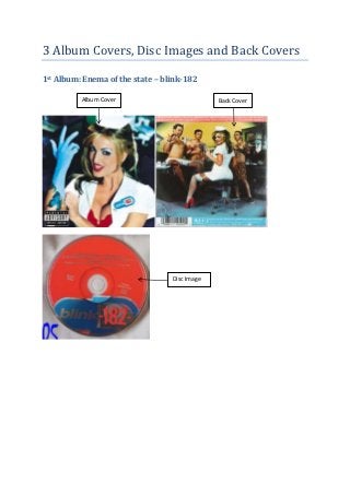
  • 1. 3 Album Covers, Disc Images and Back Covers 1st Album: Enema of the state – blink-182 Album Cover Back Cover Disc Image
  • 2. 2nd Album: What Separates Me from You – A Day to Remember Album Cover Back Cover Disc Image
  • 3. 3rd Album: Heartbreak – Kanye West Album Cover Back Cover Disc Image
  • 4. Analysis Colour Schemes From the 3 albums I have chosen, the albums come from different genres of music. The first album ‘Enema of the State’ is produced by the American punk rock band ‘blink-182’, the colour scheme in this album is quite tricky to analyse as the colours are different to the ones they normally use in their other albums, but in this album the colour scheme is colourful and luminous, this is showing that the band follows a wide and varied lifestyle and their music is about enjoying life and making the most of it hence all of the different colours. The other album is ‘What Separates Me from You’ by the band ‘A Day to Remember’ this band also does punk rock music but is more emotional and depressing. The colour scheme in this album uses very dull and dark colours this colour represents the style of music the band produces. The last album is called ‘Heartbreak’ by ‘Kanye West’; this genre of music is a mix of RnB and Hip- hop. It is pretty obvious to work out the theme of this album from the title ‘Heartbreak’, and this is why the colour scheme in this album consists of a large red heart in a breaking motion which supports the title whilst also remembering that the colour red is a symbol of danger and love hence subconsciously telling the audience that love is dangerous. Position of Images and Text The first album I chose to use for this project was the album ‘Enema of the state’ by ‘blink-182’ and this album’s position of images and text is quite straight forward. For example; there is clearly a woman at the centre of the image showing that she is the centre of attention, the text on the image is only small and is located on the woman’s jacket that she is wearing, the text is positioned here because it is near her breast which attracts attention so therefore it will most probably be read. The second album ‘What Separates Me from You’ by ‘A Day to Remember’ contains rather fascinating positioning for the images and text. For example; on the front cover of the album there is a man stood in a hourglass in the centre of the image, this is showing the audience that he feels trapped and in the middle so he cannot leave. The text in this album cover doesn’t really do anything as it is just plain text of the album name and artist going across the centre of the album, this is effective in a sense because with the text being in the centre of the image it supports the Guttenberg principle as the eye would naturally travel in that direction. The third album ‘Heartbreak’ by KanyeWest is quite simple yet effective in terms of the image and text positioning. For example; the images in the album cover show that it is a large heart literally breaking through the middle which is a good technique as it follows the rule of thirds as it is located exactly in the middle, it also supports the Guttenberg principle as the eye would naturally travel past the middle so its effective as the album can make the point it is trying to make. The text positioning is quite effective as it is very dull and unappealing, this would describe somebody’s feelings when going through the emotional pain of heartbreak so it relates well to the album title.