
Empfohlen
Weitere ähnliche Inhalte
Andere mochten auch
Andere mochten auch (9)
Ähnlich wie Presenting Infographics by Ruby Aria
Ähnlich wie Presenting Infographics by Ruby Aria (20)
Kürzlich hochgeladen
Kürzlich hochgeladen (20)
Presenting Infographics by Ruby Aria
- 1. I N F O G R A P H I C SI N F O G R A P H I C S
- 2. The earliest humans on the planet shared information in pictures that were carved and painted on rocks and caves.
- 3. Maximum information in minimum space
- 4. Your first Twitter competition: Who might need an infographic?
- 5. Infographics are best used when... ● You need to communicate quickly ● A verbal or written account is too complicated– or tedious–for comprehension ● Your audience can’t hear or read well–or at all
- 6. Sometimes an infographic tells the story faster and better than words.
- 7. The Art of Cutting to the Chase
- 8. Consider the difference Text Version: A recent poll showed that 20 percent of the residents in Precinct A voted for candidate Smith, 10 percent voted for candidate Jones, 65 percent voted for candidate Doe, and 5 percent vote for candidate Lee. How they voted in precinct A
- 9. Infographics can tell a deeper, broader, and evolving story better than raw data alone.
- 10. Infographic: A History of Social Media
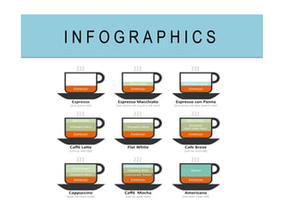
- 11. Types of infographics • Sequences • Maps • Diagrams • Charts and Graphs
- 12. Text Boxes • Bio-box • Quick Tips • Fact Box • Ordinal Lists • Compare-Contrast • Pro-Con • Outlines • Ratings • Rankings • Scores • Before-After
- 13. Your second Twitter competition: What are the five types of infographics?
- 15. Dynamically-generated Automatically update themselves as new data is collected and added to the source
- 16. Multimedia
- 19. ● Never reproduce someone else’s graphic without permission ● Use credible sources and always credit your sources ● Information, not fiction–stick to the facts ● Statistics can be flawed if you present them incorrectly–be extra careful when dealing with numbers ● If you didn’t collect the data for your infographic, put on a skeptical hat and track down the original study
- 20. Charts can lie
- 22. Parts of an infographic • Headline – Make it big, bold, and clear • Explainer – A block of text that explains the graphic • Callouts – Labels providing details about specific elements • Source line – Identifies the origin of your data • Byline – Credit to the infographic artist
- 23. Key points to successful design • Thoroughly research your topic beforehand • Group related items • Compatible design scheme • Color is your greatest ally • Keep it professional, no ornamentation • Keep the writing tight, concise, use third person , and use action verbs
- 24. Your last assignment: Tweet me @RubyAria with your pie chart of the four artists/songs you can’t get enough of currently Create Your Pie Chart!
- 25. Thank you! Enjoy your treats :)
- 26. Images courtesy of: • Guide to coffee • World Map • Evolution • Aquiziam • Too Much Iron • Edudemic • Nikon Rumors • Rebecca Hagen • Heights Technology • Pie Color • Meta-chart • Design Infographics • Pentax • Routledge
- 27. Works Cited Golombisky, Kim, and Hagen, Rebecca. White Space is Not Your Enemy. Indiana: Taylor & Francis. 2013. Print.