2. Front cover
Front cover 1st draft Front cover final draft
CLASS FEEDBACK ON WHAT TO IMPROVE:
• Make background lighter shade so that model stand out
more and is a more calm shade of yellow
• Make model image layer a more vibrant shade
• Make strapline stand out with use of typography and
shadowing
• Write cover lines in capitals
• Create a bar at the bottom and crop the barcode inside it.
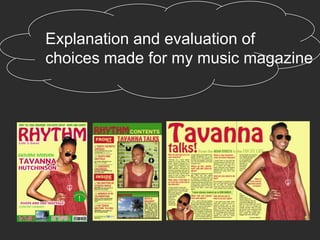
3. When making my front cover I followed the
layout and style of the magazine ‘VIBe’ I did this
by having my model centered in my magazine
except my cover lines were placed down the left
of the magazine in rule of thirds instead of both
sides of the magazine like VIBe has done, I also
followed this magazine by having my main
image overlap the masthead. Throughout my
music magazine I decided to consistently use
the colours yellow, green and red as they are
colours that are widely associated with reggae,
this way I appealed to the audience that listen to
reggae. For my front cover I decided to take
shots of my model where the model is wearing
red so that there is a continuation of colour from
the masthead to the dress. From the feedback I
received I had to change the font of some text
layers so that they stood out or were less plain I
did this by adding a drop shadow to the text or a
white stroke. In addition to the feedback in order
to improve from my first draft I made the Images
increase in vibrancy and ensured all text was
4.
5. When making my contents page I followed the
style of Q magazine’s contents page. I did this by
separating the page into 3 sections, two of them
with text layers and one with the main image. My
main image for this contents page was of the
same model featured on the front cover so that
there is a continuation from the front cover to the
contents page. I also used silhouettes of
instruments so that there is a clear indication to
the contents page being from a music magazine.
In addition to this I used my shot of a beach in the
contents page so that there is the link to the
Caribbean in my magazine. From the feedback of
my contents page I had to add social media sites
icons so that the magazines distribution is widened
in addition to this I changed the language of the
text so that it is more personal to the audience.
6. CLASS FEEDBACK ON WHAT TO
IMPROVE:
• Make Title bigger
• Put a boarder around the floating quote so it
stands out
• Make the columns equal in width
• Make the text layer float around the image
7. For my double page spread I used two images of the model from
my shoot in a dress the same colour as the title so that it plays into
the colour scheme . From my feedback of my first draft I had to
change my article columns so that they were all equal by justifying
them and manipulated them so that they flowed around the image
by following the outline of the image layer. I appealed to the target
audience by featuring a girl on my double page spread as my
magazine targets young females. I used shots from my photo shoot
where the model is smiling yet has her hand on her hip so she was
portrayed as strong. I also put a boarder around the floating quote
and changed the typography as it was basic and did not stand out
to the audience.
I decided to make my subheadings the same ‘Hobo’ font as the title
so that the audience can clearly read the double page spread and
make their way around it.