Basics of Accessible Web Design
•Als PPTX, PDF herunterladen•
1 gefällt mir•569 views

Copy of a presentation on web accessibility used at Global Accessibility Day 2015. Presentation combined an introduction to web accessibility with a modified game of chutes and ladders in order to model the ups and downs of web accessibility. This slide deck talks about four key aspects of web accessibility: page structure, color, interactive elements/forms, and non-text elements. For each aspect, a description is given along with tactics to evaluate sites using each criteria.

Empfohlen
Empfohlen
Weitere ähnliche Inhalte
Ähnlich wie Basics of Accessible Web Design
Ähnlich wie Basics of Accessible Web Design (20)
Kürzlich hochgeladen
Kürzlich hochgeladen (20)
Basics of Accessible Web Design
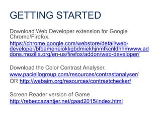
- 1. Download Web Developer extension for Google Chrome/Firefox. https://chrome.google.com/webstore/detail/web- developer/bfbameneiokkgbdmiekhjnmfkcnldhhmwww.ad dons.mozilla.org/en-us/firefox/addon/web-developer/ Download the Color Contrast Analyser. www.paciellogroup.com/resources/contrastanalyser/ OR http://webaim.org/resources/contrastchecker/ Screen Reader version of Game http://rebeccazantjer.net/gaad2015/index.html GETTING STARTED
- 2. Image from Sam Schmelzer, ourcrowd.com GLOBAL ACCESSIBILITY AWARENESS DAY 2015
- 3. Communicate #GAAD #DetroitUX @RebeccaZantjer Rebecca Zantjer UX Researcher, Owens Corning Phil Deaton A/U Intern, MSU CAL, MSU UARC, Making Learning Accessible Marta Werbanowska A/U Intern, MSU College of Arts and Letters PRESENTERS
- 4. Download Web Developer extension for Google Chrome/Firefox. https://chrome.google.com/webstore/detail/web- developer/bfbameneiokkgbdmiekhjnmfkcnldhhmwww.ad dons.mozilla.org/en-us/firefox/addon/web-developer/ Download the Color Contrast Analyser. www.paciellogroup.com/resources/contrastanalyser/ OR http://webaim.org/resources/contrastchecker/ Screen Reader version of Game http://rebeccazantjer.net/gaad2015/index.html GETTING STARTED
- 6. Statistics on disability • 18.7% of Americans have some form of disability • 6% of all males have red-green colorblindness BY THE NUMBERS
- 7. Web Content Accessibility Guidelines • International standard for web accessibility • Referenced in accessibility lawsuits • Functional requirements rather than checklists WCAG 2.0
- 8. 1. Pick a site you care about/have some ownership over. 2. Evaluate how that site holds up against four sample web accessibility guidelines. 3. Move your game piece the appropriate number of spaces (more accessible sites can move more spaces) 4. Win prizes. 5. Gloat. GAME PROCEDURE
- 9. 1. Scoring can be ambiguous, the decision of the person sitting to your right is final. 2. Be honest, but gracious (with yourself and others). 3. When you land on a + or – spot, let us know so we can talk about it. GAME RULES
- 10. Section 1: Page Structure SECTION 1: PAGE STRUCTURE
- 11. Are your page headings meaningful? • Do your headings adequately describe the content they structure? PAGE STUCTURE
- 12. Example of meaningful headings
- 13. Are your heading tags structured hierarchically? • Do your headings move hierarchically from H1 to H6? • Is your H1 tag the broadest heading/title of the page? Does it come after the navigation? PAGE STUCTURE
- 14. Example of poor heading structure
- 15. <h1> Title </h1> <h2> </h2> <h2> </h2> <h3> </h3> <h4> </h4> <h4> </h4> <h2> </h2> <h3> </h3> EXAMPLE PAGE STUCTURE
- 16. web developer tool > information tab > view document outline EVALUATING PAGE STRUCTURE
- 17. Example of view document outline view Pros • No missing heading levels • Headings at the same level are coded at the same level Cons • Text that structures content is not labeled as headings. • No H1 after the navigation. • H3s are not structured by an H2
- 18. POINTS DESCRIPTION 6 Headings were descriptive and hierarchical. Text that structured content was marked as a heading. H1 was below the navigation. 5 Headings were fairly descriptive and text that structured content was marked as a heading. H1 tag was not below the navigation and/or one heading level was skipped. 4 Headings were fairly descriptive, but some text that structured content was not marked as a heading. H1 was not below the navigation and one or two heading levels were skipped. 3 Headings were kind of descriptive and a lot of text that structured content was not marked as a heading. H1 was missing/not below the navigation and multiple heading levels were skipped or out of order. 2 Headings were vague and text that structured content was not marked as a heading. H1 was missing/not below the navigation and heading levels were skipped and out of order. 1 H1 was missing. Headings were not descriptive. Many headings were missing. Heading levels were used out of order throughout the page. SCORING PAGE STUCTURE
- 19. • makes browsing accessible • creates a document “skeleton” with markup and not just styling WHY PAGE STRUCTURE?
- 20. Section 2: Color SECTION 2: COLOR
- 21. Does your text have sufficient color contrast with the background? Is color being used as the only way to communicate meaning anywhere on your site? • Are directions dependent on color? • Are errors indicated only by color? • Are color-coded data tables able to be understood without color? COLOR
- 22. Example of poor color contrast
- 24. color contrast analyser > eyedropper > text most likely to fail EVALUATING COLOR
- 25. Demonstration of color contrast tool
- 26. POINTS DESCRIPTION 6 Text color passed contrast guidelines throughout. Meaning was not dependent on color anywhere on the page. 5 Text passed contrast guidelines on almost the entire page. Meaning was not dependent on color anywhere on the page. 4 Most text passed contrast guidelines. Meaning was slightly dependent on color. 3 Almost half of the text passed contrast guidelines. Meaning was fairly dependent on color. 2 Much of the text did not pass contrast guidelines. Meaning was fairly dependent on color on multiple portions of the page. 1 Significant portions of the page text did not meet contrast guidelines. Meaning was heavily dependent on color throughout the page. SCORING COLOR
- 27. • Some users cannot perceive colors; users with all types of vision should be able to see and use your site WHY COLOR?
- 28. Section 3: Interactive Elements SECTION 3: INTERACTIVE ELEMENTS
- 29. Do all tabbabble elements receive focus? • When you tab through the site can you see where you are on the page? Can you navigate your site using only the keyboard? • Can you get to all your menu options by using the keyboard? • Can you select any link using the keyboard? • Can you navigate any carousel items using the keyboard? INTERACTIVE ELEMETS
- 30. Example of keyboard accessible site
- 31. EVALUATING INTERACTIVE ELEMENTS refresh page > press “tab” to move forward > press “enter” to select > press “shift + tab” to move backward
- 32. POINTS DESCRIPTION 6 Focus was made very visible on all tabbable objects. All navigation items/link options were accessible via keyboard. No keyboard traps. 5 Focus was made pretty visible on all tabbable objects. All navigation items/link options were accessible via keyboard. No keyboard traps. 4 Focus was either made minimally visible on all objects or was visible on most objects. All navigation items/link options were accessible via keyboard. No keyboard traps. 3 Focus was not made visible on many objects. A few navigation items/link options were not accessible via keyboard. No keyboard traps. 2 Focus was not made visible and many navigation items/link options were not accessible via keyboard. No keyboard traps. 1 Focus was not made visible. Significant portions of navigation items/link options were not accessible via keyboard. Keyboard traps were used. SCORING INTERACTIVE ELEMENTS
- 33. • many people interact with your site without using a mouse, they need to be able to access content • more interaction strategies reduce barriers to users completing tasks on your site WHY INTERACTIVE ELEMENTS?
- 34. Are your forms accessible? • Do all form fields receive focus? • Do form fields have appropriately coded and descriptive labels? INTERACTIVE ELEMENTS (FORMS)
- 35. refresh page > press “tab” to move forward > press “enter” to select > press “shift + tab” to move backward right click page > inspect element > look for name, role, and value EVALUATING FORMS
- 36. Demonstration of evaluating form accessibility example
- 37. POINTS DESCRIPTION 3 All form fields received focus and had descriptive names, roles, and values. 2 Most form fields received focus and/or had names, roles, and values that were not descriptive. 1 Many form fields received focus and/or did not have names, roles, and values. SCORING FORMS
- 38. • visually impaired users should be able to interact with forms the same way sighted users do • name, role, and value helps prevent errors and improve user experience WHY INTERACTIVE ELEMENTS?
- 39. Section 4: Non-Text Elements SECTION 4: NON-TEXT ELEMENTS
- 40. Do all non-text elements have equivalent text alternatives? • Images? – Is the alt text really equivalent? • Videos? • Charts/graphs? Can information presented in non-text elements be understood with a screen reader? • Look especially at tables and charts. NON-TEXT ELEMENTS
- 41. Example of non-descriptive alt text
- 42. Example of video captioning
- 43. Web developer tools > display alt attributes > disable all images EVALUATING NON-TEXT ELEMENTS
- 44. POINTS DESCRIPTION 6 All graphic and multimedia elements that were used to convey information had equivalent text alternatives. 5 All graphic and multimedia elements that were used to convey information had text alternatives, some of which were not equivalent. 4 Most graphic and multimedia elements that were used to convey information had text alternatives, some of which were not equivalent. 3 Most graphic and multimedia elements that were used to convey information had text alternatives, many of which were not equivalent 2 Many graphic and multimedia elements that were used to convey information did not have text alternatives; elements that did have text alternatives rarely had equivalent text alternatives. 1 Graphic and multimedia elements that were used to convey information did not have text alternatives. Images of text were used frequently. SCORING NON-TEXT ELEMENTS
- 45. • Text is the most accessible media for presenting information • Users who can’t see/hear have no way to access content if text alternatives are not available WHY NON-TEXT ELEMENTS?
- 46. Winners WINNERS
- 47. CATEGORY ACTION ITEM Page Structure Format portfolio piece titles as H3s. Color Change color of action buttons to have sufficient contrast. Color Indicate errors with boxes and the word “error”, not just red color. Interactive Elements Make focus indicator more visible. Non-text elements Write equivalent alt-text for portfolio images. ACCESSIBILITY ACTION PLANS
- 48. 1. Pick a site you care about/have some ownership over. 2. Evaluate how that site holds up against four sample web accessibility guidelines. 3. Move your game piece the appropriate number of spaces (more accessible sites can move more spaces) 4. Win prizes. 5. Gloat. 6. Make the web a place for everyone. GAME PROCEDURE
- 49. Accessible means that individuals with disabilities are able to independently acquire the same information, engage in the same interactions, and enjoy the same services within the same timeframe as individuals without disabilities, with substantially equivalent ease of use. HAPPY GLOBAL ACCESSIBILITY AWARENESS DAY