
Empfohlen
Weitere ähnliche Inhalte
Was ist angesagt?
Was ist angesagt? (20)
Andere mochten auch
Andere mochten auch (13)
Ähnlich wie College front cover anaylse
Ähnlich wie College front cover anaylse (20)
Mehr von Rachell_94
Mehr von Rachell_94 (20)
Kürzlich hochgeladen
Kürzlich hochgeladen (20)
College front cover anaylse
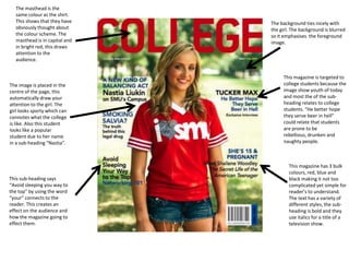
- 1. The masthead is the same colour as the shirt. This shows that they have The background ties nicely with obviously thought about the girl. The background is blurred the colour scheme. The so it emphasises the foreground masthead is in capital and image. in bright red, this draws attention to the audience. This magazine is targeted to The image is placed in the college students because the centre of the page, this image show youth of today automatically draw your and most the of the sub- attention to the girl. The heading relates to college girl looks sporty which can students. “He better hope connotes what the college they serve beer in hell” is like. Also this student could relate that students looks like a popular are prone to be student due to her name rebellious, drunken and in a sub-heading “Nastia”. naughty people. This magazine has 3 bulk colours, red, blue and This sub-heading says black making it not too “Avoid sleeping you way to complicated yet simple for the top” by using the word reader’s to understand. “your” connects to the The text has a variety of reader. This creates an different styles, the sub- effect on the audience and heading is bold and they how the magazine going to use italics for a title of a effect them. television show.
- 2. The masthead is at the top of the cover which stretches right across the This advertisement page making it clear for for paintballing in a reader’s to see. The colour pink splat could of the masthead tire nicely suggest their target with the sub-headings. audience. Young people tend to go paintballing, so this magazine could be The colour scheme used here aimed at college is yellow and white. They used students. a plain black background so the colours used in the fonts The image is placed in the stands out. They used centre of the magazine and different styles, and size the student is looking directly font, for example bold sub- at you which draws attention heading and “Dancehall’s to reader’s. This student is Bright Future” is a bigger font black could suggest that they size than other sub-headings. want to advertise cross This suggest that this is the cultural in today society. The main story. clothing wore is trendy and fashionable. This student wears a white t-shirt which emphasises the colour of his skin. The barcode is at the bottom left indicates the This student is holding a price of the magazine to book called the reader but not “Law, Business and clearly so they are not Society” this shows that distracted by the price the student is and more into the interested in his magazine itself. education and wants to continue into further studying.
- 3. The pictures takes over most of the content page. This content page shows This suggest that the the date of when the pictures are more the main magazine was issued. subject than the actually This shows that this content below. magazine comes weekly/monthly. Comparing with the other content page. This appears to be very basic and plain. The good thing The magazine layout is about this simple and clear to content page, is understand. The layout that it doesn’t had the content on the look too busy. bottom of the page and varies of pictures are at the top of the page. The pictures has page The “headline” is in bold with the numbers which is easy to page number so its more obvious to locate if they interested in notice. The little information below it. the headline is in a smaller font, this shows that its less important and only gives slight hint of what’s its about .
- 4. The question “what’s inside?” This magazine has a round yellow indicates that this circle which says “subscribe to magazine has a teachers”, adding their subscription lot of information. to the content page immediately try and lure the audience into signing up. The colour stands out from the rest , which makes it obvious when looking at the content page. The picture seems to tie in well with the content. The pictures have page numbers which indicates a little info of what that page is about but not giving too much away. This This content page is spilt gives the audience a into 2 different sub- hint of what is inside. headings “Features” and “Regulars” they did this to reach audience expectations and also to find things more quickly.