Eva Anderson - Graphic Design for Readability
•Als PPT, PDF herunterladen•
3 gefällt mir•1,548 views

"Graphic Design for Readability" was presented at the Center for Health Literacy Conference 2011: Plain Talk in Complex Times by Eva Anderson. Description: Learn design strategies that improve the readability and usability of print and Web materials. This workshop is for people who aren't designers but have to do their own graphic design at work and for people who hire graphic designers.
![[object Object],[object Object],[object Object]](data:image/gif;base64,R0lGODlhAQABAIAAAAAAAP///yH5BAEAAAAALAAAAAABAAEAAAIBRAA7)
Empfohlen
Empfohlen
Weitere ähnliche Inhalte
Was ist angesagt?
Was ist angesagt? (17)
Andere mochten auch
Ähnlich wie Eva Anderson - Graphic Design for Readability
Ähnlich wie Eva Anderson - Graphic Design for Readability (20)
Mehr von Plain Talk 2015
Mehr von Plain Talk 2015 (20)
Kürzlich hochgeladen
Kürzlich hochgeladen (20)
Eva Anderson - Graphic Design for Readability
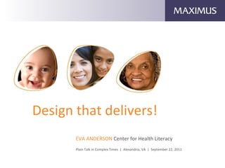
- 1. Design that delivers! EVA ANDERSON Center for Health Literacy Plain Talk in Complex Times | Alexandria, VA | September 22, 2011
- 4. Typography
- 5. 95% of what is commonly referred to as web design is typography. informationarchitects.jp/100E2R
- 8. Samples of fonts for legibility
- 9. Recommended standard PC fonts
- 13. Never force condense fonts Meta Plus Bold Meta Plus Bold condensed 70% Helvetica Neue Bold Condensed
- 22. It's a dance between type and graphic elements. White space is the music. Hierarchy is the beat, defined by color and size.
- 23. Think in terms of units
- 24. CA PCIP examples
- 27. Imagery
- 31. Color
- 33. For screen design, too much contrast is not ideal. Black type on a stark wh ite background starts to flicker and tires the eye. { R=90 G=77 B=82} For screen design, too much contrast is not ideal. Black type on a stark white background starts to flicker and tires the eye. { Black}
- 34. For best contrast when designing for the visually impaired, choose dark colors from the bottom half of the color wheel, and lighter colors from the top half. Lighthouse International, lighthouse.org/accessibility
- 39. Brand your campaign with consistent fonts, graphic elements, photo treatments and color palette. KISS!!!