More than Just Lines on a Map: Best Practices for U.S Bike Routes
Palin_15 Oct 2013_ Brand Identity booklet 1
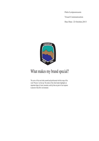
1. What makes my brand special?
The curve of the crest looks smooth and professional with the wrap of the
word ‘Preserve’on the top.The stroke of the white border highlights an
important shape of water, mountain, and sky that are parts of our response
to preserve Hua Hin’s environment.
Palin Lertpoonwasin
Visual Communication
Due Date: 22 October,2013
Hua Hin
2. 1. Logo variation
Primary logo
1. White and black are two external colors for this logo.The figure
colors are blue , brown, and blue sky.
Hua Hin
Hua Hin
Hua Hin
2. White and black are only two colors that are used
within this logo. The stroke of this logo is all white
contrasted with black.
3. White color shows the external color of crest with
the stroke of black color within this logo.
3. Hua Hin
Hua Hin
No other text or objects should
live within the edge of this
crest.
Hua Hin
Hua
Hin
Hua
2. Logo spacing
.625 Height
.
In appropriate use
Don’t add the effect, it can destroy
the quality of color and shape.
4. 3.Coporate Color
30 50 75 10 #A87B4F
CMYK WEB
0 0 0 100 #231F20
CMYK WEB
80 10 45 0 #00A79D
CMYK WEB
100 100 0 0 #2E3092
WEBCMYK
5. 1. Wide
P r e s e r v e H u a H i n
Preserve Hua Hin
2. Normal
Preserve Hua Hin
Preserve Hua Hin
3. Condensed
PreserveHuaHin
PreserveHuaHin
Thailandesa is the font style
I use to give client a choice.
I choose this font because it gives a feeling of Thai
culture and helps create the feeling of romance.
Preserve Hua HIn
Preserver Hua Hin
4. Extended
4. Fonts
6. Hua Hin
Hua Hin
Hua Hin
Hua Hin
1. Primary logo
4. Colors
CMYK Web:
0 0 0 100 #231F20
CMYK Web:
80 10 45 0 #00A79D
CMYK Web:
30 50 75 10 #A87B4F
CMYK Web:
100 100 0 0 # 2E3092
5. Font
The primary font for Preserve Hua Hin is Thailandesa.
Preserve Hua Hin
Preserve Hua Hin
Preserve Hua Hin
P r e s e r v e H u a H I n
P r e s e r v e H u a H I n
Hua Hin
.625 Height
Black and white both
in figure and the stroke
used to make contrast
Black stroke with white
crest
3. Inappropriate Logo Use
BrandReferencesheet
2. Logo spacing