Film poster analysis (A2 media studies)
•Als PPTX, PDF herunterladen•
3 gefällt mir•2,059 views


Empfohlen
Weitere ähnliche Inhalte
Was ist angesagt?
Was ist angesagt? (20)
Andere mochten auch
Andere mochten auch (20)
Ähnlich wie Film poster analysis (A2 media studies)
Ähnlich wie Film poster analysis (A2 media studies) (20)
Kürzlich hochgeladen
Kürzlich hochgeladen (20)
Film poster analysis (A2 media studies)
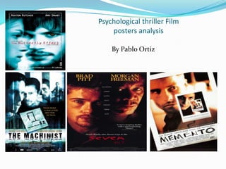
- 1. Psychological thriller Film posters analysis By Pablo Ortiz
- 2. Layout: Memento film poster analysis The composition of the Tagline: Memento film poster sees the On the second Polaroid there is the two main protagonists, Leonard tagline 'some memories are best Shelby played by Guy Pearce and forgotten' this increases the enigma Natalie played by Carrie-Anne, of the film because it makes the placed in the centre of the intended target audience ask poster. This indicates to the rhetorical questions about the audience that the narrative will predicament that the two main mainly focus on their protagonists might be in. relationship in the film. However unlike many typical film posters, This text may also suggest that there this poster appears to be tilted to is some type of conflict between the left cutting some of the Leonard and Natalie which is yet to picture out of the frame. It also be resolved in the film. seems to create an optical illusion by playing around with a Polaroid image inside of another Polaroid image, this unorthodox approach not only hints to the audience that this film has psychological themes but it will also fascinate film critics and fans because they are being Colour scheme: introduced to a new and The contrasting orange and white colour scheme combined with the immersive experience. low key lighting makes the Polaroid's appear as though they're flashbacks suggesting that Leonard and Natalie might already have a history/relationship with each other. This could suggest that Memento will either continue with more character development or it will sacrifice character development for actions sequences, although this isn't likely since there isn't many action film poster conventions present in this poster (e.g. A weapon or explosion) to suggest this.
- 3. Institution: My opinion: Memento is a 2002 American neo-noir psychological thriller directed by Christopher Nolan, the film's budget was $5 million but it grossed an impressive $40 million in the box office. Memento was also critically acclaimed by the indie community as well as the mainstream community contributing to the films massive successful. The leading stars Carrie-Anne and Guy Pearce both acted in Memento after acting in successful films including The Matrix and La Confidential. I am both impressed and inspired by this film poster, for example the use of low key lighting to hint that the Polaroid may be a flashback is a great idea. I will definitely discuss with my group about the possibility of incorporating this effect in our film poster, the use of the optical illusion of the Polaroid inside of another Polaroid is also a great idea. I would like to use the effect of an optical illusion in my film poster however due to the limited resources that I have at my disposal, this may be a difficult task, nevertheless this poster has placed a great emphasis on originality which has convinced me that breaking conventions could be beneficial. During the time period of 2002 both actors would have been popular and known for their roles in the films mentioned above. So by including them on the front of Memento's film poster it would have helped to create some buzz surrounding the release of Memento which may have also contributed to the films success. If executed well an unorthodox approach to making my film poster could set me apart from other students work however my aim is to create a film poster that appears credible with a level of professionalism and if the unorthodox approach isn't executed well then both of these elements may be sacrificed. In conclusion I will definitely be researching more film posters to find some more inspiration but at the moment I am swaying towards making a film poster that breaks the conventions of a psychological thriller film poster.
- 4. The Machinist film poster analysis. Layout: A tiny postnote of an unfinished game of hangman with two letters at the end is placed in the centre of the poster next to the tagline 'Trevour Reznik is four letters away from the truth'. The hangman theme is also used again in the films title. This continues to tease the audience by hinting that the main protagonist is being shielded from the truth suggesting that The Machinist may also have themes of a thriller. The composition of The Machinist poster sees the films main protagonist, Trevor Reznik played by Christian Bale, scattered along the top half of the poster. This not only suggests that the narrative will focus solely on him but it also suggest that this film might explore the different sides to Trevor's fragile personality, this is reinforced by his facial expressions which vary from bewildered (the first face on the left) to vulnerable (the third face on the right). This unorthodox approach of showcasing four images of the same character hints that this film might have some psychological themes because a convention of psychological films is to be unorthodox and abstract in order to distort the audiences perception of reality. Institution: Colour scheme: The colour scheme of light blue contrasting against the white background provides the poster with the low key lighting effect, this might suggest that the images of Trevor Reznik might be flashbacks which is another convention used in the typical psychological film. These unorthodox elements contribute in creating an enigma around this character leaving the audience with rhetorical questions, especially Christian Bale fans who will be intrigued by his choice to star in The Machinist. By analysing this film poster I've learnt that lighting is important because it can provide the audience with hints of what themes might be present in the film. I will definitely try to incorporate this in my film poster. Tagline: Target audience: The target audience for this film would have been the art house/ mature film critic community because although Christian Bale would have been a familiar face to a wide variety of audiences (due to his performance in American Psycho) this poster doesn’t have any aesthetically pleasing conventions (e.g. warm bright colour schemes) instead it places more emphasis on the theme of a distorted reality by using a dark and mysterious colour scheme. The Machinist is a 2004 English psychological thriller, the film's budget was $5 million and it performed poorly in the box office making just $8 million, despite the film being well received by critics. The film's leading actor Christian Bale has been critically acclaimed for his performance in 2002's American Psycho and by placing him on the front of the poster, it would have helped to create some buzz surrounding the release of The Machinist. Despite the film's poor box office performance Christian bale's performance in the Machinist was critically praised.
- 5. Colour scheme: Tagline: This film poster for the Butterfly Effect uses the colour scheme of a bright blue tint contrasting against a white background. By combining these two colours, the faces of the main protagonists Evan Treborn (Ashton Kutcher) and Kayleigh Miller (Amy Smart) look pale and overexposed to a flash of light. By looking pale it connotes that Evan is either in shock or scared, his blank expression also suggests that he is either day dreaming or in deep thought. Kayleigh’s expression is also blank suggesting that she may also be day dreaming or in deep thought. These elements contribute to making Evan and Kayleigh appear enigmatic because although the audience are being fed clues hinting at what type of characters they might be, the truth is not revealed. The effect of this colour scheme also hints that this film may have psychological themes because it's purpose is to distort the audience's perception of reality. In a typical thriller film, the main plotline focuses on a mystery that must be solved. The tag lines ‘change one thing’ and ‘change everything’ hints to the audience that The Butterfly Effect’s main plotline may also focus on a mystery that must be solved. The words chosen in the tag line reinforce this idea. The word ‘change’ is used twice to suggest a feeling of urgency, the taglines are also in capital letters which reinforce the feeling of urgency. Institution: The Butterfly Effect is a 2004 American science fiction psychological thriller film that was written and directed by Eric Bress and J. Mackye Gruber, starring Ashton Kutcher and Amy Smart. The film’s budget was $13 million but it grossed an impressive $96 million worldwide making it a box office success. However the film was not universally acclaimed with a mix of poor reviews among critics and fans. After starring in the comedy cult classic ‘Dude, Where’s my car’ and the successful rom-com ‘Just Married’, Ashton Kutcher’s performance and popularity contributed to the films success. Amy Smart’s performance was also well received and it helped to establish her career.
- 6. Target audience: The target audience of this film would have been mature film critics and fans who enjoy films that have psych0logical themes that explore the nature of the mind and reality. However with Ashton Kutcher as the star, The Butterfly Effect would have had some mainstream appeal since Kutcher was a popular figure during 2004. The films box office success suggests that it did in fact reach a wide mainstream audience. Layout: The composition of The Butterfly Effect poster sees the two main protagonists, Evan Treborn (Ashton Kutcher) and Kayleigh Miller (Amy Smart), placed in the centre of the poster. This indicates to the audience that the narrative will mainly focus on their relationship in the film. My opinion: Through the use of the colour scheme this film poster does a good job of presenting two enigmatic characters teasing the audience. The concept of this poster appears to be pretty simplistic and I'm sure that I could emulate some of the elements present in this poster. The next time I have a group discussion, I will talk about possibly using two of our main protagonists on our poster (using a gloomy colour scheme to reflect the themes in our teaser).
- 7. Seven film poster analysis Layout: Tagline and text colour: The composition of this poster for Seven sees the main protagonists , Detective William Somerset (Morgan Freeman) and Detective David Mills (Brad Pitt), faces next to each other which indicates that the narrative will focus solely on them. However Detective William Somerset is placed higher up the poster in comparison to David Mills, which suggests that Somerset might have more control/power in their relationship because he is placed physically above Mills showing some type of hierarchy. This has been included in the poster to give audiences a glimpse into what type of relationship these two characters have. The tag line 'Seven deadly sins. Seven ways to dies' adds some enigma surrounding the plot, it hints to the audience that these two characters might be investigating a murder or might have caused the murder. The title Seven is in dark red reinforcing the idea that the plot will revolve around a murder; since the colour red is associated with blood and death. The names of both the starring actors is in a different font compared to the rest of the text in this poster, this has been done to make it clear to the audience that this film has two high profile actors. This demonstrates that the unique selling point in this film poster is the high profile actors Brad Pitt and Morgan freeman who both have big fan bases. Review: This film poster has a short review 'A nerve-jangling thriller with a gutwrenching climax!' letting the audience know two things, the first is that Seven is a thriller and the second is that Rolling Stone ( a successful mainstream magazine) enjoyed the film; this would have helped to created some buzz for Seven since Rolling Stone has a big reading base/following. Some additional text in the middle hints at some themes that might be explored in Seven.
- 8. Colour scheme: The colour scheme of the black background contrasting against the orange lighting of their faces sets a serious tone/mood because aesthetically it isn't meant to be jolly/happy or funny, this serious mood is reinforced with the blank facial expressions of both Somerset and Mills. This demonstrates that Seven is not targeting a young audience, instead it is trying to target the adult/mature film community. My opinion: It is highly unlikely that I can use high profile actors in my film poster since my budget is pretty low however I can definitely use other elements present in this poster. For example I can use my main protagonists in the poster and use the composition to suggest that there is some conflict between them. Since my teaser trailer will be a psychological thriller, I could use a dark colour scheme to convey to my audience the feeling of paranoia. Institution: Seven is a 1995 American thriller film directed by David Fincher. It stars Brad Pitt and Morgan Freeman, with Gwyneth Paltrow, R. Lee Ermey, and Kevin Spacey in supporting roles. Seven was both critically acclaimed and commercially successful making $327 million worldwide. The talented cast has contributed to Sevens’ success , for example both Brad Pitt and Morgan Freeman were recognizable by audiences for their performances in films including The Shawshank Redemption and Interview with the Vampire. This demonstrates that both Pit and Freeman were showcased in this poster for Seven because it would have presented audiences with some familiarity. By using these two high profile actors it demonstrates to audiences that this film has a big budget, since both Brad Pitt and Morgan Freeman were in high demand during the 1995.