
Empfohlen
Weitere ähnliche Inhalte
Was ist angesagt?
Was ist angesagt? (20)
Ähnlich wie Media A2 Evaluation
Ähnlich wie Media A2 Evaluation (20)
Mehr von OddConnor
Kürzlich hochgeladen
Kürzlich hochgeladen (20)
Media A2 Evaluation
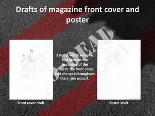
- 1. Drafts of magazine front cover and poster 2 drafts which were my first ideas at the beginning of the project, the front cover had changed throughout the entire project. Front cover draft Poster draft
- 2. Magazine front cover • In what ways does your media product use, develop or challenge forms and conventions of real media products? . My magazine Official Empire magazine Continue to next slide
- 3. • The empire magazine uses a blue glow with digital tiles in the background which symbolise a 3D digital world from 80’s pop culture. where as mine is blood red and looks similar to the flesh being ripped apart from a body in the bottom corners and blood pouring down the page. • Sticking to its horror genre, adding an eerie lighting effect above the title as if it were a spotlight in the middle of a cloudy street as I used a cloud effect to create more of an atmosphere that having it pitch black. The use of “Taivia, The Greek God of Film.” the word “Film” in Greek language is “Taivia” and adding “Greek God” into the tagline as Greek Gods are believed to be powerful and feared, I also chose it as a parody of the title “Empire”. • The use of white font in the title of the film makes it stand out from existing text on the cover where as the white font is stencil to make it look military related. Compared to the Empire magazine, Tron Legacy is in the colour of blue and white as it. • The yellow cross symbolises a plug as it is acknowledging that there are is more information in the magazine about different topics, similar to that of the Empire magazine cover which also uses a cross.
- 4. Comparison to existing posters My poster Dawn of the Dead (1978) poster 28 Days Later poster
- 5. • The font used on mine and existing posters is bold and easily stands out from the rest of the poster as the other colours are faded into the background to make the images used seem blended in with one another, such as the use of the sunrise on the Dawn of the Dead being a zombie head, 28 Days Later having infected eyes, I was influenced by using a CD to reflect that of a zombie, flesh wounds and different shade originally used for the eyes. • As for the hand, I was influenced by the Left 4 Dead cover art as it uses a zombie hand, making it easy to distinguish as a horror. Similar to the hand used, I thought it would be more effective having a CD with a reflection, using adobe Photoshop, I took ideas from the two existing posters and the Left 4 Dead cover to create something new. • The use of a tagline to summarise a subplot as Dawn of the Dead uses ”when there’s no more room in hell, the dead will walk the Earth” and 28 Days Later using “Your days are numbered”. I used “Dying is stage one. reanimation is stage two” as it shows the course of zombification, I used the same font used for the title as it resembles the military, believing that the zombie outbreak is a military experiment.
- 6. Main product and ancillary task • How effective is the combination of your main product and ancillary texts? My front cover My poster
- 7. • As my main task was to create a movie teaser trailer, that was my main objective throughout the course of our project, having plenty of ideas for my magazine and front cover from the start, I changed the plot drastically, the zombie horror genre stuck as it was the easiest to do. • The combination of my teaser trailer and my magazine cover/poster is very effective, as I have used the same basic formula that existing products, Dawn of the Dead uses the zombie as the sunrise, the zombie is also featured in the film, where as mine, the teaser trailer features me fighting a zombie at the very end and the very same zombie is shown on both the poster and magazine cover • I keep a consistent house style throughout all three tasks which distinguishes them from other projects and they can easily be linked together with the same font used on each task, using the Stencil font as the title. • The images that we took on set that show that there are a range of scenes used, although, the magazine cover is clouded to create a much more haunting setting instead of a carpark which isn’t the least scary. • There are a range of characters throughout the teaser trailer, magazine cover and poster, this shows that there is more than one plot, subplots from each survivor and zombies as in the teaser, there are dialogue that states “three ordinary students with no skillset retake Britain” showing that they come from similar backgrounds but shown from their appearance, you can tell they have different backstories. • Seen in all the tasks, the characters used are young adolescence, this can distinguish the target audience as teenagers and above. Most horror films that include zombies are that of a 18+ rating, where as the actors are younger and less gore or harsh language can be used in my teaser trailer
- 8. • What have you learned from your audience feedback? We asked 10 people about our teaser trailer, magazine cover and poster, the feedback was very useful. 1.Was the teaser trailer enjoyable and teasing to watch? 9 out of 10 people enjoyed the teaser trailer, 1 person did not. This could be as they have different taste from the other 9. 2.Is there a clear genre represented within the teaser trailer? Everyone understood the genre of that it was a action horror, which was helpful as I was sceptical that people would not acknowledge the zombie in the final scene and take more interest in the beginning news room scene and map scene. 3.Was the dialogue clearly heard? Most of the answers we got were that the dialogue was very clear, although on scene had quite fast dialogue and people were confused that the word “Town” was “Time” 4.Did the audio match appropriately to the video? The answers we got were that the audio matched the teaser appropriately, in the action scene the music faded in and was at an action pace. 5.Please can you suggest any areas of improvement? People said they were confused with the green screen as they don’t understand why it was green and thought it was an error, some had difficulty reading the titles as they weren’t on the screen for long, a wider range of sound effects could have been used throughout but as there aren’t that many, it’s quite abnormal.
- 9. • How did you use media technologies in the construction and research, planning and evaluation stages? • I read and watched existing movie trailers via Youtube .com and short fan made stories via Reddit.com as research for the plot of the teaser trailer, I was heavily influenced by Dawn of the Dead(1978) as the survivors are on the run from the undead and use a shopping mall as a base. • Throughout the planning, I drew many storyboards and rewrote a few plot synopsis’ as the ideas I had were a mixture between thrillers and horrors, I was influenced by 28 days later as near the end of the film, a character goes on a rampage and kills some military personnel, which influenced one of my plot synopsis. • I had some experience with Photoshop beforehand so it was easy to create the basic effects used in both the magazine cover and poster, the use of blood splatter in the poster with a glow plus noise added to make it look like infected blood. • I used the website Bubbl.us to explain genre research, the codes and conventions of different genres of films. I also used PowerPoint to create my magazine analysis and the website Sideshare .net to embed the powerpoint onto my Blog. Microsoft Word played a big part in the analysis of trailers and production schedule as I use of tables for the different scenes.