Product workshop air bnb vs hotel tonight (no notes)
•Als PPTX, PDF herunterladen•
0 gefällt mir•1,386 views


Empfohlen
Weitere ähnliche Inhalte
Andere mochten auch
Andere mochten auch (20)
Kürzlich hochgeladen
Kürzlich hochgeladen (20)
Product workshop air bnb vs hotel tonight (no notes)
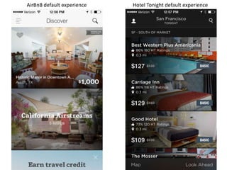
- 1. AirBnB default experience Hotel Tonight default experience
- 2. AirBnB search results screen Hotel Tonight search results screen
- 3. AirBnB map search results screen Hotel Tonight map search results screen
- 4. AirBnB listing detail screen Hotel Tonight listing detail screen
- 5. AirBnB Invite Friends flow
- 6. Hotel Tonight promotion notifications flow
Hinweis der Redaktion
- AirBnbstarts with non-geolocated discovery. get you excited about traveling by showing you travel porn.mixes up content types to show you it has range. stay in a nice place. rent an RV.showing very little information per list item. they want you to get interested, start browsing, and make a decision over the course of several visits, probably.Uses a prominent place in the default UI to promote its travel credit feature. Trying to drive long term retention.bottom always shows the top half of the next list item. helps the user know they should scroll.Search is a primary CTAHotel Tonightsign up requires access to GPS up front. added friction, but required for service. they probably get pretty high conversion and they get to show a very relevant default experience.lots of listings – they are trying the shotgun approach.each list item contains a lot of information. trying to get you to make a buying decision right away. minimize friction and increase per-user conversion. all-or-nothing approach.bottom always shows the top half of the next list item. helps the user know they should scroll.search is a primary CTA
- AirBnBonly 2 results without much information per result.“heart” is a primary action.again, they want you to get lost in the app, return again and again, and ultimately make a tough decision and convert.calling out reviews. they want you to feel like this is safe.Hotel Tonightsame screen as default experience.again, trying to lower friction as much as possible. they want you to make a snap decision.each list item does contain a rating, but it doesn’t call out reviews. they are not pushing you to engage in thoughtful behavior.
- AirBnBaccess to the filter is available – don’t have to return to the list view.filter controls are a modal. makes it easy to refine your search multiple times from preferred view (list or map)filtered search results are saved as recent searches so you can redo them easily.search is a feature: list and map are different views of the same results page. logical and easy to redo the search.prices are listed on the map.2 ways to redo the search – tap back arrow or tap into the search box. because users would feel lost?Hotel Tonightconfusing color coding that corresponds to their categorizations of different types of hotel, like Basic, Solid, Hip, Luxe, etc. Defined on list view, but there is no legend on the map… and no prices…even when you tap.the map view is like a modal. you have to close it to get back to the list view and do anything advanced, like redoing the search.search suggestions are listed below search box instead of recent searches listed below search boxno filter, not even on price. MVP?
- AirBnbKeep scrolling to get more detailStart with photo porn, then show you the host’s photo. photo + reviews next to them make them seem human and trustworthy.keep scrolling and you get a sample review, probably a positive one, to make you feel safe. they are trying to close the deal here.next is description, details, amenities, location, and more about the host if you’re still sketched out.the Instant Book and Contact host CTAs hoverHotel TonightNo scrolling. Wants you to make a snap decision.You can get more details, but it’s behind a tap. Even when you get more details, you can’t dig into the ratings.Instead of reviews, they have booker photos. You can see non-pro photos taken by the previous bookers and form the review in your mind. Lower friction.One primary CTA – Book now
- Initial CTA encourages virality while promoting the existence of their reward points feature, which encourages retention.Ask for contacts in context. Could have used an explanation that all my contacts wouldn’t be spammed.Select contact, then click send.After inviting one person, take advantage of the user’s feeling of enthusiasm for the service by asking them to post about it.i assume I get travel credit if people sign up using the NSALMON1 code. why didn’t they call that out while I was deciding to share?using built in iOS social integrations allows users to post without sending them out of the app.this is actually a 5-step flow, which is pretty long. deserves funnel analysis.
- left the app and came backthe app suspects that it didn’t work out this time. good time to ask if it can try again in the future.push notifications are great for retention.the modal is nice because it tells me why I’m about to get a prompt for push notifications. most apps just ask in the signup flow without telling you the nature of the push notifications.