Responsive layouts by Maqbool
•
1 gefällt mir•1,689 views

This Presentation was shown in LIUG Bangalore by Maqbool.

Empfohlen
Weitere ähnliche Inhalte
Ähnlich wie Responsive layouts by Maqbool
Ähnlich wie Responsive layouts by Maqbool (20)
Kürzlich hochgeladen
Kürzlich hochgeladen (20)
Responsive layouts by Maqbool
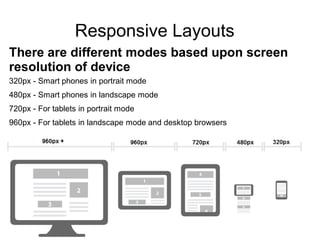
- 1. Responsive Layouts There are different modes based upon screen resolution of device 320px - Smart phones in portrait mode 480px - Smart phones in landscape mode 720px - For tablets in portrait mode 960px - For tablets in landscape mode and desktop browsers
- 2. Alloy UI Viewport Media Queries JavaScript tools (Bootstrap) Device Recognition (WURFL) Responsive Layouts Using different types
- 3. Alloy UI Viewport How to Use Alloy UI Viewport Add this line in main.js in your theme Alloy UI Viewport works It adds a few classes to the HTML element based on the width of the device’s window Based on these class, we need create selectors which match some devices only. Example of AUI Viewport AUI().use('aui-viewport') <html class="aui-view-gt320 aui-view-gt480 aui-view-gt720 auiview-gt960 aui-view-960"> #navigation li { display: inline; float:left;} .aui-view-lt720 #navigation li, .aui-view-gt480 #navigation li,.aui-view-gt320 #navigation li { display: block; float:none;} .aui-view-gt320 #navigation li { display: block; float:none;margin:0px;}
- 4. Media Queries How to Use Media Queries Add this meta in portal_normal.vm inside the head tag Add this line in portal_normal.vm inside the head tag. Or We could add in our custom style sheets import css file Also we could write css <link rel="stylesheet" type="text/css" media="screen and (max-device-width: 480px)" href="moblie480.css" /> @import url("moblie480.css") screen and (max-device-width: 480px); @media screen and (max-width: 720px) { .column {float: none; } } @media screen and (min-width: 480px) { .column {float: none; } } @media screen and (width: 320px) { .column {float: none; } } @media (min-width: 768px) and (max-width: 979px) { .column {float: none; } } <meta name="viewport" content="width=device-width, initial-scale=1">
- 5. JavaScript tools (Bootstrap) Create theme in this structure. Include bootstrap.css and bootstrap-responsive.css in main.css Include bootstrap.js and bootstrap.min.js in portal_normal.vm before closing body tag.
- 6. Change all css and div of portal_normal.vm and navigation.vm Based on your layouts. Responsive css will take care of bootstrap if you wants to customize use media queries. You could customize css and JavaScript using bootstrap tools. URL: http://twitter.github.io/bootstrap/
- 7. Device Recognition (WURFL) Download Device Recognition (WURFL) in market place. Add mobile Device rules then select rule group in site pages Then goto manage actions click on add actions select type theme modification. Select your mobile customize theme. We can also create moblie themes using jqtouch, jquery mobile.