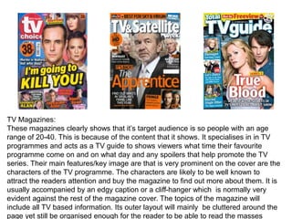
1. TV Magazines:
These magazines clearly shows that it’s target audience is so people with an age
range of 20-40. This is because of the content that it shows. It specialises in in TV
programmes and acts as a TV guide to shows viewers what time their favourite
programme come on and on what day and any spoilers that help promote the TV
series. Their main features/key image are that is very prominent on the cover are the
characters of the TV programme. The characters are likely to be well known to
attract the readers attention and buy the magazine to find out more about them. It is
usually accompanied by an edgy caption or a cliff-hanger which is normally very
evident against the rest of the magazine cover. The topics of the magazine will
include all TV based information. Its outer layout will mainly be cluttered around the
page yet still be organised enough for the reader to be able to read the masses
2. Fashion Magazine:
These magazines appeals to the target audience of females around the age
ranges of 20-30. The content is based around fashion and cosmetics and
implicitly hints around the idea of that ‘perfect girl’. It’s main feature of the key
image is the celebrity on the front cover, and will take up most of the space within
the area and are likely to be well known people that most general public are
familiar with. They will wear flashy clothing that stands out from the everyday
looks that people generally wear to make it eye catching and appealing. Their
names will be prominent on the cover, however not as prominent as the title of the
magazine that is found at the top of the cover and is behind the image, in most
magazines. This is done because of their name being so common it’s as if their
3. Pre-school/ children’s magazines:
The magazine will appeal to the target audience of children aged 5-6+ of both
genders. The content is based around TV shows as little children are heavily
influenced by shows that they watch and the values that they teach. The
cover will include pictures of cartoon/TV characters for the audience that it is
aimed at and will normally include a ‘free’ toy. Younger children will not
possess any money to buy the magazine themselves and so it is the
magazines job to entice the child which will result in the guardian/ parent of
the child buying it for them. The magazine will need to be filled with a range of
colours and activities in order to keep the attention of the child and
recognisable characters that they will know. It doesn’t have a specific colour
4. Boys magazines:
These magazines appeal to the specific gender of boys ages 8-13 because
of the TV programmes that they watch. As like children's magazines, these
may include a ‘free’ item that will appeal to the child and will want to buy it.
The covers will be colourful and will include all the characters that the target
audience is familiar with and will have minimal writing as boys tend to prefer
images and games. These prices will be slightly cheaper as at this age,
children start to get pocket money to spend on leisurely item which might be
this magazine, and therefore it might be a little cheaper so that they can
afford it. This magazine will normally be filled with images, games and maybe
sport tips and tricks to help keep the target audience occupied. They have a
5. Girls magazines:
The girls are generally for the target audience of girls ages 11-15 because they will
be at the age where they are heavily influenced by celebrities and their
appearance. The cover will contain images of well-known celebrities amongst
teenagers which will be surrounded by texts which promise tips about the latest
fashion and all of the celebrity gossip of their favourite boy bands. Most of these
texts will be exaggerated to make the magazine seen interesting. A you can see
the magazine on the far right-Teen Vogue- this magazine is created for the same
target audience yet is clearly layed out, unlike the other two which bombard
brightly coloured information to the audience . It is aimed to specifically make the
audience feel older and more mature as its is a ‘faked’ magazine off Vogue which
6. Sports magazines:
The magazines are aimed specifically at men ages 20+ due to their
love of sports. Their content will be based around sports and the recent
matches that have been recorded and any interviews. Their key image
will be of a well-known sportsperson to grasp the viewers attention.
The football magazine on the far left looks much more packed and
colourful that the other two. This is because football is a very fast-
paced sport in which the audience will be used to lots of information
being in their faces. Every bit of text will be in bold of a different font to
make the audience think that everything on the page is important. The
other two have clearly layed out text which may appeal to the older end
7. Superimposition-images andwordsare
laidover each other(titlepartially
coveredby the keyimage.)
Themagazinewebsiteallowsthe
readerto accessmore online
content
Makesthereaderfeellike they
aregetting themost out of their
magazine.(253+)
Keytheme intereststhereader:‘Vacation
dressing’which introducesthenew clothing
linesforthe new season-summer.
Wordlike ‘artistapproved’makesthe
readerfeel like theinformationwill
be valuableto them.
It is rareforthe centralimage to be
nearfull length,it representswhat
the readershouldwear.
Advice to the readerforgetting ‘perfect’
skin byfollowing theirtipsandtricks.
Thekey image is of a celebrity-SelenaGomez.
A mode of address-themagazineestablishesa personal
andalmostfriendlyrelationshipwith thereader.
Thekey image covers thetitle (superimposition)
Sheis lookingat the audience/readerto make it more
personal-Directmode of address.Thisis doneto engage
the audience.
Thisisthe anchoragetext to linkthe image to the
topic/personin the article.
Thiswouldappealto the targetaudienceof
femalesaged 20-30.
Thecontentis basedaroundfashion
andcosmeticsandimplicitlyhints
aroundthe ideaof that‘perfectgirl’.
Thepuff ‘must-pack’suggeststhe
insidecontentandwhat the reader
wouldbenefitfrom
Thedifferentvarietyof fontsallowsthereaderto quickly
skim the page for interestand like thingsto gather of the
samefont.The boldfontshighlightedshowthe ideaof advice
whereastheonesin whiteshowtheideaof improving outer
image- ‘perfectgirl’.
8.
9. Genre Conventions
The conventions shown in the mood board are all from the higher end of
the fashion genre that are sold (Vogue, Elle, Rush, Fashion, Mango etc.)
The contents have very minimal writing inside and are filled with large
images that may take up most of the room on the double page. Its article
contents use direct mode of address to ensure the reader is kept interested
and as if the advice and articles give includes the reader. It’s target
audience appeals to female teenagers/young adults (16-20+) due to its
content such as fashion and makeup and personal health and social
articles that will matter only to this particular group. Its price ranged from
£5-£10+ because of its popularity and high standards of exclusiveness that
it has to maintain throughout its target group. The raised price is also done
because of their expected wages as people of this age are more likely to
have a job and so will put money aside on leisure activities. This contrasts
with magazines for younger teenagers as they are less likely to have a job
and will not have any money but will receive minimal pocket money and
therefore the magazines that are for their target audience would be
considerably cheaper. The cover will always include a central key image
11. The mode of address of the magazines tends
to include the reader by using words such as
‘you’ and ‘perfect’ to make the reader feel like
the magazine is specifies to them in particular.
These words are particularly used in the
description to define the heading in which the
magazine is divided up in. (cross-head)
The body copy uses serif fonts (fonts like Times
New Romans which have little bars on the end of
the letters. It also includes white space which
divides up the text to reveal the colour of the
paper to make the page seem less overloaded
with information and makes the text easier to
read.
The key image in this contents page
portrays some of the items in which
you can and ‘should aspire to buy’ in
order to become the ‘ideal figure’ that
they want you to be. In this key
image the decadent chair is
purchasable for £258 which is written
in bold as opposed to the rest of the
text on the page.
The colours on this page are very neutral-lilac,
white, pink and green These tones all compliment
each other very well and give a nice calm neutral
feel rather than an bold and bright feel.
This contents page also includes the following
devices:
• Borders-The gaps at the end of the page
• Gutters-The gaps between the columns of
text
• Leading- the spaces between the lines of the
text
• Kerning-The spaces between lines of text
These all help the text stay spread out onto the
page and make everything clearly and easy for
the reader to read. Upon further inspection it
also uses drop capitals (capitals which start of
an article) for the first main words in the
description.
12. The layout here for the
double-page spread is not
uncommon for fashion
magazines. It will consist of
having an image that will take
up the entire page whether it
may be an advertisement or a
model/ picture as it is
displayed in the image. On
the other side it will have a
description (anchorage text)
about the image or it may be
a completely different text.
This page consists of a picture with the
relating text of an interview, this is
known as anchorage text.
The colours used on this double-pages spread are very bold and bright when
put singularly they don’t seem to compliment each other, however when put
together on the page amongst other information, they actually compliment
each other very well. These colours are very prominent on the dress of the
celebrity seen on the left hand side of the double page. This obviously
contrasts with the other side of the page which is plain and filled with text.
Like the contents page, this
page also uses devices such
as:
• Borders
• Gutters
• Kerning
• Leading
All these conventions are
also used in other similar
magazines based on fashion
and all have a similar layout.
A page like this views the interests of the reader and includes
content such as interviews as like this page of Michelle
Dockery and her thoughts on playing ‘lady Mary’ in the
television series Downton Abbey.
The layout for the text
written on the right is set
out in a very interesting
way. Normally other
fashion related magazines
will have a picture of the
topic and will have
paragraphs underneath.
Alternatively this magazine
have chosen to have a
large boarder around the
page to make the text look
condensed and have
chosen to add a quote the
middle and the rest of the
interview surrounding the
quote in a very well
structured way. The quote
in the middle almost acts
like a drop capital in a
sense as it starts off/relates
to the text..
The font in which is used for the
text is serif fonts however the
quote is written in a bigger font
size than the rest of the text to
give it structure and to make it
stand out.
13. The more prominent colours on this
magazine cover is grey, white and baby
pink. They all compliment each other
very well and the contrast from the pink
on the grey makes it very eye catching
and the white letters with the masthead
and body copy stand out to the reader to
make sure they see the content.
The noticeable colours on this magazine
cover is baby blue, white and black.
Again, these colour compliment each
other as black and white go with any
colour. The masthead and body copy are
both written in either black and white to
make sure the readers eye is caught to
certain information first. The backdrop is
of a lighter shade to make sure these
colours stand out.
The more prominent colours on this Dazed
and Confused magazine are: hot pink, blue,
purple and white. These neon colours
against a more paler background create a
very bold effect and instantly attracts the
readers attention to where the most brighter
colours lay first as opposed to pastel
colours. They all seem to compliment each
14. All the colours used here are all very ‘fall’
inspired. These are all colours that are very
fashionable during the autumn season which
are: burgundy, black and white. They
compliment each other and are very striking
to the eye when on the shelf against other
magazines.
This is a very interesting mix of colours as
individually, they do not seem to go together
and compliment each other as magazine
colours should go. However on the magazine
the layout of the colours seem to go very
well. The yellow is used for the masthead
to draw the readers eye . The black is used
for the body copy and the white and green is
used for the background and the key image’s
dress to add a more spring themed feel to the
overall cover.
The colours on this magazine are very
interesting. As separate colours They do
not match and/or compliment each other in
any way, however, the 3 primary colours
red, yellow and blue are used to fill in the
hole inside the letters of the mast head
which is written in white , The dark blue is
used to fill in the colour of the background
15. The colours used here are very bold yet
simple. They all compliment each other very
well as they are well situated on the page. It
is mainly grey used for the background and
the light pink put on top for effect and for it t
stand out. This is called a banner.
The colours used on this ‘fashion’
magazine are very distinctive in the
sense that they do not seem to go well
together. However they do contrast a lot
in order to create a bold statement look.
The blue and black are used on the key
image’s dress and the purple is used to
contrast these colours.
Red, silver/grey and white are used on
this magazine in order to create a very
elegant feel to the whole layout of the
magazine. The white is the brightest
colour that is used for the colour
scheme and therefore is used for
certain information to stand out to the
reader. The red is used for the key
16. The type of font that ELLE have used for their masthead, has
a appearance of elegance to the viewers eyes. It is tall yet thin
serif font which portrays a ‘figure’ type in that which makes it
more feminine and distinctively leads to the thought of
fashion which is more commonly associated with
sophistication and elegance which is what the magazine strive
to provide to its audience. There is a large kerning between
the letters which hints to the idea of originality and
individuality.The font for the masthead is alike to ELLE’s, however it
is more bold yet still has a more elegant feel to it. This
gets the message across to the reader that it wants to be
noticed will hence be the first thing that they see. Like
Elle, it also has a more bolder version of serif fonts
which makes it very classical yet feminine.
The cosmopolitan font is very altered compared to
VOGUE and ELLE as it is more recognised by its
distinctive use of the colours white and pink which
shows feminism in its genre. It has a sans serif font
which is written in white and a pink banner behind it
which adds to its house style. All the letters are much
more closer together when comparing it to ELLE, and
conveys the thought of the genre to be all topics
17. Century Gothic
This font named ‘Century Gothic’ and other
fonts similar to this are known as sans serif
fonts. These are fonts which do not have little
serif (bars) at the end of the letters. These types
of fonts would be used for texts as they are small
and easy to read. They are too plain for it to be
used as a title as such but will make reading
large amounts of texts easy for the reader. Fonts
like this give a more informal/laid back
impression to the reader.
Copperplate Gothic ‘Copperplate Gothic’ is a type of font that
would be distinguished as a serif font which are
types of fonts that do have little serif (bars) at
the end of each letter. This gives a more formal
impression to the magazine.
Matisse ITC The font ‘Matisse ITC’ is a type of font that
would possibly used for titles or heading at the
top of the page. It stands out from other
simpler texts and gives a creative vibe to the
page, hence enticing the reader to investigate
the page further. It is very sophisticated and
elegant and will add more of a creative
18.
19. The target audience for my magazine will be females based
around the age 16-14. The genre of fashion that I am doing will
be vintage and floral in different themes as well as incorporating
different looks to appeal to a wider variety of target audience
possible. It will be a high-end magazine that will be priced
around £4.00 with 40-60 pages included. I will use very neutral
colours with a subtle hints of brighter colours in order to attract
the readers attention to different details of the magazines with a
floral theme following the current seasons fashion. The content
in the magazine will be based around fashion and the latest
trends of he season. It will have celebrity interviews and tips and
hack to make the reader feel that they are getting the most out
of their magazine. The type of target audience I have created for
myself are known to be ‘leading edge’ which are people who are
generally creative with ideas and also ‘scenesters’- which are an
alternative hipster type of fashion sense. My target audience’s
style in fashion will vary however the magazine should appeal to
Target Audience