Apidays New York 2024 - The Good, the Bad and the Governed by David O'Neill, ...
Graphic Guidelines For Media Shout Scripters
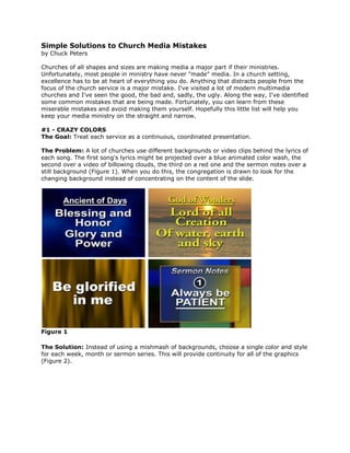
1. Simple Solutions to Church Media Mistakesby Chuck PetersChurches of all shapes and sizes are making media a major part if their ministries. Unfortunately, most people in ministry have never quot;
madequot;
media. In a church setting, excellence has to be at heart of everything you do. Anything that distracts people from the focus of the church service is a major mistake. I've visited a lot of modern multimedia churches and I've seen the good, the bad and, sadly, the ugly. Along the way, I've identified some common mistakes that are being made. Fortunately, you can learn from these miserable mistakes and avoid making them yourself. Hopefully this little list will help you keep your media ministry on the straight and narrow.#1 - CRAZY COLORS The Goal: Treat each service as a continuous, coordinated presentation.The Problem: A lot of churches use different backgrounds or video clips behind the lyrics of each song. The first song's lyrics might be projected over a blue animated color wash, the second over a video of billowing clouds, the third on a red one and the sermon notes over a still background (Figure 1). When you do this, the congregation is drawn to look for the changing background instead of concentrating on the content of the slide.<br />Figure 1 <br />The Solution: Instead of using a mishmash of backgrounds, choose a single color and style for each week, month or sermon series. This will provide continuity for all of the graphics (Figure 2). <br />Figure 2 <br />Songs are often selected to tie into the message of the morning, so consistent backgrounds also make the entire service seem more connected. You'll find that the flow of the service is much smoother. Save your creative variations for special music numbers. #2 - MISLEADING LYRICS The Goal: If you project lyrics for your songs, you need to time the appearance of the text with the singing carefully. For a smooth presentation, it is essential that the slides lead, not follow, the singers. Timing is everything. The person running the slideshow has to be intimately familiar with the songs so that he or she can anticipate slide changes and lead the leaders and the congregation. The Problem: Improper and untimely slide changes are a major distraction to people trying to sing what you show. Never attempt to follow what they do on stage. This can trip-up your song leaders and your congregation. Lagging changes are just as bad as putting slides up in the wrong sequence. The Solution: Attend rehearsals and take good notes. Meet with the music leader in advance of the rehearsal so you have a full understanding of the order and flow of the service. The person running the slides is as much a part of the music team as an instrumentalist or vocalist. Your job is to literally lead the singing. You need to know the songs as well as anyone on the platform. When I run graphics for lyrics, I always work from a script. Before rehearsal, I note every slide in order on paper and I write production notes like quot;
musical interludequot;
or quot;
repeat 3x.quot;
A script gives you a roadmap so you never have to guess where the song leaders are going.#3 - BAD FONT CHOICES The Goal: When it comes to selecting fonts, the goal is always readability. And, remember, the words need be easy to read from a distance. This means making good decisions in regard to size and style. They should also be consistent from one graphic to the next. The goal: keep it clean, clear and simple. The Problem: Narrow or swirly fonts are hard to read from a distance and should be avoided (Figure 3). Cartoonish fonts aren't appropriate for most church settings (Figure 4). Their overly silly style can make your graphics seem immature and can rob your content of the respect it is due. If your fonts change from slide to slide or song to song, you may cause your parishioners to pay more attention to your crazy presentation than the content of the message.<br />Figure 3 Figure 4 <br />The Solution: Simple, bold fonts are always the easiest to read from a distance. Thick sans serif fonts are often best for on-screen readability (Figure 5). <br />Figure 5 <br />While you may think serifs look classier, the primary goal is for the text to be legible from the back of the room. Avoid multiple fonts by finding a font family that you like and sticking with it. To keep continuity, use the same typeface for every graphic you create. Keep font variations subtle, changing only the style (regular, bold or italics) to create emphasis when necessary. Use a dark drop shadow or outline to help separate light text from light-colored backgrounds.<br />#4 - TMI (TOO MUCH INFORMATION) The Goal: Don't put too much information on a single slide. Putting too much information on the screen at once can overwhelm your audience. The Problem: If you have a long chorus or scripture verse to put on the screen, it can be tempting to use small text to get it all on one slide (Figure 6). <br />Figure 6 <br />But, small type can be difficult to read from the back of the auditorium, especially if there's a lot of it. The Solution: Break long pieces of text into a series of slides so you can increase the font size and make it easier for the congregation to follow along (Figure 7). <br />Figure 7 <br />There's no rule for setting font size. What size type you use depends completely on the size of your screen and the size of your room. The best bet is to preview your slides from the back of the auditorium to make sure the text is large enough to easily read.#5 - CLUNKY TRANSITIONS The Goal: The primary goal of anything that goes up on the screen during a church service is to enhance the worship experience. The images that you project onto your screens-whether edited videos or simple slides-have to be presented smoothly, and transitions to and from your segments must be quick and smooth so as to not distract those in attendance. The Problem: If transitioning to or from a video clip or presentation involves a drawn out process of closing window blinds, dimming lights, raising and lowering screens or fumbling through startup menus or video inputs on your projector, you will surely disrupted the flow of the service. Blasts of video snow and audio feedback are simply not acceptable. Those long, painful delays and awkward lulls of silence while everyone waits for the screen to come down and the video to come up should be avoided at all costs. Ultimately, a disruptive presentation may do more to harm a service than the video does to help it. The Solution: Take time to prepare your equipment and your people so you can transition to and from media segments quickly and smoothly. This may mean scheduling a practice time to train your team. Think of your team like a NASCAR pit crew. See how quick and clean you can make your transitions. Rather than figuring it out during the service, preparing in advance will help ensure that all goes smoothly. One of the best quot;
coversquot;
that I've found is to lead schedule the video after a prayer. Lower the screen and dim the lights while heads are bowed and eyes are closed. Cue the start of your clips on the quot;
Amen.quot;
Ironically, the ultimate goal of using media in a church setting is for the media itself to be invisible: no one should realize you are there and no one should notice your work. If folks are squinting at poorly designed graphics or gaping in amazement at the stunning 3D animations you are projecting, you are not doing your job. With your life and your service, a job well done should be its own reward. In a church setting, if you can't do it with excellence, you need to decide whether you should be using multimedia at all.Chuck Peters is Vice President of Media and Promotions at Digital Juice and is the Editor of Digital Juice Magazine.<br />