Infographics for Nonprofits - Forefront Member Breakfast Series
•Als PPTX, PDF herunterladen•
0 gefällt mir•447 views

Subtitled, "When Good Fact Sheets Go Bad," Delia Coleman and Kathleen Murphy of Forefront discuss the do's and don'ts of nonprofit infographics. This deck covers the basics of visual storytelling, proper data use, and design principles for non-designers.

Empfohlen
Empfohlen
Weitere ähnliche Inhalte
Was ist angesagt?
Was ist angesagt? (20)
Ähnlich wie Infographics for Nonprofits - Forefront Member Breakfast Series
Ähnlich wie Infographics for Nonprofits - Forefront Member Breakfast Series (20)
Kürzlich hochgeladen
Kürzlich hochgeladen (20)
Infographics for Nonprofits - Forefront Member Breakfast Series
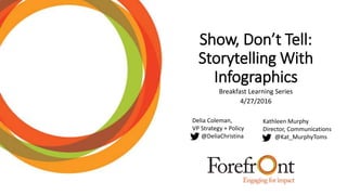
- 1. Show, Don’t Tell: Storytelling With Infographics Breakfast Learning Series 4/27/2016 Delia Coleman, VP Strategy + Policy @DeliaChristina Kathleen Murphy Director, Communications @Kat_MurphyToms
- 2. #Goals Understanding why Infographics are the made for communicating data We’ll understand basic principles of how people process information Infographics: It’s more than data We’ll understand how to best fit the right kind of data to the right kind of infographic We’ll understand basic principles for creating an infographic We’ll understand the questions to ask when thinking about presenting data Workshop your own infographic Translate your organization’s data into a beautiful, shareable, informative and engaging piece of content to promote your cause and tell your story.
- 3. Why Infographics work. People only read and process 28% of text on web pages The brain processes visuals 60,000x faster than words. An infographic can make information more easy to interpret and easier to connect with. Cool Link: 13 Reasons Why Your Brain Craves Infographsics
- 5. Bad Infographic • Textextextextextextext • Bad/Inaccurate charts • Using data as a starting point • Incoherent story • Content doesn’t match audience • Unknown purpose (what will it be used for?) • Boring • Bad sourcing of data (if you’re using secondary information)
- 8. Deciding What Data to Represent Hint: Don’t Use it As a Starting Point The #1 mistake most people make when they want to create infographics is to use their data as the starting point Readers don’t exactly care about your data, they care about the story you are telling. Think about what you want people to learn and take away after they look at your infographic.
- 10. Case Study: Forefront’s SROI reports Forefront data before • Printed • Hidden on website • Superfluity of TEXT • Long • Boring • Unused Forefront data after • Online • Story-driven • Social • Advocacy-oriented • Accessible • Visually compelling
- 11. Visualizing Your Story: Finding your Narrative 1. Audience & Purpose (How will people *use* it? Where will they use it?) 2. Introduce the topic, striking title design, typography, brief summary of what your graphic is about 3. Introduce the problem or conflict 4. Present central argument: let the data shine 5. So what? End with a call to action (a url is not a call to action)
- 12. Visualizing Your Story: Organizing • Timeline • Comparing and Contrasting • Data Representations (stats heavy) • Process Infographics (how we get from a to b) • Geographic Infographics • Hierarchical Infographics
- 13. Visualizing Your Story: Design Principles for Effective Visual Communication Venngage
- 14. Visualizing Your Story: Design Principles for Effective Visual Communication Venngage
- 15. Visualizing Your Story: Design Principles for Effective Visual Communication Venngage
- 16. Visualizing Your Story: Design Principles for Effective Visual Communication Venngage
- 17. Visualizing Your Story: Design Principles for Effective Visual Communication Venngage
- 18. Visualizing Your Story: Design Principles for Effective Visual Communication Venngage
- 19. Visualizing Your Story: Design Principles for Effective Visual Communication Venngage
- 20. Visualizing Your Story: Design Principles for Effective Visual Communication Venngage
- 21. Visualizing Your Story: Design Principles for Effective Visual Communication Venngage
- 22. Visualizing Your Story: Infographic Hacks 1. Go to Venngage, Pitkochart Templates page 2. Pick one or a few you like. Then use that as the base style. 3. Create an outline of the infographic with all the charts and elements (on paper) 4. Create the infographic on a tool like Venngage (using the outline and template) 5. Change the color, fonts and other elements to create your own style derivative. (ColorLovers.com)
- 23. Resources People • Ann K Emery (annkemery.com) •Cole Nussbaumer (Storytellingwithdata.com) Tools to make you look like a genius • Piktochart • Canva • Venngage • Easel.lyLinks The Ultimate Guide to Infographics for Nonprofits
- 24. myforefront.org
Hinweis der Redaktion
- Infographics work. They’re great as standalone blog posts, they dazzle readers of ebooks and content all over the internet, and they’re easily shareable because the brain processes visuals 60,000x faster than text Sharing these beautiful data presentations is easy; the challenging part is how to create your own, manipulate your own company’s data, and translate that into a beautiful, shareable, informative and engaging piece of content that will increase traffic and leads to your business.
- This is not a bad infographic. But it’s not great. It’s your basic data-driven infographic. The problem is, this infographic tries too hard to fit all the great data the non-profit had collected and did not focus on what the potential audience would be interested in learning. A great infographic not only answers questions that people are curious about, it reframes them in an unconventional way. It challenges us and sparks new insights to old problems. It should have an impact, and leave you pondering on your existence, not unlike a good book or a good movie.
- In this infographic, there’s no question the story being told isn’t about data. It’s about the impact of how it’s represented in a story: the animals we think are killers aren’t even close to comparing deaths caused by mosquitos.
- The #1 mistake most people make when they want to create infographics is to use their data as the starting point Readers don’t exactly care about your data, they care about the story you are telling. Creating a great infographic is about answering questions and solving problems people have. Using your data to think about infographic stories will impede you in the selection of interesting topics and inevitably bias you towards what Venngage calls a “data for the sake of data infographic.” Try not to brainstorm with your data first. In fact, do the opposite - take your data and lock it up. Don’t look at it. Forget about your data for now. Think about what you want people to learn and take away after they look at your infographic.
- No uneven Margins, grid, symmetry,
- Don’t over-design! Doesn’t need to be complex to deliver impact
- use Color Lovers to find color schemes that match a particular color. It’s a great tool. I use it all the time.