
Empfohlen
Weitere ähnliche Inhalte
Was ist angesagt?
Was ist angesagt? (20)
Andere mochten auch
Ähnlich wie R and b part 2
Ähnlich wie R and b part 2 (20)
Mehr von Miz_A
Mehr von Miz_A (20)
Kürzlich hochgeladen
Kürzlich hochgeladen (20)
R and b part 2
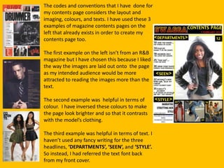
- 1. The codes and conventions that I have done for my contents page considers the layout and imaging, colours, and texts. I have used these 3 examples of magazine contents pages on the left that already exists in order to create my contents page too. The first example on the left isn’t from an R&B magazine but I have chosen this because I liked the way the images are laid out onto the page as my intended audience would be more attracted to reading the images more than the text. The second example was helpful in terms of colour. I have inversed these colours to make the page look brighter and so that it contrasts with the model’s clothing. The third example was helpful in terms of text. I haven’t used any fancy writing for the three headlines, ‘DEPARTMENTS’, ‘SEEN’, and ‘STYLE’. So instead, I had referred the text font back from my front cover.
- 2. Instead of adding two more images above the main image, I have used three. I have placed the page numbers on the images into the different corners because it makes the page more interesting. At the top of the page, I didn’t use images, so I filled up half of the banner with the magazine logo, and the other half with the title and the ‘content page’ title. I have used these ‘<>’ signs rather than this’>’ sign for the three headlines because I saw that it looked more stylish and helped to develop a house style. I have used some texts from this ‘VIBe’ magazine but I had added my own too. In this example of the ‘VIBe’ magazine, I saw that they had included captions under each of their stories and topics to anchor their meaning and that is what I did too. I made the captions as short as possible so that the page is readable and tempting by the fact that there is not enough information but just the key words that my target audience would be attracted to.
- 3. As you can see, none of the magazines on the left have a border around them. When I showed my contents page without the borders to my intended audience, they had recommended to me to add the border lines to give a nice bolder effect. My intended audience also recommended that I should add a web link to get people talking about this magazine. So I made a follow-up Facebook link at the bottom left corner.