
Empfohlen
Weitere ähnliche Inhalte
Was ist angesagt?
Was ist angesagt? (19)
Andere mochten auch
Andere mochten auch (14)
Ähnlich wie Target audience
Ähnlich wie Target audience (20)
Mehr von Michael
Mehr von Michael (20)
Kürzlich hochgeladen
Kürzlich hochgeladen (20)
Target audience
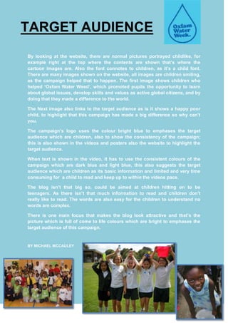
- 1. TARGET AUDIENCE By looking at the website, there are normal pictures portrayed childlike, for example right at the top where the contents are shown that’s where the cartoon images are. Also the font connotes to children, as it’s a child font. There are many images shown on the website, all images are children smiling, as the campaign helped that to happen. The first image shows children who helped ‘Oxfam Water Weed’, which promoted pupils the opportunity to learn about global issues, develop skills and values as active global citizens, and by doing that they made a difference to the world. The Next image also links to the target audience as is it shows a happy poor child, to highlight that this campaign has made a big difference so why can’t you. The campaign’s logo uses the colour bright blue to emphases the target audience which are children, also to show the consistency of the campaign; this is also shown in the videos and posters also the website to highlight the target audience. When text is shown in the video, it has to use the consistent colours of the campaign which are dark blue and light blue, this also suggests the target audience which are children as its basic information and limited and very time consuming for a child to read and keep up to within the videos pace. The blog isn’t that big so, could be aimed at children hitting on to be teenagers. As there isn’t that much information to read and children don’t really like to read. The words are also easy for the children to understand no words are complex. There is one main focus that makes the blog look attractive and that’s the picture which is full of come to life colours which are bright to emphases the target audience of this campaign. BY MICHAEL MCCAULEY