
Empfohlen
Weitere ähnliche Inhalte
Was ist angesagt?
Was ist angesagt? (20)
Ähnlich wie POW! Your Point Handout 2: Design Basics
Ähnlich wie POW! Your Point Handout 2: Design Basics (20)
Mehr von MesaPublicLibrary
Kürzlich hochgeladen
Kürzlich hochgeladen (20)
POW! Your Point Handout 2: Design Basics
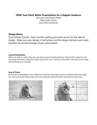
- 1. POW! Your Point: Better Presentations for a Happier Audience Sara Lipich and Cherise Mead Mesa Public Library AzLA 2015 Conference Design Basics Form follows function. Don't sacrifice getting your point across for the sake of design. Make sure your design is harmonious and the design decisions you make facilitate the central message of your presentation. Layout/Composition When you look at a slide, does your eye bounce around, looking all over, trying to find a place to rest? Use design elements to lead the viewer's eye to the "aha" moment on the slide, to the part of the image that reinforces your message. Rule of Thirds Borrow this photographer's trick: divide your slide into three equal sections vertically and horizontally. For maximum visual interest, place the most important elements at the intersections of the lines.
- 2. Scale Scale creates relationships between objects on the slide, and helps the audience navigate visually. Big things can have a big impact… Contrast Color Color Colors have emotional impact. Each color can impart a mood or feeling; each color has both positive and negative associations (ex. red is exciting, but is also associated with anger). Be aware of your own personal preferences towards color, and make sure you are using colors that are appropriate to reinforce your message, not just colors you like. …so can small things. Dark text on a light background is easy to read It needs to be heavier weight and a larger point size. Light text on a dark background is more difficult to read. Space Don't be afraid to leave some empty space on your slide. Used effectively, it can make your message stand out, and increase the impact of an image. The eye is drawn to the active space.
- 3. Text & Font Is it Legible? This is the most important rule when it comes to text and font! Above all, make sure the text on your slides is easy to read. Emphasis Heirarchy: Display vs. Body Font styles are designed for different reasons. Some fonts are created for big emphasis, but do not look good when shrunk down (the detail gets lost and they become difficult to read). "Body" fonts are meant for bigger blocks of text – they remain legible at smaller sizes. ALL CAPS Slows reading and there is a loss of legibility. Use only for attention-getting headlines. Italics Also slows reading but legibility is usually well maintained. Use for emphasis (when you want the viewer to slow down and absorb a point). Bold Use for emphasis, legibility and readability is well maintained. But be careful, font that is very big and bold can be difficult on the eyes. Underlined Underlined text on a screen usually signifies a hyperlink, so this can be confusing. Best to avoid in PPT. Alignment Flush Left This is how most typewritten text is set, so it's familiar to people and easy to read. Flush Right Because it is less common, it's a little more difficult to read, but can also be used to make an impact. Centered If you just have a few words on the slide, centered can look nice. But if there's a lot of text centered, it's more difficult for the eye and brain to track.
- 4. Serif vs. Sans Serif In typography, a serif is a small finishing stoke attached to the beginning and/or end of the main stroke of a letter or symbol in some fonts. "Sans" is French for "without," - sans serif fonts do not have these finishing stokes. Serif fonts are easier to read in print. Sans Serif fonts are easier to read on screens. This font, Times New Roman, is a serif font. This font, Segoe UI, is a sans serif font. Kerning The horizontal spacing between letters. Kerning can be adjusted so that words stretch out to take up more horizontal space or compact together to take up less. This can be helpful for fine-tuning the design of a slide, but too much adjustment in either direction can make text more difficult to read. Thes e le tter s a r e s pa ced to o wide ly . Theselettersarespacedtooclose. These letters are just right. Line Spacing The vertical distance between lines of text. If lines are spaced inadequately or too widely, it makes the text more difficult to read. What Font Should You Use? Remember fonts have personalities. Choose the appropriate personality for your message. Stick to 2-3 font types and font sizes throughout your PPT. Size Matters Font size in a PPT slide should not be smaller than 28 points. Ever. Generally bigger is better (but a font that is very bold and then made very large size can be overwhelming to the eye, so be careful – 96 pt is listed as the maximum in PPT for a reason!). How Much Text? Ideally no more than 7-10 words across on a slide (10-14 is also acceptable, but remember that your font size will decrease). Bullets If you have to do bullet points on a slide, 3 is the ideal number. 5 maximum. If you have more points to make, it warrants being made into a separate slide(s). Generally, save your bullets for your handouts.