2. In what ways does your media
product use, develop or challenge
forms and conventions of real
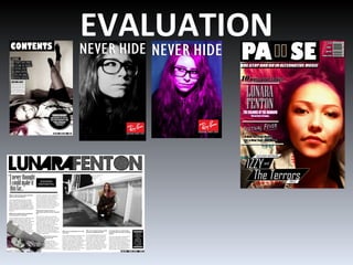
media products?
3. PRICE
BARCODE
DATE
WEBSITE
EYE
CONTACT
COVER LINES
C- SHAPED EYE
FLOW
My magazine is an alternative music magazine that comes out
monthly for £3.50. The magazine focus’ on alternative, indie, folk,
rock and underground music.
4. Conventions that I have
used on the front cover:
I wanted to use is the
eye contact with the
model; this is because I
think that it gives a
direct feel to the reader
and also makes it eye
catching.
I also decided to have a
slightly busy cover with
a lot of cover lines and
kickers.
Conventions that I challenged:
•I used the rule of thirds with my model being on the right hand side on my cover whereas
most covers put their model in the centre.
•On my cover photograph the model is lying down I did this to give the magazine an edgy
arty looking feel.
•I used more than three different fonts and magazines usually stick to three different fonts.
•My masthead doesn’t go all the way across the top it like most magazines, it is on the left
hand side with the barcode next to it.
5. My masthead challenges normal
conventions as it is very unconventional
because it has a pause sign as the U
and it has a black background. It also
doesn’t go all the way across the page.
It was inspired by Wonderland
magazine which is a very arty
alternative magazine.
6. Conventions I used in my
My contents page challenges normal conventions contents page were:
because: •I put an editors note from
•In the image my model is lying down me which most magazines
•I only put a couple of editorial pillars that I thought were the have.
most important things •I put a subscriptions
•I used black boxes behind the text which was inspired by section.
Dazed and Confused magazines unconventional TOC
7. I have kept to some of the conventions used
in a music magazine double page spread
such as:
Slugs
pull quotes
I challenged normal Double page spread conventions by:
•Not have one page specifically for a photo.
•Using monochrome colours.
•Having a C shaped eye flow going from right to left and then back.
•The image is on the right hand side instead of the left which is the conventional way for magazines to
have it.
•Using two small images instead of one large image.
8. I chose to do my advert
for Ray-Ban because it
appeals to my target
audience who are young
and into the up to date
fashions and Ray-Ban is
a very well known
fashionable brand.
I also made these two adverts
inspired by Ray ban's never hide
campaign on Photoshop. I
decided to do one in colour as
well as the black and white one
because they had another
campaign called Never Hide-
Colourise.
9. How does your media
product represent
particular social groups?
10. TARGET AUDIENCE
YOUNG ADULTS: 16-15
MOSTLY FEMALE
UP TO DATE WITH
MUSIC AND FASHION.
AVERAGE
INTELLIGENCE
FOLLOWERS OF MUSIC
AND CULTURE.
11. Demographics
My audience demographic would be
social groups B and E.
My readers would mostly be creative
and into fashion and music and a lot of
them would be younger therefore
unemployed students or casual workers.
That is why my magazine is only £3.50
12. Psychographics
My readers would mostly be aspirers
and explorers because they are
fashion conscious, always wanting to
know what the coolest new music is
and they want something different and
exciting.
13. What kind of media institution
might distribute your media
product and why?
14. IPC Media Bauer Media
NME – would be a strong competitor Q Magazine is distributed by them –
as they are already a very successful however their target audience is different to
magazine and could cause my own as it reaches over 25 year olds
cannibalism.
They reach more women then men Kerrang has a different type of audience as
and my own magazine targets both. well and the main genre of the magazine is
rock
◘There is a gap in this market for my own
publication as my audience is 16-25 year olds
and the genre of pause is alternative.
15. Bauer Media
I chose Bauer Media because even though it already has two music
magazines, Pause is a completely different genre to those and reaches a
different audience. I also liked Bauer Media because it uses online media
and it publishes globally.
17. The language:
• Colloquial, conversational
•Using words such as “Exclusive” and
“Must have”
• I used a young model so that my
target audience can relate.
•I included cover lines about things like
festivals which people of my audiences
age usually go to.
•My audience are very arty creative
people with their own outgoing styles
so I made my model have pink hair to
relate to all the young hipsters and
aspirers.
•I put the website URL on to keep up
with advancing technology as
everyone using the internet all the
time everyday.
18. The language used:
Colloquial, authoritative
• I used a young model so that my
target audience can relate.
•I made the subscriptions sections offer
35% off all concerts and gigs that Pause
sponsors, this addresses my audience
because they are young and want to go
out and have a good time but they are
probably also not very wealthy so this
would be a good deal for them.
•I put the website URL on to keep up
with advancing technology as everyone
using the internet all the time
everyday.
19. The language used:
Colloquial, humorous
•I addressed my
audience by using
a young model as
my audience can
relate.
•I put the website
URL on to keep up
with advancing
technology as
everyone using the
internet all the time
everyday.
•I put a slug that
tells the audience
they can receive a
free download.
20. Ray- Ban is a very popular well know brand. It is seen as very
fashionable and my readers are fashion conscious so these
adverts target them. The adverts also have a quite arty fell to
them and my readers would be very creative.
21. What have you learnt about
technologies from the process of
constructing this product?
22. PHOTOSHOP:
I learnt how to edit images to hide
blemishes and scars
I also learnt how to change lighting
and contrast levels within the picture
How to put the grid up to make
everything inline.
I learnt how to simplify and edit text.
I also learnt how to change the colour
of things e.g Lunaras hair.
23. On Photoshop I edited the image and turned Lunara’s hair and
eyebrows pink to give her and edgy alternative look. I also
made the image a bit more contrasted and I added eye shadow
to match her hair.
24. I used this to upload presentations and
publications
All I had to do was to paste the URL or
embedded link into compose and then giving it a
title and publishing it.
25. •Makes it easier to upload PowerPoint
presentations onto the blog because you just
need to paste the embedded link and then
press upload.
•It also gives the presentations a more
professional clean feel.
26. Looking back at your preliminary
task, what do you feel you have
learnt in the progression from it to
the full product?
27. I think that the
improvements that I
have made with my
music magazine are:
making the cover
lines stand out from
the background
Using a more simple
photo
Barcodes
The model has eye
contact with the reader
Keeping the layout
clear
28. I think that the
improvements that I
have made with my
music magazine are:
Using a more simple
photo
Having a
subscriptions section
Having an editors
note
The model has eye
contact with the reader
Keeping the layout
clear