SlideShare ist ein Scribd-Unternehmen logo
1 von 7
Poster and Magazine Cover
Analysis
The image                                                                                             The tagline
The close up shot of both faces is                                                                The tagline ‘Chucky Gets
mysterious as you can only see                                                                    Lucky’ is a mysterious
half a face which hides half of the                                                               tagline which gets
identity, keeping the audience                                                                    audience thinking of who
thinking. The image is in black and                                                               Chucky is and what the
white however the image on the                                                                    concept is behind the
left has stiches whereas the                                                                      story as the tagline does
image on the right does not which                                                                 not give away the story
shows the image on the left may                                                                   but it gets the audience
be the villain of the story. The                                                                  thinking who chucky.
image fades into the darkness
again giving a mysterious vibe and                                                                     The Title
hiding identity.
                                                                                                The ‘bride of’ is in red which
The Extra Strapline                                                                             connotes danger, blood,
‘The Honeymoon’s going to be a                                                                  death and passion, making it
killer’ links in with the title                                                                 stand out from the dark black
‘Bride’. This extra strapline gives                                                             background whereas
away a bit of the story as the                                                                  ‘CHUCKY’ is in white and bold
world ‘killer’ may indicate to a                                                                text which shows whoever
slasher movie. This conforms to                                                                 ‘chucky’ may be is more
Barthes pleasure of Text theory                                                                 dominant and also the lead
where the audience guess what                                                                   character as the text is very
will happen and seeing this                                                                     bold and strong.
strapline gives them pleasure to            The Credits
go watch it.                  There is information of the producers and all the people
                                                                                                    The Date
                              involved in making ‘The bride of Chucky’. The production    The date is at the very bottom of the
                              logo makes dedicated members of the audience wanting        page and it is ironic that the film will
                              to go and see the film because they know that it is a big   be releasing on Halloween.
                              budget and at high quality.
The image                                                                                       The tagline
Having the image of the house                                                           The film ‘SAW’ and
in the background instantly tells                                                       ‘PARANORMAL ACTIVITY’ have
us that the location will be set                                                        been successful films in the past.
in a house. We can also see a                                                           Fans of ‘SAW’ and PARANORMAL
shadow in the window of a hand                                                          ACTIVITY’ are likely to go watch
which confuses the audience                                                             the film and this conforms to
between the supernatural and                                                            Barthes pleasure of text theory
slasher genre. The medium close                                                         where the audience guess what
up shot of the boy has his eyes                                                         will happen and seeing this play
scratched out which indicates                                                           out gives them the pleasure.
that he may be possessed and                                                                     The Title
he may be the lead character as                                                         The title ‘INSIDIOUS’ is in white
his placed in front of the house.                                                       which stands out and it sums up
The sky in the image is dark and                                                        the content of the film and the
gloomy which is a horror                                                                supernatural subgenre it
paradigm as horror movies do                                                            belongs to. This is Barthes
not show a bright sunny day as it                                                       ‘’Pleasure of text theory in
is always dark.                                                                         action as the audience can guess
                                                                                        what the film is about but want
Fan comment
                                                                                        to view the film to see it play
‘SO SCARY’ instantly draws in                                                           out.
the audiences attention as the 5
                                     The Credits                        Website            The Extra Strapline
star awarded film attracts the
                               There is information of the producers Website is         The extra strapline gives away a
audience to believe in the
                               and all the people involved in making given to           bit about the film because we
comment and so that the
                                                                        promote the     now know that the house is not
viewers can go and watch the ‘Insidious’. The production logo makes
                               dedicated members of the audience        film further.   haunted but the boy maybe. This
film.
                               wanting to go and see the film because                   may make the audience want to
                               they know that it is a big budget and at                 go watch the film to find out who
                               high quality.                                            is haunted.
The Title                                         The image
 The title ‘Demonic Toys’ is               The image of toys and a clown
 written in two different fonts.           looks creepy and the extra strap
 ‘Demonic’ emphasises on the               line makes it even more scary as
 genre of demons and                       the strapline connects to the
 supernatural horror where toys            image. The toys are directly
 become alive. The crayon style            looking at the audience. The
 text of ‘Toys’ emphasises on the          background looks like a fire
 child like behaviour as children          which resembles danger. The
 play with toys and crayons.               image takes up most of the
                                           poster and the image makes the
                                           poster look more dramatic with
                                           the green background.

                                           The Extra Strapline
                                           The strapline ‘They want to play
                                           with you’ talks to the audience.
                                           The ‘you’ positions the audience
                                           in the victim’s place which
  The Credits                              creates fear. The font is coloured
                                           in blue which stands out against
There is information of the producers      the black background.
and all the people involved in making
‘Demonic toys’. However this is a old
film which was made in 1992 where
the technology was not so advanced as
today but the movie was still a big hit.
The Banner                                                                      The Masthead
                                                                        The masthead is bold and
The yellow colour font stands                                           eye-catching with red which
the banner out from the dark                                            connotes danger with the bright
background. The yellow is                                               yellow outline. The masthead is
constantly used throughout the                                          placed in front of the image
magazine keeping white and                                              making the masthead stand out.
yellow and a bit of red as the                                          In addition this magazine is not
theme colour.                                                           well known as the ‘Empire’
                                                                        magazine normally places there
The image                                                               images in front having the
                                                                        masthead hidden behind as
The medium close up shot is
                                                                        many people are aware of the
very bold and stands out as the
                                                                        magazine.
cuts in the dolls face are sharp
and edgy making the magazine
look eye catching. The knife                                                 The main cover line
which is a horror paradigm has
been used as an image which                                             The main cover line ‘’Child’s
reflects another image in the                                           play’’ relates to dolls, children
knife of another doll.                                                  and playing. The main cover line
                                                                        is tilted which may show
Barcode                                                                 something is wrong relating to
                                                                        the knife and fearful image in
The barcode is positioned on the                                        the background.
bottom left hand side in a          Website
vertical position. A barcode is     There is a website link placed on
necessary for it to be scanned in   the right hand side at the
the shops.                          bottom of the page for fans to
                                    get more information on about
                                    the magazine.
The Banner                                                                                       The Masthead
The green font colour of the                                                                The issue number, price and date of
banner blends it with the green                                                             publication are positioned between
theme of the magazine keeping the                                                           the ‘’M’’ which is a convention for
colours simple to green, white and                                                          Empire magazine. The small font is
black throughout. The banner                                                                not very noticeable for readers as a
provides an incentive for readers                                                           result, it is the last thing readers
who my wish to collect the covers.                                                          look at. The ‘’Empire’’ has a green
It is positioned at the top of the                                                          outer glow which correlates with the
page making it visible for readers.                                                         green colour scheme.
The Film Title                                                                                    The image
It is clear as to what film this                                                           The image is a extreme close up shot
edition will feature as it is shown                                                        of as Joker which instantly stands out
on the front cover. The                                                                    from the other magazine covers on
juxtaposition in ‘’summer’’ and                                                            the shelf. The readers are attracted to
‘’scary’’ mirrors the juxtaposition                                                        the front cover through direct eye
of the ‘’mass murdering clown’’                                                            contact. The red paint on the lips and
which conveys that the film will be                                                        smeared across the face could be
unique.                                                                                    blood which highlights the sadistic
The cover line                                                                             nature of the clown. The white fast
                                                                                           gives him a ghostly, pale, deathlike
The cover line invites the reader     Extra cover line                                     appearance which creates fear for
to take a glimpse of the articles                                                          readers alongside the creepy smile.
                                      The cross is a conventional tool in Empire
featured inside and a ‘’12 page
                                      magazine covers and here it provides a neat
career special’’ on Eastwood’s                                                             Barcode
                                      ordering of the extra cover lines. Other films are   The barcode is positioned on the
career is likely to make his fans
                                      featured on the front page with short                bottom left hand side in a
want to purchase the magazine.
                                      description to engage readers.                       vertical position. A barcode is
The white font stands out against
the green background making it                                                             necessary for it to be scanned in
stand out on the cover.                                                                    the shops.
The Banner                                                                               The image
The banner features yellow text                                                      The main image is of the
that states three main areas of                                                      showcased film which is
horror which the magazine focuses                                                    insidious. Face is centred and
on.                                                                                  the light source is a candle,
                                                                                     while the background is dark
                                                                                     and scary. The image is
Masthead                                                                             mysterious as the eyes have a
                                                                                     black shade and the image
Sharp, font, made to look like fangs
                                                                                     blends in with the dark black
from each side, and they are made
                                                                                     background.
to look even more like fangs
because they are white with blood
on them.                                                                             The cover line
                                                                                     Cover lines are coloured in
The plug                                                                             white and red keeping the
                                                                                     coloured theme the same
This text tells readers that they can                                                throughout the magazine.
expect four posters included within                                                  Like most magazines
the magazine, this will encourage                                                    ‘Fangoria’ shows readers what
them to buy it.                                                                      to expect within the
                                                                                     magazine.

                                                The magazine has a very old fashioned feel to it. The font used is
        Four films on a video reel that is
                                                the kind you would find on a 1960s painted horror magazine. By
        most likely the films that are listed
                                                looking at this magazine and the demonic toy poster and the new
        above or are included in the
                                                empire magazine you can see how technology has changed and
        magazine at some point.
                                                developed and how the conventions of magazine and posters have
                                                stayed the same.

Weitere ähnliche Inhalte

Was ist angesagt?

Film poster analysis
Film poster analysisFilm poster analysis
Film poster analysis
edaozdemir
 
Assignment 15 finished research
Assignment 15   finished researchAssignment 15   finished research
Assignment 15 finished research
Rosiezein
 
Assignment 15 finished research
Assignment 15   finished researchAssignment 15   finished research
Assignment 15 finished research
ChelseaFashole
 
Research into Existing Thrillers
Research into Existing ThrillersResearch into Existing Thrillers
Research into Existing Thrillers
Megan Freestone
 
Film poster annotations (2)
Film poster annotations (2)Film poster annotations (2)
Film poster annotations (2)
ruwaydah13
 
Title Research
Title ResearchTitle Research
Title Research
louise1577
 
Opening credits inspiration
Opening credits inspirationOpening credits inspiration
Opening credits inspiration
churchillmedia
 
Posters
PostersPosters
Posters
fbobby
 
Assignment 11 draft 6-1 - part 2
Assignment 11   draft 6-1 - part 2Assignment 11   draft 6-1 - part 2
Assignment 11 draft 6-1 - part 2
Abc Abc
 
Assignment 16draft 3
Assignment 16draft 3Assignment 16draft 3
Assignment 16draft 3
ceriseoliviaa
 
Assignment 16draft 3
Assignment 16draft 3Assignment 16draft 3
Assignment 16draft 3
Kella94
 
A2: Research & Planning - Trailer Analysis: Hostel
A2: Research & Planning - Trailer Analysis: HostelA2: Research & Planning - Trailer Analysis: Hostel
A2: Research & Planning - Trailer Analysis: Hostel
SabaMedia
 
Media2014 poster analysis
Media2014 poster analysisMedia2014 poster analysis
Media2014 poster analysis
Jake Shelvey
 
Assignment 15 finished research
Assignment 15   finished researchAssignment 15   finished research
Assignment 15 finished research
lcuk
 

Was ist angesagt? (17)

A2 Media Coursework
A2 Media CourseworkA2 Media Coursework
A2 Media Coursework
 
Evaluation
EvaluationEvaluation
Evaluation
 
Evaluation
EvaluationEvaluation
Evaluation
 
Film poster analysis
Film poster analysisFilm poster analysis
Film poster analysis
 
Assignment 15 finished research
Assignment 15   finished researchAssignment 15   finished research
Assignment 15 finished research
 
Assignment 15 finished research
Assignment 15   finished researchAssignment 15   finished research
Assignment 15 finished research
 
Research into Existing Thrillers
Research into Existing ThrillersResearch into Existing Thrillers
Research into Existing Thrillers
 
Film poster annotations (2)
Film poster annotations (2)Film poster annotations (2)
Film poster annotations (2)
 
Title Research
Title ResearchTitle Research
Title Research
 
Opening credits inspiration
Opening credits inspirationOpening credits inspiration
Opening credits inspiration
 
Posters
PostersPosters
Posters
 
Assignment 11 draft 6-1 - part 2
Assignment 11   draft 6-1 - part 2Assignment 11   draft 6-1 - part 2
Assignment 11 draft 6-1 - part 2
 
Assignment 16draft 3
Assignment 16draft 3Assignment 16draft 3
Assignment 16draft 3
 
Assignment 16draft 3
Assignment 16draft 3Assignment 16draft 3
Assignment 16draft 3
 
A2: Research & Planning - Trailer Analysis: Hostel
A2: Research & Planning - Trailer Analysis: HostelA2: Research & Planning - Trailer Analysis: Hostel
A2: Research & Planning - Trailer Analysis: Hostel
 
Media2014 poster analysis
Media2014 poster analysisMedia2014 poster analysis
Media2014 poster analysis
 
Assignment 15 finished research
Assignment 15   finished researchAssignment 15   finished research
Assignment 15 finished research
 

Ähnlich wie Poster and magazine cover analysis

Ähnlich wie Poster and magazine cover analysis (20)

Film Poster Analysis
Film Poster Analysis Film Poster Analysis
Film Poster Analysis
 
Horror film trailer research
Horror film trailer research Horror film trailer research
Horror film trailer research
 
Mise
MiseMise
Mise
 
Research into similar magazines and posters
Research into similar magazines and postersResearch into similar magazines and posters
Research into similar magazines and posters
 
Poster Analysis
Poster AnalysisPoster Analysis
Poster Analysis
 
The Dark Knight Analysis
The Dark Knight AnalysisThe Dark Knight Analysis
The Dark Knight Analysis
 
Thriller poster analysis
Thriller poster analysisThriller poster analysis
Thriller poster analysis
 
Trailer analysis hates outline
Trailer analysis   hates outlineTrailer analysis   hates outline
Trailer analysis hates outline
 
Cape fear 9 frame analysis
Cape fear 9 frame analysisCape fear 9 frame analysis
Cape fear 9 frame analysis
 
Horror posters analysis
Horror posters analysisHorror posters analysis
Horror posters analysis
 
Film Poster Analysis Hide and seek
Film Poster  Analysis Hide and seekFilm Poster  Analysis Hide and seek
Film Poster Analysis Hide and seek
 
Se7en
Se7enSe7en
Se7en
 
Thriller poster analysis
Thriller poster analysisThriller poster analysis
Thriller poster analysis
 
#
##
#
 
Horror film poster analysis.
Horror film poster analysis.Horror film poster analysis.
Horror film poster analysis.
 
'Se7en' 9 shot analysis
'Se7en' 9 shot analysis'Se7en' 9 shot analysis
'Se7en' 9 shot analysis
 
The rite
The riteThe rite
The rite
 
Analysis of Ancillary Poster
Analysis of Ancillary PosterAnalysis of Ancillary Poster
Analysis of Ancillary Poster
 
The sinister poster
The sinister posterThe sinister poster
The sinister poster
 
Poster analysis
Poster analysisPoster analysis
Poster analysis
 

Poster and magazine cover analysis

  • 1. Poster and Magazine Cover Analysis
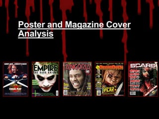
  • 2. The image The tagline The close up shot of both faces is The tagline ‘Chucky Gets mysterious as you can only see Lucky’ is a mysterious half a face which hides half of the tagline which gets identity, keeping the audience audience thinking of who thinking. The image is in black and Chucky is and what the white however the image on the concept is behind the left has stiches whereas the story as the tagline does image on the right does not which not give away the story shows the image on the left may but it gets the audience be the villain of the story. The thinking who chucky. image fades into the darkness again giving a mysterious vibe and The Title hiding identity. The ‘bride of’ is in red which The Extra Strapline connotes danger, blood, ‘The Honeymoon’s going to be a death and passion, making it killer’ links in with the title stand out from the dark black ‘Bride’. This extra strapline gives background whereas away a bit of the story as the ‘CHUCKY’ is in white and bold world ‘killer’ may indicate to a text which shows whoever slasher movie. This conforms to ‘chucky’ may be is more Barthes pleasure of Text theory dominant and also the lead where the audience guess what character as the text is very will happen and seeing this bold and strong. strapline gives them pleasure to The Credits go watch it. There is information of the producers and all the people The Date involved in making ‘The bride of Chucky’. The production The date is at the very bottom of the logo makes dedicated members of the audience wanting page and it is ironic that the film will to go and see the film because they know that it is a big be releasing on Halloween. budget and at high quality.
  • 3. The image The tagline Having the image of the house The film ‘SAW’ and in the background instantly tells ‘PARANORMAL ACTIVITY’ have us that the location will be set been successful films in the past. in a house. We can also see a Fans of ‘SAW’ and PARANORMAL shadow in the window of a hand ACTIVITY’ are likely to go watch which confuses the audience the film and this conforms to between the supernatural and Barthes pleasure of text theory slasher genre. The medium close where the audience guess what up shot of the boy has his eyes will happen and seeing this play scratched out which indicates out gives them the pleasure. that he may be possessed and The Title he may be the lead character as The title ‘INSIDIOUS’ is in white his placed in front of the house. which stands out and it sums up The sky in the image is dark and the content of the film and the gloomy which is a horror supernatural subgenre it paradigm as horror movies do belongs to. This is Barthes not show a bright sunny day as it ‘’Pleasure of text theory in is always dark. action as the audience can guess what the film is about but want Fan comment to view the film to see it play ‘SO SCARY’ instantly draws in out. the audiences attention as the 5 The Credits Website The Extra Strapline star awarded film attracts the There is information of the producers Website is The extra strapline gives away a audience to believe in the and all the people involved in making given to bit about the film because we comment and so that the promote the now know that the house is not viewers can go and watch the ‘Insidious’. The production logo makes dedicated members of the audience film further. haunted but the boy maybe. This film. wanting to go and see the film because may make the audience want to they know that it is a big budget and at go watch the film to find out who high quality. is haunted.
  • 4. The Title The image The title ‘Demonic Toys’ is The image of toys and a clown written in two different fonts. looks creepy and the extra strap ‘Demonic’ emphasises on the line makes it even more scary as genre of demons and the strapline connects to the supernatural horror where toys image. The toys are directly become alive. The crayon style looking at the audience. The text of ‘Toys’ emphasises on the background looks like a fire child like behaviour as children which resembles danger. The play with toys and crayons. image takes up most of the poster and the image makes the poster look more dramatic with the green background. The Extra Strapline The strapline ‘They want to play with you’ talks to the audience. The ‘you’ positions the audience in the victim’s place which The Credits creates fear. The font is coloured in blue which stands out against There is information of the producers the black background. and all the people involved in making ‘Demonic toys’. However this is a old film which was made in 1992 where the technology was not so advanced as today but the movie was still a big hit.
  • 5. The Banner The Masthead The masthead is bold and The yellow colour font stands eye-catching with red which the banner out from the dark connotes danger with the bright background. The yellow is yellow outline. The masthead is constantly used throughout the placed in front of the image magazine keeping white and making the masthead stand out. yellow and a bit of red as the In addition this magazine is not theme colour. well known as the ‘Empire’ magazine normally places there The image images in front having the masthead hidden behind as The medium close up shot is many people are aware of the very bold and stands out as the magazine. cuts in the dolls face are sharp and edgy making the magazine look eye catching. The knife The main cover line which is a horror paradigm has been used as an image which The main cover line ‘’Child’s reflects another image in the play’’ relates to dolls, children knife of another doll. and playing. The main cover line is tilted which may show Barcode something is wrong relating to the knife and fearful image in The barcode is positioned on the the background. bottom left hand side in a Website vertical position. A barcode is There is a website link placed on necessary for it to be scanned in the right hand side at the the shops. bottom of the page for fans to get more information on about the magazine.
  • 6. The Banner The Masthead The green font colour of the The issue number, price and date of banner blends it with the green publication are positioned between theme of the magazine keeping the the ‘’M’’ which is a convention for colours simple to green, white and Empire magazine. The small font is black throughout. The banner not very noticeable for readers as a provides an incentive for readers result, it is the last thing readers who my wish to collect the covers. look at. The ‘’Empire’’ has a green It is positioned at the top of the outer glow which correlates with the page making it visible for readers. green colour scheme. The Film Title The image It is clear as to what film this The image is a extreme close up shot edition will feature as it is shown of as Joker which instantly stands out on the front cover. The from the other magazine covers on juxtaposition in ‘’summer’’ and the shelf. The readers are attracted to ‘’scary’’ mirrors the juxtaposition the front cover through direct eye of the ‘’mass murdering clown’’ contact. The red paint on the lips and which conveys that the film will be smeared across the face could be unique. blood which highlights the sadistic The cover line nature of the clown. The white fast gives him a ghostly, pale, deathlike The cover line invites the reader Extra cover line appearance which creates fear for to take a glimpse of the articles readers alongside the creepy smile. The cross is a conventional tool in Empire featured inside and a ‘’12 page magazine covers and here it provides a neat career special’’ on Eastwood’s Barcode ordering of the extra cover lines. Other films are The barcode is positioned on the career is likely to make his fans featured on the front page with short bottom left hand side in a want to purchase the magazine. description to engage readers. vertical position. A barcode is The white font stands out against the green background making it necessary for it to be scanned in stand out on the cover. the shops.
  • 7. The Banner The image The banner features yellow text The main image is of the that states three main areas of showcased film which is horror which the magazine focuses insidious. Face is centred and on. the light source is a candle, while the background is dark and scary. The image is Masthead mysterious as the eyes have a black shade and the image Sharp, font, made to look like fangs blends in with the dark black from each side, and they are made background. to look even more like fangs because they are white with blood on them. The cover line Cover lines are coloured in The plug white and red keeping the coloured theme the same This text tells readers that they can throughout the magazine. expect four posters included within Like most magazines the magazine, this will encourage ‘Fangoria’ shows readers what them to buy it. to expect within the magazine. The magazine has a very old fashioned feel to it. The font used is Four films on a video reel that is the kind you would find on a 1960s painted horror magazine. By most likely the films that are listed looking at this magazine and the demonic toy poster and the new above or are included in the empire magazine you can see how technology has changed and magazine at some point. developed and how the conventions of magazine and posters have stayed the same.