
Empfohlen
Weitere ähnliche Inhalte
Andere mochten auch
Ähnlich wie MEDIA AFL2016 Magazine Reviews
Ähnlich wie MEDIA AFL2016 Magazine Reviews (10)
Kürzlich hochgeladen
Kürzlich hochgeladen (20)
MEDIA AFL2016 Magazine Reviews
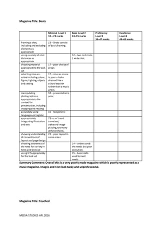
- 1. MEDIA STUDIES AFL2016 Magazine Title: Beats Summary Comment: Overall this isa very poorly made magazine whichis poorly representedasa music magazine.Images and Text look tacky and unprofessional. Magazine Title: Touched Minimal Level1 10 – 23 marks Basic Level2 24–35 marks Proficiency Level3 36–47 marks Excellence Level4 48–60 marks framinga shot, includingand excluding elements as appropriate 23 – Shots consist of basicframing. usinga variety of shot distancesas appropriate 32 – two mid shots, 1 wideshot. shootingmaterial appropriateto thetask set 17 – poor choiceof props selectingmise-en- scèneincludingcolour, figure,lighting,objects and setting 17 – miseen scene is poor –looks dressed likea school teacher rather than a music artist. manipulating photographsas appropriateto the contextfor presentation,including croppingand resizing 10 – presentation is poor. accurately using languageand register 15 – too generic appropriately integratingillustration and text 23 – can’tread sometext, awkward image placing,too many differentfonts. showingunderstanding of conventionsof layoutand pagedesign 23 – poor layoutin someareas showingawarenessof the need for variety in fonts and textsize 24 – understands the needs butpoor execution. usingICTappropriately for the task set 35 – basic skills used to meet needs.
- 2. MEDIA STUDIES AFL2016 Summary Comment: Overall this magazine attempt to replicate the professional lookmany magazineshave, but this ispoorly executeddue to lack of care and detail. Magazine Title: RNB Minimal Level1 10 – 23 marks Basic Level2 24–35 marks Proficiency Level3 36–47 marks Excellence Level4 48–60 marks framinga shot, includingand excluding elements as appropriate 35 – clear understandingof howthey want shots to beframed. usinga variety of shot distancesas appropriate 24 – variety not truly met shootingmaterial appropriateto thetask set 20- doesn’ttruly conformto music magazinestyle. Looks morelikea beauty/fashion magazinefor women. selectingmise-en- scèneincludingcolour, figure,lighting,objects and setting 20 – styled liketeen students rather than a musicartist. manipulating photographsas appropriateto the contextfor presentation,including croppingand resizing 23- croppingdone well,butresizing has madesome images look stretched. accurately using languageand register 24 – language discusses music but too generic and seems very scripted and un-natural appropriately integratingillustration and text 23- Text and images used,however someimages and text seem unnecessary. showingunderstanding of conventionsof layoutand pagedesign 24- attempts to followlayout, however not extremely clear and preciseandseems morelikeputting element where suits. showingawarenessof the need for variety in fonts and textsize 26 – understands the needs butbasic execution. usingICTappropriately for the task set 35 – basic skills used to meet needs.
- 3. MEDIA STUDIES AFL2016 Summary Comment: Overall this magazine attempt shows a clear understandingof how to create a effective andprofessional magazine,however,theirlackof knowledge and skill makes the magazine look unprofessional. Magazine Title: FUSE Minimal Level1 10 – 23 marks Basic Level2 24–35 marks Proficiency Level3 36–47 marks Excellence Level4 48–60 marks framinga shot, includingand excluding elements as appropriate 35 – clear understandingof howthey want shots to beframed. usinga variety of shot distancesas appropriate 35 – A Variety of shots used to includea Two Shot. shootingmaterial appropriateto thetask set 35 – clear shooting material thatshows genre easily. selectingmise-en- scèneincludingcolour, figure,lighting,objects and setting 25 – Miseen scene makes genreclear however lighting on contents and DPS images are poor manipulating photographsas appropriateto the contextfor presentation,including croppingand resizing 23- croppingdone well,butresizing has madesome images look stretched. accurately using languageand register 35 – language discusses music well and meet genre register well with someflaws appropriately integratingillustration and text 36 – this isdone simplybut effectively. showingunderstanding of conventionsof layoutand pagedesign 36–clear understandingof layoutand page design however there area number of flaws in their execution. showingawarenessof the need for variety in fonts and textsize 34 – understands the needs but knowledgeable execution. usingICTappropriately for the task set 35 – basic skills used to meet needs effectively.
- 4. MEDIA STUDIES AFL2016 Summary Comment: Overall this magazine is a great attempt and producing a professional looking magazine.The layout, Mise enscene,colour scheme is presentedwell due to a great knowledge and skill of Photo-editingsoftware. Magazine Title: R.A.W.R Minimal Level1 10 – 23 marks Basic Level2 24–35 marks Proficiency Level3 36–47 marks Excellence Level4 48–60 marks framinga shot, includingand excluding elements as appropriate . 48 – Greatuseof shots with cleaver exclusion. usinga variety of shot distancesas appropriate 38 – a largevariety in shots. shootingmaterial appropriateto thetask set 38 – looks and feels likea music magazinethat emphasisesits genre. selecting Mise-en- scèneincludingcolour, figure,lighting,objects and setting 50 – a greateffort has been madeto ensuremiseen sceneis effectively used. manipulating photographsas appropriateto the contextfor presentation,including croppingand resizing 38 – donewell – imageof ‘Eva’on contents agelooks slightlyodd. accurately using languageand register 47 – language discusses music genre well. appropriately integratingillustration and text 41 – Positioningof text and images has been cleverly though about. showingunderstanding of conventionsof layoutand pagedesign 49 – Layoutand pagedesign iswell executed. showingawarenessof the need for variety in fonts and textsize 50 – great understandingof the need for variety in fonts and text size usingICTappropriately for the task set 50 – great knowledgeand skill to useICTwell for the task.
- 5. MEDIA STUDIES AFL2016 Minimal Level1 10 – 23 marks Basic Level2 24–35 marks Proficiency Level3 36–47 marks Excellence Level4 48–60 marks framinga shot, includingand excluding elements as appropriate 60 – Greatuseof shots onlyusingthe aspects of shots needed usinga variety of shot distancesas appropriate 57 – A variety of shots used to providea professional look. shootingmaterial appropriateto thetask set 55- All shotsused areappropriateand supportgenre perfectly,making the magazinelook professionally. selectingmise-en- scèneincludingcolour, figure,lighting,objects and setting 60 – miseen scene is perfectly executed to support genre and the magazine’sstyle. manipulating photographsas appropriateto the contextfor presentation,including croppingand resizing 55- the cropping and resizingof images isdoneto a professional standard and providesa well presented look. accurately using languageand register 55 – language relates to themusic genre well and discusses artistlike a real magazine. appropriately integratingillustration and text 60- The images used for the magazinefitthe purposeand genres very well. showingunderstanding of conventionsof layoutand pagedesign 49 – Layoutand pagedesign iswell executed. showingawarenessof the need for variety in fonts and textsize 55 – great understandingof the need for variety in fonts and text size usingICTappropriately for the task set 50 – great knowledgeand skill to useICTwell for the task and the skillsareused to makea very professional magazine.
- 6. MEDIA STUDIES AFL2016 Summary Comment: Overall this magazine attempt to replicate the professional lookmany magazineshave and it has hit it withperfection. The designimplementsastyle that you would mistake for a real magazine and therefore hashit the highestmarks.