💫✅jodhpur 24×7 BEST GENUINE PERSON LOW PRICE CALL GIRL SERVICE FULL SATISFACT...
Graphic design products for chad
1. She settled on choosing to illustrate a 3D
alternate reality wireframe, featured in the
book. After storing away information about
aspects of the novel that she had read
and works that related to these themes
and aspects, Rebecca had confidently
built up a strong idea of what she wanted
to create on the cover. All significant
aspects of her preparation up to that point
had all merged together to form a strong
final plan.
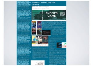
Rebecca Lemker s blog post
analysis
Rebecca Lemker outlines the
stages that she had gone through
in order to produce the book
jacket for “Enders Game”. At the
beginning of her post she states
that this is because she was
always encouraged to keep a
special “progress book” by her
professor on her graphic design
studio course. I agree that it is
important to show a record of your
progress as it dives deeper into
how you deal with such tasks and
can also be used to influence
others.
She started off with an essential
researching process which
involved looking back a previous
covers and re-reading the book.
Most people seem to rush this
process but Iʼve realised how
important it is to make sure
youʼve picked up on all of the
recurring themes like Rebecca
has. What makes this process
quite is the fact that you donʼt
have to by any means copy
what has been previously done.
Lemker confirms that she wants
to take a different route to the
original, 80ʼs and 90ʼs covers.
She decides to go for a 3D
approach but with the same eye
catching quality. I really like the
idea of using visuals of previous
works to fuel your own
innovation. Iʼll certainly attempt
to do so in my design project!
She then built a small mood
board
featuring images that matched
the concept of her new idea.
These images both relate to the
recurring themes picked up in the
book and the new modern 3D
idea she has now developed.
Mood boards like this hold alot of
elements that can quite easily be
added to a new piece and are
therefore very handy.
As Lemker goes on to explain,
“the next stage, naturally, is
sketching”. She explains how she
drew lots of sketches, mainly
disregarding their quality and
sorting them by significance
later, so that she could just
get alot of her floating ideas
and concepts written down in
a short amount of time. I feel
Things began to fall further into place as she pulled the idea of a
radar screen from the book and related it to her developed idea
of 3D alternate reality wireframe. Again, she was using
information possibly gathered from early research to enhance
her fast developing final idea.
Then, after deciding to settle on an idea of drawing a spaceship,
she put together a second board of different Enders Game
spaceship designs. General mood boards like this visually
contrast and compare different images
which are able to be collaborated.
Using the board, she sketched out her
own spaceship design, this also lead
her onto laying out some ideas for the
composition of the dust jacket.
However, Rebecca didnʼt just sketch out one
“final design” she sketched out just over half a
dozen and then found one to settle on. This is
a great technique to use as it really is
important that you
settle for the
best you can do,
not just the first
idea that springs
to mind.
She later
conducted a
type study, to find
the correct font to use for the title and cover
lines. She again, created an effective mood
board whilst also lining up those fonts to the
picture, to see how theyʼd truly fit with the
overall theme.
After deciding that the type sheʼd picked was
too blocky, she continued to work on the font
and match it with an appropriate colour
scheme and the finished spaceship design.
She limited her type study. Itʼs great to narrow
things down to a smaller collection sometimes,
as it halts the subconscious pressure you feel
to just pick one! After pushing her previous
“wireframe” idea into her design, finding an
appropriate font and
settling on a darker colour
2. Fruit ninja, a game that focuses not so much on a
digital character but rather on digital objects, was
more open to a range of different interpretations
within the icon design as there is no personal or
emotional connection shared between the player
and a particular individual in the game apart from a
physical interaction with the sabre.
The East Asian theme and setting has been carried
into the logo, which features a background layered
with a texture that looks just like bamboo. The
sabre, that is illuminated effectively (perhaps to
convey to the user that it is in fact the primary
weapon/character) slants strongly directly on the
diagonal line that shoots up from the bottom left
hand corner of the icon to its top right. The two
halves of the watermelon sit predominantly within
the centre circle with their ends emerging just
outside. The juice splatters are not organised as
neatly, yet most of it occurs in the bottom left
square of its grid.
The juice of the chopped watermelon (which appears to have been selected as the default fruit, perhaps
for its juiciness) shown to be splattered across the screen of the icon to add a sense of depth to it,
whilst the juice splatters themselves are coloured with a slight transparency to add a lack of depth to
their texture, which is realistic in ways.
The colour scheme uses many shades of the same colour to provide an effective method of shading.
For instance, 3 shades of red are used to add detail to centre of the inside of the watermelon by
layering it up them. 6 shades of green are also used to master the pattern of the watermelon’s outer
shell. Many different variations of beige, including a very dark brown, have been implemented to
texturise the background in a realistic, natural bamboo colour.
3. Breaks?
The UK employment
law states that for
every 6 hours of
working at a
computer you should
receive a 20 minute,
uninterrupted break.
Ergonomics
Computer Health and Safety for Graphic designers
As Laptops are not particularly designed for long work periods, they can be used for 10 -15 minutes
as they are. However, if youʼre using one for an hour or more, it is important that you use the correct
posture. Laptop use is a major source of musculoskeletal problems. An ideal way to use a
laptop, that would eliminate all posture related problems would be to use a laptop stand and
possibly a separate keyboard and mouse. Laptop stands, that start off at the £20 price mark, a
great for keeping great posture and prevent the neck, back and arm pains that can be experienced
through bad posture.
Leeds student medical practice
BAD POSTURE: Arching your
back like this lady over a
laptop for a long period of time
can lead to pain and injury to
the lumbar region of your
back.
The same injuries can be obtained whilst sitting at a desktop computer.
Here are some ways that you can make your ergonomic setup safer for
you:
The space under your desk should allow you to place your legs
underneath without twisting or leaning, or being squashed under
a low desk.
Ensure your wrists are not bent, use a wrist-rest.
Ensure the chair back is adjusted so that your upper body is relaxed
and supported
Adjust your screen position - the top of the screen should be level with
your eyes and you will then naturally look at the centre of the screen. If
using a CRT monitor it may be necessary to move your desk away
from the wall, so that you can push the monitor further away from your
head to create a comfortable viewing distance. Ensure that tired eyes/
headaches may result in problems relating to reading your screen.
Ensure you do not have reflections or glare and if necessary try moving
your screen to a different angle. Avoid sitting with windows or lights
directly in front or behind your screen. If possible, sit with the screen at
right angles to light coming through windows, if not use window blinds
or curtains to cut out the light. Adjust the brightness and contrast
controls on the screen to suit lighting conditions. Remember to keep
your screen clean, and have your eyes tested regularly
Graphics Tablet safety
Much like a computer mouse, a graphics tablet and pen require the hand and fingers to make alot of short,
exact, strained movements. If this happens for a long period of time this can cause pain and soreness in
the top of the hand, around the wrist and along the forearm whilst it can also cause the Formulation of
painful nodules, and in the later stages, ganglion cysts, around the joints and along
the tendons and cause numbness and tingling around the index finger and thumb.
Repetitive Strain Injury (RSI), is a painful, lengthy injury that can occur if you do the same thing all the time with alot
of pressure and strain focusing on a specific part of your body.
Obviously, this injury could prevent you from further use of a graphics tablet all together,
so here are some tips on how to prevent it: Source - NHS
Make sure your overall set up is comfortable and that yourʼe putting the least amount on your fingers possible.
4. Platform banner
Title Character
Title
PEGI rating Developer name
Online
compatibility
!"#$%&'()*+,-%."/*+%(-%0"11*)%$2%03*%456,-%$7'.8%$'99*+:%!"%03*%7*;%"<%03*%
$'99*+%-(0-%03*%9'#*%"<%03*%17'="+#>%0"%03*%+(?30>%03*%@07*%'9)%7"?"%"<%03*%
"97(9*>%47'2-0'@"9%A*0B"+8:%C9)*+9*'03%03*%03(9%+*)%7(9*%$"+)*+(9?%"D%03*%
$'99*+%<+"#%03*%'+0B"+8%(-%'%-1'.("E-%2*0%/*+2%)*0'(7*)%1(*.*%"<%'+0:%F'+'%
G+";>%03*%1+(9.(1'7%.3'+'.0*+>%-0'9)-%0'77%'9)%)"#(9'0*-%03*%#())7*%"<%03*%
."/*+>%-3(9(9?%'9)%?7(-0*9(9?%B(03%+'(9%B'0*+%'9)%3"7)(9?%3*+%B"E9)*)%'+#>%
B3(.3%$7"")%'11*'+-%0"%$*%+E99(9?%)"B9:%53*%(-%3"7)(9?%3*+%$"B%)"B9B'+)-%
'9)%-1"+@9?%'9%()7*%?7'+*>%."9H+#(9?%03'0%-3*%(-%.E++*9072%9"0%*9?'?(9?%(9%'92%
-"+0%"<%$'I7*:%J"B*/*+>%03*%$'.8?+"E9)%*9/(+"9#*90%-E??*-0-%03'0%03(-%B(77%
9"0%$*%<"+%7"9?%'-%0*K0E+*%"<%03*%.+'-3(9?%B'/*-%)*#"9-0+'0*-%03*#%.+'-3(9?%
(90"%03*%.'/*>%<+"#%B3*+*%"E+%1*+-1*.@/*%7(*-:%!3*+*%(-%B3'0%'11*'+-%0"%$*%'%
-3(1B+*.8%LE-0%"E0-()*%"<%03*%.'/*%$E0%03*%'+@-0%3'-%.3"-*%9"0%0"%+*/*'7%0"%
#E.3%"<%03(->%0"%1*+3'1->%*9@.*%03*%17'2*+%(9%0"%H9)%"E0%)E+(9?%?'#*17'2:%!3*%
4MNO%+'@9?>%)(-@9?E(-3*)%<+"#%03*%$7'.8>%)+*'+2%$'.8)+"1%B(03%(0-%+*)%$"K>%
-(0-%(9%03*%$"I"#%7*;%."+9*+%"<%03*%."/*+>%B3(7-0%LE-0%03*%)*/*7"1*+,-%.+*)(0-%
-(0%(9%03*%$"I"#%+(?30>%'))(9?%'%-*9-*%"<%-"#*B3'0%#"+*%-1'.*%0"%03*%."/*+:
Platform banner
Title
Television System
Main Character
ESRB rating
Developer Publisher
!"#$%#&'()*+,+"-./$)�.1)2"$3456$)78#9/$)-152.:51')85++.1)5-)-%.)-#3;)"-/$)<-4.)$"=+>)
&4.5146)5>5"+$-)-%.)?%"-.)85&'>1#@+2;)?"-%)5)35A.1+)#B)"-/$)-152"<#+54)#@1$)-#)-%.)
1">%-)#B)-%.)85++.1C)D%.)&5$.)"$)54$#)#@1.2)"+)78#9/$)81">%-)>1..+)-152.:51')#@1C)
D%.)-.4.0"$"#+)$6$-.:;)EDFG;)?%"&%)-%.)>5:.)"$)&#:35<84.)?"-%;)$"-$)%@:846)58#0.)
-%.)>5:.)$.1".$/)<-4.;)?%"&%;)345-.2)5>5"+$-)5+)5+<H@.)4##'"+>)1@$-6)$%".42;)?"-%)
35-1"#<&;)4#654)$-51$)345&.2)@+2.1+.5-%;)"$)$315?4.2)&#+,2.+-46)5&1#$$)-%.)-#3)#B)-%.)
�.1C)D%.)I"+,+"-.J)$3.&",&5<#+)5&-$)54:#$-)4"'.)5)$@8)%.52.1;)$.3515-.2)#+)5+#-%.1)
$%".42;)?"-%)-%.)1.:+5+-$)#B)5)KF)L5>):.4<+>)#M)"-C)D%.)&#:8"+5<#+)#B)35-1"#<$:)
5+2)2.$-1@&<#+)"$)&#+<+@.2)?"-%"+)-%.)85&'>1#@+2;)?"-%)-%.)?1.&'.2;)N:.1"&5+)L5>)
25+>4"+>)%.434.$$46)2#?+)-%.)1">%-)$"2.)#B)-%.)�.1;)#+),1.C)D%"$)3.1%53$)%"+-$)5-)-%.)
@3-)$#&".-6)B.5-@1.2)"+)-%.)>5:.)5+2)2.>152"+>)#B)-%.)KF)>#0.1+:.+-)5+2)-%."1)
0".?$)"+)"-C)D%.)31.2#:"+5+-)B#&54)3#"+-)#B)-%.)�.1)"$)@+2#@8-.246)-%.)31#-5>#+"$-;)
!##'.1)O.P"A;)?%#)3#$.$)"+)5)&5$@54)6.-)5>>1.$$"0.)$-5+&.;)?"-%)%"$)$%#->@+)$4@+>)
#0.1)%"$)$%#@42.1;)85+25>.$)?1533.2)51#@+2)%"$)?1"$-)5+2)>1.5-)51<$<&)2.-5"4)3@-)
"+-#)%"$)&4#-%"+>)5+2)5$3.&-$)#B)%"$)&%515&-.1)5$):"+@-.)5$)-%.)-.9-@1.)#B)%"$)%5"1)5+2)
%"$)$-@884.C)Q"$),>@1.)"$)�.1.2)86)5+)51156)#B),1.)$351'$)-%5-)522)5)$.+$.)#B)5&<#+)
-#)-%.)$.=+>)#B)-%.)�.1)5+2)-%.1.B#1.)5)&.1-5"+)I&##4)B5&-#1J)-#)!##'.1/$)&%515&-.1;)
5$)%.)4##'$)$#)&5$@54C)D%.)RFS!)15<+>)$"-$)"+)-%.)�.1$)8#A#:)4.T)+.1)?%"4$-)-%.)
2.0.4#3.1)5+2)-%.)3@84"$%.1/$)4#>#$)$"-).H@5446)$"U.2)"+)-%.)8#A#:)1">%-C
5. Platform
Online
Compatibility
Exclusive to
platform
Title
Joel & Ellie
ESRB rating Developer
Publisher
!"#$%&'($)*$+',$-).#/$"&'$'0&11#/$230#4'3)4'5$6#347$&$89:$7&0#;$!"#$89:,'$61&-<$6&44#/$=#('$
&-/)''$("#$()>$)*$("#$-).#/5$7#?47$137"(#/$&'$3($>/)7/#''#'$()$("#$/37"(;$@4$("#$1#A$)*$("#$
6&44#/$'3($("#$4&0#$)*$("#$>1&B)/0$C"31'($("#$D(1#$&42$1)7)$)*$("#$)4134#5$81&E'(&D)4$
F#(C)/<5$'3($-1#&/1E$)4$("#$137"(#/5$/37"($'32#;$+42#/4#&("$("#$/37"($)*$6&44#/,'$23'D4-($&42$
#G#-D.#$("34$/#2$6)/2#/5$&$>&4#1$#0#/7#'5$#0>"&'3'347$")C$("#$7&0#$3'$&$81&E'(&D)4$
#H-1I'3.#5$4)($)41E$()$>/)0)(#$("#$7&0#$6I($("#$>1&B)/0$&'$C#11;$!"#$#4D/#$>#/'>#-D.#$)*$
("#$6)H$&/($3'$D(1#2$()$("#$1#A5$()$73.#$3($&$/I77#2$1))<;$J)("$("#$#4.3/)40#4($&42$("#$
&K#4D)4$)*$("#$-"&/&-(#/'$73.#$("#$7&0#$&$2#(&31#2$&42$34$2#>("$*##1$)4$("3'$).#/;$!"#$
'<E'-/&>#/'$&/#$(&11$&42$34D032&D47$&42$/3'#$C&E$&6).#$("#$3423.32I&1'5$("#$D(1#$&42$("#$
6&44#/$)*$("#$6)H5$C"31'($("#$-"&/&-(#/'5$L)#1$&42$M113#$NC")$3'$'(&42347$4#&/#/$()$>#/"&>'$
&K&34$("#$*)-I'$)*$("#$>1&E#/$&42$()$-)4.#E$("#$30>)/(&4-#$)*$"#/$-"&/&-(#/O$'(&/#$)4$34()$
("#$23'(&4-#5$()$30>1E$("#/#$3'$0)/#$34$("&($#4.3/)40#4($("&4$C"&($0##('$)I/$#E#';$!"#$
D(1#$'3('$34$&$'30>1#5$6)125$C"3(#$*)4(5$#0#/7347$*/)0$("#$-).#/,'$1#A$()$P($34$C3("$C#'(#/4$
/#&2347$>&K#/4'$&42$3'$2#-)/&(#2$C3("5$/)I7"5$61&-<$'0I27#'$()$'I6(1E$-)4D4I#$("#$/I'(E5$
&6&42)4#2$("#0#'$)*$("#$7&0#;$!"#$M9QJ$/&D47$3'$)4$("#$1#A5$("#$2#.#1)>#/,'$-/#23('$=I'($
&$13K1#$63($1&/7#/$("&4$("#$>I613'"#/,'$)4$("#$/37"(;$+42#/4#&("$("#'#$-/#23('$&-/)''$("#$
6)K)0$)*$("#$'-/##4$/3'#$')0#$61&2#'$)*$7/&''$.#/E$4#&/$()$)I/$>#/'>#-D.#5$>#/"&>'$()$
-/#&(#$&$"&42'$)4$&>>/)&-"$)/$()$-)4.#E$")C$0I-"$4&(I/#$3'$(&<347$).#/$("#$I/6&4$
-3(E'-&>#;$
Platform banner
Title
Television system
Awards sticker
Main player
types
ESRB rating
Developer Publisher
!"#$%&$''()*+,-./*0")1'$2)*34,5()*#/$0.6$/7*4$%%./*$#*#8.*#,19*"#()*:#'.*)";%<*+'.$/'2*$<$"%)#*
#8.*=8"#.*4$+7</,>%09*="#8*$*1$?./%*,&*"#()*#/$0":,%$'*+,',>/)*#,*#8.*/"<8#*,&*#8.*4$%%./@*!8.*
+$).*")*$'),*+,',>/.0*"%*34,5()*4/"<8#*</..%*#/$0.6$/7*+,',>/@*!8.*#.'.-")",%*)2)#.69*A!BC9*
=8"+8*#8.*<$6.*")*+,61$:4'.*="#89*)"#)*8>64'2*$4,-.*#8.*<$6.()*:#'.9*=8"+89*"%*4'$+79*4,'09*
+$1"#$'*$%0*&>#>/"):+*&,%#9*)#$%0)*,>#*$+/,))*#8.*#,1*,&*#8.*+,-./9*+,61'"6.%#.0*42*$*=8"#.9*
D$6.*'"7.9*0/,1*)8$0,=@*!8")*")*)8,=%*=.''*$<$"%)#*#8.*4."<.*)8$0.09*+',>02*)72*,&*#8.*
)72'"%.*4$+7</,>%09*=8,).*6,%,#,%.*$%0*+',).*/.'$:,%)*,&*+,',>/)*$%0*0")#$%#*4>"'0"%<)*$00*
4,#8*%.$#*0.)"<%*$%0*0.1#8*#,*#8.*1./+.1:,%*,&*#8.*<$6.()*.%-"/,%6.%#@*A,#*#,,*6>+8*
)1$+.*")*'.E*&,/*0")#$%+.*8,=.-./9*$)*"%*#8.*<$1*,%*#8.*/"<8#*)"0.*,&*#8.*+,-./9*$*'$4.'*4,$)#)*
#8.*<$6.()*)#$#>)*,&*="%%"%<*,-./*FG*$=$/0)@*!8.*)"H.*,&*#8.*:#$%*1/.?2*6>+8*+,-./)*#8.*
6$I,/"#2*,&*#8.*'.E*)"0.*,&*#8.*4,5*$%0*2.#*"#*")*)#$:,%$/2*$%0*,1.%@*!8.*1"',#*)..6)*#,*
+'"64"%<*,>#*"%#,*#8.*-$)#*.%-"/,%6.%#*+,%-.2.09*0.6,%)#/$:%<*#8.*<$6.()*&,+>)*,%*#8.*
8>6$%)*$)*=.''*$)*#8.*/,4,#)*$)*=.''*$)*#8.*).%).*,&*$0-.%#>/.*#8$#*#8.*<$6.*8,'0)@*!8.*
4'$+7*$%0*=8"#.*JBKL*/$:%<*)"#)*"%*"#)*#/$0":,%$'*)1,#9*#8.*4,?,6*'.E*,&*#8.*+,-./9*=8"')#*#8.*
1>4'")8./()*MJNO*)264,'*)"#)*"%*#8.*/"<8#*+,/%./*"%*$*)#2'").09*)#$61*'"7.9*#/$%)1$/.%#*6$%%./@*
!8")*'.$-.)*#8.*.%:/.#2*,&*#8.*+,-./)*',=./*1,/:,%*#,*4.*+'$"6.0*42*#8.*0.-.',1./()*
MK.)1$=%O*',<,@*!8.*4,'09*=8"#.*$%0*,/$%<.*&,%#*,&*#8."/*#.5#*$%0*',<,*)#$#.*8,=*#8.2*
+./#$"%'2*6$2*=$%#*),6.*+/.0"#*&,/*#8")*:#'.@*
10. REEL INYOUR CONSUMER THROUGH
APP ICONS
by Joshua Matthews
PressedArt
FIVEWAYS
1. Establish the theme and graphic style of your game within the artwork, yet be
creative with the texture. You need to balance conveying the nature of the game with presenting
its best potential design elements at first glance.
2. Use a unique and significant perspective for your
design.Yes, perhaps a central, 2D representation of your central feature
is the safest option to vouch for but will it make your game stand out?
3. Not too close, not too far. Get the
zooming correct.Your main feature should be
visible but not overwhelmingly close.The consumer
needs to be able to establish what it is.
4. Unless your game has good reason or the authority in
gameplay to present a minimalistic theme, avoid it.
Chances are, a simple design will probably work against you in standing
out if the game has many other competitors who share the same
theme.
5. And finally, disguise your
weaknesses. Perhaps you’ve incorporated a few
cliches into your game. Perhaps the game in general just lacks
culture, creativity and quality. If your’e unfortunate enough to
realise this post development, the least you can do is combine
all the positives into the icon in a collage of ‘quality’.That icon
is a small vent in which you can visually boast to the consumer
what your game has to offer. Either spend hours on a
innovative and good quality design of the single, defining
feature or creatively piece together a moderate amount of
significant elements of the game into the box.
12. FEEDBACK 1
For this design, I chose to adopt simple, retro style to represent the main character. I
thought about what it’d be like if we had online app stores in the 1980s. What icons
and colour scheme would they adopt? I gathered that
icons would use a simplistic colour scheme and pixel art to convey a basic idea of the
game’s theme and character but use its neat and polished look to draw consumers in
for more.
It has a basic colour scheme which does give it a quite boring look and
might not give it an eye catching design compared to other apps.
The simple design also gives any viewer an idea of what game it is as
you have included the character and skateboard.
It is very plain but also effective as it is not to complex and would
stand out well in the App Store due to the minimal but bright and bold
colour use.
You might want to use a gradient or some sort of shine to give it a
more polished look.
The character from the game has been used effectively as a logo style
in your design. This links the design with the actual game and
artwork. It also matches the pixelated design of your game.
13. FEEDBACK 2
As Chad typically skates across a flat surface, i felt that it would be
easy to incorporate Chad’s character model into this design, with him
seemingly skating across the title. I feel that this design holds
perhaps the most clarity out of my prototypes as it features three
highly significant aspects of both the assets and design of Chad: The
character model, the title and the main background.
This idea has a very eye catching colour scheme making it an attractive
piece of artwork. It also blends well together in terms of art style and
themes.
The design has a very flat look to it, but also works well as it is a pixel art
game.
The pixelated theme of you game comes across thoroughly in this
design.
14. THE IDEATHAT I’VE CHOSENTO PURSUE AND AN ACTION PLANFOR
IMPROVEMENTS
Although this idea was perhaps the most minimalistic and
could, arguably, look quite dull in comparison with my other
designs, I feel that it holds the most promising layout and basic
textures and this is the design I could probably expand on the
most and is open to the most innovative ideas.
Three improvements I could enforce upon this idea
- Add a colourful, textured edge to the currently solid and rather dull pink
background. I could perhaps decorate the shade of pink with a layer of different
shades of that same colour
- Colour Chad with a pixelated colour texture that combines his genuine colours
with his own video game theme.
-Experiment with both coordinating and contrasting different variations of pixelated
textures and their colours.
15. “Chad” Icon greyscale prototypes
This is my first greyscale prototype. At first glance, it
looks fairly neat. The background and Chad’s figure
contrast well in terms of shades. However, after I
plotted out some arrows to convey and measure the
spacing between certain features, I noticed that some
things weren’t right. Notice the large space at the top
of the icon square that isn’t present at the bottom, it
isn’t symmetrical. Chad’s hands, whilst resting
directly opposite each other and within equal spacing,
they are located a little too high up, as is the rest of
his body, which appears stretched and uneven in
proportion to the rest of the icon’s space.
I have since made several significant modifications that
have acted as vital improvements. Firstly, I’ve cut out a
proportion of Chad’s mid section and shrunk his height
in order to bring his entire body more into the centre,
towards the focal point of the icon. I also lightened up
the background so the figure shows up better and
softened the relief on the the pixels of the artwork.
Chad’s arms have been moved down into a more
central position as well.
16. APP ICON: COLOURVARIANTS
Although the game’s iconic pink shade was my
favourite from the beginning, I did explore a range of
other background colours.
I had already used colours within
Chad’s outfit and features that are
positioned at opposite sides of
the colour wheel, so I tried some
darker greens that would not
clash with the blue due to darker
tones. I feel that the brighter
green captured the vibes of Chad
rather than the darker shade.
I tried to experiment further. As I was limited in terms of the number
of complimentary colour combinations on the wheel, I took some
risks, trying out colours near to or even next to certain colours that
had already been used. Here’s two that I felt at least worked slightly,
Plum and Brown. I soon realised that these colours could never be
used to represent the game , especially the brown, as they are far too
dark and mellow compared to the bright shades of the 80’s.
18. Vests: Inspiration
I searched the internet for 80’s and 80’s influenced basketball kits
from the NBA after hearing Grandmaster Flash’sThe Message on a
music playlist I was listening to whilst working on my App icon.This
song reminded me of the colourful, urban streets of the era and
made me think basketball vests.
I found this unique and iconic kit for the Denver Nuggets. I was
immediately drawn to this design as I noticed the skyline that lines
the middle.This skyline holds a strong resemblance the buildings and
backdrop of Chad and I therefore felt that this kit was appropriate to
recreate.
I then saved a vest template from a copyright free provider and recovered the designed png file of our skyline from our original
game and place it onto the vest, just like the Nuggets vest.After experimenting with some levels regarding the skyline, I began to
research some fonts....
19. Vest Typography Ideas and Feedback
1 CHAD 2 CHAD 3 CHAD
4 CHAD 5 CHAD 6 CHAD
7CHAD 8 CHAD
Bandung Hardcore GP Collegerion Fine College
Friday Night Lights Jersey Letters JimThorpe
Lethal League Team 401
“Two thin and urban, very lean” “Quite 90’s looking but could work well” “Sketchy texture is to weak”
“Might be a bit too bold” “Chad isn’t varsity enough for this” “Shadowing gives it retro authority”
“Too rough and edgy” “Funky and sporty”
20. Vest: ColourVariants
This predominantly green colour scheme was taken from the green and pink
colour scheme of Chad as a game. I felt that the green tinted white colour would
give the main part of the vest a bigger sense of space, enough space to effectively display
the contrasting pink typography and would better contrast with the dark green inside and
piping.
The yellow and blue colour scheme was an attempt to replicate the genuine Denver Nuggets
vests.The colours all seem to contrast a little too much, but I felt its eccentric tone would
catch on to the crazy 80’s theme.
21. VEST DESIGNS: CLIENT FEEDBACK
My Client stated: “Personally, I like the second draft as it resembles an actual basketball vest as the
typography looks neater. The first draft’s typography looks a bit too spaced out and the third’s covers
the image of the skyline too much which is confusing. I enjoy the colour scheme of the fourth vest, yet
the second holds more appeal as it fits the game’s colour scheme better. “
23. Poster: Inspiration
I felt that a unique and obscure way of producing promotional material would be to create a imagined personal possession of Chad
himself. I decided that in conjunction with and like his target audience, that Chad would be a big music fan and have a favourite band.
That band would have a tour poster (like most bands of that era). I could create that poster!
Research began immediately and I scoured the web for a genuine 80’s poster for inspiration to go with the band name “Krystal
Slipper” that me and some friends had come up with.
The Cure poster on the above right, holds a black background that I thought would provide great opportunity to illustrate some
effective imagery in the same teal colour as that featured on their poster. The tour name typography, with its thin, rugged font,
influenced that which I would use in the poster as well.
I recovered a design I had saved from the web a few months ago during the making of Chad. It was a Miami poster (above left) that
looks very 80’s and, as well as matching Chad’s colour scheme only with a brighter tone, the white and pink stripes especially, caught
my eye.
This design also lead me to think of Miami and it’s neon lights which lead me to search for imagery that held a neon texture.
24. PosterTypography ideas and feedback.
1 Krystal
Slipper
1900.80.S
2 Krystal Slipper
80sTeenie
3 Krystal Slipper
Academy Engraved LET
4 Krystal
Slipper
5 Krystal Slipper
Colours of Autumn
Jazz LET
6 Krystal Slipper
GroovaliciousTweak
“Too 90’s and futuristic looking” “Doesn’t perceive an adult band”
“Very New Romantic. Too regal to represent
the essence of the 80’s
“Captures the tone of
the mid 80’s.”
“Looks more 1920’s” “This has more of a 70’s disco feel due to all
the stars”
25. Poster designs: Client Feedback
In the first design, the client liked how the title looks like an 80ʹ′s neon sign but was not sure about the space down in the left hand corner.
In the second design, the client thought the masking was effective but preferred the other design as this one’s a bit plain. Maybe try
underlining the title?
27. PRODUCTION DIARY
and consequential freelance rate
Monday May 12th - Picked a design for App Icon from colour variants. (5 mins)
Researched NBA vests for vest design. (30 mins)
Tuesday May 13th - Settled on final App icon colour scheme. (10 mins)
Created 4 vest prototypes. (45 mins)
DraftedVestTypography (20 mins)
Wednesday 14th - Researched 80’s band tour posters for poster. (10 mins)
Received feedback forVest prototypes. (20 mins)
Settled onVestTypography (5 mins)
Thursday 15th - Settled on finalVest prototype after changes and evaluated how it would work in campaign. (30 mins)
Began work on poster designs. (45 mins)
Friday 16th - Created two prototypes for Poster design. (1 hour)
DraftedTypography for Poster design (30 mins)
Settled on PosterTypography (5 mins)
Sunday May 18th - Received feedback for two Poster drafts (20 mins)
Monday May 19th - Modified design and settled on Final Poster design (1 hour)
Tuesday May 20th - Evaluated and finalised products (1 hour)
Monday May 5th - Drafted up 6 prototypes of App Icon (1 hour)
Tuesday May 6th - Evaluated which 2 of the 6 I wanted to further develop. (10 mins)
Received Feedback on the 2 I chose. Ended up settling with the character/action design. (40 mins)
Wednesday May 7th - Switched the colour to greyscale and experimented with the size of the logo.
(1 hour)
Thursday May 8th - Changed the scheme from greyscale and drafted 3 colour schemes (1 hour)
Friday May 9th - Drafted another 3 colour schemes (45 mins)
Settled on creating a item of clothing for Chad campaign (10 mins)
Although I spent weeks on this project, I feel that I could’ve done it in a shorter amount of time and have taken this into consideration
whilst calculating my freelance rates.
On average, Graphic Designers charge around £20 per hour.
This project was completed over 10 working hours.
This would amount of a price of £200 in total.
However, I feel this would be unfair and that I could get it done sooner for the client. 3 hours sooner.
This would result to my freelance rate being £140 for 7 hours.
29. Professional ProductsCompare & ContrastDesigns
My app icon design and this one for the
8 bit IOS game, 8-bit Ninja, both share
the same 8 bit design, that matches the
gameplay of their games. My design is
more iconic as it presents a simple yet
clear depiction of Chad as a main
character, whereas the 8 bit ninja
design features a more action packed
cover that depicts a sequence more
towards gameplay. The pixels of the 8
bit ninja design are more pixelated than
the grainy pixels of my design.
Both my product and Fall Out 3s T shirt
referencing their fictional faction,
present clear references to their games
whilst driving with an alternative edge.
The way I present an alternative take on
Chad differers from the way Fall out 3
does this here, as I used the fact that its
a vest, theres a shirt number
(referencing the year) the basketball
influence to contrast the skating, urban
theme whilst keeping it 80’s, whilst the
Fall Out 3 tee has all of its alternative
reference in the design, as it simply
presents a fictional logo from within the
design.
My design for a poster of the fictional
favorite band of Chad’s and this genuine
80’s poster for a tour by The Cure, both
share the trait of having a black
background. In fact, it was this poster
that caught my eye and influenced me
for the colour scheme of the design, as I
liked the way the green of the octopus
contrasted with the black background
and decided to implement this contrast
with the neon guitar and notes. There’s
also a similarity with the placing of the
tour name text and its white colouring.
You notice it immediately after the band
name in both designs, especially for
western audiences as they read right to
left.
30. From some feedback I received on a rough draft was that I had a
very simple colour scheme (two colours) and, although I initially
felt that the simple layout enhanced the iconic figure of Chad, I
understood that, combined with a plain and smooth texture, that
it looked incredibly dull.
It was also mentioned that I should ensure that the figure of
Chad contrasted well against the solid backdrop, which I did,
both through a variety of colour and effective shadowing
techniques.
The client feedback that I received for the 4 vest designs that I
pitched suggested that I focused more on keeping the
typography closer together rather than spacing it out. I figured
that if the typography was kept closer together, it would be
noticed quicker, as a whole, immediately by the consumer.
The other suggestion which I feel has been an important one to
act on was the observation of the typography obstructing the
skyline imagery in two of the designs. It has made sense to
make everything visible and after trying it out within these
designs, the layering of features hasn’t worked with this
design.
The main improvements I was asked to make regarding my
poster designs regarded space. In the first design, the bottom
left corner was said to be too spacious and acted as a big hole
in a otherwise well sorted poster. The second design was said
to be to spacious all round and the background colour didn’t
support this, being a solid, simple colour.
There were a few suggestions as to what to include within the
second design due to its bland vibe. It was suggested that I
underlined the title, incorporate the same neon imagery as the
first design and even to illustrate within the mask.
However, I felt that these suggestions would all break the even
distribution of space and simple layout (like that of Daft
Punk’s self titled album cover, although it’s not 80s). So,
instead of making the layout seem uneven, I decided to settle
with my first design for further development, which received
less suggestions and criticism.
Designs Suggested Improvements
31. The improvements I was suggested with by my client for my stronger poster design all concerned the
organisation of space.
The poster holds quite a few contrasting features, such as the pink stripe, the neon imagery and the
thin, white typography. All these features needed to be arranged reasonably apart and in positions that
prevented nasty colour clashes (such as the white title not becoming visible against the light pink
stripe) or obstructions. I decided to lower the positioning of the band name a little to ensure it is totally
visible to the consumer against that different but not opposite light pink stripe. In fact, that pink stripe
was highlighted by the client at one point. However, it was important to me that I kept it in the design,
as the stripes light pink contrasted with the black background, which I first saw in another poster from
the same era, posed as an inspiration for this design. The main issue was the large amount of blank,
black space in the bottom left corner of the poster, which I effectively filled with a fictional band tour
name, like I’d seen in professional 80’s band posters, such as The Cure’s design that I referenced earlier.
Feedback ----- Amendments
32. An effective use of texture was very important to the progression of my App Icon design. The solid
colour scheme and texture of my draft just didn’t capture the game’s vibe or artwork at all for that
matter. My client directly referenced the fact that I needed an effective, contrasting texture for the
background and figure to really release the 80’s vibe. Straight away, I tested out the pixelated filter in
Photoshop, which really didn’t do the icon any justice in this instance and actually just enhanced its
solid feel as it didn’t compliment the colour scheme. I then decided it needed a more materialised filter
to sharpen the Icon up a little bit and that was when I settled on a modified, enhanced grain filter, that
appeared as though it had shot a essence of glitter into the design, not directly matching our exact
game art style but certainly enforcing the theme that we wanted to represent our game.
33. Software
I combined all the elements of my ideas using Photoshop CS5 software. I balanced out creating my own shapes and patterns with arranging
influential templates (for example the foundation of my vest design). Photoshop not only provided easy access to full editorial control of the
entire aspects of my design but it also compliments my rugged design techniques (such as rough sketching and freehand placement and
dimensions management) and I found it gave me a bigger and better choice of options with its wide array of filters.
I also used Pages to arrange my draft designs together effectively and convey the way the feedback relates to them through the use of arrows.
Pages is a highly accessible word processing document and I felt that it was just what I needed to showcase and arrange my near- final
products.
Music posed as a surprising yet effective influential medium during the planning process of my products, especially that of the vests. The
urban, street ball connotations held by the active vibes and colourful overtones of 80’s hip hop really brought out the idea of the bright, urban
basketball vest.
Whilst brainstorming ideas for the products, I would listen to playlists of 80’s hits to stimulate an atmosphere and possible ideas. The idea for
the basketball vests was triggered by the songs “The Message” by Grandmaster Flash & The Furious Five, which lead my mind to imagine the
graffiti decorated, street basketball orientated streets of New York and Philadelphia amongst the early 80’s and “Me, Myself and I” by De La
Soul, whose colourful synth melody rather inspired me to experiment and project a range of contrasting bright colours after re-imagining the
track’s album cover. The poster was rather influenced by sophisticated sounds of The Cure and Spandau Ballet. I wanted to contrast the vibe
of the poster with the vests as I felt that 80’s had too many styles and genres to be generalised.
Peripherals
I used a printer to print off an A3 sheet of my final Poster design. I ensured that the RGB inks, in particular, were filled appropriately in order
to produce the fullest and most enhanced colour tone possible. I left the paper to dry for 5 minutes minimum to prevent any smudging of the
vulnerable, wet, black background.
Shortly before printing, I had used my iPhone 5 camera to capture a strictly filter-less image of the environment in which we were going to
shoot our game’s trailer in order to determine how big we needed the poster to be in order to effectively incorporate it into the video.
I felt that the A3 sheet was of great quality and that the ink used to print the sheet was next to faultless and was full. In both environments
used to shoot our trailer, the images we captured prior to shooting really enabled us to ensure that the poster was realistically placed whilst
also visible enough to stand out.
34. FIT FOR PURPOSE
My App Icon reels in Chad’s target audience with its alternative take on the typical
representation of retro app store games. Rather than replicate the pixelated game artwork, my
icon retains the honest artistic style of Chad whilst engulfing it in a true essence of the era in
which it’s set with a glittering pattern and slightly broken texture. It uses its balance of loyalty
to its purpose and character with its loyalty to its era and atmosphere to form an effective icon
with which many others cannot compare.
My vests work effectively as a form of in-direct advertising. However, over the course of our campaign, I
have worried the overly sporty format of my designs and the rather varsity designs themselves contrast
heavily with the actual theme of our game. On the other side of my mind, I am relishing in this contrast and
feel that the youthful feel of the vest design and active connotations of its features replicate the positive
drive and enthusiasm of Chad well, whilst matching the style.
My poster’s design and tones may not appeal directly to my Target Audience. Their generation may not fully
appreciate the themes depicted in the design. As a integrated piece of outstanding promotional material,
intertwined with our social media campaigns and other media, I think it fits well in an alternative, detailed
fashion, in the sense that fans would actually have to research our other material to understand the true
meaning of this product. However, I do feel this may complicate things way too much.