How a magazine attracts its electro/dubstep audience
•Als PPTX, PDF herunterladen•
0 gefällt mir•381 views

The document discusses how imagery, text, and color were used to attract the intended audience for an electronic music magazine. For imagery, photos were taken at concerts and of DJ equipment to engage readers interested in genres like drum and bass. Photos were edited with techniques like depth of field and composite backgrounds. Fonts like Bauhaus 93 and Eris Bold ITC were used for text to look modern. Color schemes of purple, black, white and yellow were chosen to represent the electronic music genre and emulate club/festival lighting styles. Together these visual elements aimed to attract younger audiences by accurately representing the electronic music scene.

Empfohlen
Empfohlen
Weitere ähnliche Inhalte
Was ist angesagt?
Was ist angesagt? (16)
Ähnlich wie How a magazine attracts its electro/dubstep audience
Ähnlich wie How a magazine attracts its electro/dubstep audience (20)
Mehr von Matt Goring
Kürzlich hochgeladen
Kürzlich hochgeladen (20)
How a magazine attracts its electro/dubstep audience
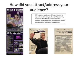
- 1. How did you attract/address your audience? • My magazine used many different aspects to appeal and attract my audience. The upcoming slides will show how the: colour scheme; imagery and text are used throughout to appeal to my different sections of my audience.
- 2. Imagery • Imagery is something I wanted to be perfect on my magazine as I think it is the single most important aspect of the magazine to attract the audience. • I began by drafting up ideas of where I was going to go and what I was going to use as my key pictures in my magazine. I decided that the best place to begin taking photos was at a concert so I went to see a quite famous liquid funk artist known as Netsky. I got over 200 photos from the concert but found the majority were blurry and ended up only using around 10 as potential for final photos. Another issue was the resolution. It was far too pixelated to be used as a cover image or for the double page spread, so was then allocated as a smaller image in my double page spread. • After I began planning images for the double page and cover and I started looking at clubs or shops that focused around electro and dance music and came across a shop called Cyber Dog in Camden. It had the perfect look for the photos and also featured a DJ and a range of staff members who suited the conventional look of the genre. However as I looked deeper into taking photos it became apparent that taking photos were forbidden and so I had to start researching somewhere else to use. The images from Netsky attract an audience interested in drum and bass music because they provide live and unseen photos from within the crowd. Although they are not very big they help the audience engage and simulate what the atmosphere was like at the actual event.
- 3. Imagery • After a while of not finding anyone or anywhere on the internet that could provide me with a suitable person or place to take the photos I began asking my family to see if they had links to any DJ’s and I found out that my mum did. She got me a special meeting with an upcoming Drum and bass DJ who had all the latest equipment for mixing and editing music. • I took a range of photos of the different equipment from many different angles and applied my photography skills to make it look as engaging as possible. • I also took a range of photos of the DJ (DJ K.I.M.) from many different angles and with her using a range of equipment. I found that the depth of field photos with her staring into the lens were the most engaging and so there for chose a couple of them to be potential double page spread photos. I chose to use a depth of field shot of the artist looking into the lens for the double page because it was engaging but also featured an expensive pair of headphones which would attract the audience who are interested in technology. Depth of field Expensive equipment Simple background, no distractions Gaze Theory
- 4. Imagery For my cover page I used an image of the DJ behind the decks which is image conventional scene in pictures from concerts and clubs. I thought this was perfect for representing all sections of the audience. However the background was too plain and therefore I wanted too change it for something that fitted the genre better. So I Googled Dubstep and drum and bass and was presented with a range of different images but the one that stood out was that of a graphic equaliser. So I used Adobe Photoshop to design a layout for it. It consisted of many squares and a single square to show where the max limit was for each bar. I added this to the image of the artist of the DJ but it was still too dull. I decided to use the purple which is conventional throughout my magazine to create a gradient overlay for the image. This makes it look a lot more vibrant and combined with the image from my photo shoot with the DJ creates a great representation of the Electro/ Dubstep genre. This would attract an audience because it is styled to look like cover art used on recent Dubstep album covers and also looks like the image has been taken straight out of a club, which is where the majority of my target audience would find out about this genre of music. Gaze Theory Dynamic Background Expensive equipment and extremely good Conventional colours Conventional composition of image
- 5. Imagery • The imagery I have used attracts my audience because it uses dynamic and engaging approaches to photography to display the genre and present the artists and equipment. • By using a range of photographical techniques including depth of field, macro shots and low angles I have been to provide the audience with a wide range of interesting photos to look at. • The double page spread and cover page both use gaze theory to attract an audience through use of beauty of the artist. This is a convention used throughout images for all magazines and I decided it was an important aspect to consider when appealing to my audience. • Since my audience is built up of young people the photo can make or break their decision to engage and read through the rest of the magazine. • The use of Photoshop to create a dynamic background also indentifies to the audience what genre the magazine is. It also helps improve the actual appearance of the cover image and adds a sense of atmosphere as if she was presenting in a club.
- 6. Text • Text is another element that helps to address and attract an audience. Whether it is the style and font of the text or what is written, each bit helps to attract the audience. • Content – I made sure that the content in the magazine features some of the best artists out there including Skrillex and Dirtyphonics. Artists like this are very big at the moment and they have a vast database of fans who will want to know everything that is happening with them, so would be interested in getting the magazine just to find out a bit more information about them. My text content also features information about prizes which means that my magazine also interacts with its audience. Interaction isn’t a key factor I focused on but the prizes allow the audience to show an interest in what Max Sounds doing and therefore lets me see what the audience think of the magazine and their understanding of the content we offer.
- 7. Text • Another aspect of text which engages and draws in the audience is the style. I have made my style look very modern to fit the genre and design I had laid out for my magazine. I decided to use two main fonts in my work Bauhaus 93 and Eris Bold ITC. Bauhaus 93 looks really modern but was hard to read when in paragraphs so was therefore used for titles and page numbers. Eris Bold ITC was perfect for the main body of text and with Bauhaus 93 also looked quite modern and helped construct the genre of Electro/Dubstep. • I think that presentation and style of text is rather essential when attracting the audience. I carefully picked mine so that fitted the genre of Dubstep and clearly represented the atmosphere and style that professional magazines use when featuring a Dubstep artist. Bauhaus 93 Eras Bold ITC Modern text to help create representation of a club atmosphere.
- 8. Colour • The last aspect I think was important in attracting my audience was the use of colour. I didn't want it to appear dull and gritty like a rock magazine I wanted it to appear fresh and modern. I got my ideas for colour from my visit to Netsky at The Forum. I found that the use of a blue or purple with a black created a vibrant and engaging colour scheme. From personal preference I preferred the colour purple and it also fitted better with the good photos I got from the concert so I used it as my primary colour to layout the designs, originally, for all the pages. It didn't suit the double page spread so was removed from there but was used a lot on the cover and contents page. • The text needed to be another colour but it still had to be able to fit with the colours for the designs of the page. I chose to use white for the body text and yellow for the tiles as they clearly stood out from the other colours but it didn't make it look tacky instead it made look vibrant and sharp the way I wanted it to be. A black stroke was added to the majority of text just to give it an extra bit of definition. Colour is an aspect that helps represent the genre. The colours I chose to use are modern and slick and appeal to younger audiences as they emulate the style and design of lighting that is used in clubs and at festivals.
- 9. Conclusion • To attract my audience I have used a variety of aspects ranging from the colour of font to the way the images are composed. I found that genre representation is key when addressing the audience. That's why I have used colours that I have found are used by actual artists and images that have been in composed in such a way that they show off the style of the genre and the atmosphere administered by the music I'm featuring. I have also featured content in my text that shows the greatest artist in the scene at the moment so that my audience can easily identify the genre.