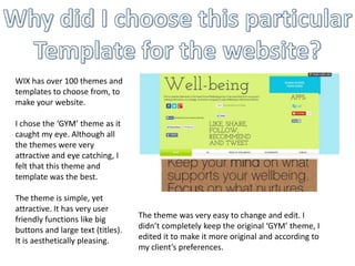
1. WIX has over 100 themes and
templates to choose from, to
make your website.
I chose the ‘GYM’ theme as it
caught my eye. Although all
the themes were very
attractive and eye catching, I
felt that this theme and
template was the best.
The theme is simple, yet
attractive. It has very user
friendly functions like big
buttons and large text (titles).
It is aesthetically pleasing.
The theme was very easy to change and edit. I
didn’t completely keep the original ‘GYM’ theme, I
edited it to make it more original and according to
my client’s preferences.
2. In my previous analysis of other ‘Well-being’ websites, I emphasized the
fact that the colour scheme of the website really does make all the
difference. It immediately sets the ‘mood’ of the website as well as the type
of feeling it should evoke in the reader. This is the main colour scheme
(excluding pink and purple). I chose these colours as they are warm.
3. These images that I have used are related to Well-being and all have
significance in relevance to the topic.
4. I decided to use these links on the Homepage
to make the website seem more friendlier. The
tone of these phrases is welcoming and I feel it
allows the viewers to feel more “at home”
when they are visiting the website.
Although this menu of contents is very common in other websites as well, I felt it kept the
look of the website simple and neat. The website didn’t require any drop down menus
either, so I felt this sort of navigation would fit the website quite well.
5. This font was the original template font, I
didn’t change it much as I felt it really suited
the theme.
It is a ‘friendly’ font and is easy to read as well.
6. This is the forum page. Every other Well-being
group’s website included this page as it
allowed students and viewers to
comment/question and or talk to the group. It
could start insightful discussion as well.
7. For each page, I made sure to use a different
layout. This makes the website more
interesting to look at and browse. If the
website had the same, boring layout on each
page, it would lack any life or friendliness in it
which would disinterest viewers.
8. I put all the social media buttons with the Apps buttons together. I didn’t want these
methods of promotion and social awareness to get ignored. These are important as
(especially students) people use these websites quite a lot, especially to communicate and
share things, and are a vital piece of many people’s lives.