SlideShare ist ein Scribd-Unternehmen logo
1 von 13
Goals, Audience & Message
1. Goals: My overall goal is reducing adult illiteracy in my community.
2. Audience: The target audience is adult non-readers and those who want
to improve their reading skills.
3. Adult functional illiteracy negatively impacts employment.
1st design
This was the first design and it needed a lot of work. I used a center alignment,
which I later learned wasn’t very recommended and a chunky serif Cooper Black
font that I thought would catch a reader’s attention. Although we hadn’t studied it
yet, there was a bit of contrast in the font color, but because the yellow was on top
of the photo, it didn’t work that well. This design left a lot of room for
improvement in the weeks to come.
Week 5:
Proximity
and
Alignment
This design is a proximity and alignment design from week 5. Instead of having a
center alignment like the first design, I used a right alignment. I also changed the
font from the heavy serif Cooper Black to sans serif Segoe UI Bold. Although that
wasn’t what we learned in this week, it made the legibility and readability much
better and easier. The change in background color from a grey texture to a solid
blue also helped to enhance the design. I used an artistic filter on this photo to
bring out certain features of his face like the razor stubble. I also used one of the
blue hues as the background color. The spaces between the paragraphs gives the
text good proximity as it defines that these are three different parts; the title,
subtitle and the body of the text.
I think that all of these changes gave this design a much cleaner look, but there
was still a lot of work that needed to be done.
Week 6:
Repetition
and
Contrast
This design was a repetition and contrast design from week 6. There were radical
changes to the design’s look from week 5 to week 6. Instead of one large photo, I
used three small photos whose size was repeated to illustrate three ways that
illiteracy effects adults. I rewrote and reduced the text, which made it easier for
the reader to scan, and grouped the important information into three columns,
creating repetition. The columns created better chunks. I chose a different
background color because I thought it contrasted nicely with the black and white
text. I used color contrast and repetition in the title and in the conclusion text by
having white letters on top of a dark background. I also used size contrast in the
fonts. The title’s text is a 250-point font and the font in the photo captions and the
bottom text box are a 140-point font. The text below the photos is 120-point font
which wasn’t enough of a contrast and, in retrospect, created a conflict. A better
way to have created contrast there would have been to have used a contrasting
font like an oldstyle font or to have made the photo captions an appropriately
decorative font and kept the explanatory text as is.
This was a good design, but could be better.
Week 7
Style and Color
This design is from week 7 and concentrated on style and color. The style I was
trying to communicate was uneasiness. By taking one of the three photos from
the previous week, making it black and white and putting a bit of a blur on it
helped to achieve that. The font color choices are good because the yellow
contrasts with the background and stands out really well. The black and white
text repeat the black and white in the photo. However, the font choice did not
lend itself to the style I was trying to create. I was having a difficult time
downloading fonts to GIMP and given that restriction, I used the decorative
Kristen ITC Semi-Expanded font. With the exception of the font, I really like this
design.
Week 8:
Type
This design is from week eight where we focused on type. I was able to download
many different kinds of fonts this week which made communicating the uneasiness
style I was trying to create last week much easier. I used three fonts for this design:
• Static Age Heavy Condensed for the title,
• Plateia for the words prison, poverty and unemployment and the lines next to
each word
• Arimo for the bottom text
Although the usual rule is to only use two fonts, I think using three fonts is justified
because the Static Age Heavy Condensed and the Plateia font both respectively
convey uneasiness and fear. I think that these two fonts work well to convey the style.
The yellow in the title jumps out at the reader and contrasts well with the black and
white fonts. The words prison, poverty and unemployment stand out because of their
weight and the use of black against the background.
This design is really getting closer to what I'm looking for but still is not quite there.
Final Design
The final design kept quite a bit from what was in week eight’s
design, but I changed the size and the colors of the font caption,
repeated the Static Age Heavy Condensed font for the subtitles of
prison, poverty and wages, used split complement triad colors for the
information about prison, poverty and wages and changed the text at
the bottom from what was in another Week eight design not shown
in this presentation.

Weitere ähnliche Inhalte

Was ist angesagt?

Magazine cover 1 editing
Magazine cover 1 editingMagazine cover 1 editing
Magazine cover 1 editingbc05093848
 
Magazine table of contents feedback
Magazine table of contents feedbackMagazine table of contents feedback
Magazine table of contents feedbackEvieTheodore
 
Evaluation Q1: In what way does your magazine use/develop/challenge forms and...
Evaluation Q1: In what way does your magazine use/develop/challenge forms and...Evaluation Q1: In what way does your magazine use/develop/challenge forms and...
Evaluation Q1: In what way does your magazine use/develop/challenge forms and...Tom Welsh
 
All my media planning (mock ups included)
All my media planning (mock ups included)All my media planning (mock ups included)
All my media planning (mock ups included)Joshua_Read
 
Changes made from mock up to final
Changes made from mock up to finalChanges made from mock up to final
Changes made from mock up to finalJosh Mckay
 
Yearbook 2019 Ideas
Yearbook 2019 IdeasYearbook 2019 Ideas
Yearbook 2019 Ideasjonasmonton2
 
Step up 3 d empire magazine review analysis
Step up 3 d empire magazine review analysisStep up 3 d empire magazine review analysis
Step up 3 d empire magazine review analysiskierantatum
 
Double page analysis
Double page analysisDouble page analysis
Double page analysisNfalie123
 
Text analysis for Cd cover and advert
Text analysis for Cd cover and advertText analysis for Cd cover and advert
Text analysis for Cd cover and advertLukeBrazierMedia
 
Media power point round up
Media power point round upMedia power point round up
Media power point round upJosephKnight
 
Evaluation q1: in what way does your magazine use/develop/challenge forms and...
Evaluation q1: in what way does your magazine use/develop/challenge forms and...Evaluation q1: in what way does your magazine use/develop/challenge forms and...
Evaluation q1: in what way does your magazine use/develop/challenge forms and...Tom Welsh
 
Use develop challenge
Use develop challengeUse develop challenge
Use develop challengeamysheldon4
 

Was ist angesagt? (19)

Magazine cover 1 editing
Magazine cover 1 editingMagazine cover 1 editing
Magazine cover 1 editing
 
Magazine table of contents feedback
Magazine table of contents feedbackMagazine table of contents feedback
Magazine table of contents feedback
 
Evaluation Q1: In what way does your magazine use/develop/challenge forms and...
Evaluation Q1: In what way does your magazine use/develop/challenge forms and...Evaluation Q1: In what way does your magazine use/develop/challenge forms and...
Evaluation Q1: In what way does your magazine use/develop/challenge forms and...
 
All my media planning (mock ups included)
All my media planning (mock ups included)All my media planning (mock ups included)
All my media planning (mock ups included)
 
Presentation
PresentationPresentation
Presentation
 
Changes made from mock up to final
Changes made from mock up to finalChanges made from mock up to final
Changes made from mock up to final
 
5. Pre-Production
5. Pre-Production5. Pre-Production
5. Pre-Production
 
Yearbook 2019 Ideas
Yearbook 2019 IdeasYearbook 2019 Ideas
Yearbook 2019 Ideas
 
Cosmo research
Cosmo researchCosmo research
Cosmo research
 
Step up 3 d empire magazine review analysis
Step up 3 d empire magazine review analysisStep up 3 d empire magazine review analysis
Step up 3 d empire magazine review analysis
 
Task 6
Task 6Task 6
Task 6
 
Double page analysis
Double page analysisDouble page analysis
Double page analysis
 
Text analysis for Cd cover and advert
Text analysis for Cd cover and advertText analysis for Cd cover and advert
Text analysis for Cd cover and advert
 
Media power point round up
Media power point round upMedia power point round up
Media power point round up
 
Evaluation
EvaluationEvaluation
Evaluation
 
Task 7
Task 7Task 7
Task 7
 
Feedback
FeedbackFeedback
Feedback
 
Evaluation q1: in what way does your magazine use/develop/challenge forms and...
Evaluation q1: in what way does your magazine use/develop/challenge forms and...Evaluation q1: in what way does your magazine use/develop/challenge forms and...
Evaluation q1: in what way does your magazine use/develop/challenge forms and...
 
Use develop challenge
Use develop challengeUse develop challenge
Use develop challenge
 

Ähnlich wie Assignment 9-4 Margie Port's Poster Progression

Slide design sharing
Slide design sharingSlide design sharing
Slide design sharinglivinwhope
 
Olivia Bolt Digital graphics pro forma
Olivia Bolt Digital graphics pro formaOlivia Bolt Digital graphics pro forma
Olivia Bolt Digital graphics pro formaOliviaBolt
 
Digital graphics pro forma
Digital graphics pro formaDigital graphics pro forma
Digital graphics pro formaOliviaBolt
 
As research planning
As research planningAs research planning
As research planningKeleisha123
 
Digital graphics pro forma
Digital graphics pro formaDigital graphics pro forma
Digital graphics pro formaRichardBurnn
 
CSE615_Graves_Interpretive Sign Designs
CSE615_Graves_Interpretive Sign DesignsCSE615_Graves_Interpretive Sign Designs
CSE615_Graves_Interpretive Sign Designsngraves12
 
CSE 615 assignment
CSE 615 assignment CSE 615 assignment
CSE 615 assignment tmoore1908
 
Double Page Evaluation
Double Page EvaluationDouble Page Evaluation
Double Page Evaluationcallumharrison
 
Constructing film magazine page
Constructing film magazine pageConstructing film magazine page
Constructing film magazine page08girvinjac
 
Vocal success magazine
Vocal success magazineVocal success magazine
Vocal success magazinecallumharrison
 
Music magazine front cover peer review
Music magazine front cover peer reviewMusic magazine front cover peer review
Music magazine front cover peer reviewangiem2a
 
Eval 1 presentation
Eval 1 presentationEval 1 presentation
Eval 1 presentationsteviemccann
 
Popish Design Progression | Assignment 9-4 | CSE 615, Winter 2018
Popish Design Progression | Assignment 9-4 | CSE 615, Winter 2018Popish Design Progression | Assignment 9-4 | CSE 615, Winter 2018
Popish Design Progression | Assignment 9-4 | CSE 615, Winter 2018Mary Popish
 
Cse615 dyer poster design slideshow assign 9.4
Cse615 dyer poster design slideshow assign 9.4Cse615 dyer poster design slideshow assign 9.4
Cse615 dyer poster design slideshow assign 9.4mdyer15
 

Ähnlich wie Assignment 9-4 Margie Port's Poster Progression (20)

Smith_9-4
Smith_9-4Smith_9-4
Smith_9-4
 
Slide design sharing
Slide design sharingSlide design sharing
Slide design sharing
 
Boyce 9-4
Boyce 9-4 Boyce 9-4
Boyce 9-4
 
Olivia Bolt Digital graphics pro forma
Olivia Bolt Digital graphics pro formaOlivia Bolt Digital graphics pro forma
Olivia Bolt Digital graphics pro forma
 
Digital graphics pro forma
Digital graphics pro formaDigital graphics pro forma
Digital graphics pro forma
 
As research planning
As research planningAs research planning
As research planning
 
Evaluation
EvaluationEvaluation
Evaluation
 
Evaluation
EvaluationEvaluation
Evaluation
 
Digital graphics pro forma
Digital graphics pro formaDigital graphics pro forma
Digital graphics pro forma
 
CSE615_Graves_Interpretive Sign Designs
CSE615_Graves_Interpretive Sign DesignsCSE615_Graves_Interpretive Sign Designs
CSE615_Graves_Interpretive Sign Designs
 
CSE 615 assignment
CSE 615 assignment CSE 615 assignment
CSE 615 assignment
 
Double Page Evaluation
Double Page EvaluationDouble Page Evaluation
Double Page Evaluation
 
Constructing film magazine page
Constructing film magazine pageConstructing film magazine page
Constructing film magazine page
 
Vocal success magazine
Vocal success magazineVocal success magazine
Vocal success magazine
 
As media evaluation 7
As media evaluation 7 As media evaluation 7
As media evaluation 7
 
Music magazine front cover peer review
Music magazine front cover peer reviewMusic magazine front cover peer review
Music magazine front cover peer review
 
Eval 1 presentation
Eval 1 presentationEval 1 presentation
Eval 1 presentation
 
Popish Design Progression | Assignment 9-4 | CSE 615, Winter 2018
Popish Design Progression | Assignment 9-4 | CSE 615, Winter 2018Popish Design Progression | Assignment 9-4 | CSE 615, Winter 2018
Popish Design Progression | Assignment 9-4 | CSE 615, Winter 2018
 
Cse615 dyer poster design slideshow assign 9.4
Cse615 dyer poster design slideshow assign 9.4Cse615 dyer poster design slideshow assign 9.4
Cse615 dyer poster design slideshow assign 9.4
 
1. research
1. research1. research
1. research
 

Kürzlich hochgeladen

ENGLISH6-Q4-W3.pptxqurter our high choom
ENGLISH6-Q4-W3.pptxqurter our high choomENGLISH6-Q4-W3.pptxqurter our high choom
ENGLISH6-Q4-W3.pptxqurter our high choomnelietumpap1
 
USPS® Forced Meter Migration - How to Know if Your Postage Meter Will Soon be...
USPS® Forced Meter Migration - How to Know if Your Postage Meter Will Soon be...USPS® Forced Meter Migration - How to Know if Your Postage Meter Will Soon be...
USPS® Forced Meter Migration - How to Know if Your Postage Meter Will Soon be...Postal Advocate Inc.
 
Karra SKD Conference Presentation Revised.pptx
Karra SKD Conference Presentation Revised.pptxKarra SKD Conference Presentation Revised.pptx
Karra SKD Conference Presentation Revised.pptxAshokKarra1
 
Concurrency Control in Database Management system
Concurrency Control in Database Management systemConcurrency Control in Database Management system
Concurrency Control in Database Management systemChristalin Nelson
 
Field Attribute Index Feature in Odoo 17
Field Attribute Index Feature in Odoo 17Field Attribute Index Feature in Odoo 17
Field Attribute Index Feature in Odoo 17Celine George
 
GRADE 4 - SUMMATIVE TEST QUARTER 4 ALL SUBJECTS
GRADE 4 - SUMMATIVE TEST QUARTER 4 ALL SUBJECTSGRADE 4 - SUMMATIVE TEST QUARTER 4 ALL SUBJECTS
GRADE 4 - SUMMATIVE TEST QUARTER 4 ALL SUBJECTSJoshuaGantuangco2
 
Keynote by Prof. Wurzer at Nordex about IP-design
Keynote by Prof. Wurzer at Nordex about IP-designKeynote by Prof. Wurzer at Nordex about IP-design
Keynote by Prof. Wurzer at Nordex about IP-designMIPLM
 
HỌC TỐT TIẾNG ANH 11 THEO CHƯƠNG TRÌNH GLOBAL SUCCESS ĐÁP ÁN CHI TIẾT - CẢ NĂ...
HỌC TỐT TIẾNG ANH 11 THEO CHƯƠNG TRÌNH GLOBAL SUCCESS ĐÁP ÁN CHI TIẾT - CẢ NĂ...HỌC TỐT TIẾNG ANH 11 THEO CHƯƠNG TRÌNH GLOBAL SUCCESS ĐÁP ÁN CHI TIẾT - CẢ NĂ...
HỌC TỐT TIẾNG ANH 11 THEO CHƯƠNG TRÌNH GLOBAL SUCCESS ĐÁP ÁN CHI TIẾT - CẢ NĂ...Nguyen Thanh Tu Collection
 
AMERICAN LANGUAGE HUB_Level2_Student'sBook_Answerkey.pdf
AMERICAN LANGUAGE HUB_Level2_Student'sBook_Answerkey.pdfAMERICAN LANGUAGE HUB_Level2_Student'sBook_Answerkey.pdf
AMERICAN LANGUAGE HUB_Level2_Student'sBook_Answerkey.pdfphamnguyenenglishnb
 
Student Profile Sample - We help schools to connect the data they have, with ...
Student Profile Sample - We help schools to connect the data they have, with ...Student Profile Sample - We help schools to connect the data they have, with ...
Student Profile Sample - We help schools to connect the data they have, with ...Seán Kennedy
 
Transaction Management in Database Management System
Transaction Management in Database Management SystemTransaction Management in Database Management System
Transaction Management in Database Management SystemChristalin Nelson
 
INTRODUCTION TO CATHOLIC CHRISTOLOGY.pptx
INTRODUCTION TO CATHOLIC CHRISTOLOGY.pptxINTRODUCTION TO CATHOLIC CHRISTOLOGY.pptx
INTRODUCTION TO CATHOLIC CHRISTOLOGY.pptxHumphrey A Beña
 
Grade 9 Quarter 4 Dll Grade 9 Quarter 4 DLL.pdf
Grade 9 Quarter 4 Dll Grade 9 Quarter 4 DLL.pdfGrade 9 Quarter 4 Dll Grade 9 Quarter 4 DLL.pdf
Grade 9 Quarter 4 Dll Grade 9 Quarter 4 DLL.pdfJemuel Francisco
 
Proudly South Africa powerpoint Thorisha.pptx
Proudly South Africa powerpoint Thorisha.pptxProudly South Africa powerpoint Thorisha.pptx
Proudly South Africa powerpoint Thorisha.pptxthorishapillay1
 
Judging the Relevance and worth of ideas part 2.pptx
Judging the Relevance  and worth of ideas part 2.pptxJudging the Relevance  and worth of ideas part 2.pptx
Judging the Relevance and worth of ideas part 2.pptxSherlyMaeNeri
 
How to Add Barcode on PDF Report in Odoo 17
How to Add Barcode on PDF Report in Odoo 17How to Add Barcode on PDF Report in Odoo 17
How to Add Barcode on PDF Report in Odoo 17Celine George
 
Incoming and Outgoing Shipments in 3 STEPS Using Odoo 17
Incoming and Outgoing Shipments in 3 STEPS Using Odoo 17Incoming and Outgoing Shipments in 3 STEPS Using Odoo 17
Incoming and Outgoing Shipments in 3 STEPS Using Odoo 17Celine George
 
Influencing policy (training slides from Fast Track Impact)
Influencing policy (training slides from Fast Track Impact)Influencing policy (training slides from Fast Track Impact)
Influencing policy (training slides from Fast Track Impact)Mark Reed
 

Kürzlich hochgeladen (20)

ENGLISH6-Q4-W3.pptxqurter our high choom
ENGLISH6-Q4-W3.pptxqurter our high choomENGLISH6-Q4-W3.pptxqurter our high choom
ENGLISH6-Q4-W3.pptxqurter our high choom
 
USPS® Forced Meter Migration - How to Know if Your Postage Meter Will Soon be...
USPS® Forced Meter Migration - How to Know if Your Postage Meter Will Soon be...USPS® Forced Meter Migration - How to Know if Your Postage Meter Will Soon be...
USPS® Forced Meter Migration - How to Know if Your Postage Meter Will Soon be...
 
Karra SKD Conference Presentation Revised.pptx
Karra SKD Conference Presentation Revised.pptxKarra SKD Conference Presentation Revised.pptx
Karra SKD Conference Presentation Revised.pptx
 
Concurrency Control in Database Management system
Concurrency Control in Database Management systemConcurrency Control in Database Management system
Concurrency Control in Database Management system
 
Field Attribute Index Feature in Odoo 17
Field Attribute Index Feature in Odoo 17Field Attribute Index Feature in Odoo 17
Field Attribute Index Feature in Odoo 17
 
GRADE 4 - SUMMATIVE TEST QUARTER 4 ALL SUBJECTS
GRADE 4 - SUMMATIVE TEST QUARTER 4 ALL SUBJECTSGRADE 4 - SUMMATIVE TEST QUARTER 4 ALL SUBJECTS
GRADE 4 - SUMMATIVE TEST QUARTER 4 ALL SUBJECTS
 
FINALS_OF_LEFT_ON_C'N_EL_DORADO_2024.pptx
FINALS_OF_LEFT_ON_C'N_EL_DORADO_2024.pptxFINALS_OF_LEFT_ON_C'N_EL_DORADO_2024.pptx
FINALS_OF_LEFT_ON_C'N_EL_DORADO_2024.pptx
 
Keynote by Prof. Wurzer at Nordex about IP-design
Keynote by Prof. Wurzer at Nordex about IP-designKeynote by Prof. Wurzer at Nordex about IP-design
Keynote by Prof. Wurzer at Nordex about IP-design
 
HỌC TỐT TIẾNG ANH 11 THEO CHƯƠNG TRÌNH GLOBAL SUCCESS ĐÁP ÁN CHI TIẾT - CẢ NĂ...
HỌC TỐT TIẾNG ANH 11 THEO CHƯƠNG TRÌNH GLOBAL SUCCESS ĐÁP ÁN CHI TIẾT - CẢ NĂ...HỌC TỐT TIẾNG ANH 11 THEO CHƯƠNG TRÌNH GLOBAL SUCCESS ĐÁP ÁN CHI TIẾT - CẢ NĂ...
HỌC TỐT TIẾNG ANH 11 THEO CHƯƠNG TRÌNH GLOBAL SUCCESS ĐÁP ÁN CHI TIẾT - CẢ NĂ...
 
AMERICAN LANGUAGE HUB_Level2_Student'sBook_Answerkey.pdf
AMERICAN LANGUAGE HUB_Level2_Student'sBook_Answerkey.pdfAMERICAN LANGUAGE HUB_Level2_Student'sBook_Answerkey.pdf
AMERICAN LANGUAGE HUB_Level2_Student'sBook_Answerkey.pdf
 
Student Profile Sample - We help schools to connect the data they have, with ...
Student Profile Sample - We help schools to connect the data they have, with ...Student Profile Sample - We help schools to connect the data they have, with ...
Student Profile Sample - We help schools to connect the data they have, with ...
 
Model Call Girl in Tilak Nagar Delhi reach out to us at 🔝9953056974🔝
Model Call Girl in Tilak Nagar Delhi reach out to us at 🔝9953056974🔝Model Call Girl in Tilak Nagar Delhi reach out to us at 🔝9953056974🔝
Model Call Girl in Tilak Nagar Delhi reach out to us at 🔝9953056974🔝
 
Transaction Management in Database Management System
Transaction Management in Database Management SystemTransaction Management in Database Management System
Transaction Management in Database Management System
 
INTRODUCTION TO CATHOLIC CHRISTOLOGY.pptx
INTRODUCTION TO CATHOLIC CHRISTOLOGY.pptxINTRODUCTION TO CATHOLIC CHRISTOLOGY.pptx
INTRODUCTION TO CATHOLIC CHRISTOLOGY.pptx
 
Grade 9 Quarter 4 Dll Grade 9 Quarter 4 DLL.pdf
Grade 9 Quarter 4 Dll Grade 9 Quarter 4 DLL.pdfGrade 9 Quarter 4 Dll Grade 9 Quarter 4 DLL.pdf
Grade 9 Quarter 4 Dll Grade 9 Quarter 4 DLL.pdf
 
Proudly South Africa powerpoint Thorisha.pptx
Proudly South Africa powerpoint Thorisha.pptxProudly South Africa powerpoint Thorisha.pptx
Proudly South Africa powerpoint Thorisha.pptx
 
Judging the Relevance and worth of ideas part 2.pptx
Judging the Relevance  and worth of ideas part 2.pptxJudging the Relevance  and worth of ideas part 2.pptx
Judging the Relevance and worth of ideas part 2.pptx
 
How to Add Barcode on PDF Report in Odoo 17
How to Add Barcode on PDF Report in Odoo 17How to Add Barcode on PDF Report in Odoo 17
How to Add Barcode on PDF Report in Odoo 17
 
Incoming and Outgoing Shipments in 3 STEPS Using Odoo 17
Incoming and Outgoing Shipments in 3 STEPS Using Odoo 17Incoming and Outgoing Shipments in 3 STEPS Using Odoo 17
Incoming and Outgoing Shipments in 3 STEPS Using Odoo 17
 
Influencing policy (training slides from Fast Track Impact)
Influencing policy (training slides from Fast Track Impact)Influencing policy (training slides from Fast Track Impact)
Influencing policy (training slides from Fast Track Impact)
 

Assignment 9-4 Margie Port's Poster Progression

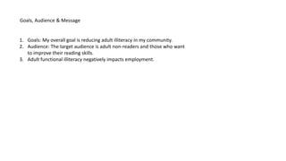
  • 1. Goals, Audience & Message 1. Goals: My overall goal is reducing adult illiteracy in my community. 2. Audience: The target audience is adult non-readers and those who want to improve their reading skills. 3. Adult functional illiteracy negatively impacts employment.
  • 3. This was the first design and it needed a lot of work. I used a center alignment, which I later learned wasn’t very recommended and a chunky serif Cooper Black font that I thought would catch a reader’s attention. Although we hadn’t studied it yet, there was a bit of contrast in the font color, but because the yellow was on top of the photo, it didn’t work that well. This design left a lot of room for improvement in the weeks to come.
  • 5. This design is a proximity and alignment design from week 5. Instead of having a center alignment like the first design, I used a right alignment. I also changed the font from the heavy serif Cooper Black to sans serif Segoe UI Bold. Although that wasn’t what we learned in this week, it made the legibility and readability much better and easier. The change in background color from a grey texture to a solid blue also helped to enhance the design. I used an artistic filter on this photo to bring out certain features of his face like the razor stubble. I also used one of the blue hues as the background color. The spaces between the paragraphs gives the text good proximity as it defines that these are three different parts; the title, subtitle and the body of the text. I think that all of these changes gave this design a much cleaner look, but there was still a lot of work that needed to be done.
  • 7. This design was a repetition and contrast design from week 6. There were radical changes to the design’s look from week 5 to week 6. Instead of one large photo, I used three small photos whose size was repeated to illustrate three ways that illiteracy effects adults. I rewrote and reduced the text, which made it easier for the reader to scan, and grouped the important information into three columns, creating repetition. The columns created better chunks. I chose a different background color because I thought it contrasted nicely with the black and white text. I used color contrast and repetition in the title and in the conclusion text by having white letters on top of a dark background. I also used size contrast in the fonts. The title’s text is a 250-point font and the font in the photo captions and the bottom text box are a 140-point font. The text below the photos is 120-point font which wasn’t enough of a contrast and, in retrospect, created a conflict. A better way to have created contrast there would have been to have used a contrasting font like an oldstyle font or to have made the photo captions an appropriately decorative font and kept the explanatory text as is. This was a good design, but could be better.
  • 9. This design is from week 7 and concentrated on style and color. The style I was trying to communicate was uneasiness. By taking one of the three photos from the previous week, making it black and white and putting a bit of a blur on it helped to achieve that. The font color choices are good because the yellow contrasts with the background and stands out really well. The black and white text repeat the black and white in the photo. However, the font choice did not lend itself to the style I was trying to create. I was having a difficult time downloading fonts to GIMP and given that restriction, I used the decorative Kristen ITC Semi-Expanded font. With the exception of the font, I really like this design.
  • 11. This design is from week eight where we focused on type. I was able to download many different kinds of fonts this week which made communicating the uneasiness style I was trying to create last week much easier. I used three fonts for this design: • Static Age Heavy Condensed for the title, • Plateia for the words prison, poverty and unemployment and the lines next to each word • Arimo for the bottom text Although the usual rule is to only use two fonts, I think using three fonts is justified because the Static Age Heavy Condensed and the Plateia font both respectively convey uneasiness and fear. I think that these two fonts work well to convey the style. The yellow in the title jumps out at the reader and contrasts well with the black and white fonts. The words prison, poverty and unemployment stand out because of their weight and the use of black against the background. This design is really getting closer to what I'm looking for but still is not quite there.
  • 13. The final design kept quite a bit from what was in week eight’s design, but I changed the size and the colors of the font caption, repeated the Static Age Heavy Condensed font for the subtitles of prison, poverty and wages, used split complement triad colors for the information about prison, poverty and wages and changed the text at the bottom from what was in another Week eight design not shown in this presentation.