
Empfohlen
Weitere ähnliche Inhalte
Was ist angesagt?
Was ist angesagt? (17)
Ähnlich wie Creating the digipak
Ähnlich wie Creating the digipak (20)
Kürzlich hochgeladen
Kürzlich hochgeladen (20)
Creating the digipak
- 2. Layout The first thing that I did to create the digipak was to open the template in Photoshop so that it can be edited. In order to clearly see the borders whilst I was adding all of the images I added a layer and then pressed alt – backspace which made the layer turn white so that the layout could be seen over the top of it.
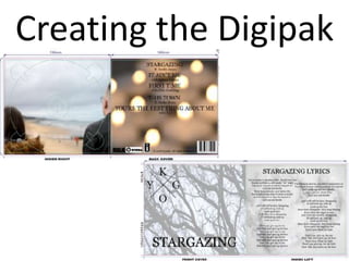
- 3. Front CoverTo create the front cover I used a picture of the trees that I took from the music video. I opened it as an image in photoshop, then used the quick select tool to select the part of the image that I wanted and then paste it into the panel of the digipak that it was going to go in. After I pasted the image I had to transform it so that it fit the area that the digipak laid out. To do this I pressed Ctrl-T which brought up the transformation box so that I could stretch the image without changing the scale. In order for the image to not be too bright and for the tree trunks to be not too dark I had to change the opacity so that the colours were calmer and more sad like the song.
- 4. The logo was a picture that I put into photoshop. The original image had a white background that I didn’t want to have so after watching a YouTube tutorial I used the refine edge tool to mark the area that I wanted to remove. I then smoothed the edge and changed the transparency so that there was no longer a white background but rather no background at all. This allowed me to put the image on top of the background so that it could still be seen but have the Kygo logo laid over the top of it. The word stargazing was written straight onto the background image. I used the text tool to write the word in all capital letters – just like the Kygo logo is written in all capitals. I then changed the text colour from white to black and changed the font to Georgia so that it looked like the font that Kygo used.
- 5. To create the back cover I used a picture of the tea lights that I took from the music video. I opened it as an image in photoshop, then used the quick select tool to select the part of the image that I wanted and then paste it into the panel of the digipak that it was going to go in. I then did the same as what I did for the front cover so that the back cover was the same size. Back Cover I wanted this picture not to be too dark as that would mean that you couldn’t read the writing that was on it so I lowered the opacity just enough so that it kept the orange colour from the flames and so that writing would be able to be read on it.
- 6. I added the list of tracks the back cover in the same font and colour as all the other writing and in capitals. I made the size of the song bigger than the name of the featuring artist so that the viewer is drawn to the song first as this is more important for them to know. Next I added the record label logos. I was able to remove the background from the RCA logo but I was unable to do this for the others due to the fact that the white was in the logo as well as around it. I then added the barcode to the bottom right hand corner where it is most commonly placed. I did this by inserting it as an image just as I had done for the background image. The last piece of information that I added was the copyright details. These were limited as I was only able to find the very basics, but this is what is commonly seen of EDM digipaks so I didn’t need to find any more.
- 7. Inside Right The inside right panel was made in the same way that the front and back covers were made. The image is taken from the music video just as all of the others are. I had to use the quick select tool to only take the part of the image that I wanted so that when I placed it on top of the layout that the two people were either side of the CD. This was difficult as I had keep cropping the image and than expanding it so that it was the right size and distance apart for the meaning to be seen.
- 8. Inside Left The inside left panel was made in the same way that the front and back covers were made. The image is taken from the music video just as all of the others are. I used the quick select tool to take only the heart and not much of the surrounding area. The image in the music video was too over exposed so when I put it into photoshop I changed the opacity so that the white wasn’t as bright and I used the contrasting tool to make the outline of the heart stand out more against the snowy background.
- 9. On top of the heart I added the lyrics to the song Stargazing. I decided only to add the lyrics to this song as this was the song that I created the video for. I used the same font and colour as on the other panels but I only had the title in capitals rather than all of the lyrics as well. Having the lyrics is unconventional but I wanted to make the listeners engage more with the music so by having the lyrics there it means that they can sing along.
- 10. The spine of the digipak consisted of only the name of the artist and the name of the album. This was so that it could be easily identified when sitting on a shelf in a shop. In order to have the writing down the spine I had to write it horizontally, change the font type and colour and then rotate it 90 degrees so that it sat parallel to the cutting lines. It wasn’t until this was done that I was able to change the size of the writing so that it was easier to read from a distance. Spine