
Empfohlen
Weitere ähnliche Inhalte
Was ist angesagt?
Andere mochten auch
Ähnlich wie Photoshop - Kill Ville
Ähnlich wie Photoshop - Kill Ville (20)
Mehr von MRSmedia
Kürzlich hochgeladen
Kürzlich hochgeladen (20)
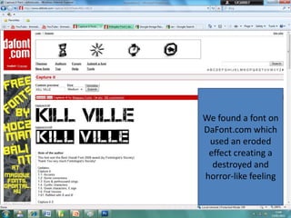
Photoshop - Kill Ville
- 1. We found a font on DaFont.com which used an eroded effect creating a destroyed and horror-like feeling
- 2. I dragged the text into Photoshop and inverted the colours to keep a black background. I arranged the text in this order so that the LL’s would link together in the middle…
- 3. Using the box shape tool, I created two towers in the middle for the LL in both ‘kill’ and ‘ville’, leaving them as plain white blocks.
- 4. I added the KV initials in the blocks to use as a separate simple logo. I noticed a lot of other production companies also have a more simplified version of their logo.
- 5. Using the shape tool again I created a box around the whole text. This inspiration came from the film [REC] poster which uses the video recording symbol
- 6. I created the small red dot on a separate page and then dragged it onto the logo page. The red dot consists of a white outline.
- 8. To make it look professional I added the ® symbol in the corner
- 9. I erased parts of the outline to complete the camera recording look
- 10. Finished by adding ‘PRODUCTIONS’ in the space between the bottom outline