SlideShare ist ein Scribd-Unternehmen logo
1 von 5
In what ways does your media product use, develop or challenge magazine forms and conventions
of real media products?

During my planning and research for my final media product, I researched different magazines so
that I could find inspiration for my final product. The genre I wanted my final magazine product to
have was Hip-Hop. In order to follow conventions of the hip hop genre, I researched various music
magazines. I looked at magazines such as the source magazine, and VIBE magazine and noted down
the generic conventions that the magazine had in order for me to make sure that I was following the
same conventions when I was making my magazine so that it appeals to my target audience.

For the front page of my magazine, I followed the layout of the KING magazine for example I copied
the way my model was shot I used a mid shot, which the KING magazine used. But instead of getting
my model to bare an excessive amount of flesh, I challenged this convention by getting my model to
wear a white vest, a black jacket and blue jeans. The only flesh I asked my model to show was her
belly, which does challenge the representation of women to an extent. I also asked my model to
wear two silver chains, so that it would act as iconography in order to reflect the hip hop genre and I
asked my model to wear red lipstick as the red connotes sexuality objectifying my model.
I also noticed during my research, that magazines such as the KING, source and VIBE magazine put
their models in front of the masthead, this is because the target audience already the know the
name and identity of the magazine. This was another convention that I followed during the making
of my front cover for my magazine. Also from the KING magazine, I saw that the model had a direct
mode of address which I also mimicked on my front cover which was successful. However the only
problem was that the quality of the picture didn't turn out to be successful as I had hoped and this
was unable to be fixed this during post production.
For my contents page, I used the NME contents page for inspiration. This meant that having a variety
of images was important as I needed to use them to anchor the headings of some of the content I
had on my contents page. For example in the NME contents page, they would have a main image
and an introduction to head the main image on the contents page. Then would have a few other
pictures on the contents page. For example In order ti follow conventions of music magazines for my
contents page, I used another picture of my model, this time I used a close up shot for my model,
this time I asked my model to wear a black vest, sunglasses and chains which I deliberately used for
iconography to reflect the hip hop genre and short shorts in the form of jeans again, she was bearing
flesh which meant that I was following conventions of the hip hop genre. When I took the photo, I
purposely made sure that the Mis-en-scene that was used was the wall that had graffiti in the
background. This again served as iconography in order for me to reflect the hip hop genre in my
magazine. When the picture had been taken, I put in a mini introduction to the double page spread
that was in my Magazine as NME do in their contents page so that I would be following conventions
of Hip Hop magazines so that It would appeal to my target audience.
They also had an advertisement telling their target audience to subscribe to their magazine which is
another convention that I used in the making of my contents page as it would attract my target
audience who would be interested in subscribing to my magazine. Another form of advertising I
used fot my magazine was one were my target audience could win a pair of Addidas shoes, for the
picture to anchor this, I took a photo of a pair of addidas shoes at a low angle, but also at eye level
so that it was facing directly at the camera. I took a photo of the addidas shoes so that It could it
could be used as deliberate iconography to reflect the hip hop genre in my music magazine.


                                                  For my double page spread, I mimicked a double
page spread from the source magazine in terms of the way it was laid out. The photo I used for the
double page was taken at a mid shot. The costume I asked my model to wear was a yellow cardigan,
blue jeans and hi-tops. Again, I asked my model to wear silver chains as it served as iconography to
reflect the genre that was Hip hop in my magazine. The photo had a direct mode of address and it
also follows conventions as my model is bearing a lot of flesh, a convention that I continued to
follow from the KING magazine this convention was that women are usually objectified in the hip
hop genre. I also cropped and decreased the size of the photo in post production as in the source
double page spread the photo and the text were placed on either side of the page, another
convention I followed in the making of my double page spread. I also mimicked the way the drop cap
was used, however when I did it, I made the colour of the drop cap green so that the black text could
be seen on the page and it also followed the colour scheme that was used in my double page spread.


My final magazine was called "#Bassline" the font I used was the astera font; this was because it was
the most popular font amongst my target audience. I made the font a yellow/gold colour as it
followed the colour scheme I wanted to go for on my front page. I made the font big and bold so
that it will take up the width of my magazine cover as it means I am following conventions of
magazines such as the source, VIBE and KING magazines where the mast head takes up the most of
the space of the front cover. In terms of the layout for my front cover, I followed the layout of the
VIBE magazine

Weitere ähnliche Inhalte

Was ist angesagt?

Evaluation 2
Evaluation 2Evaluation 2
Evaluation 2Birteb
 
Evaluation of my music magazine production
Evaluation of my music magazine productionEvaluation of my music magazine production
Evaluation of my music magazine productionAshleigh Foy
 
Evaluation of my own music magazine production
Evaluation of my own music magazine productionEvaluation of my own music magazine production
Evaluation of my own music magazine productionAshleigh Foy
 
Evaluation questions
Evaluation questionsEvaluation questions
Evaluation questionsgreenie46
 
Evaluation questions
Evaluation questionsEvaluation questions
Evaluation questionslukegreen6
 
Question 1 article
Question 1   articleQuestion 1   article
Question 1 articleMatthew Hill
 
Media evaluation
Media evaluationMedia evaluation
Media evaluationChris
 
Media evaluation
Media evaluationMedia evaluation
Media evaluationfaithsavory
 
Evaluation Question 1
Evaluation Question 1Evaluation Question 1
Evaluation Question 1taylzz1
 
Question 1
Question 1Question 1
Question 1Tsykeira
 
Evaluation question 1 øøøøøøøø
Evaluation question 1 øøøøøøøøEvaluation question 1 øøøøøøøø
Evaluation question 1 øøøøøøøønikolinef
 
Question 1
Question 1Question 1
Question 1zainab_a
 
Describe the design of the title.docx
Describe the design of the title.docxDescribe the design of the title.docx
Describe the design of the title.docxElizabethAdeoye23
 
Evaluation activity 1
Evaluation activity 1Evaluation activity 1
Evaluation activity 1Alex Wilson
 

Was ist angesagt? (18)

Evaluation 2
Evaluation 2Evaluation 2
Evaluation 2
 
Evaluation of my music magazine production
Evaluation of my music magazine productionEvaluation of my music magazine production
Evaluation of my music magazine production
 
Evaluation of my own music magazine production
Evaluation of my own music magazine productionEvaluation of my own music magazine production
Evaluation of my own music magazine production
 
Evaluation questions
Evaluation questionsEvaluation questions
Evaluation questions
 
Evaluation questions
Evaluation questionsEvaluation questions
Evaluation questions
 
Evaluation 1 final
Evaluation 1 finalEvaluation 1 final
Evaluation 1 final
 
Question 1
Question 1Question 1
Question 1
 
Evaluation 1
Evaluation 1Evaluation 1
Evaluation 1
 
Contents page q1
Contents page q1Contents page q1
Contents page q1
 
Question 1 article
Question 1   articleQuestion 1   article
Question 1 article
 
Media evaluation
Media evaluationMedia evaluation
Media evaluation
 
Media evaluation
Media evaluationMedia evaluation
Media evaluation
 
Evaluation Question 1
Evaluation Question 1Evaluation Question 1
Evaluation Question 1
 
Question 1
Question 1Question 1
Question 1
 
Evaluation question 1 øøøøøøøø
Evaluation question 1 øøøøøøøøEvaluation question 1 øøøøøøøø
Evaluation question 1 øøøøøøøø
 
Question 1
Question 1Question 1
Question 1
 
Describe the design of the title.docx
Describe the design of the title.docxDescribe the design of the title.docx
Describe the design of the title.docx
 
Evaluation activity 1
Evaluation activity 1Evaluation activity 1
Evaluation activity 1
 

Ähnlich wie Media Evaluation Question 1: In what ways does your media product use, develop or challenge forms and conventions of real media products?

(Final evalution)
(Final evalution)(Final evalution)
(Final evalution)Benita29
 
Evaluation of my own music magazine production
Evaluation of my own music magazine productionEvaluation of my own music magazine production
Evaluation of my own music magazine productionAshleigh Foy
 
Evaluation question 1
Evaluation question 1Evaluation question 1
Evaluation question 1Rachell_94
 
Magazine evaluation
Magazine evaluationMagazine evaluation
Magazine evaluationjpriest17
 
Evaluation question 1
Evaluation question 1Evaluation question 1
Evaluation question 1Jack Goodman
 
Evaluation question 1
Evaluation question 1Evaluation question 1
Evaluation question 1Rachell_94
 
Evaluation Questions
Evaluation Questions Evaluation Questions
Evaluation Questions ZoeRadford
 
Evaluation of my music magazine production
Evaluation of my music magazine productionEvaluation of my music magazine production
Evaluation of my music magazine productionZoeRadford
 
Evaluation of my own music magazine production [autosaved]
Evaluation of my own music magazine production [autosaved]Evaluation of my own music magazine production [autosaved]
Evaluation of my own music magazine production [autosaved]ZoeRadford
 
Evaluation of my music magazine
Evaluation of my music magazineEvaluation of my music magazine
Evaluation of my music magazineZoeRadford
 
Evaluation question 1
Evaluation question 1Evaluation question 1
Evaluation question 1xoibz21
 
Evaluation Question 1
Evaluation Question 1 Evaluation Question 1
Evaluation Question 1 trishamedia
 
Evaluation question 1
Evaluation question 1Evaluation question 1
Evaluation question 1shahriyar94
 
Media music magazine evaluation
Media music magazine evaluationMedia music magazine evaluation
Media music magazine evaluationsharonbachra
 
Evaluation 1
Evaluation 1Evaluation 1
Evaluation 1Hal452
 
Question 1 evaluation
Question 1 evaluationQuestion 1 evaluation
Question 1 evaluationchloeheads
 
Shannon Haines' evaluation
Shannon Haines' evaluationShannon Haines' evaluation
Shannon Haines' evaluationmrsmwlms
 

Ähnlich wie Media Evaluation Question 1: In what ways does your media product use, develop or challenge forms and conventions of real media products? (20)

(Final evalution)
(Final evalution)(Final evalution)
(Final evalution)
 
Evaluation of my own music magazine production
Evaluation of my own music magazine productionEvaluation of my own music magazine production
Evaluation of my own music magazine production
 
Evaluation question 1
Evaluation question 1Evaluation question 1
Evaluation question 1
 
Magazine evaluation
Magazine evaluationMagazine evaluation
Magazine evaluation
 
Evaluation question 1
Evaluation question 1Evaluation question 1
Evaluation question 1
 
Evaluation question 1
Evaluation question 1Evaluation question 1
Evaluation question 1
 
Question 1
Question 1Question 1
Question 1
 
Evaluation Questions
Evaluation Questions Evaluation Questions
Evaluation Questions
 
Evaluation of my music magazine production
Evaluation of my music magazine productionEvaluation of my music magazine production
Evaluation of my music magazine production
 
Evaluation of my own music magazine production [autosaved]
Evaluation of my own music magazine production [autosaved]Evaluation of my own music magazine production [autosaved]
Evaluation of my own music magazine production [autosaved]
 
Evaluation of my music magazine
Evaluation of my music magazineEvaluation of my music magazine
Evaluation of my music magazine
 
Evaluation question 1
Evaluation question 1Evaluation question 1
Evaluation question 1
 
Question 5
Question 5Question 5
Question 5
 
Evaluation Question 1
Evaluation Question 1 Evaluation Question 1
Evaluation Question 1
 
Evaluation question 1
Evaluation question 1Evaluation question 1
Evaluation question 1
 
Media music magazine evaluation
Media music magazine evaluationMedia music magazine evaluation
Media music magazine evaluation
 
Evaluation 1
Evaluation 1Evaluation 1
Evaluation 1
 
Question 1 evaluation
Question 1 evaluationQuestion 1 evaluation
Question 1 evaluation
 
Question 1
Question 1Question 1
Question 1
 
Shannon Haines' evaluation
Shannon Haines' evaluationShannon Haines' evaluation
Shannon Haines' evaluation
 

Mehr von MBangura1995

Question 4: How did you use New Media Technologues in the Construction, Plann...
Question 4: How did you use New Media Technologues in the Construction, Plann...Question 4: How did you use New Media Technologues in the Construction, Plann...
Question 4: How did you use New Media Technologues in the Construction, Plann...MBangura1995
 
Question 4: How Did you use New Media Technologies in the construction and re...
Question 4: How Did you use New Media Technologies in the construction and re...Question 4: How Did you use New Media Technologies in the construction and re...
Question 4: How Did you use New Media Technologies in the construction and re...MBangura1995
 
Looking back at your preliminary task, what do you feel you have learnt in th...
Looking back at your preliminary task, what do you feel you have learnt in th...Looking back at your preliminary task, what do you feel you have learnt in th...
Looking back at your preliminary task, what do you feel you have learnt in th...MBangura1995
 
What have you learnt about technologies from the process of constructing this...
What have you learnt about technologies from the process of constructing this...What have you learnt about technologies from the process of constructing this...
What have you learnt about technologies from the process of constructing this...MBangura1995
 
How does your media product represent particular social groups?
How does your media product represent particular social groups?How does your media product represent particular social groups?
How does your media product represent particular social groups?MBangura1995
 
Copy of magazine progress
Copy of magazine progressCopy of magazine progress
Copy of magazine progressMBangura1995
 
Colour scheme Graph analysis
Colour scheme Graph analysisColour scheme Graph analysis
Colour scheme Graph analysisMBangura1995
 
Masthead shortlist
Masthead shortlistMasthead shortlist
Masthead shortlistMBangura1995
 

Mehr von MBangura1995 (11)

Question 2
Question 2Question 2
Question 2
 
Question 4: How did you use New Media Technologues in the Construction, Plann...
Question 4: How did you use New Media Technologues in the Construction, Plann...Question 4: How did you use New Media Technologues in the Construction, Plann...
Question 4: How did you use New Media Technologues in the Construction, Plann...
 
Question 4: How Did you use New Media Technologies in the construction and re...
Question 4: How Did you use New Media Technologies in the construction and re...Question 4: How Did you use New Media Technologies in the construction and re...
Question 4: How Did you use New Media Technologies in the construction and re...
 
Looking back at your preliminary task, what do you feel you have learnt in th...
Looking back at your preliminary task, what do you feel you have learnt in th...Looking back at your preliminary task, what do you feel you have learnt in th...
Looking back at your preliminary task, what do you feel you have learnt in th...
 
What have you learnt about technologies from the process of constructing this...
What have you learnt about technologies from the process of constructing this...What have you learnt about technologies from the process of constructing this...
What have you learnt about technologies from the process of constructing this...
 
How does your media product represent particular social groups?
How does your media product represent particular social groups?How does your media product represent particular social groups?
How does your media product represent particular social groups?
 
Copy of magazine progress
Copy of magazine progressCopy of magazine progress
Copy of magazine progress
 
Magazine progress
Magazine progressMagazine progress
Magazine progress
 
Colour scheme Graph analysis
Colour scheme Graph analysisColour scheme Graph analysis
Colour scheme Graph analysis
 
Masthead shortlist
Masthead shortlistMasthead shortlist
Masthead shortlist
 
Q7
Q7Q7
Q7
 

Media Evaluation Question 1: In what ways does your media product use, develop or challenge forms and conventions of real media products?

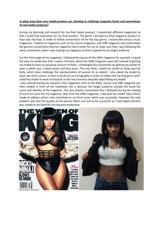
  • 1. In what ways does your media product use, develop or challenge magazine forms and conventions of real media products? During my planning and research for my final media product, I researched different magazines so that I could find inspiration for my final product. The genre I wanted my final magazine product to have was Hip-Hop. In order to follow conventions of the hip hop genre, I researched various music magazines. I looked at magazines such as the source magazine, and VIBE magazine and noted down the generic conventions that the magazine had in order for me to make sure that I was following the same conventions when I was making my magazine so that it appeals to my target audience. For the front page of my magazine, I followed the layout of the KING magazine for example I copied the way my model was shot I used a mid shot, which the KING magazine used. But instead of getting my model to bare an excessive amount of flesh, I challenged this convention by getting my model to wear a white vest, a black jacket and blue jeans. The only flesh I asked my model to show was her belly, which does challenge the representation of women to an extent. I also asked my model to wear two silver chains, so that it would act as iconography in order to reflect the hip hop genre and I asked my model to wear red lipstick as the red connotes sexuality objectifying my model. I also noticed during my research, that magazines such as the KING, source and VIBE magazine put their models in front of the masthead, this is because the target audience already the know the name and identity of the magazine. This was another convention that I followed during the making of my front cover for my magazine. Also from the KING magazine, I saw that the model had a direct mode of address which I also mimicked on my front cover which was successful. However the only problem was that the quality of the picture didn't turn out to be successful as I had hoped and this was unable to be fixed this during post production.
  • 2. For my contents page, I used the NME contents page for inspiration. This meant that having a variety of images was important as I needed to use them to anchor the headings of some of the content I had on my contents page. For example in the NME contents page, they would have a main image and an introduction to head the main image on the contents page. Then would have a few other pictures on the contents page. For example In order ti follow conventions of music magazines for my contents page, I used another picture of my model, this time I used a close up shot for my model, this time I asked my model to wear a black vest, sunglasses and chains which I deliberately used for iconography to reflect the hip hop genre and short shorts in the form of jeans again, she was bearing flesh which meant that I was following conventions of the hip hop genre. When I took the photo, I purposely made sure that the Mis-en-scene that was used was the wall that had graffiti in the background. This again served as iconography in order for me to reflect the hip hop genre in my magazine. When the picture had been taken, I put in a mini introduction to the double page spread that was in my Magazine as NME do in their contents page so that I would be following conventions of Hip Hop magazines so that It would appeal to my target audience. They also had an advertisement telling their target audience to subscribe to their magazine which is another convention that I used in the making of my contents page as it would attract my target audience who would be interested in subscribing to my magazine. Another form of advertising I used fot my magazine was one were my target audience could win a pair of Addidas shoes, for the picture to anchor this, I took a photo of a pair of addidas shoes at a low angle, but also at eye level so that it was facing directly at the camera. I took a photo of the addidas shoes so that It could it could be used as deliberate iconography to reflect the hip hop genre in my music magazine. For my double page spread, I mimicked a double page spread from the source magazine in terms of the way it was laid out. The photo I used for the double page was taken at a mid shot. The costume I asked my model to wear was a yellow cardigan, blue jeans and hi-tops. Again, I asked my model to wear silver chains as it served as iconography to reflect the genre that was Hip hop in my magazine. The photo had a direct mode of address and it also follows conventions as my model is bearing a lot of flesh, a convention that I continued to
  • 3. follow from the KING magazine this convention was that women are usually objectified in the hip hop genre. I also cropped and decreased the size of the photo in post production as in the source double page spread the photo and the text were placed on either side of the page, another convention I followed in the making of my double page spread. I also mimicked the way the drop cap was used, however when I did it, I made the colour of the drop cap green so that the black text could be seen on the page and it also followed the colour scheme that was used in my double page spread. My final magazine was called "#Bassline" the font I used was the astera font; this was because it was the most popular font amongst my target audience. I made the font a yellow/gold colour as it followed the colour scheme I wanted to go for on my front page. I made the font big and bold so that it will take up the width of my magazine cover as it means I am following conventions of magazines such as the source, VIBE and KING magazines where the mast head takes up the most of the space of the front cover. In terms of the layout for my front cover, I followed the layout of the VIBE magazine
  • 4. follow from the KING magazine this convention was that women are usually objectified in the hip hop genre. I also cropped and decreased the size of the photo in post production as in the source double page spread the photo and the text were placed on either side of the page, another convention I followed in the making of my double page spread. I also mimicked the way the drop cap was used, however when I did it, I made the colour of the drop cap green so that the black text could be seen on the page and it also followed the colour scheme that was used in my double page spread. My final magazine was called "#Bassline" the font I used was the astera font; this was because it was the most popular font amongst my target audience. I made the font a yellow/gold colour as it followed the colour scheme I wanted to go for on my front page. I made the font big and bold so that it will take up the width of my magazine cover as it means I am following conventions of magazines such as the source, VIBE and KING magazines where the mast head takes up the most of the space of the front cover. In terms of the layout for my front cover, I followed the layout of the VIBE magazine
  • 5. follow from the KING magazine this convention was that women are usually objectified in the hip hop genre. I also cropped and decreased the size of the photo in post production as in the source double page spread the photo and the text were placed on either side of the page, another convention I followed in the making of my double page spread. I also mimicked the way the drop cap was used, however when I did it, I made the colour of the drop cap green so that the black text could be seen on the page and it also followed the colour scheme that was used in my double page spread. My final magazine was called "#Bassline" the font I used was the astera font; this was because it was the most popular font amongst my target audience. I made the font a yellow/gold colour as it followed the colour scheme I wanted to go for on my front page. I made the font big and bold so that it will take up the width of my magazine cover as it means I am following conventions of magazines such as the source, VIBE and KING magazines where the mast head takes up the most of the space of the front cover. In terms of the layout for my front cover, I followed the layout of the VIBE magazine