The World Has Gone Mobile – Have Your Emails? | Lyris Blog
•
1 gefällt mir•223 views

Andrew King explains growing importance of mobile optimization and also provides three options for optimizing your emails for mobile. Visit http://blog.lyris.com/ to accelerate your digital & email marketing campaigns.

Empfohlen
Empfohlen
Weitere ähnliche Inhalte
Kürzlich hochgeladen
Kürzlich hochgeladen (20)
Empfohlen
Empfohlen (20)
The World Has Gone Mobile – Have Your Emails? | Lyris Blog
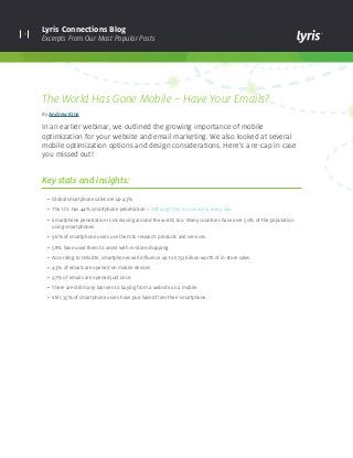
- 1. 1 Lyris Connections Blog Excerpts From Our Most Popular Posts The World Has Gone Mobile – Have Your Emails? By Andrew King In an earlier webinar, we outlined the growing importance of mobile optimization for your website and email marketing. We also looked at several mobile optimization options and design considerations. Here’s a re-cap in case you missed out! Key stats and insights: • Global smartphone sales are up 43%. • The U.S. has 44% smartphone penetration – Although this is increasing every day. • Smartphone penetration is increasing around the world, too. Many countries have over 50% of the population using smartphones. • 96% of smartphone users use them to research products and services. • 58% have used them to assist with in-store shopping. • According to Deloitte, smartphones will influence up to $752 billion worth of in-store sales. • 43% of emails are opened on mobile devices. • 97% of emails are opened just once. • There are still many barriers to buying from a website on a mobile. • Still, 35% of smartphone users have purchased from their smartphone.
- 2. 2 Lyris Connections Blog Excerpts From Our Most Popular Posts Three options for optimizing your emails for mobile Fluid Email Layout: Email width expands or contracts depending on the size of the screen that you are viewing it on. This is a fairly simple approach to mobile optimization that is achieved by setting the width of your email to a percentage rather than a fixed number. So the email effectively flows across whatever screen you are viewing it on. Pros • Easy to do • Seamless experience Cons • Not appropriate for image-only emails • Doesn’t always look good on a large screen • Only effective with simple layouts
- 3. 3 Lyris Connections Blog Excerpts From Our Most Popular Posts Pros • Seamless experience • Looks good in all environments • Easy to do and doesn’t require extra coding or design work Cons • Limits your design options • Not flexible • Not appropriate if you have a lot of content Scalable Design: An email design that features a single “mobile-friendly” layout that looks good on small and large screens. Unique features of this design approach include: • A single-column layout which is relatively narrow compared to most other emails • Large titles • Large calls-to-action which are easy to click on mobile devices • A good amount of white space • And a small amount of body copy which can easily be read at a glance
- 4. 4 Lyris Connections Blog Excerpts From Our Most Popular Posts Responsive Design: Responsive design allows you to change the way your email looks or is displayed depending on the size of the screen that email is being viewed on. It gives you an enormous amount of flexibility to add, remove, or re-arrange the content of your email, so that your subscribers will have the very best experience, no matter what device or email client they read your email on. Pros • Seamless experience • Extremely flexible • Just one HTML file Cons • Complex to code • Doesn’t work on all mobile devices • Adds weight which impacts loading time
- 5. lyris.comCopyright © 2014 Lyris, Inc. All rights reserved. About Lyris Inc: Lyris (@Lyris ) is a leading global provider of digital marketing solutions that help companies engage with customers in more meaningful ways. Lyris products and services empower marketers to design, automate, and optimize data- driven interactive marketing campaigns that facilitate superior engagement, increase conversions, and deliver measurable business value. Lyris’ high-performance, secure, and flexible digital marketing platforms improve marketing efficiency by providing automated digital message delivery, robust segmentation, and real-time digital channel analytics. The Lyris solutions portfolio is comprised of both in-the-cloud and on-premises offerings – Lyris HQ and Lyris LM – combined with customer-focused services and support. More than 5,000 companies worldwide partner with Lyris to manage and execute sophisticated digital marketing campaigns across email, social, Web, and mobile channels. Learn more at www.lyris.com. Keep up with the latest industry trends, developments and best practices for continuously optimizing your digital marketing campaigns. Visit Lyris Connections Blog Steps for optimizing your own emails • Identify the most popular mobile, webmail, and desktop clients and devices among YOUR subscribers. • Analyze the results and determine the best mobile optimization approach. • TEST your new design first. • Roll out your shiny new mobile-optimized email. • Keep on tracking in case new devices become popular among your subscribers. Still not sure where to start? Lyris Professional Services can help! We offer a number of mobile optimization services including: • Optimization of your existing email templates • Design and coding of brand new scalable or responsive templates • Responsive design training. Want to learn how to code your own responsive email templates? One of our in- house experts can train you