SlideShare ist ein Scribd-Unternehmen logo
1 von 25
Downloaden Sie, um offline zu lesen
First Front Cover Draft
First, I Inserted the masthead by adding text, changing it to a suitable size and font that I got from
the website Dafont. I changed the colour of my masthead to a red colour that I liked. When I decided
on the colour, I took note of the code which is highlighted in blue and has a # next to it. This was to
make sure that whenever I wanted to use red, it would always be the same as this one.
After choosing the colour I wanted to use, I clicked 3D on the option bar at the top. This gave my
masthead the 3-dimensional look I wanted.
I then inserted the image I had chosen for my model and used the background eraser tool to get rid
of the background. This tool was much easier and faster than any other tool for me as it did not alter
the actual figure of my model, his hair or his shadow. I was happy with this because I wanted to keep
his shadow on the page.
By using the rectangle tool, I created my strap line, and by using the ellipse tool
and the custom shape tool, to make stars, I created my plug. I moved the
strapline to the top of the page. I wanted to achieve a layered effect with my
strapline under and connected to my masthead. To get my masthead in front
of the strapline, I simply moved the masthead layer, in the layer’s section,
above the strapline layer so it overlapped it. This made my masthead stand out
more and gave it more of a 3D look.
For all my sub-images, I added in a stroke effect to make them stand out more. I also used this
stroke effect on my “World Exclusive Interview” text as it made it more prominent and helped add
to my colour scheme giving it a different feel. I got this idea from Q magazine.
Overall I wasn’t very happy with this first draft and structure. The page looked flat and had no
energy. My main image didn’t look as good as I was hoping it would and my text didn’t really fit the
page, so there was a lot of space left. All the elements didn’t really link together. I couldn’t get the
effect of my masthead overlapping my main image which I was hoping for. Therefore, I decided to
start again and create another flat plan.
I used the eye dropper tool to make note of the colours I used so I would have a consistent colour
scheme. I clicked on every colour using the tool. Then I clicked on the colour picker and made note
of the number next to the #.
Second Front Cover Draft
This was the photo I chose for my second draft. I liked this photograph because it will give me a blue
colour link from the image to the text. I first started by adding effects. This gave it more of a
professional design with better lighting to make my dominant image stand out more.
I added these effects via iPhone by altering the light setting. This was the quickest and easiest way
for me to do it.
I opened a new document and inserted my main image.
I tried using the background eraser tool, but unfortunately, because of the lighting on my model’s
face, it also erased part of him. Therefore, I used the quick selection tool instead. I cut out the image
of my model. I did this by selecting the parts of the picture I wanted to keep. This was quite simple
as my model had a simple hairstyle and wasn’t holding any items, so he was easy to cut around. I
kept the shadow in the shot as I liked the effect.
I copied and pasted what I had selected into a new layer. I then deleted the original image and was
left with my model and the plain white background I wanted.
I then copied over the features I liked from my first draft including my masthead with the 3D effect
and the strapline at the top.
I wanted my masthead to be in front of the shadow of my model, but behind his actual head.
Therefore, using the quick selection tool again, I selected part of his head and copied and pasted it
into a new layer. I then moved this layer in front of my masthead.
I then added in my puff, but changed the colour from red to yellow because it wasn’t prominent.
This made it stand out more and gave me an extra option of colour, helping my colour scheme and
appealing to my target audience because yellow was the next favoured colour after red, black and
white in my survey results.
I also changed the colour, size and positioning of some of my text from my first draft as it helped fit
my colour scheme and structure more.
While searching through the custom shapes tool on Photoshop, I came across a film section with a
film roll.
I thought this would be a good idea to use as I could put my sub-images inside of the frames. So, I
proceeded to work on my ideas and created a film roll containing photographs I had previously
taken of my dad performing. The images I used already had effects on because I was messing about
with them after I had taken them and lost the original image. These are the sub images I used:
The first one didn’t really fit in to the colour scheme that well, therefore I changed certain effects of
it via the computer to get this:
The reason I chose all the photos to be of my dad and not different models was because it was the
only way I could think of to link the relevant text in with the film roll images. I placed the film roll
over the top of my dominant image to connect with it and its main sell line and to add to the
layering effect.
However, I only took three pictures of him performing and there was one slot left on the film roll.
Therefore, I got an image of my other models, Fallen Angels, that was portrait and placed it over the
top of the film roll, at an angle. I changed the lighting effect on the image via the computer to blend
more with the colour scheme of the front cover. This gave it a much more professional look and will
appeal more to my wide target audience of both genders.
Following on from this, I wanted to fill the space on the bottom of my magazine. From my research, I
noticed that Kerrang used a “Plus” strapline at the bottom of their front cover. This interested me
from the start as it looked quite appealing to the eye and gave balance to the page. It will also
enable me to include the bands and artists from my original “Plus” list on my front cover practice
first draft because I had no room to include them on this draft. This will increase my magazine’s
content suggesting more value for money.
Overall, I was happy with the structure of this magazine. But I was not overly pleased with the colour
scheme of this front cover and the picture of Fallen Angels wasn’t next to, or didn’t link to its
relevant text. I also noticed that my main sell line was as big as my masthead. Therefore, I decided to
stay with the structure of this magazine but change certain elements inside of it.
Third Front Cover Draft
For my third draft, I decided to increase the size of my masthead by using Free Transform. I also
added a new font of “Fallen Angels” to their photograph to identify the band and make it into a free
poster.
I then proceeded to move my plug further down the page to appear on top of my model’s shoulder.
This was to create more space so I could increase the size of my masthead. I also decided to put my
date and issue number on the contents page, therefore leaving enough space at the top right of the
page to put my website link.
I made my strapline smaller as I thought it stood out too much, and I also changed the colour of it as
the red distracted from the masthead. I made it blue to give a colour balance to the page and create
boundaries. This made it look a lot better. I spread the text out more and could fit “Donnington
Headliners” on to one line.
I added a stroke effect on to my main sell line to make it more dominant and I also changed the
word “Guy” to “Boy” as it allowed me to use alliteration with the words “Bad” and “Brett”. This will
make it more appealing to my audience. I also changed the words “Saint” and “Sinner” around to
“Sinner or Saint?” as sinner appeals more to a rock magazine and is likely to appeal to my target
audience. Putting it first will make the word stronger and stand out in my audience’s minds.
I got this cover assessed by my lecturer and she gave me some suggestions on what I could improve
on.
Fourth Front Cover Draft
Following suggestions from my lecturer, I decided to change a few things on my front cover. First, I
moved the barcode up the page a bit so I could fit “+ More” on the strapline. This will give the
audience an indication that there are more artists included in the magazine that are not featured in
the cover lines. This will increase the appeal to my target audience because my magazine features all
genres of rock music. It also suggests they will get value for money as there’s a lot of content
included in the magazine. I made my barcode smaller because it didn’t need to be as big as it was. I
then added a white rectangle on the edge of the barcode so I could put the date in. I put the issue
number on the top of it. I changed the colour of text for the date and the price so they would stand
out more, just like they do in Q magazine. I used the same red and blue as my colour scheme to form
a connection between the barcode and the front cover.
I then altered the angle of the film roll with my sub images in as it directs the eye more to the image
and complements the angles of the other images. This also created more space above it for me to be
able to alter the size and length of my cover lines. I decided to see what it would look like if I moved
all my cover lines off my main image and its shadow. This made the dominant image stand out more.
My lecturer told me that it’s better to use a wider range of fonts, therefore I changed the font and
size of my blue cover lines. Furthermore, I added a black line beneath each cover line to give it a
better structural design. They also do this in Q magazine.
Lastly, I played around with some different fonts on my masthead because my lecturer wasn’t too
sure whether she liked the one I was using. I went back on to the website Dafont to look for some
relevant fonts that I liked. I tested some out and finally came up with the decision of choosing
“Manual Cookie Bucket” from the section Eroded in Fancy. This looked bold enough to be my
masthead and looked even better when I added a stroke effect.
I was very pleased with this draft because the 3D effect, layering and angles gave it more energy and
dynamics.
First Contents Page Draft
I started by adding my masthead to the contents page, making it smaller and placing it on the top
left hand corner of the page. I then inserted the title “Contents”, with a black stroke effect, and tried
to box both this and the masthead in by adding the rectangular tool in across the top of the page,
making it blue for continuity with the front cover. I followed this from the red strapline/banner from
the contents page of Q magazine. I didn’t really like the design of the top of the magazine, but I
decided to keep going with the rest of the construction and fix it later. I inserted my main image and
placed it on to the right side of the page. I then proceeded to add in my sub images around it and
played around with them until I was content with how they looked and overlapped. I added a white
stroke effect on each one of the images giving them a much more dominant and nicer look
resembling photographs. I used the quick selection tool to cut out one of my images at the top right.
I added in all my text and boxed them into their different categories using the rectangle tool, I gave
each one a different colour to clearly differentiate each section making it easier for the reader to
find what they are looking for. I used the same colours as my colour scheme for continuity and to
limit the colours on the page. I used the custom shape tool to add in stars. I also created a
subscription box and took a screenshot of my front cover so I could make it look more realistic. I
decided to change my font for the “Contents” and take the stroke effect off. Instead I made it a
similar design to Q in the fact that I made the title plain black and put it next to my masthead. By
messing about I found a nicer design by getting rid of the blue strapline and replacing it with a
simpler line at the top of the page under the title and my masthead. I wasn’t happy with the blue
strapline because the masthead and sub image didn’t stand out. I made my issue number a low
number because the magazine is meant to have been recently released. I boxed in my masthead and
issue number, and by adding a light grey to certain parts on the page, I made it look much more
appealing instead of everything being plain white. I added social media links at the bottom of the
page to appeal to my target audience and create a community of readers.
Overall I was quite pleased with how this looked but I still think it needed some improvements. I
couldn’t think of anything so I decided to get it peer assessed by my lecturer. She managed to come
up with a few things I could improve on.
Second Contents Page Draft
After hearing from my lecturer, I first started by changing my issue number to a higher number to
make it more realistic. I got this assessed the same time as I got my front cover assessed so, after
changing my font for my masthead on my front cover, I had to change it for my contents as well. This
did give it a neater design. She told me to use a wider variety of fonts and so I changed the font for
my sub-heads. I used one she had recommended to me from Dafont called “Bebas”. I found that it
did stand out more from the rest of the text. The last improvement she gave me was to add in a
couple more issues of Da CAPO to the subscription box just like they do in other music magazines.
So, I decided to make two more front covers as if I was creating more issues. I didn’t care so much
about the design because they will be small and only half of the magazine will be showing with the
other half behind my original front cover screenshot. I used two pictures from my photoshoot which
weren’t used at all in my magazine. I added some text and changed their background colours and
effects to make each magazine look different and realistic.
Once I placed and angled these in the subscription box, I added a black stroke effect to each one to
make them stand out more.
Overall, I was quite pleased with how this contents page looked. However, I did not like the amount
of blank spaces and positioning of some of the text. I decided to get this work peer assessed to see
what other people thought of it.
Third Contents Page Draft
After listening to some peer feedback, they said that there were too many black lines and it made
everything look boxed in and it didn’t give it a nice look. So, I decided to take this comment on
board. First, using the ruler tool, I evened out my text and numbers to make it look cleaner and more
professional.
I then added in two different parts of the same photograph behind my sub images to give a nice
collage of overlaying pictures that looked much better than the blank, white space that was there. I
then filled in the blank space left in the gig guide by adding in a plug made by an ellipses shape tool
with “Full Details” inside. This expands the gig guide giving it more information. I also changed the
page number of the gig guide to 74 because all my other page numbers were quite low and I wanted
to expand the content in my magazine making it the right value for money. This looked much better
with no more dead space. I realised that my three logos of Facebook, Twitter and Instagram were
falling off the page a bit so I made them smaller. Finally, I wanted to make my title stand out more
and not make everything at the top look as boxed in. Therefore, I took out the top black lines and
moved my masthead down a bit so I could move the date to above it. I also moved the picture of
Brett White to the right a little bit freeing up more space to enlarge the page title. Then, sticking to
my colour scheme, I added the colour blue to certain parts of the page. This made my page more
vibrant and my photographs stand out more. This helped in its appeal to my target audience and
made it more attractive to the eye. I also changed the font of my bottom page number to keep
consistency.
Overall, I was very pleased with how this turned out the way it did. However, I thought that there
was an inconsistency of the colour blue because there was a lot at the top of the page and not really
any at the bottom.
Fourth Contents Page Draft
I decided to add a banner of the colour blue to the bottom of my page. This kept consistency with
my front cover and balanced the colours on my page. However, it made the black text of my social
media links and page number not stand out as much. Therefore, I made the text white and this
solved the problem.
Overall, I was much happier with this contents page.
Double Page Spread First Draft
I opened a new document and put the page width and height the opposite way around to my front
cover and contents page. This gave me my double page spread. First I changed the colour of my
background to black, and then I inserted my main image. I had already added effects on to this
image to try and make the outside darker because I wanted it to blend in with the black background.
I added these effects via my iPhone and my computer.
By adding these effects I was able to make my image go from this:
To this:
But I found that this still didn’t blend in fully with the black background.
Therefore, after a bit of
research, I used lens correction on a new layer to alter with the vignette of the image.
I resized this layer over the top of my main image and made it see-through by changing it to Multiply
in the drop-down box in layers.
I then proceeded to add in my title, strap line and kicker. I used my consistent colour palette of red,
yellow and blue to stick to my colour scheme. I then typed my written article into word so I could
use Word Processor to check if there were any mistakes. Once I’d finished doing this, I copied my
written article and pasted it on to my double page spread putting different parts in different text
boxes. By putting them in text boxes, it enabled me to create columns that were the same size. I
included a drop capital at the beginning of the article by inserting different parts of my text into
different text boxes and moving them about to make space for a drop capital. I made my text white
to stand out and be easy to read. When arranging my text, l left a gap at the bottom of the page so I
could add in a sub image, and enough space at the bottom so I could add in the page numbers and
masthead.
I then inserted my sub image and using the quick selection tool, I cut out part of the background to
get rid of the top part of the picture and the window because it wouldn’t blend in well with the rest
of the page. I couldn’t crop it out either because when I tried to, it also cut out part of the angel
wings This is the image I used:
I wanted to see what it would look like with the wings underneath the text, but the wings were too
bright and you couldn’t read the text because of this. Therefore, I used the lens correction again to
darken the outside of the photo. This made it easier to see the white text.
I then added in my page number, mastheads, pull quotes and edits to come up with my finished first
draft.
Overall I was pleased with how the main image looked. But I wasn’t happy with the use of colours as
they didn’t blend well together. You couldn’t see the nice use of colour on the angel wings as they
were covered by writing and had a darkened overlay effect on them. Also, I didn’t like the wall
showing on my sub image. I proceeded to get my work assessed by my lecturer. She couldn’t think of
any improvements but did advise that I change my edits from “Article Photograph” to “Article and
Photograph”, and to also rotate it 90° so it would fit across the side of the page.
While reading through my work I noticed that I had copied and pasted my written article from Word
wrong. This did make me happier because it meant that I would have more space to work with when
getting rid of the repeated text. But what I also noticed is that I kept changing tense so it didn’t read
right.
Double Page Spread Second Draft
After correcting my text to get rid of repeated sections, making it slightly shorter and making it all
the same tense, I ended up with my work in two columns instead of three. This gave me more space
to work with and made the angel wings on my sub image more prominent. I then altered the edits
to what my lecturer told me and this gave it more of a professional look. Furthermore, I changed the
colour on some of my text to try and make it look better and make things like the pull quotes stand
out more. As I didn’t like the wall showing in my sub image, I decided to cut the wings and my model
out. I did this using the quick selection tool. I’m not that advanced in Photoshop so I couldn’t use any
of the other tools such as the lasso. I found this tool the quickest and by far the easiest to use.
After cutting my sub image out and removing the wall, I could enlarge it to fit more of the space. I
liked the idea of part of the angel wings merging in to the text. It was now starting to look better as
my images represented heaven and hell therefore they went very well with the title “Hell Raiser or
Heaven Sent?”. I also made the quote “I chose my own hell” larger and shaped it around my sub
image.
Overall I was happier with how it was starting to look, but I still didn’t like the text overlapping the
angel wings as you couldn’t read the white text over it.
Double Page Spread Third Draft
To start off with I tried to make more space on my page. I moved the strapline above the title so I
could bring the kicker up a bit. I preferred this design to the other one. Following on from this I
remembered that you’ve got to have your text aligned so that it doesn’t run across both pages as
you will not be able to read some of the text when printed and folded. Therefore, in the ‘View’
section on the ribbon at the top, I turned ’Rulers’ on and then created four guides using the ‘New
Guide’ button. This presented me with four blue lines that, when moved in to position, stated the
lengths of the page. I moved two of the lines to each end of the page then changed the
measurements of my ruler to inches as I knew that my page was made in inches. I then moved the
third line to the middle of the page at the 3.5 inches mark as I knew that was half of 7. I then had to
re-arrange my article text so it would all fit on one page.
After altering my text to fit on the page, I decided to change a few fonts colours and enlarge my sub
image to bump in to my text. I moved my text around an angel wing on my sub image.
I changed the font of my page numbers to the same as my contents page to keep consistency as they
do in a real magazine.
Overall, I felt that this was my best draft so far because I liked the effect of the sub image bumping in
to the text. However, I felt like embedding a pull quote in the middle of the text might make it look
better and less text heavy. I also got some peer feedback on this draft and someone recommended
moving my sub image to the left of the page and moving my text to the right. They said it would
spread the text out more and force the reader’s eyes elsewhere on the page making it more pleasing
to the eye.
Double Page Spread Fourth Draft
I decided to take my peer feedback comments on board and see what it would look like if I moved
my sub image to the bottom left of the page and move some of my text to the right, arranging my
text around the angel wings. But first I changed the colour of my kicker to a lighter brown as I
thought the colour orange was too close to the colour red. This did look better and made my title
stand out more. I then went on YouTube and searched “How to wrap text around an image in
Photoshop” as I didn’t know how to do this. After watching a few tutorials, I decided to give it a go
myself. To start, I saved another copy of my document just in case anything went wrong. I then had
to start with clear space and no text, so I cut and paste my text onto a word document. I selected
my sub image by clicking on the layer while holding Ctrl. I then went on ‘Select’, ‘Modify’ and
‘Expand’. I chose 20 pixels and clicked ‘OK’. After doing this, I right clicked on the image and saved
the selection naming it ‘Angel Wings’ so this became a new channel. I got hold of the Rectangular
Marquee Tool and drew an area where I wanted to insert my text, making sure to put it over an area
of the sub image. I went on my channels and, holding Ctrl, clicked on the channel named ‘Angel
Wings’. This made my Marquee Tool selection warp around my sub image and therefore, my text
would not go over the image. I then made my Marquee selection into a work path so I could input
the text. I copied and pasted some of my text back over into this box but left some of it as I needed
to keep columns. To do this, I repeated the steps twice for ‘warping the text around the angel
wings’. After doing this and inserting all my text, I ended up with four neatly placed columns; two on
the left page and two on the right page. This gave my page a much nicer, professional look. I decided
to change the font of my Article text to Arial because it looked cleaner and easier to read than Vacer
Serif Personal. It made the text 1pt smaller, giving me enough space to embed a pull quote in to the
middle of the text. I needed a long quote to put across the middle of two columns, therefore I got rid
of one of my pull quotes “Drink, drugs and sex was all I cared about” and inserted a longer one. I
made this quote fit perfectly into the space I created. I moved my other quotes around my main
image as if they were framing it in. Lastly, I realised that “Hell Raiser” was one word and so, I
corrected this.
Overall, I was extremely happy with how this draft turned out. The colour scheme was starting to
look much better and I felt that there were no more improvements needed for the structure. I
decided to get some peer feedback on it to gather other people’s opinions.
Double Page Spread Fifth Draft
After listening to people’s feedback, I have decided to take on board what they said. First, I changed
the colour of my kicker to white making it stand out more. Although my article text was white, my
kicker was a different, bolder font and a different size. The brown was too dark and didn’t stand out
on the black background. It also wasn’t part of my colour scheme therefore it did look a bit odd. I
then moved my article title to the top of the page and put my strapline below it instead of above.
This gave my page a cleaner look.
Overall, I thought that this was the best I could make my page and decided to stick with this design.

Weitere ähnliche Inhalte

Was ist angesagt?

Was ist angesagt? (20)

Development of front cover
Development of front coverDevelopment of front cover
Development of front cover
 
EVALUATION - QUESTION I
EVALUATION - QUESTION IEVALUATION - QUESTION I
EVALUATION - QUESTION I
 
Photoshop front page and contents print screens
Photoshop front page and contents print screensPhotoshop front page and contents print screens
Photoshop front page and contents print screens
 
Music magazine construction
Music magazine constructionMusic magazine construction
Music magazine construction
 
6. Production Reflection 2
6. Production Reflection 26. Production Reflection 2
6. Production Reflection 2
 
Fmp evaluation
Fmp evaluationFmp evaluation
Fmp evaluation
 
6. Production Reflection
6. Production Reflection6. Production Reflection
6. Production Reflection
 
Media Logs Saff Frost Blogspot
Media Logs Saff Frost BlogspotMedia Logs Saff Frost Blogspot
Media Logs Saff Frost Blogspot
 
Pr11 production commentary sarah murray
Pr11 production commentary sarah murrayPr11 production commentary sarah murray
Pr11 production commentary sarah murray
 
Evaluation/reflection
Evaluation/reflectionEvaluation/reflection
Evaluation/reflection
 
Evaluation
EvaluationEvaluation
Evaluation
 
Comm130 portfolio
Comm130 portfolioComm130 portfolio
Comm130 portfolio
 
13 a justinscott1
13 a justinscott113 a justinscott1
13 a justinscott1
 
Production diary
Production diaryProduction diary
Production diary
 
Screen caps for fc !!
Screen caps for fc !!Screen caps for fc !!
Screen caps for fc !!
 
U14 LO4
U14 LO4U14 LO4
U14 LO4
 
Evidence of Creating Drafts
Evidence of Creating DraftsEvidence of Creating Drafts
Evidence of Creating Drafts
 
3. production experiments (1)
3. production experiments (1)3. production experiments (1)
3. production experiments (1)
 
5. pre production
5. pre production5. pre production
5. pre production
 
Portfolio
Portfolio Portfolio
Portfolio
 

Ähnlich wie Construction of magazine

Construction of contents page
Construction of contents pageConstruction of contents page
Construction of contents pageAS Media Column D
 
Making my First Draft of My Double Page Spread
Making my First Draft of My Double Page SpreadMaking my First Draft of My Double Page Spread
Making my First Draft of My Double Page Spreadshannoncammish
 
Development diary media
Development diary mediaDevelopment diary media
Development diary mediagracesykes
 
Evaluation h – skills development
Evaluation h – skills developmentEvaluation h – skills development
Evaluation h – skills developmentRyan Tarran
 
Evidence of Front Cover
Evidence of Front CoverEvidence of Front Cover
Evidence of Front CoverTiaMaletta
 
Print screens for the construction of my front cover, contents and double pag...
Print screens for the construction of my front cover, contents and double pag...Print screens for the construction of my front cover, contents and double pag...
Print screens for the construction of my front cover, contents and double pag...brontesullivan14
 
Cover layout and photoshop
Cover layout and photoshopCover layout and photoshop
Cover layout and photoshopzoya167
 
Cover layout decisions and photoshop
Cover layout decisions and photoshopCover layout decisions and photoshop
Cover layout decisions and photoshopaamina24
 
Magazine and Print Evaluation
Magazine and Print EvaluationMagazine and Print Evaluation
Magazine and Print EvaluationThomas Haase
 
6. production reflection f
6. production reflection f 6. production reflection f
6. production reflection f AlicjaMorawska
 
Process of magazine jaye
Process of magazine jayeProcess of magazine jaye
Process of magazine jayeaslihan_s
 
Dps Photoshop and layour
Dps Photoshop and layourDps Photoshop and layour
Dps Photoshop and layourzoya167
 
Photoshop process
Photoshop processPhotoshop process
Photoshop processasmediae15
 
Production process 3 fc
Production process 3 fcProduction process 3 fc
Production process 3 fcso05056454
 
Photoshop process
Photoshop processPhotoshop process
Photoshop processasmediae15
 
Creating my contents page
Creating my contents pageCreating my contents page
Creating my contents pageTiaMaletta
 
Screen caps for dps
Screen caps for dpsScreen caps for dps
Screen caps for dpsLeah Hancox
 

Ähnlich wie Construction of magazine (20)

Construction of contents page
Construction of contents pageConstruction of contents page
Construction of contents page
 
Making my First Draft of My Double Page Spread
Making my First Draft of My Double Page SpreadMaking my First Draft of My Double Page Spread
Making my First Draft of My Double Page Spread
 
Development diary media
Development diary mediaDevelopment diary media
Development diary media
 
Evaluation h – skills development
Evaluation h – skills developmentEvaluation h – skills development
Evaluation h – skills development
 
Evidence of Front Cover
Evidence of Front CoverEvidence of Front Cover
Evidence of Front Cover
 
Print screens for the construction of my front cover, contents and double pag...
Print screens for the construction of my front cover, contents and double pag...Print screens for the construction of my front cover, contents and double pag...
Print screens for the construction of my front cover, contents and double pag...
 
Cover layout and photoshop
Cover layout and photoshopCover layout and photoshop
Cover layout and photoshop
 
Cover layout decisions and photoshop
Cover layout decisions and photoshopCover layout decisions and photoshop
Cover layout decisions and photoshop
 
Magazine and Print Evaluation
Magazine and Print EvaluationMagazine and Print Evaluation
Magazine and Print Evaluation
 
6. production reflection f
6. production reflection f 6. production reflection f
6. production reflection f
 
Process of magazine jaye
Process of magazine jayeProcess of magazine jaye
Process of magazine jaye
 
Designing my dps
Designing my dpsDesigning my dps
Designing my dps
 
Dps Photoshop and layour
Dps Photoshop and layourDps Photoshop and layour
Dps Photoshop and layour
 
Photoshop process
Photoshop processPhotoshop process
Photoshop process
 
Construction on front cover
Construction on front coverConstruction on front cover
Construction on front cover
 
Production process 3 fc
Production process 3 fcProduction process 3 fc
Production process 3 fc
 
Photoshop process
Photoshop processPhotoshop process
Photoshop process
 
Development diary-1
Development diary-1Development diary-1
Development diary-1
 
Creating my contents page
Creating my contents pageCreating my contents page
Creating my contents page
 
Screen caps for dps
Screen caps for dpsScreen caps for dps
Screen caps for dps
 

Mehr von Lyndan Trenholm

Mehr von Lyndan Trenholm (20)

Construction of magazine
Construction of magazine Construction of magazine
Construction of magazine
 
March 2017 calender
March 2017 calenderMarch 2017 calender
March 2017 calender
 
February 2017 calendar
February 2017 calendarFebruary 2017 calendar
February 2017 calendar
 
April 2017 calender
April 2017 calenderApril 2017 calender
April 2017 calender
 
January 2017 calender
January 2017 calenderJanuary 2017 calender
January 2017 calender
 
December 2016 calender
December 2016 calenderDecember 2016 calender
December 2016 calender
 
November 2016 calender
November 2016 calenderNovember 2016 calender
November 2016 calender
 
October 2016 calender
October 2016 calenderOctober 2016 calender
October 2016 calender
 
September 2016 calender
September 2016 calenderSeptember 2016 calender
September 2016 calender
 
Liam gallagher similar products
Liam gallagher similar productsLiam gallagher similar products
Liam gallagher similar products
 
Evaluation question 2
Evaluation question 2Evaluation question 2
Evaluation question 2
 
Evaluation question 2
Evaluation question 2Evaluation question 2
Evaluation question 2
 
Enrolment Task
Enrolment TaskEnrolment Task
Enrolment Task
 
As Media Costume Brief
As Media Costume Brief As Media Costume Brief
As Media Costume Brief
 
As media prop brief
As media prop briefAs media prop brief
As media prop brief
 
Masthead ideas main
Masthead ideas mainMasthead ideas main
Masthead ideas main
 
Font Ideas
Font IdeasFont Ideas
Font Ideas
 
Language and Register AS Media
Language and Register AS MediaLanguage and Register AS Media
Language and Register AS Media
 
Target Audience Survey
Target Audience Survey Target Audience Survey
Target Audience Survey
 
Image mode of address
Image mode of addressImage mode of address
Image mode of address
 

Kürzlich hochgeladen

Causes of poverty in France presentation.pptx
Causes of poverty in France presentation.pptxCauses of poverty in France presentation.pptx
Causes of poverty in France presentation.pptxCamilleBoulbin1
 
Presentation on Engagement in Book Clubs
Presentation on Engagement in Book ClubsPresentation on Engagement in Book Clubs
Presentation on Engagement in Book Clubssamaasim06
 
Chiulli_Aurora_Oman_Raffaele_Beowulf.pptx
Chiulli_Aurora_Oman_Raffaele_Beowulf.pptxChiulli_Aurora_Oman_Raffaele_Beowulf.pptx
Chiulli_Aurora_Oman_Raffaele_Beowulf.pptxraffaeleoman
 
Dreaming Music Video Treatment _ Project & Portfolio III
Dreaming Music Video Treatment _ Project & Portfolio IIIDreaming Music Video Treatment _ Project & Portfolio III
Dreaming Music Video Treatment _ Project & Portfolio IIINhPhngng3
 
Aesthetic Colaba Mumbai Cst Call girls 📞 7738631006 Grant road Call Girls ❤️-...
Aesthetic Colaba Mumbai Cst Call girls 📞 7738631006 Grant road Call Girls ❤️-...Aesthetic Colaba Mumbai Cst Call girls 📞 7738631006 Grant road Call Girls ❤️-...
Aesthetic Colaba Mumbai Cst Call girls 📞 7738631006 Grant road Call Girls ❤️-...Pooja Nehwal
 
Thirunelveli call girls Tamil escorts 7877702510
Thirunelveli call girls Tamil escorts 7877702510Thirunelveli call girls Tamil escorts 7877702510
Thirunelveli call girls Tamil escorts 7877702510Vipesco
 
AWS Data Engineer Associate (DEA-C01) Exam Dumps 2024.pdf
AWS Data Engineer Associate (DEA-C01) Exam Dumps 2024.pdfAWS Data Engineer Associate (DEA-C01) Exam Dumps 2024.pdf
AWS Data Engineer Associate (DEA-C01) Exam Dumps 2024.pdfSkillCertProExams
 
SaaStr Workshop Wednesday w/ Lucas Price, Yardstick
SaaStr Workshop Wednesday w/ Lucas Price, YardstickSaaStr Workshop Wednesday w/ Lucas Price, Yardstick
SaaStr Workshop Wednesday w/ Lucas Price, Yardsticksaastr
 
Sector 62, Noida Call girls :8448380779 Noida Escorts | 100% verified
Sector 62, Noida Call girls :8448380779 Noida Escorts | 100% verifiedSector 62, Noida Call girls :8448380779 Noida Escorts | 100% verified
Sector 62, Noida Call girls :8448380779 Noida Escorts | 100% verifiedDelhi Call girls
 
BDSM⚡Call Girls in Sector 97 Noida Escorts >༒8448380779 Escort Service
BDSM⚡Call Girls in Sector 97 Noida Escorts >༒8448380779 Escort ServiceBDSM⚡Call Girls in Sector 97 Noida Escorts >༒8448380779 Escort Service
BDSM⚡Call Girls in Sector 97 Noida Escorts >༒8448380779 Escort ServiceDelhi Call girls
 
Busty Desi⚡Call Girls in Sector 51 Noida Escorts >༒8448380779 Escort Service-...
Busty Desi⚡Call Girls in Sector 51 Noida Escorts >༒8448380779 Escort Service-...Busty Desi⚡Call Girls in Sector 51 Noida Escorts >༒8448380779 Escort Service-...
Busty Desi⚡Call Girls in Sector 51 Noida Escorts >༒8448380779 Escort Service-...Delhi Call girls
 
Bring back lost lover in USA, Canada ,Uk ,Australia ,London Lost Love Spell C...
Bring back lost lover in USA, Canada ,Uk ,Australia ,London Lost Love Spell C...Bring back lost lover in USA, Canada ,Uk ,Australia ,London Lost Love Spell C...
Bring back lost lover in USA, Canada ,Uk ,Australia ,London Lost Love Spell C...amilabibi1
 
Air breathing and respiratory adaptations in diver animals
Air breathing and respiratory adaptations in diver animalsAir breathing and respiratory adaptations in diver animals
Air breathing and respiratory adaptations in diver animalsaqsarehman5055
 
Introduction to Prompt Engineering (Focusing on ChatGPT)
Introduction to Prompt Engineering (Focusing on ChatGPT)Introduction to Prompt Engineering (Focusing on ChatGPT)
Introduction to Prompt Engineering (Focusing on ChatGPT)Chameera Dedduwage
 
lONG QUESTION ANSWER PAKISTAN STUDIES10.
lONG QUESTION ANSWER PAKISTAN STUDIES10.lONG QUESTION ANSWER PAKISTAN STUDIES10.
lONG QUESTION ANSWER PAKISTAN STUDIES10.lodhisaajjda
 
The workplace ecosystem of the future 24.4.2024 Fabritius_share ii.pdf
The workplace ecosystem of the future 24.4.2024 Fabritius_share ii.pdfThe workplace ecosystem of the future 24.4.2024 Fabritius_share ii.pdf
The workplace ecosystem of the future 24.4.2024 Fabritius_share ii.pdfSenaatti-kiinteistöt
 
Report Writing Webinar Training
Report Writing Webinar TrainingReport Writing Webinar Training
Report Writing Webinar TrainingKylaCullinane
 
My Presentation "In Your Hands" by Halle Bailey
My Presentation "In Your Hands" by Halle BaileyMy Presentation "In Your Hands" by Halle Bailey
My Presentation "In Your Hands" by Halle Baileyhlharris
 
BDSM⚡Call Girls in Sector 93 Noida Escorts >༒8448380779 Escort Service
BDSM⚡Call Girls in Sector 93 Noida Escorts >༒8448380779 Escort ServiceBDSM⚡Call Girls in Sector 93 Noida Escorts >༒8448380779 Escort Service
BDSM⚡Call Girls in Sector 93 Noida Escorts >༒8448380779 Escort ServiceDelhi Call girls
 

Kürzlich hochgeladen (20)

Causes of poverty in France presentation.pptx
Causes of poverty in France presentation.pptxCauses of poverty in France presentation.pptx
Causes of poverty in France presentation.pptx
 
Presentation on Engagement in Book Clubs
Presentation on Engagement in Book ClubsPresentation on Engagement in Book Clubs
Presentation on Engagement in Book Clubs
 
Chiulli_Aurora_Oman_Raffaele_Beowulf.pptx
Chiulli_Aurora_Oman_Raffaele_Beowulf.pptxChiulli_Aurora_Oman_Raffaele_Beowulf.pptx
Chiulli_Aurora_Oman_Raffaele_Beowulf.pptx
 
Dreaming Music Video Treatment _ Project & Portfolio III
Dreaming Music Video Treatment _ Project & Portfolio IIIDreaming Music Video Treatment _ Project & Portfolio III
Dreaming Music Video Treatment _ Project & Portfolio III
 
Aesthetic Colaba Mumbai Cst Call girls 📞 7738631006 Grant road Call Girls ❤️-...
Aesthetic Colaba Mumbai Cst Call girls 📞 7738631006 Grant road Call Girls ❤️-...Aesthetic Colaba Mumbai Cst Call girls 📞 7738631006 Grant road Call Girls ❤️-...
Aesthetic Colaba Mumbai Cst Call girls 📞 7738631006 Grant road Call Girls ❤️-...
 
Thirunelveli call girls Tamil escorts 7877702510
Thirunelveli call girls Tamil escorts 7877702510Thirunelveli call girls Tamil escorts 7877702510
Thirunelveli call girls Tamil escorts 7877702510
 
AWS Data Engineer Associate (DEA-C01) Exam Dumps 2024.pdf
AWS Data Engineer Associate (DEA-C01) Exam Dumps 2024.pdfAWS Data Engineer Associate (DEA-C01) Exam Dumps 2024.pdf
AWS Data Engineer Associate (DEA-C01) Exam Dumps 2024.pdf
 
SaaStr Workshop Wednesday w/ Lucas Price, Yardstick
SaaStr Workshop Wednesday w/ Lucas Price, YardstickSaaStr Workshop Wednesday w/ Lucas Price, Yardstick
SaaStr Workshop Wednesday w/ Lucas Price, Yardstick
 
Sector 62, Noida Call girls :8448380779 Noida Escorts | 100% verified
Sector 62, Noida Call girls :8448380779 Noida Escorts | 100% verifiedSector 62, Noida Call girls :8448380779 Noida Escorts | 100% verified
Sector 62, Noida Call girls :8448380779 Noida Escorts | 100% verified
 
BDSM⚡Call Girls in Sector 97 Noida Escorts >༒8448380779 Escort Service
BDSM⚡Call Girls in Sector 97 Noida Escorts >༒8448380779 Escort ServiceBDSM⚡Call Girls in Sector 97 Noida Escorts >༒8448380779 Escort Service
BDSM⚡Call Girls in Sector 97 Noida Escorts >༒8448380779 Escort Service
 
Busty Desi⚡Call Girls in Sector 51 Noida Escorts >༒8448380779 Escort Service-...
Busty Desi⚡Call Girls in Sector 51 Noida Escorts >༒8448380779 Escort Service-...Busty Desi⚡Call Girls in Sector 51 Noida Escorts >༒8448380779 Escort Service-...
Busty Desi⚡Call Girls in Sector 51 Noida Escorts >༒8448380779 Escort Service-...
 
Bring back lost lover in USA, Canada ,Uk ,Australia ,London Lost Love Spell C...
Bring back lost lover in USA, Canada ,Uk ,Australia ,London Lost Love Spell C...Bring back lost lover in USA, Canada ,Uk ,Australia ,London Lost Love Spell C...
Bring back lost lover in USA, Canada ,Uk ,Australia ,London Lost Love Spell C...
 
Air breathing and respiratory adaptations in diver animals
Air breathing and respiratory adaptations in diver animalsAir breathing and respiratory adaptations in diver animals
Air breathing and respiratory adaptations in diver animals
 
Introduction to Prompt Engineering (Focusing on ChatGPT)
Introduction to Prompt Engineering (Focusing on ChatGPT)Introduction to Prompt Engineering (Focusing on ChatGPT)
Introduction to Prompt Engineering (Focusing on ChatGPT)
 
lONG QUESTION ANSWER PAKISTAN STUDIES10.
lONG QUESTION ANSWER PAKISTAN STUDIES10.lONG QUESTION ANSWER PAKISTAN STUDIES10.
lONG QUESTION ANSWER PAKISTAN STUDIES10.
 
ICT role in 21st century education and it's challenges.pdf
ICT role in 21st century education and it's challenges.pdfICT role in 21st century education and it's challenges.pdf
ICT role in 21st century education and it's challenges.pdf
 
The workplace ecosystem of the future 24.4.2024 Fabritius_share ii.pdf
The workplace ecosystem of the future 24.4.2024 Fabritius_share ii.pdfThe workplace ecosystem of the future 24.4.2024 Fabritius_share ii.pdf
The workplace ecosystem of the future 24.4.2024 Fabritius_share ii.pdf
 
Report Writing Webinar Training
Report Writing Webinar TrainingReport Writing Webinar Training
Report Writing Webinar Training
 
My Presentation "In Your Hands" by Halle Bailey
My Presentation "In Your Hands" by Halle BaileyMy Presentation "In Your Hands" by Halle Bailey
My Presentation "In Your Hands" by Halle Bailey
 
BDSM⚡Call Girls in Sector 93 Noida Escorts >༒8448380779 Escort Service
BDSM⚡Call Girls in Sector 93 Noida Escorts >༒8448380779 Escort ServiceBDSM⚡Call Girls in Sector 93 Noida Escorts >༒8448380779 Escort Service
BDSM⚡Call Girls in Sector 93 Noida Escorts >༒8448380779 Escort Service
 

Construction of magazine

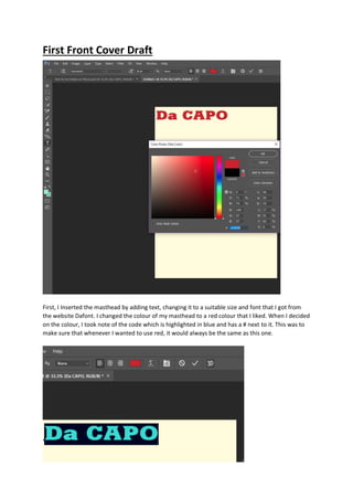
  • 1. First Front Cover Draft First, I Inserted the masthead by adding text, changing it to a suitable size and font that I got from the website Dafont. I changed the colour of my masthead to a red colour that I liked. When I decided on the colour, I took note of the code which is highlighted in blue and has a # next to it. This was to make sure that whenever I wanted to use red, it would always be the same as this one.
  • 2. After choosing the colour I wanted to use, I clicked 3D on the option bar at the top. This gave my masthead the 3-dimensional look I wanted. I then inserted the image I had chosen for my model and used the background eraser tool to get rid of the background. This tool was much easier and faster than any other tool for me as it did not alter the actual figure of my model, his hair or his shadow. I was happy with this because I wanted to keep his shadow on the page.
  • 3. By using the rectangle tool, I created my strap line, and by using the ellipse tool and the custom shape tool, to make stars, I created my plug. I moved the strapline to the top of the page. I wanted to achieve a layered effect with my strapline under and connected to my masthead. To get my masthead in front of the strapline, I simply moved the masthead layer, in the layer’s section, above the strapline layer so it overlapped it. This made my masthead stand out more and gave it more of a 3D look. For all my sub-images, I added in a stroke effect to make them stand out more. I also used this stroke effect on my “World Exclusive Interview” text as it made it more prominent and helped add to my colour scheme giving it a different feel. I got this idea from Q magazine. Overall I wasn’t very happy with this first draft and structure. The page looked flat and had no energy. My main image didn’t look as good as I was hoping it would and my text didn’t really fit the page, so there was a lot of space left. All the elements didn’t really link together. I couldn’t get the effect of my masthead overlapping my main image which I was hoping for. Therefore, I decided to start again and create another flat plan.
  • 4. I used the eye dropper tool to make note of the colours I used so I would have a consistent colour scheme. I clicked on every colour using the tool. Then I clicked on the colour picker and made note of the number next to the #. Second Front Cover Draft This was the photo I chose for my second draft. I liked this photograph because it will give me a blue colour link from the image to the text. I first started by adding effects. This gave it more of a professional design with better lighting to make my dominant image stand out more. I added these effects via iPhone by altering the light setting. This was the quickest and easiest way for me to do it.
  • 5. I opened a new document and inserted my main image. I tried using the background eraser tool, but unfortunately, because of the lighting on my model’s face, it also erased part of him. Therefore, I used the quick selection tool instead. I cut out the image of my model. I did this by selecting the parts of the picture I wanted to keep. This was quite simple as my model had a simple hairstyle and wasn’t holding any items, so he was easy to cut around. I kept the shadow in the shot as I liked the effect.
  • 6. I copied and pasted what I had selected into a new layer. I then deleted the original image and was left with my model and the plain white background I wanted. I then copied over the features I liked from my first draft including my masthead with the 3D effect and the strapline at the top. I wanted my masthead to be in front of the shadow of my model, but behind his actual head. Therefore, using the quick selection tool again, I selected part of his head and copied and pasted it into a new layer. I then moved this layer in front of my masthead.
  • 7. I then added in my puff, but changed the colour from red to yellow because it wasn’t prominent. This made it stand out more and gave me an extra option of colour, helping my colour scheme and appealing to my target audience because yellow was the next favoured colour after red, black and white in my survey results. I also changed the colour, size and positioning of some of my text from my first draft as it helped fit my colour scheme and structure more.
  • 8. While searching through the custom shapes tool on Photoshop, I came across a film section with a film roll. I thought this would be a good idea to use as I could put my sub-images inside of the frames. So, I proceeded to work on my ideas and created a film roll containing photographs I had previously taken of my dad performing. The images I used already had effects on because I was messing about with them after I had taken them and lost the original image. These are the sub images I used: The first one didn’t really fit in to the colour scheme that well, therefore I changed certain effects of it via the computer to get this: The reason I chose all the photos to be of my dad and not different models was because it was the only way I could think of to link the relevant text in with the film roll images. I placed the film roll over the top of my dominant image to connect with it and its main sell line and to add to the layering effect.
  • 9. However, I only took three pictures of him performing and there was one slot left on the film roll. Therefore, I got an image of my other models, Fallen Angels, that was portrait and placed it over the top of the film roll, at an angle. I changed the lighting effect on the image via the computer to blend more with the colour scheme of the front cover. This gave it a much more professional look and will appeal more to my wide target audience of both genders. Following on from this, I wanted to fill the space on the bottom of my magazine. From my research, I noticed that Kerrang used a “Plus” strapline at the bottom of their front cover. This interested me from the start as it looked quite appealing to the eye and gave balance to the page. It will also enable me to include the bands and artists from my original “Plus” list on my front cover practice first draft because I had no room to include them on this draft. This will increase my magazine’s content suggesting more value for money.
  • 10. Overall, I was happy with the structure of this magazine. But I was not overly pleased with the colour scheme of this front cover and the picture of Fallen Angels wasn’t next to, or didn’t link to its relevant text. I also noticed that my main sell line was as big as my masthead. Therefore, I decided to stay with the structure of this magazine but change certain elements inside of it. Third Front Cover Draft For my third draft, I decided to increase the size of my masthead by using Free Transform. I also added a new font of “Fallen Angels” to their photograph to identify the band and make it into a free poster.
  • 11. I then proceeded to move my plug further down the page to appear on top of my model’s shoulder. This was to create more space so I could increase the size of my masthead. I also decided to put my date and issue number on the contents page, therefore leaving enough space at the top right of the page to put my website link. I made my strapline smaller as I thought it stood out too much, and I also changed the colour of it as the red distracted from the masthead. I made it blue to give a colour balance to the page and create boundaries. This made it look a lot better. I spread the text out more and could fit “Donnington Headliners” on to one line. I added a stroke effect on to my main sell line to make it more dominant and I also changed the word “Guy” to “Boy” as it allowed me to use alliteration with the words “Bad” and “Brett”. This will make it more appealing to my audience. I also changed the words “Saint” and “Sinner” around to “Sinner or Saint?” as sinner appeals more to a rock magazine and is likely to appeal to my target audience. Putting it first will make the word stronger and stand out in my audience’s minds. I got this cover assessed by my lecturer and she gave me some suggestions on what I could improve on.
  • 12. Fourth Front Cover Draft Following suggestions from my lecturer, I decided to change a few things on my front cover. First, I moved the barcode up the page a bit so I could fit “+ More” on the strapline. This will give the audience an indication that there are more artists included in the magazine that are not featured in the cover lines. This will increase the appeal to my target audience because my magazine features all genres of rock music. It also suggests they will get value for money as there’s a lot of content included in the magazine. I made my barcode smaller because it didn’t need to be as big as it was. I then added a white rectangle on the edge of the barcode so I could put the date in. I put the issue number on the top of it. I changed the colour of text for the date and the price so they would stand out more, just like they do in Q magazine. I used the same red and blue as my colour scheme to form a connection between the barcode and the front cover. I then altered the angle of the film roll with my sub images in as it directs the eye more to the image and complements the angles of the other images. This also created more space above it for me to be able to alter the size and length of my cover lines. I decided to see what it would look like if I moved all my cover lines off my main image and its shadow. This made the dominant image stand out more. My lecturer told me that it’s better to use a wider range of fonts, therefore I changed the font and size of my blue cover lines. Furthermore, I added a black line beneath each cover line to give it a better structural design. They also do this in Q magazine. Lastly, I played around with some different fonts on my masthead because my lecturer wasn’t too sure whether she liked the one I was using. I went back on to the website Dafont to look for some relevant fonts that I liked. I tested some out and finally came up with the decision of choosing “Manual Cookie Bucket” from the section Eroded in Fancy. This looked bold enough to be my masthead and looked even better when I added a stroke effect. I was very pleased with this draft because the 3D effect, layering and angles gave it more energy and dynamics.
  • 13. First Contents Page Draft I started by adding my masthead to the contents page, making it smaller and placing it on the top left hand corner of the page. I then inserted the title “Contents”, with a black stroke effect, and tried to box both this and the masthead in by adding the rectangular tool in across the top of the page, making it blue for continuity with the front cover. I followed this from the red strapline/banner from the contents page of Q magazine. I didn’t really like the design of the top of the magazine, but I decided to keep going with the rest of the construction and fix it later. I inserted my main image and placed it on to the right side of the page. I then proceeded to add in my sub images around it and played around with them until I was content with how they looked and overlapped. I added a white stroke effect on each one of the images giving them a much more dominant and nicer look resembling photographs. I used the quick selection tool to cut out one of my images at the top right. I added in all my text and boxed them into their different categories using the rectangle tool, I gave each one a different colour to clearly differentiate each section making it easier for the reader to find what they are looking for. I used the same colours as my colour scheme for continuity and to limit the colours on the page. I used the custom shape tool to add in stars. I also created a subscription box and took a screenshot of my front cover so I could make it look more realistic. I decided to change my font for the “Contents” and take the stroke effect off. Instead I made it a similar design to Q in the fact that I made the title plain black and put it next to my masthead. By messing about I found a nicer design by getting rid of the blue strapline and replacing it with a simpler line at the top of the page under the title and my masthead. I wasn’t happy with the blue strapline because the masthead and sub image didn’t stand out. I made my issue number a low number because the magazine is meant to have been recently released. I boxed in my masthead and issue number, and by adding a light grey to certain parts on the page, I made it look much more appealing instead of everything being plain white. I added social media links at the bottom of the page to appeal to my target audience and create a community of readers.
  • 14. Overall I was quite pleased with how this looked but I still think it needed some improvements. I couldn’t think of anything so I decided to get it peer assessed by my lecturer. She managed to come up with a few things I could improve on. Second Contents Page Draft After hearing from my lecturer, I first started by changing my issue number to a higher number to make it more realistic. I got this assessed the same time as I got my front cover assessed so, after changing my font for my masthead on my front cover, I had to change it for my contents as well. This did give it a neater design. She told me to use a wider variety of fonts and so I changed the font for my sub-heads. I used one she had recommended to me from Dafont called “Bebas”. I found that it did stand out more from the rest of the text. The last improvement she gave me was to add in a couple more issues of Da CAPO to the subscription box just like they do in other music magazines. So, I decided to make two more front covers as if I was creating more issues. I didn’t care so much about the design because they will be small and only half of the magazine will be showing with the other half behind my original front cover screenshot. I used two pictures from my photoshoot which weren’t used at all in my magazine. I added some text and changed their background colours and effects to make each magazine look different and realistic.
  • 15. Once I placed and angled these in the subscription box, I added a black stroke effect to each one to make them stand out more. Overall, I was quite pleased with how this contents page looked. However, I did not like the amount of blank spaces and positioning of some of the text. I decided to get this work peer assessed to see what other people thought of it. Third Contents Page Draft After listening to some peer feedback, they said that there were too many black lines and it made everything look boxed in and it didn’t give it a nice look. So, I decided to take this comment on board. First, using the ruler tool, I evened out my text and numbers to make it look cleaner and more professional.
  • 16. I then added in two different parts of the same photograph behind my sub images to give a nice collage of overlaying pictures that looked much better than the blank, white space that was there. I then filled in the blank space left in the gig guide by adding in a plug made by an ellipses shape tool with “Full Details” inside. This expands the gig guide giving it more information. I also changed the page number of the gig guide to 74 because all my other page numbers were quite low and I wanted to expand the content in my magazine making it the right value for money. This looked much better with no more dead space. I realised that my three logos of Facebook, Twitter and Instagram were falling off the page a bit so I made them smaller. Finally, I wanted to make my title stand out more and not make everything at the top look as boxed in. Therefore, I took out the top black lines and moved my masthead down a bit so I could move the date to above it. I also moved the picture of Brett White to the right a little bit freeing up more space to enlarge the page title. Then, sticking to my colour scheme, I added the colour blue to certain parts of the page. This made my page more vibrant and my photographs stand out more. This helped in its appeal to my target audience and made it more attractive to the eye. I also changed the font of my bottom page number to keep consistency.
  • 17. Overall, I was very pleased with how this turned out the way it did. However, I thought that there was an inconsistency of the colour blue because there was a lot at the top of the page and not really any at the bottom. Fourth Contents Page Draft I decided to add a banner of the colour blue to the bottom of my page. This kept consistency with my front cover and balanced the colours on my page. However, it made the black text of my social media links and page number not stand out as much. Therefore, I made the text white and this solved the problem. Overall, I was much happier with this contents page. Double Page Spread First Draft I opened a new document and put the page width and height the opposite way around to my front cover and contents page. This gave me my double page spread. First I changed the colour of my background to black, and then I inserted my main image. I had already added effects on to this image to try and make the outside darker because I wanted it to blend in with the black background. I added these effects via my iPhone and my computer.
  • 18. By adding these effects I was able to make my image go from this: To this: But I found that this still didn’t blend in fully with the black background. Therefore, after a bit of research, I used lens correction on a new layer to alter with the vignette of the image.
  • 19. I resized this layer over the top of my main image and made it see-through by changing it to Multiply in the drop-down box in layers. I then proceeded to add in my title, strap line and kicker. I used my consistent colour palette of red, yellow and blue to stick to my colour scheme. I then typed my written article into word so I could use Word Processor to check if there were any mistakes. Once I’d finished doing this, I copied my written article and pasted it on to my double page spread putting different parts in different text boxes. By putting them in text boxes, it enabled me to create columns that were the same size. I included a drop capital at the beginning of the article by inserting different parts of my text into different text boxes and moving them about to make space for a drop capital. I made my text white to stand out and be easy to read. When arranging my text, l left a gap at the bottom of the page so I could add in a sub image, and enough space at the bottom so I could add in the page numbers and
  • 20. masthead. I then inserted my sub image and using the quick selection tool, I cut out part of the background to get rid of the top part of the picture and the window because it wouldn’t blend in well with the rest of the page. I couldn’t crop it out either because when I tried to, it also cut out part of the angel wings This is the image I used: I wanted to see what it would look like with the wings underneath the text, but the wings were too bright and you couldn’t read the text because of this. Therefore, I used the lens correction again to darken the outside of the photo. This made it easier to see the white text.
  • 21. I then added in my page number, mastheads, pull quotes and edits to come up with my finished first draft. Overall I was pleased with how the main image looked. But I wasn’t happy with the use of colours as they didn’t blend well together. You couldn’t see the nice use of colour on the angel wings as they were covered by writing and had a darkened overlay effect on them. Also, I didn’t like the wall showing on my sub image. I proceeded to get my work assessed by my lecturer. She couldn’t think of any improvements but did advise that I change my edits from “Article Photograph” to “Article and Photograph”, and to also rotate it 90° so it would fit across the side of the page. While reading through my work I noticed that I had copied and pasted my written article from Word wrong. This did make me happier because it meant that I would have more space to work with when getting rid of the repeated text. But what I also noticed is that I kept changing tense so it didn’t read right. Double Page Spread Second Draft After correcting my text to get rid of repeated sections, making it slightly shorter and making it all the same tense, I ended up with my work in two columns instead of three. This gave me more space to work with and made the angel wings on my sub image more prominent. I then altered the edits to what my lecturer told me and this gave it more of a professional look. Furthermore, I changed the colour on some of my text to try and make it look better and make things like the pull quotes stand out more. As I didn’t like the wall showing in my sub image, I decided to cut the wings and my model out. I did this using the quick selection tool. I’m not that advanced in Photoshop so I couldn’t use any of the other tools such as the lasso. I found this tool the quickest and by far the easiest to use.
  • 22. After cutting my sub image out and removing the wall, I could enlarge it to fit more of the space. I liked the idea of part of the angel wings merging in to the text. It was now starting to look better as my images represented heaven and hell therefore they went very well with the title “Hell Raiser or Heaven Sent?”. I also made the quote “I chose my own hell” larger and shaped it around my sub image. Overall I was happier with how it was starting to look, but I still didn’t like the text overlapping the angel wings as you couldn’t read the white text over it. Double Page Spread Third Draft To start off with I tried to make more space on my page. I moved the strapline above the title so I could bring the kicker up a bit. I preferred this design to the other one. Following on from this I remembered that you’ve got to have your text aligned so that it doesn’t run across both pages as you will not be able to read some of the text when printed and folded. Therefore, in the ‘View’ section on the ribbon at the top, I turned ’Rulers’ on and then created four guides using the ‘New Guide’ button. This presented me with four blue lines that, when moved in to position, stated the lengths of the page. I moved two of the lines to each end of the page then changed the measurements of my ruler to inches as I knew that my page was made in inches. I then moved the third line to the middle of the page at the 3.5 inches mark as I knew that was half of 7. I then had to re-arrange my article text so it would all fit on one page.
  • 23. After altering my text to fit on the page, I decided to change a few fonts colours and enlarge my sub image to bump in to my text. I moved my text around an angel wing on my sub image. I changed the font of my page numbers to the same as my contents page to keep consistency as they do in a real magazine.
  • 24. Overall, I felt that this was my best draft so far because I liked the effect of the sub image bumping in to the text. However, I felt like embedding a pull quote in the middle of the text might make it look better and less text heavy. I also got some peer feedback on this draft and someone recommended moving my sub image to the left of the page and moving my text to the right. They said it would spread the text out more and force the reader’s eyes elsewhere on the page making it more pleasing to the eye. Double Page Spread Fourth Draft I decided to take my peer feedback comments on board and see what it would look like if I moved my sub image to the bottom left of the page and move some of my text to the right, arranging my text around the angel wings. But first I changed the colour of my kicker to a lighter brown as I thought the colour orange was too close to the colour red. This did look better and made my title stand out more. I then went on YouTube and searched “How to wrap text around an image in Photoshop” as I didn’t know how to do this. After watching a few tutorials, I decided to give it a go myself. To start, I saved another copy of my document just in case anything went wrong. I then had to start with clear space and no text, so I cut and paste my text onto a word document. I selected my sub image by clicking on the layer while holding Ctrl. I then went on ‘Select’, ‘Modify’ and ‘Expand’. I chose 20 pixels and clicked ‘OK’. After doing this, I right clicked on the image and saved the selection naming it ‘Angel Wings’ so this became a new channel. I got hold of the Rectangular Marquee Tool and drew an area where I wanted to insert my text, making sure to put it over an area of the sub image. I went on my channels and, holding Ctrl, clicked on the channel named ‘Angel Wings’. This made my Marquee Tool selection warp around my sub image and therefore, my text would not go over the image. I then made my Marquee selection into a work path so I could input the text. I copied and pasted some of my text back over into this box but left some of it as I needed to keep columns. To do this, I repeated the steps twice for ‘warping the text around the angel wings’. After doing this and inserting all my text, I ended up with four neatly placed columns; two on the left page and two on the right page. This gave my page a much nicer, professional look. I decided to change the font of my Article text to Arial because it looked cleaner and easier to read than Vacer Serif Personal. It made the text 1pt smaller, giving me enough space to embed a pull quote in to the middle of the text. I needed a long quote to put across the middle of two columns, therefore I got rid of one of my pull quotes “Drink, drugs and sex was all I cared about” and inserted a longer one. I made this quote fit perfectly into the space I created. I moved my other quotes around my main image as if they were framing it in. Lastly, I realised that “Hell Raiser” was one word and so, I corrected this.
  • 25. Overall, I was extremely happy with how this draft turned out. The colour scheme was starting to look much better and I felt that there were no more improvements needed for the structure. I decided to get some peer feedback on it to gather other people’s opinions. Double Page Spread Fifth Draft After listening to people’s feedback, I have decided to take on board what they said. First, I changed the colour of my kicker to white making it stand out more. Although my article text was white, my kicker was a different, bolder font and a different size. The brown was too dark and didn’t stand out on the black background. It also wasn’t part of my colour scheme therefore it did look a bit odd. I then moved my article title to the top of the page and put my strapline below it instead of above. This gave my page a cleaner look. Overall, I thought that this was the best I could make my page and decided to stick with this design.