1. Brief
• For this task I am going to design the front cover and the contents page of
a school magazine. To do this I am going to be taking photos of my peers
around the school editing them and placing them on a page with relevant
school information and colour scheme to form a school magazine.
• The design of both the front cover and the contents page is going to be
similar and flowing throughout using the colours red and black as main
colours for the magazine and I am going to include text written within the
same font throughout the magazine for added consistency and clarity.
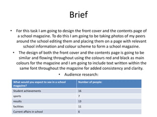
• Audience research:
What would you expect to see in a school
magazine?
Number of people:
Student achievements 16
sports 7
results 13
facilities 11
Current affairs in school 6
2. Large title outlines in bold and
shining through to emphasise the
name of the school magazine. This
shows that the school is pound of
their magazine name and of their
magazine as a whole and want
people to see it and pick it up to
read.
There is a slogan to sell the school to the
parents so they can see that the school has
confidence within themselves and the
underlined words (best and today) are
underlined so as to inform the reader that
they see that this school the subtitle is there
to explain what the magazine is about and
this one is clearly trying to get parents to
enrol their children into the school. This is
also a strap sell line.
The main image shows a young girl (younger
than average) wearing the graduation hat
showing great intelligence in younger pupils.
The girl is smiling showing that she is happy
within the learning environment that she is
in.
School colour scheme is used throughout the front cover of the magazine . This
subliminally makes the reader continue to think about the school as they read through
the magazine.
The font is kept the same throughout the front cover
of the magazine apart from the title which stands
out among all of the text that is displayed on the
front cover.
The language is generic and can be determined by
both students and adults however the available
content looks to be something that parents would
prefer to read than something that a child would
read however the colours of the text would suggest
otherwise.
Secondary stories are present
on this front cover again in the
school colours. The first one has
the year date for last term on it
showing how well the school
did the previous year.
Interviews are present within the
Magazine as they have asked student
about their problems and answered
them in the magazine making people
want to see what they have answered.
These titles could also be seen as teaser
stories as they have enough info on them to
make the reader want to see what they are
about and perhaps make the person that is
looking to buy the magazine purchase it
because of what they read on the front
cover.
There is a price for the magazine on the front
however there is a lacking of the date that the
magazine was put out on and there is no place
saying the number of the issue or even the
month that the magazine was released on.
However the use of the price is good as its
informative to the reader so they can make a
judgement as to whether they can afford to
buy the magazine or not.
The white background of
the image is white which
makes printing fees
cheaper it’s a well edited
image.
3. The date of release and the time of year
are both stated at the top of this
magazine next to the type of addition
that the magazine is as well. All of this
information is relevant as it is a formal
way to tell the reader what they are
buying and if its in date or not.
There is a website address at the top of the magazine to show
the reader where they can go for more information if they
want it. This is a good thing to have on a magazine so people
have the option to go to extra places for information if they
want to. It gives people a choice.
The publisher of the magazine is also
present on this print and this shows
how professional the magazine is by
showing that it is able to have a
publisher.
There is a mini contents on the front page
which tells you where the big stories are within
the magazine. These could be seen as teaser
stories as they have a title and the page
number of the story. This is a nice addition to
the magazine as it allows people to see just
what they are going to be reading within the
magazine.
There is a title which is in bold and is
the largest piece of writing on this
magazine. The title is written in a thick
font and the word parent is thinner
and larger to emphasise the target
audience of the magazine, this is a
quick way for the reader to realise
who the magazine is targeted at.
There is a strap line (sell line on this
magazine it helps to sell the
magazine to the intended
audience. As it is about helping
your children showing it is for
adults not students.
The image is centred and uses highlighted
colours and an image which are usually
associated with summertime. The image
shows a cricketer wearing a white kit with
red lining which the designer of the
magazine has used to make the colour
scheme of the magazine. This image gives
the implication that the school are keen on
sports and may enhance the way the school
looks to those that like sports or prefer
sports within schools.
there is a competition within the
magazine which is there so that
people will see it and then want to
buy the magazine to enter into the
competition and then be in with a
chance of winning a prize. It is a
good marketing technique to add
into the magazine.
There is a swish sub heading
which could also be a kind of
strap line which is place upon
the image and is almost a
pun. The writing says have a
sporting summer and works
with the image to add a slight
bit of humour to the
magazine.
There is another strap line
at he bottom of the
magazine which is again
used to help sell the
magazine to parents by
using a professionally
written catch line.
4. AS Media Studies Preliminary Task – School Magazine Front Page Proposal Form
Target audience:
(age range, interests)
Although it is a school newsletter you still have to think about your
audience and how to appeal to them.
The main target audience for my magazine is going to be the sixth form, parents of sixth form and teachers of sixth form.
The starting age is from around 16+ and it can go all the way up to around the age of 50.
The interests of the audience will be more adult than that of a younger audience as they have more knowledge than younger people.
The sixth forms interests will be ideally on sixth form and what is going on with the sixth form and things that will only concern the
sixth form.
Possible title ideas:
(masthead / title block)
What is your magazine going to be called? TPSixth
Main image:
What will be the focal point of your front page, remember, your work
“must include a photograph of a student in a medium close-up”
The main image will be of a sixth form student smiling wearing a suit with a pen or some sort of writing device. Perhaps books in his
or her hands.
Main cover line:
What will be the main story?
How will we cater for the new sixth!?
Additional key images:
What other images will be on your front cover?
Remember, it is a school magazine.
Glasses on table.
Headphones being held.
Confused and constrained children.
Additional cover lines:
Other features, stories or selling points which will be inside the
magazine, these need to be audience appropriate.
Can we defeat the bridging work blues.
A day in the sixth
Should Hair be considered as uniform?
Music department gets a face lift.
Typography:
(style, size, colour of copy)
Think about the writing and the style of the writing on your front page.
Block text will be used,
Black, white and grey used as the main colour as well as the use of the logo.
Colour will punch through from the main image.
Technique font.
Background colour/image:
What will be in the background, remember you don’t want to take the
focus away from the main image.
The background will be white as this is one of the main colours of the colour scheme.
Technical considerations:
(equipment, setting, props, costume, lighting)
Be realistic and creative, think about what you have access to and how
you could use it.
generic sixth form clothing. Headphones, glasses, camera, school stationary.
5. Preliminary exercise: produce a front page and contents page of a school magazine. Front covers must include a
photograph of a student in a medium close-up with appropriately laid out text and use of an image manipulation
programme (Photoshop).
Below start to sketch what the front cover of your newsletter will look like.
6. Preliminary exercise: produce a front page and contents page of a school magazine. Front covers must include a
photograph of a student in a medium close-up with appropriately laid out text and use of an image manipulation
programme (Photoshop).
Below start to sketch what the contents page of your newsletter will look like.
7. Front cover of my magazine
The title/ header of the
magazine is written in the
colours of the priory
school logo which is also
the colour scheme and
this is a key part of the
magazine both on the
front cover and on the
contents page.
The sub headings are
written with black colours
over the red and black logo
of the school fitting with the
colour scheme and also
being easily read over the
light colours in the
background.
The barcode at the
bottom is not really
necessary on a school
magazine however for a
big school that has a
large amount of sales
may have this on their
magazine.
The issue number and date
of release are important for
the front cover as it is a
requirement for most
magazines to have this
information so the audience
know what they are reading
and if it is up to date or not.
The main image is a
medium shot where a
student looks into the
distance, half of his is cut off
to good effect on the side of
the magazine and the image
also is taking up quite a
section of the front cover
which effectively sells the
magazine to the audience
as it is fun and looks good.
8. Contents page for my magazine
This page was effected mainly
by the use of opacity as I
made most of the images and
boxes on this page around
60% visible which meant that
they were see through
allowing the background to
also be visible through the
text and the boxes.
The title of this page is the
same style as the one on the
front cover which shows
consistency within the
magazine and the colour
scheme is being used
throughout.
The text on this page is all the
same colour and font and the
size is also the same. The text
being the same is a key part to
the clarity of the magazine.
The image at the bottom
like the two others is just
there for some relevance
to the stories that are
featured within the
magazine and have titles
mentioned in the contents
page. They are not all my
own images however in the
future they will be.
9. 1)
For this image I firstly removed the background so that the image was
on a white background to do this is used the magnetic lasso tool and
the regular lasso tool to remove the excess image that I didn’t need.
2)
Once I did this I then had to remove any small issues on the face of the
model. I did this by using the plaster tool otherwise known as the spot
remover tool to improve the look of the model and to make his skin
look farer than it does in the previous image.
3)
After this I was able to use brightness and contrast to change the
overall look of the image to make it less dim and to bring out the
colour in jacks skin and to make him look more presentable on the
front cover so that the magazine would benefit my audience more.
10. This image like the one before was edited in a similar way, I first removed the
background so that there was no pattern behind and so that I could then add
images to this and make a good looking contents page that would appeal to my
audience.
The spot clearer or plaster tool was used secondly and then after this I used the
brightness and contrast to improve the look of the image and make it look different
and not too boring.